YOUNITED – International School Branding
Rebranding Givat Haviva International School into YOUNITED was about more than just a new name. It was about capturing a mission: uniting diverse voices into one vision. From naming to visual identity, this project aimed to reflect the school's commitment to cross-cultural cooperation and leadership. Proudly, this branding won first prize at the 2024 Israel Branding Awards
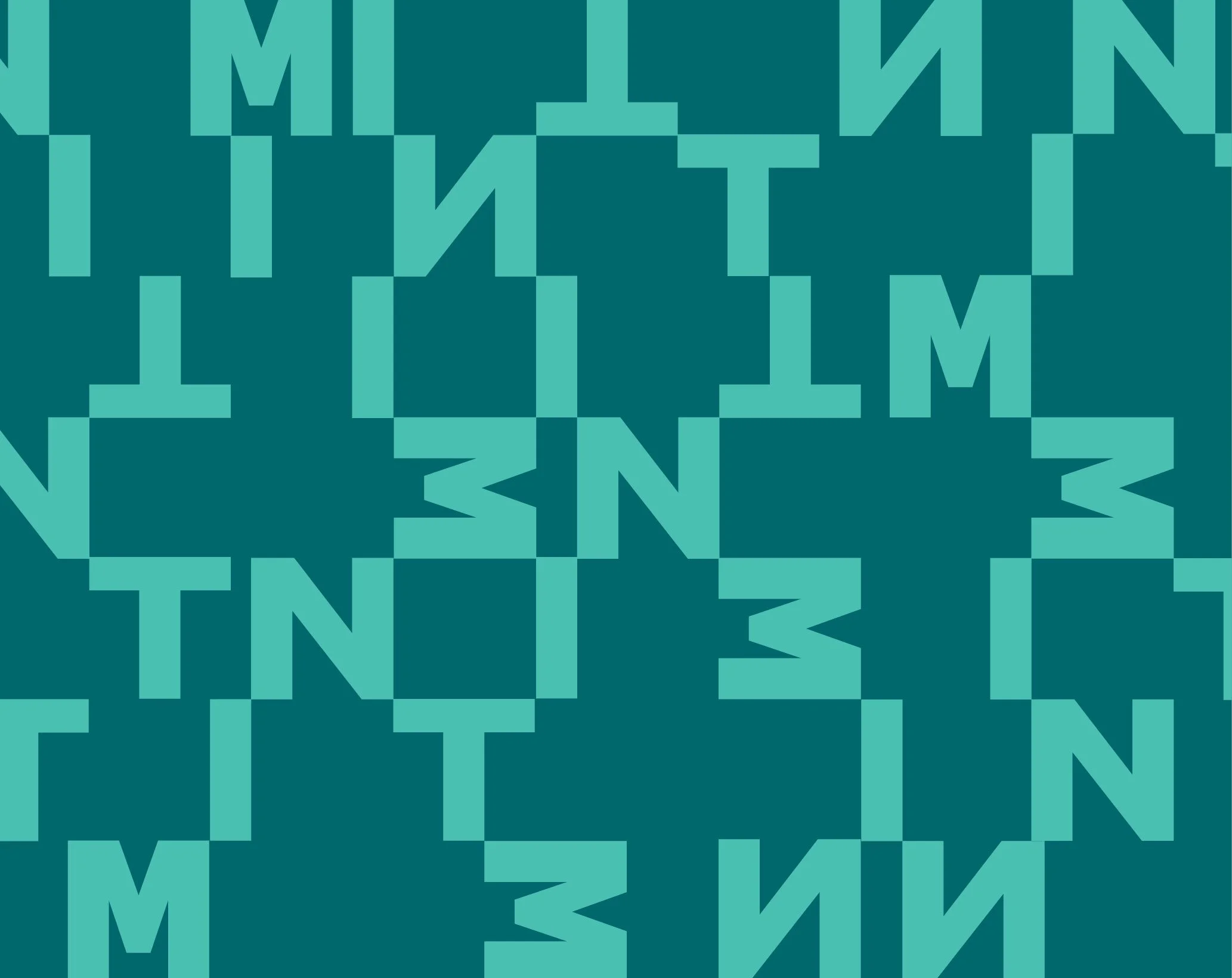
MINT – Modular Thinking for Industrial Kitchens
MINT designs complex, large-scale kitchen systems — from food production plants to corporate dining facilities.
The branding is built on the same principles as their work: modularity, precision, and adaptability.
Just like an industrial kitchen is assembled from flexible, interchangeable components, the visual identity uses a modular design system that reflects this logic.
It’s clean, smart, and engineered for growth — just like every MINT kitchen.
Poopahh – A Name That Feels Like a Sigh of Relief.
The brand Poopahh was born from the exact feeling of relief — that moment right after. The name hints at the release that follows a “poop,” ending with a soft “ahh” that captures both physical and emotional ease. The visual language translates this into a sense of “high” — lightness, cleanliness, and a breath of fresh air.
The design features bold typography, a color palette that’s vibrant yet soft, and playful illustrations that highlight the simplicity, aesthetics, and ease of the service. It’s a language that communicates cleanliness, comfort, and humanity — just like the feeling that follows real relief.
Poopahh strikes a balance between humor, professionalism, and a unique user experience. It breaks conventions in a market that rarely embraces aesthetics — doing so with a big smile and a genuine sense of ease.
Metalpress – Industrial Precision, Branded
The Metalpress identity is built on the core qualities of metalworking: strength, accuracy, and structure.
The visual language uses bold, mechanical typography and a clean grid system to reflect the brand’s precision and reliability.
Every design element feels engineered — from the sharp lines to the solid color palette — reinforcing Metalpress’s commitment to quality, innovation, and performance.
AGOL – Dispute Resolution Center
The name AGOL is inspired by the concept of the "round table" — a place where people come together to resolve conflicts as equals. The visual identity builds on this idea: graphic elements connect halves of circles into unified, whole forms — symbolizing a conflict that has been resolved. The design is calm, precise, and centered on clarity and dialogue.
Shozrim – Flowers That Connect People
“Shozrim” is a social initiative that brings together organizations seeking meaningful volunteer experiences with the residents of an assisted living home.
Volunteers and seniors sit side by side, weaving flower bouquets together — creating moments of connection, dignity, and beauty.
The brand identity reflects this meeting point: warm, human, and optimistic.
Under the tagline “Flowers that connect people”, Shozrim celebrates the power of simple acts to build community.
KEDEM – Reframing Aging, Redefining Community
KEDEM is a branding initiative aimed at replacing outdated terms like “nursing homes” or “assisted living” with a more human, respectful vision: Senior Communities.
The name and identity reflect a shift in perspective — from care institutions to vibrant, growing communities.
The logo features a plant with unfolding leaves, symbolizing life, growth, and connection. Look closer, and you'll find tiny house icons nestled within the design, representing home, belonging, and collective care.
The visual language is soft, optimistic, and rooted in dignity — just like the vision behind KEDEM.
Technion DDS – Making Sense of It
The Technion’s Faculty of Data and Decision Sciences is all about turning complexity into clarity.
The branding reflects this through a dynamic visual language based on arrows — pointing, flowing, converging — symbolizing data streams, directional thinking, and informed decision-making.
This structured yet flexible identity supports the faculty’s mission to lead in data-driven research, education, and innovation.
Smart. Clear. Moving forward
Kaplan Medical Center – Branding with Purpose
Kaplan Medical Center is a cornerstone of Israel's healthcare, known for its innovation and dedication to patient care. Our branding approach aimed to reflect these values, creating a visual identity that embodies trust, precision, and forward-thinking. By focusing on clean design and clear hierarchy, we developed a brand that resonates with both medical professionals and the community, reinforcing Kaplan's commitment to excellence.
Q-room – Where Relief Begins
The name Q-room hints at both quiet and cure — a calm space and a signal for healing.
The branding reflects this duality through a soft, minimal visual language rooted in clean geometry.
It’s designed to feel serene yet precise, echoing the center’s focus on advanced, non-invasive pain relief treatments.
A subtle, trustworthy identity that balances clinical innovation with emotional comfort.
Jetty Flowers – Let’s Get Creative with Color
Jetty Flowers specializes in something magical — coloring flowers.
Through an innovative process, they transform natural blooms into vibrant, custom-colored creations, allowing clients to bring any idea to life.
The branding celebrates this unique creativity, with a bold, playful visual language that invites experimentation and self-expression.
From dreamy pastels to neon bursts — if you can imagine it, Jetty can dye it.
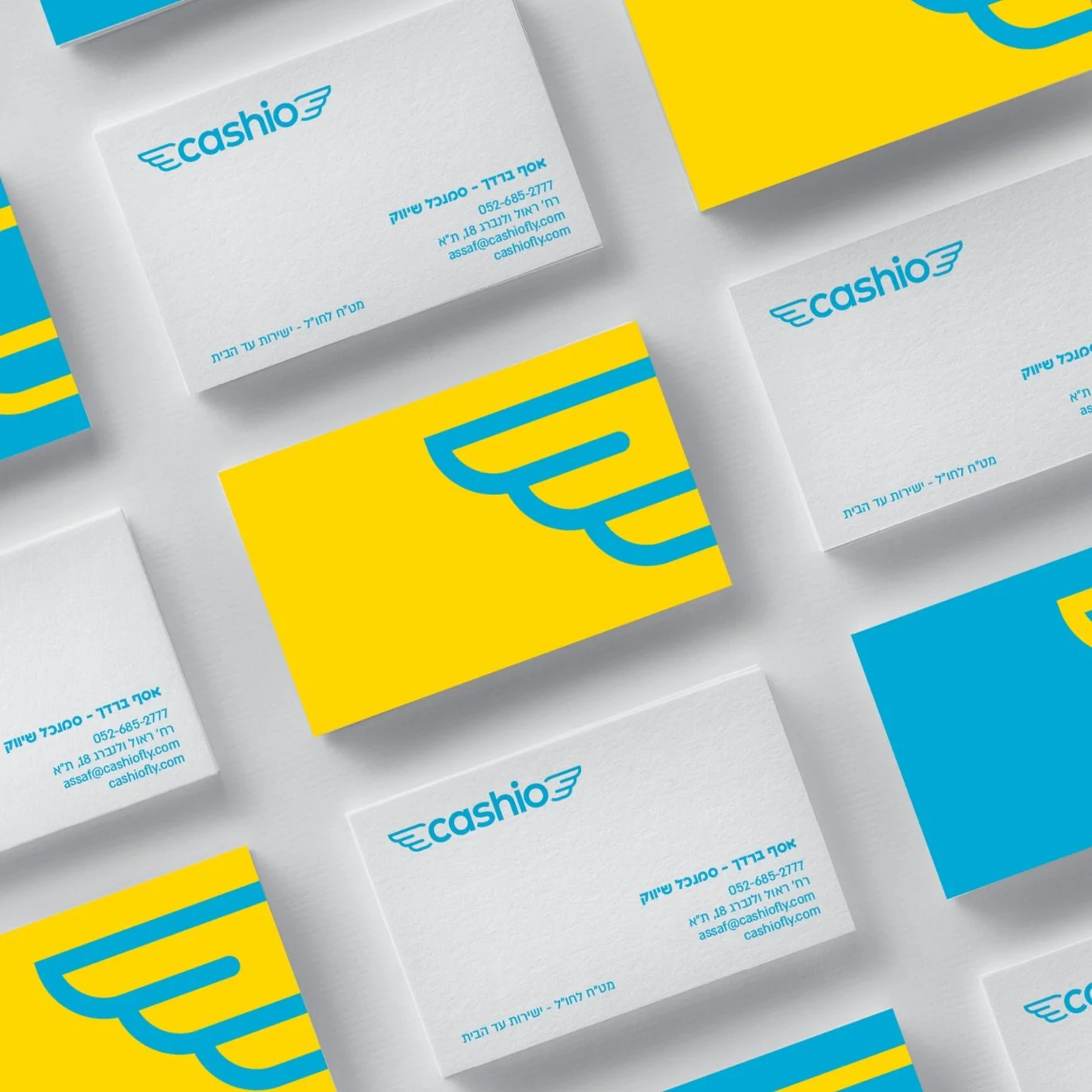
Cashio – Cash Delivery, Reimagined
Cashio revolutionizes the way cash moves — making it fast, secure, and smart.
The branding reflects this with a bold, modular visual system that mirrors the flow of money: dynamic, precise, and always in motion.
With a clean typographic approach and a palette that balances trust with innovation, Cashio positions itself as the modern solution for cash logistics in a digital-first world.
Adhestick – Connecting the Unexpected
The Adhestick – Connecting the Unexpected branding project captures the essence of a company that thrives on innovation and versatility. Adhestick specializes in developing polymer-based solutions across diverse industries, including industrial adhesives, agricultural pest control, defense applications, and even bicycle accessories.
The branding concept centers around the idea of "connecting the unexpected," reflecting Adhestick's ability to bring together seemingly unrelated elements to create innovative solutions. The visual identity likely employs modular and dynamic design elements, symbolizing the company's adaptability and the seamless integration of its products into various applications.
This approach not only highlights Adhestick's technical expertise but also its commitment to pushing boundaries and exploring new possibilities in material science. The branding effectively communicates the company's role as a connector and innovator in the field of advanced polymer solutions.
AMT Fitness – Be the One
The concept behind AMT Fitness Center's branding is all about empowerment: Be the One. The number "1" is integrated into the logo itself, serving as both a typographic and symbolic element — a reminder that every person has the potential to be their own #1.
The design is bold and energetic, using sharp, athletic typography and strong visual contrasts to evoke motion, focus, and personal achievement. The visual language is rooted in strength — the typography feels powerful and deliberate, echoing the intensity and drive of the fitness world.
The color palette and layout are designed to inspire action and determination, making every interaction with the brand feel like a call to move, push, and grow.
At AMT, it’s not just about working out — it’s about stepping up. Being the one who shows up, who improves, who leads.
Now Plastics – Flexible by Design
Now Plastics is a global leader in plastic films, aluminum foil, and flexible packaging solutions. With over 40 years of expertise, the branding reflects the company’s agility, reliability, and forward-thinking approach.
The visual identity is clean and efficient — just like their supply chain — with design elements that suggest flow, transparency, and adaptability. A key concept in the logo and graphic language is a translucent strip that overlays the brand name — much like a sheet of plastic — subtly referencing the core product in a tactile, visual way.
It’s a brand that balances global scale with precision, and innovation with sustainability.
Frontline – Empowering PCB Innovation Through Strategic Branding
Frontline is a provider of advanced printed circuit board (PCB) control systems, specializing in sophisticated monitoring and automation solutions for the mobile phone industry. Their systems offer complete control over the entire PCB manufacturing process — from start to finish.
The Cleaner was brought in to develop a full rebrand — from the core brand language and visual identity, to a redesigned website and the creative production of three corporate and product videos. At the center of it all was the brand promise: Make the most of your process.
This guiding idea shaped the entire branding concept, including the logo, which features a dynamic line passing through a sequence of points — symbolizing the journey through each production station. It visually expresses the idea of flow, precision, and full-process visibility.
The result is a strong, flexible identity system that positions Frontline as a forward-thinking leader in PCB innovation. We didn’t just write the line — we lived it through the entire process.
Delta Galil – Body Before Fabric
The branding for Delta Galil Industries is rooted in the company’s core philosophy: Body before fabric.
This idea guided a full visual refresh for the global leader in intimate apparel and activewear — putting the human experience at the heart of the design system.
The identity is clean, confident, and contemporary, balancing softness with strength.
From signage to packaging and internal materials, every detail was crafted in close collaboration with Delta’s design teams in Israel and New York.
The result: a brand that feels as comfortable, thoughtful, and elevated as the products it represents.
Balance Triangle – Wellness in Perfect Proportion
Balance Triangle is a wellness initiative based on one simple truth: balance is personal. The visual identity is built on the idea that each person has their own unique “triangle” — the relationship between sleep, nutrition, and physical activity.
At the heart of the logo is a triangle with a dynamic line that can tilt left or right — a visual metaphor for what happens when one part of the wellness triangle is off balance. This subtle movement captures the essence of the brand: balance isn’t static, it shifts, adapts, and evolves.
Through clean geometry and a modular system, the branding reflects the ongoing journey to find harmony. It’s calm, precise, and flexible — just like wellness should be. It’s not about being perfect. It’s about finding your balance.
Exposee – Nothing to Hide
Exposee is a bold interview platform that dives deep — raw, unfiltered, and radically honest.
The branding is built around one central idea: transparency.
The logo itself visually reflects this — with layered forms and exposed type — while the color system is deliberately bold and saturated, mirroring the intensity and emotional depth of the content.
It’s a brand that doesn’t shy away from truth.
Exposee invites viewers into open, provocative conversations with extraordinary people — and lets everything show.
Vainqueur – Elegance in Motion
Vainqueur is a premium horse riding fashion brand that blends timeless elegance with modern performance.
The branding draws inspiration from the equestrian world — its discipline, grace, and prestige.
The logo is refined and poised, echoing the power and elegance of both horse and rider.
With a sophisticated color palette and sharp typographic choices, the identity feels both classic and current — fit for a brand that rides at the intersection of heritage and high fashion.
456 – Branding a Strategic Business Hub
The “456” commercial real estate project is named after its unique geographic advantage — a location surrounded by three of Israel’s main highways: Routes 4, 5, and 6. This naming strategy immediately conveys the project's biggest asset: exceptional accessibility.
In the fast-paced world of real estate, branding is often short-lived. A project's marketing window is limited — making it even more crucial to create instant impact. That’s exactly what guided our process for 456: to build a bold, memorable brand that delivers clarity from the first glance.
The logo design cleverly fuses the digits 4, 5, and 6 into one unified visual form, subtly reinforcing the idea of interconnected routes and nonstop movement. When the name is also the concept — there’s no need to overdesign. The visual language is deliberately simple, strong, and direct.
456 positions itself as more than a location — it’s a promise of access, visibility, and opportunity at the very heart of Israel.
Starving Burger – Born Hungry, Built Like a Star
The name Starving Burger says it all — intense craving, big flavor, and a wink of attitude.
But there's more behind it: the word “starving” meets the visual of a bold star, hinting at an all-American burger joint with iconic energy.
The branding fuses classic Americana with a modern twist — playful typography, punchy colors, and a logo that feels like a cult brand in the making.
It’s loud, proud, and made to hit the spot.
Velocee – From Text to Voice, Adapted to Fit
Velocee is a data-communication startup that turns written content into spoken word.
At the heart of the branding is a logo designed for adaptability — built from modular parts that can shift, stretch, and reshape to fit any format or context.
This flexibility mirrors Velocee’s core product: turning static information into dynamic, living sound.
The identity is sleek, minimal, and in constant motion — just like the brand itself.
Madanet Ha’Atid – Shaping the Scientists of Tomorrow
Madanet Ha’Atid is a national educational initiative aimed at nurturing scientific excellence among students — cultivating the next generation of scientists and engineers in Israel.
The branding reflects a fusion of innovation, curiosity, and academic rigor.
The logo is built from modular geometric shapes, representing the foundational principles of scientific thinking: observation, experimentation, and conclusion.
The graphic language is colorful, inspiring, and youthful, while maintaining clarity and structure.
It conveys a sense of constant growth and exploration, encouraging students to see science as exciting, accessible, and empowering.
Madanet Ha’Atid's identity speaks to the future — bright, bold, and driven by knowledge.
BICS Analytics – Structured Intelligence, Designed for Scale
BICS, a subsidiary of BDO, sought to reorganize their sub-brands and establish a cohesive, modern brand language to reinforce their market leadership and appeal to potential clients, particularly their main distributor and partner, SAP. gal zacay
The branding strategy focused on creating a visual identity that embodies clarity, precision, and adaptability. By developing a structured design system, the new brand language ensures consistency across various platforms and touchpoints. This approach not only strengthens BICS's position in the analytics solutions market but also enhances its collaboration with key partners like SAP.gal zacay
The updated branding effectively communicates BICS's commitment to delivering reliable and innovative analytics solutions, positioning the company as a forward-thinking leader in the industry.
Sources
Tadmor Levy – A Modern Identity for a Leading Law Firm
The branding for Tadmor Levy Law Offices, crafted by The Cleaner, reflects the firm's stature as a premier Israeli law firm with a global outlook. The visual identity is designed to convey professionalism, trust, and a forward-thinking approach, aligning with the firm's commitment to providing sophisticated legal services across various sectors.
At the core of the visual identity is a unique logo: a clean, structured frame with one deliberate opening. This “not-quite-closed” frame symbolizes the balance between legal structure and creative thinking — a nod to the firm’s ability to work within the rules, yet think outside the box when needed. It suggests that law is not only about boundaries, but also about finding space for strategic flexibility and innovation.
The refined color palette and modern aesthetics reinforce Tadmor Levy’s reputation for excellence and its dedication to serving a diverse clientele, including multinational corporations and government entities.
Overall, the branding effectively communicates Tadmor Levy's position at the forefront of the Israeli legal arena, highlighting its blend of tradition, structure, and innovation.
VFJ – Bridging Israeli Innovation with Japanese Insight
VFJ (Vered Farber Japan) is a consultancy dedicated to connecting Israeli businesses with the Japanese market. The branding, crafted by The Cleaner, reflects this mission through a visual identity that embodies clarity, precision, and adaptability.
The logo features modular geometric shapes, symbolizing the foundational principles of scientific thinking: observation, experimentation, and conclusion. This design choice conveys a sense of constant growth and exploration, encouraging clients to see the Japanese market as exciting, accessible, and empowering.
The refined color palette and modern aesthetics reinforce VFJ's reputation for excellence and its dedication to serving a diverse clientele, including multinational corporations and government entities.
Overall, the branding effectively communicates VFJ's position at the forefront of Israeli-Japanese business relations, highlighting its blend of tradition, structure, and innovation.
Meshek Energy – Harnessing Sunlight with Purpose
Meshek Energy is a leading Israeli renewable energy company, specializing in the development, construction, and operation of large-scale solar projects. The company's branding reflects its commitment to sustainability and innovation in the energy sector.
A key feature of the visual identity is the logo, which replaces the Hebrew letter Aleph with a stylized wind turbine icon — a modern, symbolic gesture representing clean energy and motion. This subtle yet impactful design choice anchors the brand in the world of renewables, while maintaining a distinct and memorable presence.
The broader graphic language extends this idea, using circular forms, radiating lines, and modular compositions to echo the dynamics of solar and wind energy. The result is a visual system that feels active, optimistic, and grounded in purpose.
Through thoughtful design and meaningful symbolism, the branding of Meshek Energy effectively communicates the company's dedication to advancing renewable energy initiatives and contributing to a sustainable future.
Sindyanna of Galilee – Branding Peace Through Olive Oil
Sindyanna of Galilee is a unique non-profit organization led by Arab and Jewish women working together to create social change from the ground up. Their mission is to produce outstanding olive oil and other premium food products while enhancing Arab-Jewish cooperation, promoting Fair Trade, creating economic opportunities for Arab women, and assisting local growers and producers.
A distinctive element in the label design is the use of large, bold words at the center — words like Hope, Peace, and Together. These aren't just graphic choices; they serve as direct messages of optimism and a vision for a better, more unified world. This language-forward approach turns each bottle into a statement — not only of quality, but of purpose.
The visual identity also incorporates colorful illustrations created by the children of Sindyanna, adding a sense of warmth, community, and continuity across generations.
Through thoughtful design and meaningful symbolism, the branding of Sindyanna of Galilee beautifully expresses its dedication to peace, equality, and the empowerment of women in the region.
Nachshonim – Pioneering Dual-Career Paths
Nachshonim is an innovative platform that empowers outstanding graduates to simultaneously pursue both business and social careers. The branding, crafted by The Cleaner, encapsulates this unique duality through a smart and adaptable visual identity.
The logo and graphic elements are designed to reflect the concept of two parallel paths—professional and social—intertwining to create a cohesive journey. This approach symbolizes the balance and synergy between personal ambition and societal contribution.
By integrating these themes into the branding, Nachshonim effectively communicates its mission to foster a new generation of leaders who are equally committed to professional excellence and social impact.
Sensa – Passion Served in Abundance
Sensa is a boutique catering brand that celebrates creativity, bold presentation, and culinary abundance.
More than just food, every event is an experience — full of vibrant flavors, rich materials, and surprising compositions.
The name Sensa and the visual language express a deep passion for food, with bold typography and expressive color reflecting the energy and excitement behind every dish.
The branding mirrors the culinary style: imaginative, abundant, and unforgettable.
Sensa doesn’t just serve meals — it creates edible moments guests won’t stop talking about.
Jerusalem Biblical Zoo – Partners with Nature
The rebranding of the Jerusalem Biblical Zoo reflects its evolving mission: conservation, care, and the return of wildlife to their natural habitats.
The tagline "Partners with Nature" embodies the zoo’s commitment to environmental stewardship and collaborative preservation.
The visual identity draws inspiration from open landscapes and natural ecosystems, with design elements that emphasize the deep connection between animals and their environments.
The overall look and feel evoke compassion, responsibility, and hope — inviting visitors to see themselves as active participants in protecting wildlife.
This refreshed brand positions the zoo as a leader in conservation and environmental education, inspiring the public to join its vision for a more sustainable, compassionate world.
Network – A Workspace That Connects
Network is a shared workspace designed to foster connection, collaboration, and creativity. The branding, developed by The Cleaner, reflects this mission through a visual identity that embodies clarity, flow, and connection.
At the heart of the logo and graphic language is a continuous line — a visual metaphor for the network itself. This single flowing stroke expresses ideas of movement, continuity, and relationships, symbolizing how people, ideas, and energy move freely within the space.
The refined color palette and modern aesthetic support the sense of openness and dynamism, positioning Network as more than just a place to work — it’s a place to connect, grow, and create.
Overall, the branding effectively communicates Network’s unique role in the world of shared workspaces: structured yet fluid, grounded yet open.
Zak's – Where Good Food Meets Fresh Design
Opening a restaurant is challenging enough — branding one is sometimes twofold. It requires meaning, clarity, and a strong connection to the owner’s vision. Zak’s, a warm and ambitious culinary space, entrusted us with the mission of building a brand that captures the essence of both a cozy bistro and a high-end bakery.
With a limited budget and a clear creative direction, we developed a rustic, simple, and appetizing visual identity. The branding uses a minimal color palette and basic, tactile materials to evoke freshness, comfort, and authenticity. The result is a clean yet character-filled experience that feels both refined and familiar.
The logo features straightforward typography and subtle details that echo the homemade nature of Zak’s food, while the broader visual language supports the space’s welcoming and delicious atmosphere.
This is branding that supports not just the look of the place — but its heart.
Cartiv – Refreshing Your Car Wash Experience
Cartiv is a car wash brand that reimagines the traditional vehicle cleaning experience by infusing it with fun, freshness, and a touch of whimsy. The name Cartiv — a playful invention inspired by the Hebrew word for “ice pop” (kartiv) — was created as part of the branding process to evoke coolness, lightness, and that freshly cleaned feeling.
Developed by The Cleaner from naming to visual identity, the brand turns what’s usually a chore into something surprisingly enjoyable. The graphic language is bold, colorful, and friendly, using soft shapes and vibrant hues that signal refreshment and simplicity.
Cartiv positions itself not just as a car wash, but as a cheerful experience — a moment of brightness in your routine, where your car gets clean and your mood lifts.
By aligning the name, tone, and design, Cartiv delivers a fresh new take on automotive care — one that people will remember and smile about.
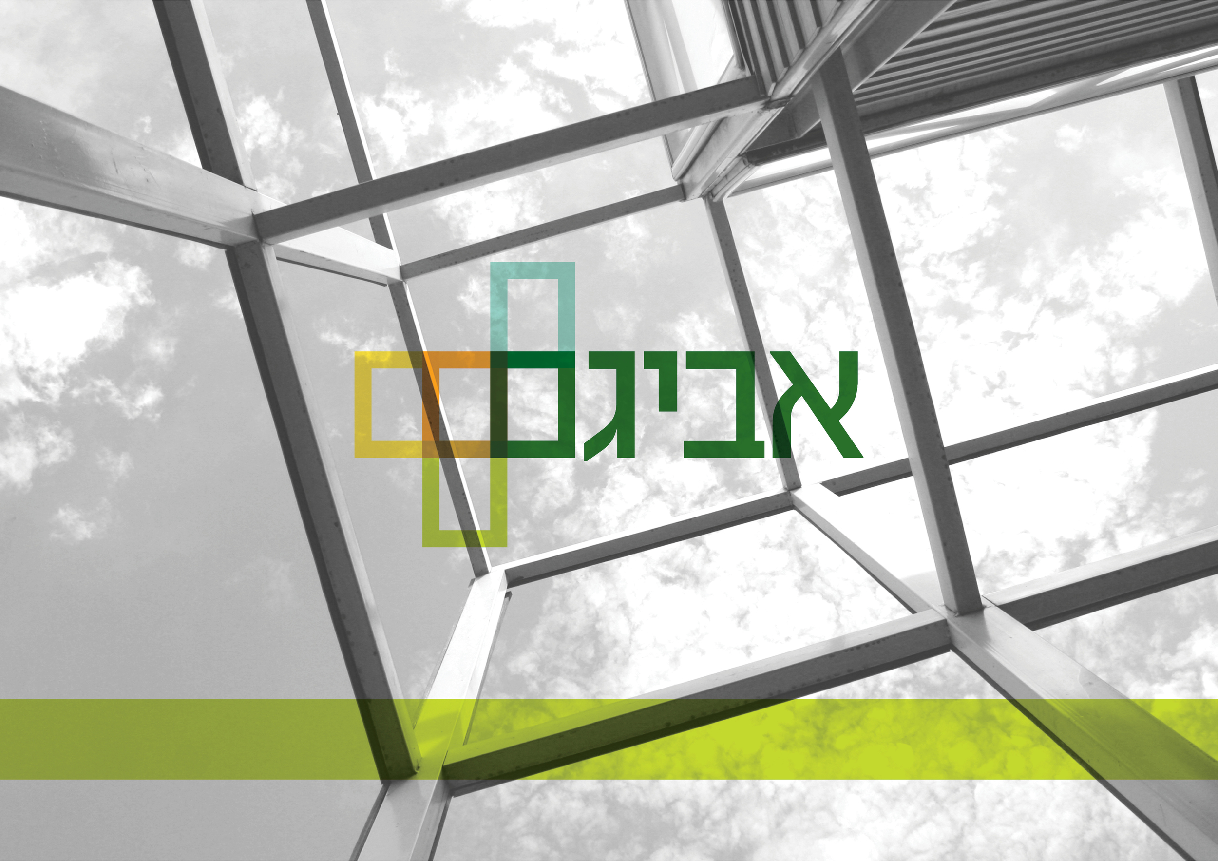
Avigam – Logistics with Structure and Flow
Avigam is a logistics and warehousing company that specializes in efficient, high-volume storage and distribution — but its work goes beyond storage. The company builds large-scale commercial centers, providing clients with custom industrial spaces designed for flexibility and growth.
It’s often a challenge to take a slightly dull industry and give it a fresh, vibrant, and contemporary identity — without losing the seriousness and professionalism at its core. That was the mission when branding Avigam.
The modular logo, built from intersecting frames that connect with the final letter of the name, visually expresses Avigam’s core business: constructing modular aluminum-based structures. These frames also reflect the company’s philosophy — we give you the frame, you define what’s inside it.
The color palette adds a light and colorful touch, helping convey the diversity of structural forms, services, and advantages the company offers. The branding balances clarity with flexibility, precision with openness.
The result is a brand identity that feels solid yet dynamic — just like the spaces Avigam creates.
Kabbalah Center – Visualizing Mystical Wisdom
The branding for the Kabbalah Center, crafted by The Cleaner, encapsulates the essence of ancient Jewish mysticism through a modern design lens.
The logo design draws inspiration from the Tree of Life, a central symbol in Kabbalistic teachings, representing the interconnectedness of the divine and the earthly realms. This intricate structure is simplified into a clean, contemporary form, making the profound concepts of Kabbalah accessible to a broader audience.
The color palette is thoughtfully chosen to reflect spiritual themes, utilizing deep blues and golds to evoke a sense of depth, wisdom, and enlightenment. Typography is elegant yet approachable, balancing tradition with modernity.
Overall, the branding bridges the gap between ancient teachings and contemporary seekers, inviting individuals to explore the depths of Kabbalistic wisdom in a visually engaging manner.
WorkBlock – Structured Flexibility in a Shared Workspace
WorkBlock is a shared workspace designed to offer professionals a harmonious blend of structure and flexibility. The branding, developed by The Cleaner, reflects this balance through a modular visual identity that emphasizes both order and adaptability.
The logo features interlocking geometric shapes, symbolizing the interconnectedness of ideas and the collaborative nature of coworking environments. This design choice conveys a sense of community and shared purpose, aligning with WorkBlock's mission to foster productivity and innovation among its members.
The color palette is thoughtfully selected to evoke professionalism and creativity, using neutral tones complemented by vibrant accents. Typography is clean and modern, enhancing readability and reinforcing the brand's contemporary appeal.
Overall, the branding positions WorkBlock as a dynamic and inviting space that caters to the evolving needs of modern professionals, offering a foundation for growth, collaboration, and success.