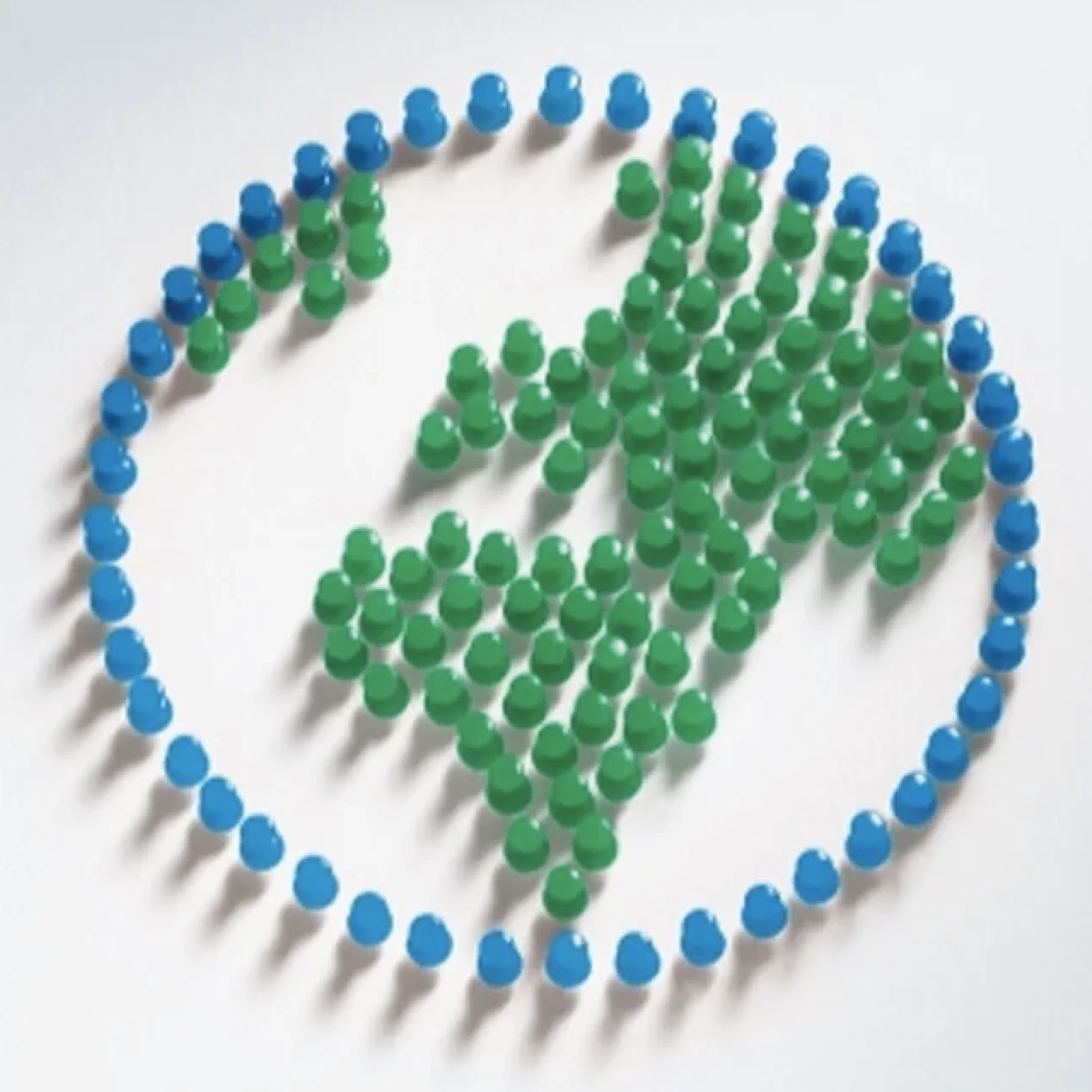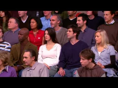

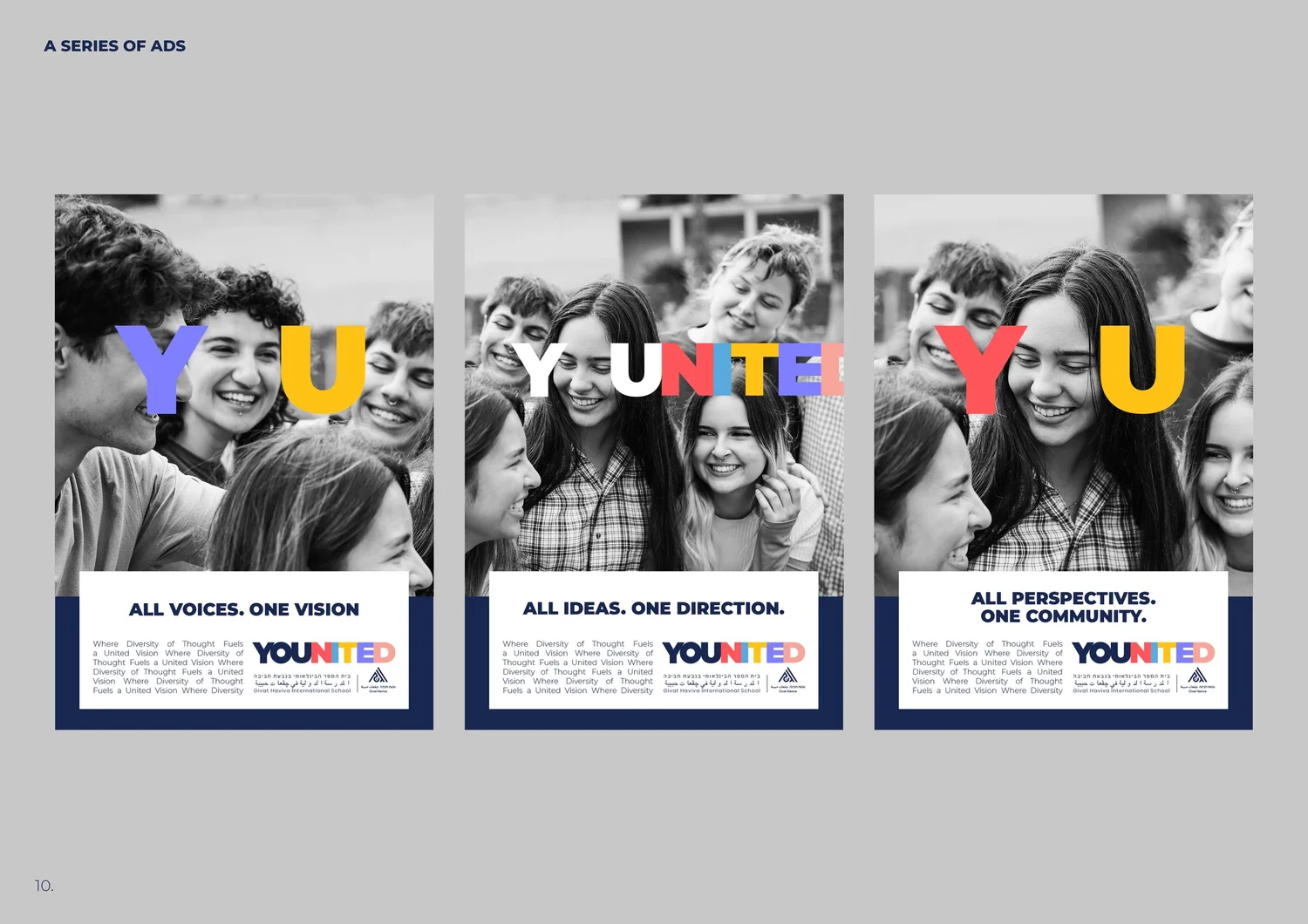
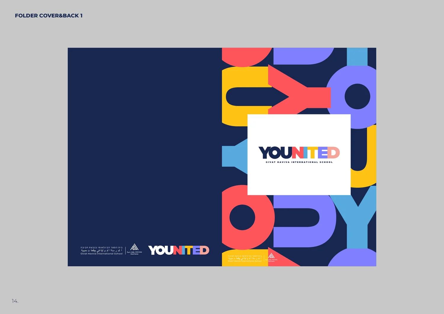
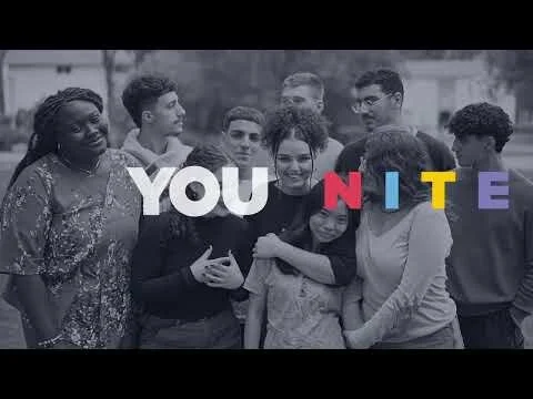
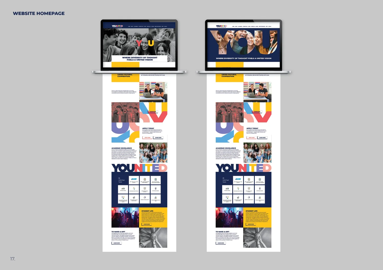
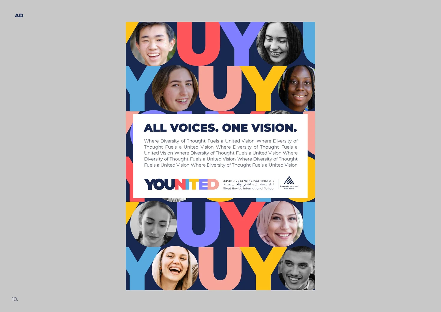
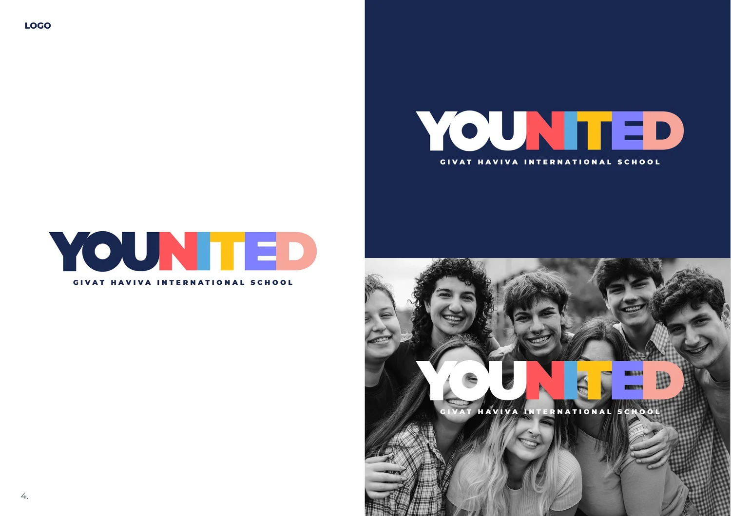
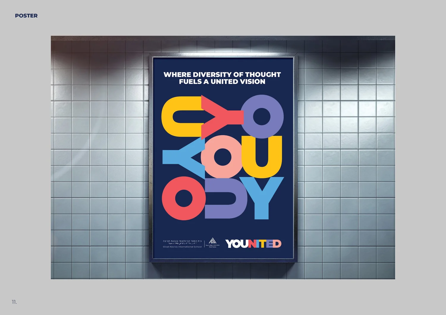
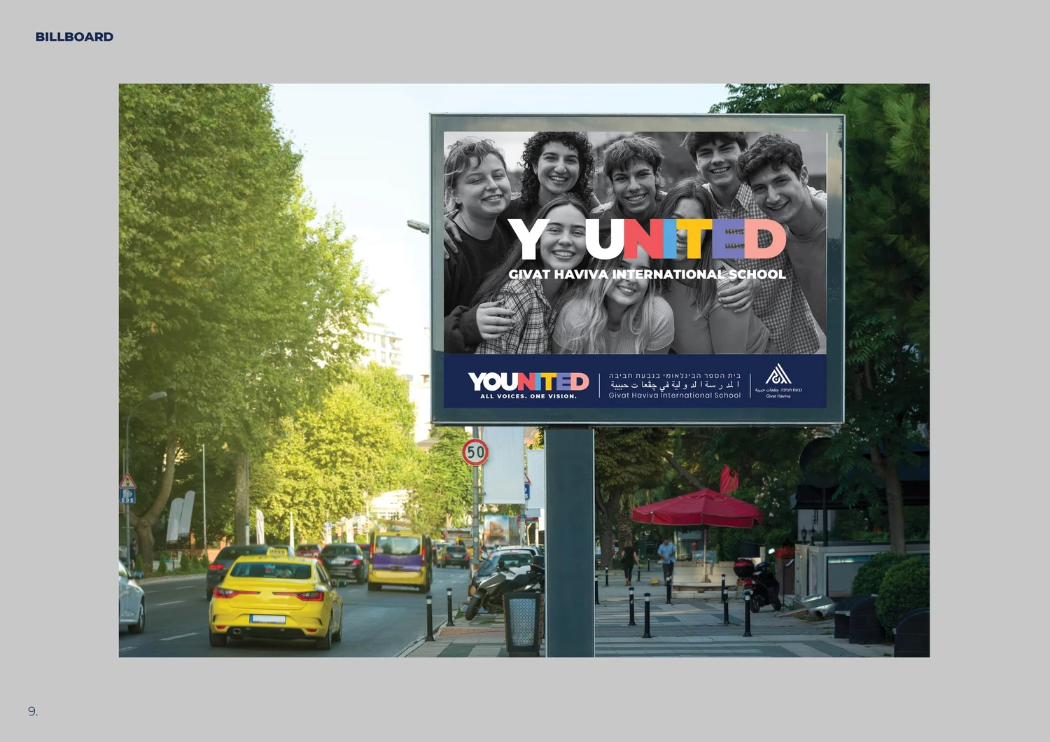
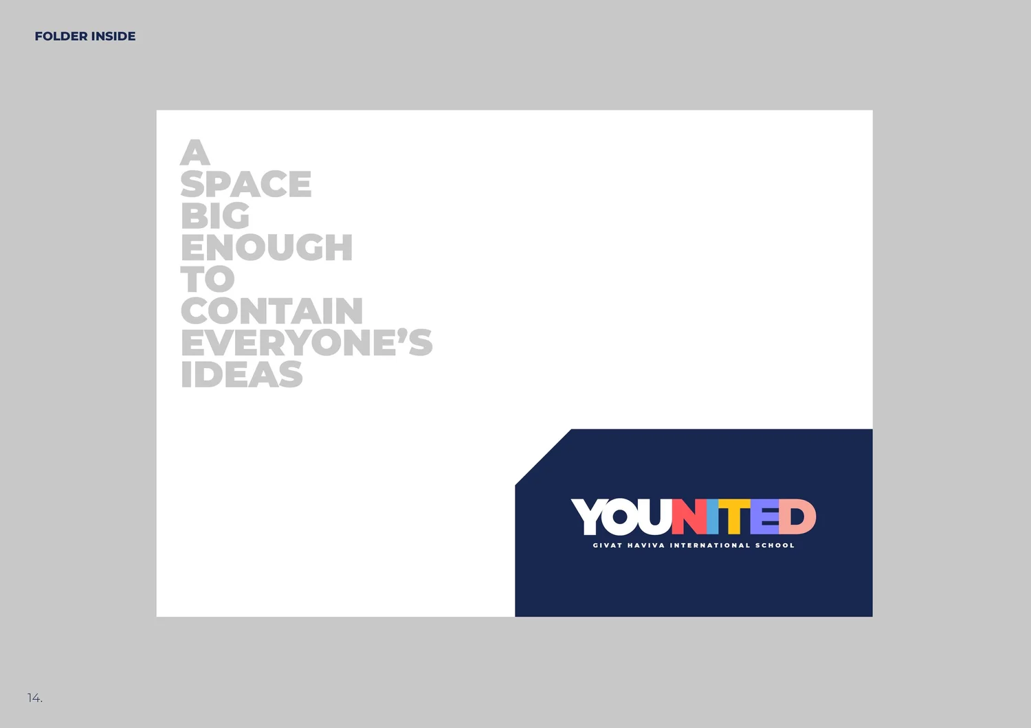
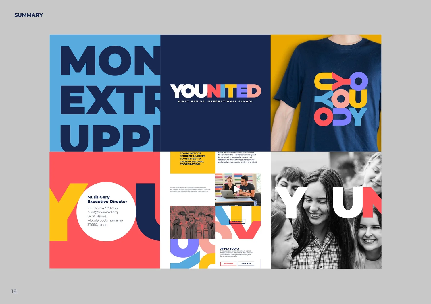
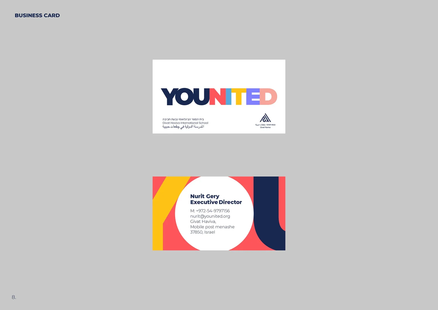
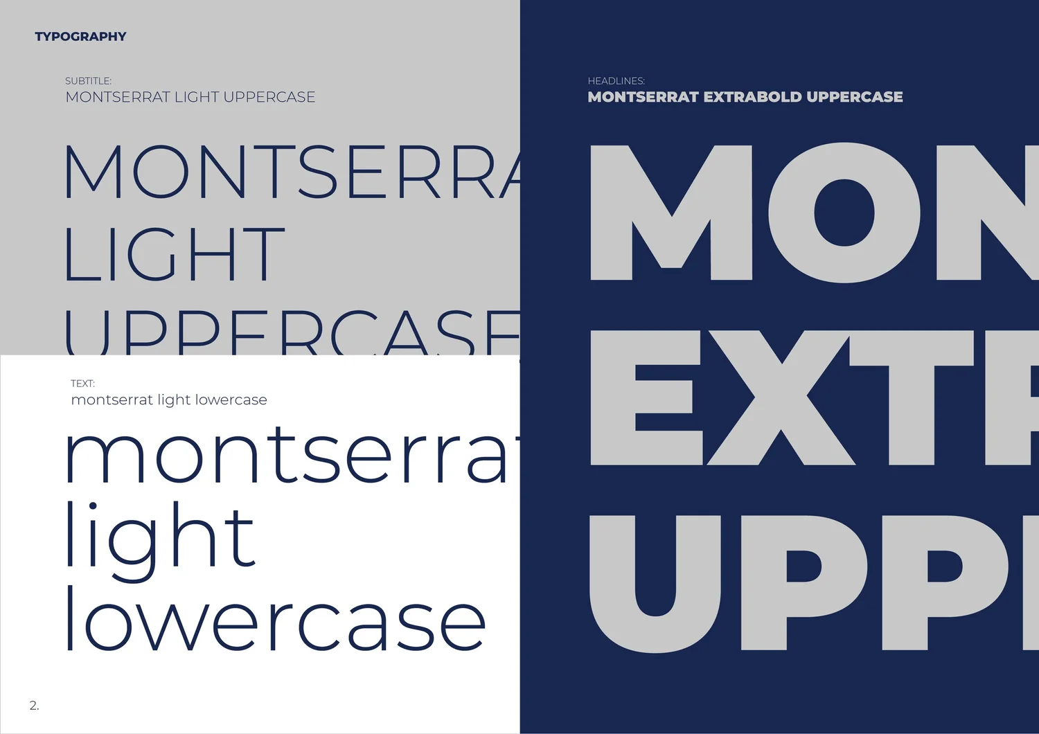
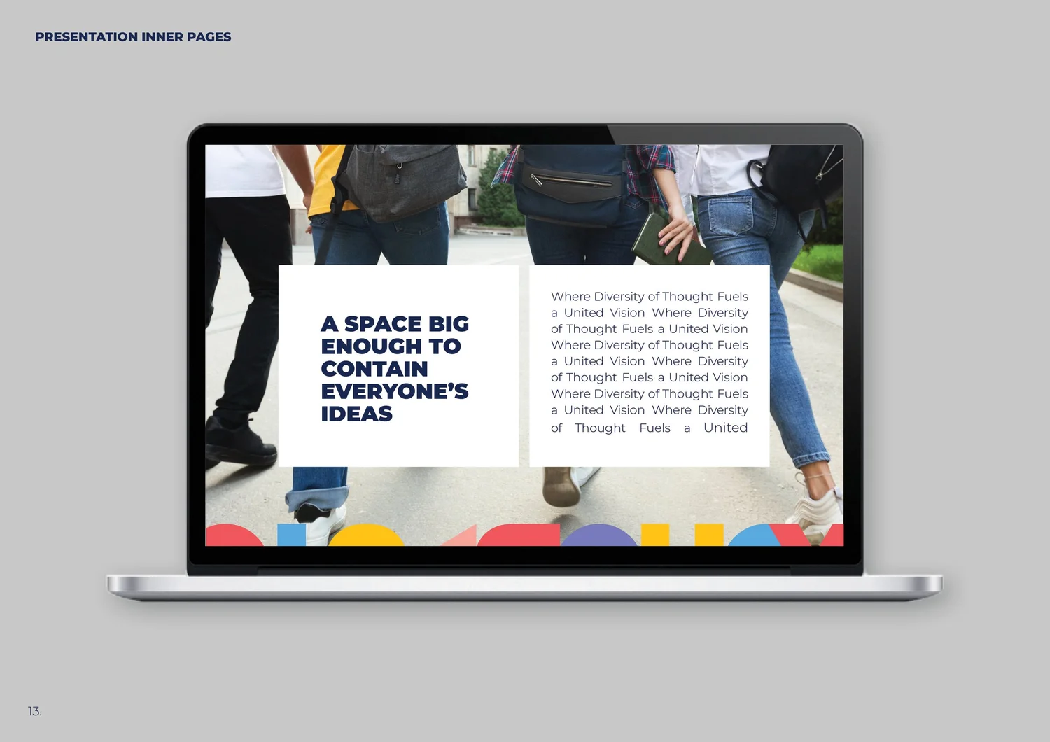
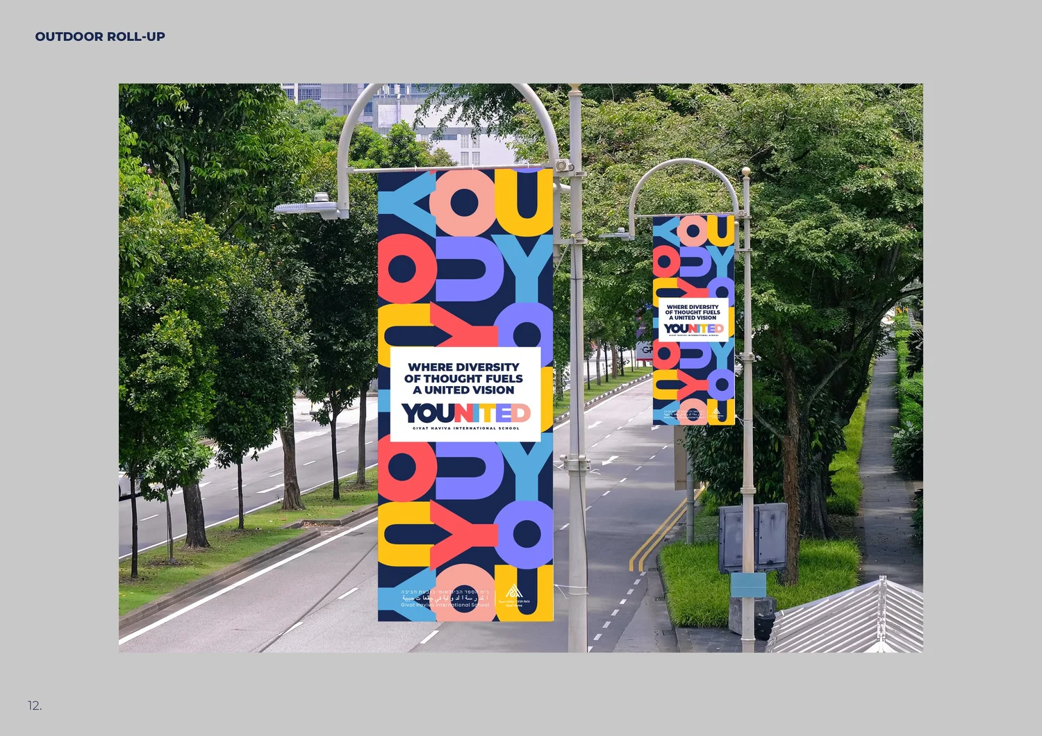
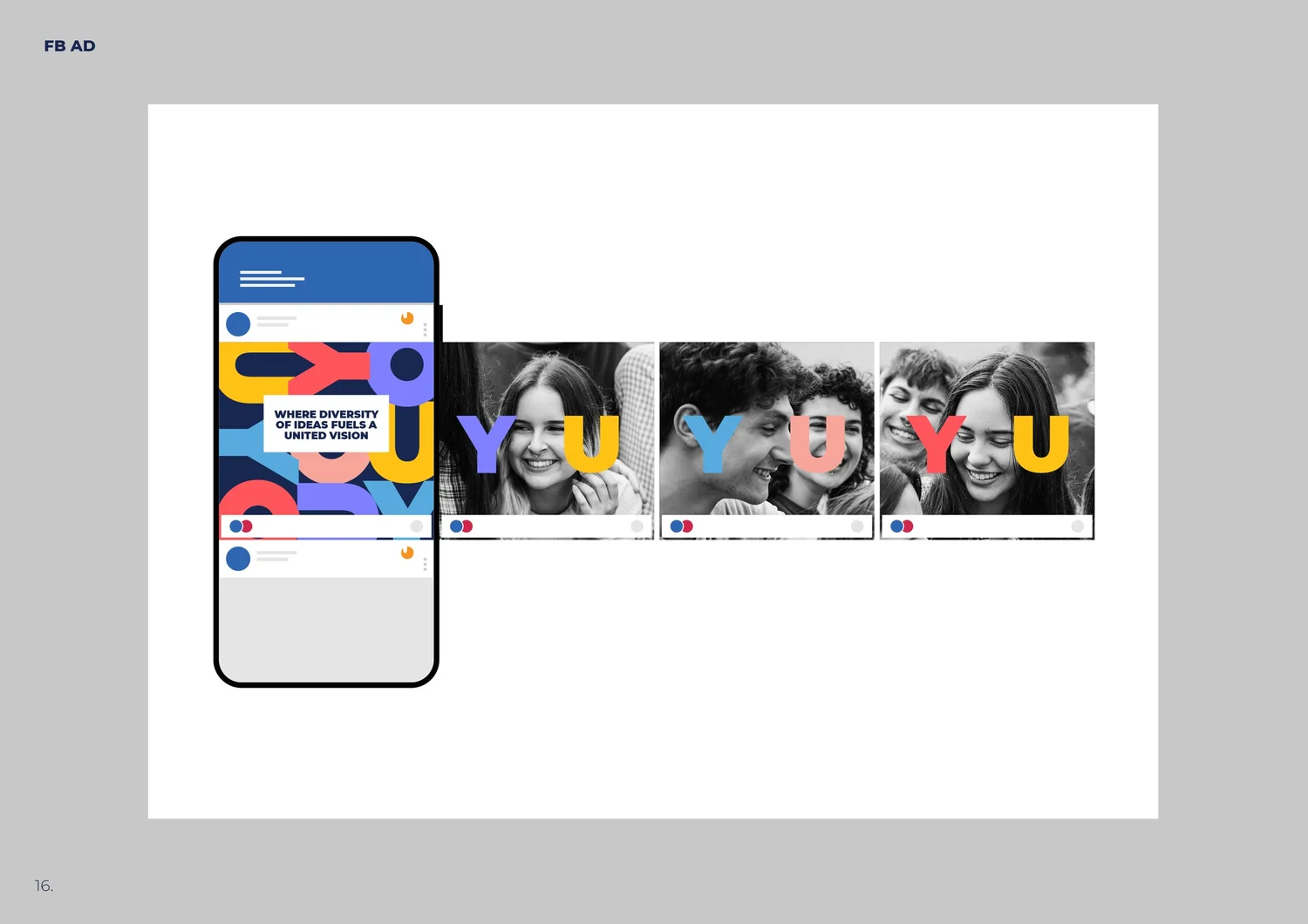
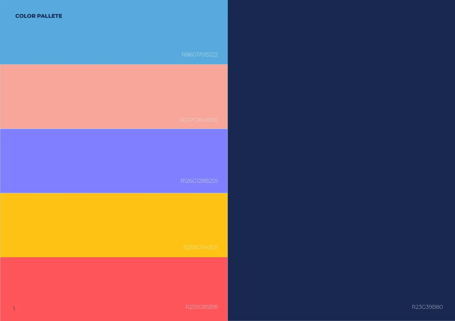
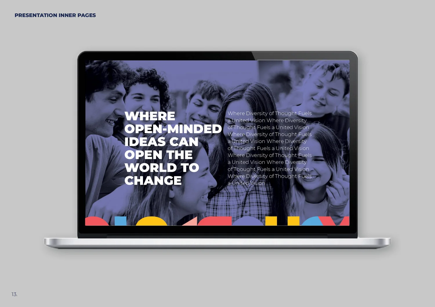
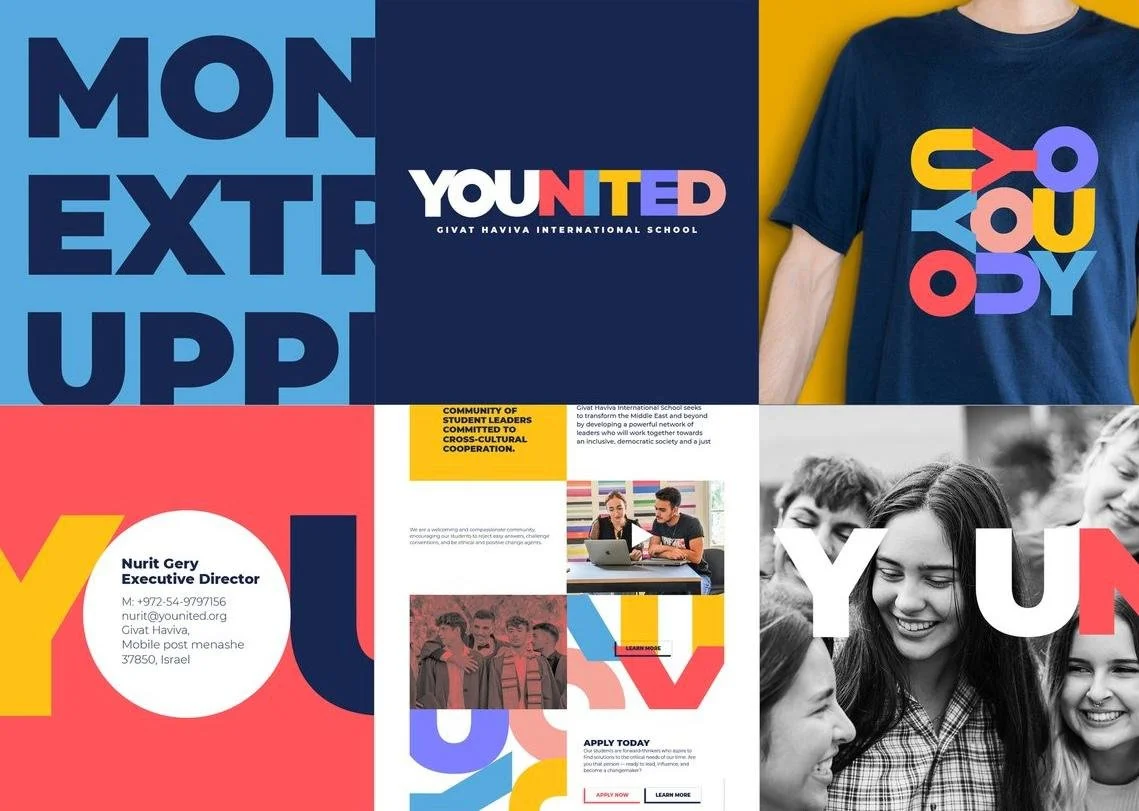
Different cultures, one shared future. The identity turns the school’s mission into a simple idea: many individual voices coming together as one.
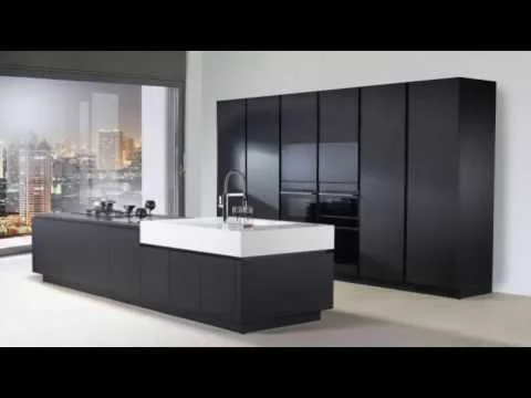
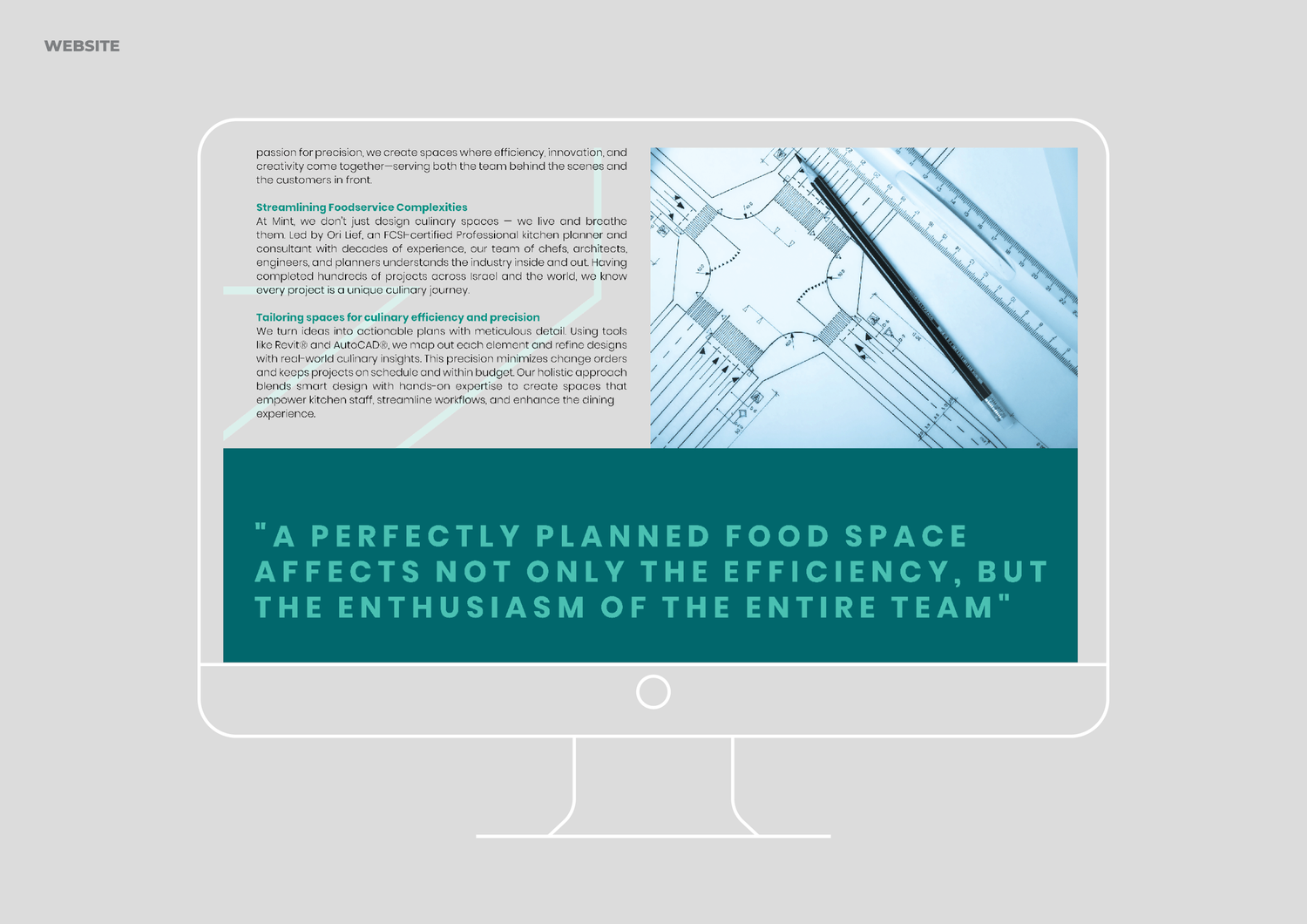
Built like an industrial kitchen: modular, precise and assembled from interchangeable parts. The system can expand and reorganize without losing its logic.
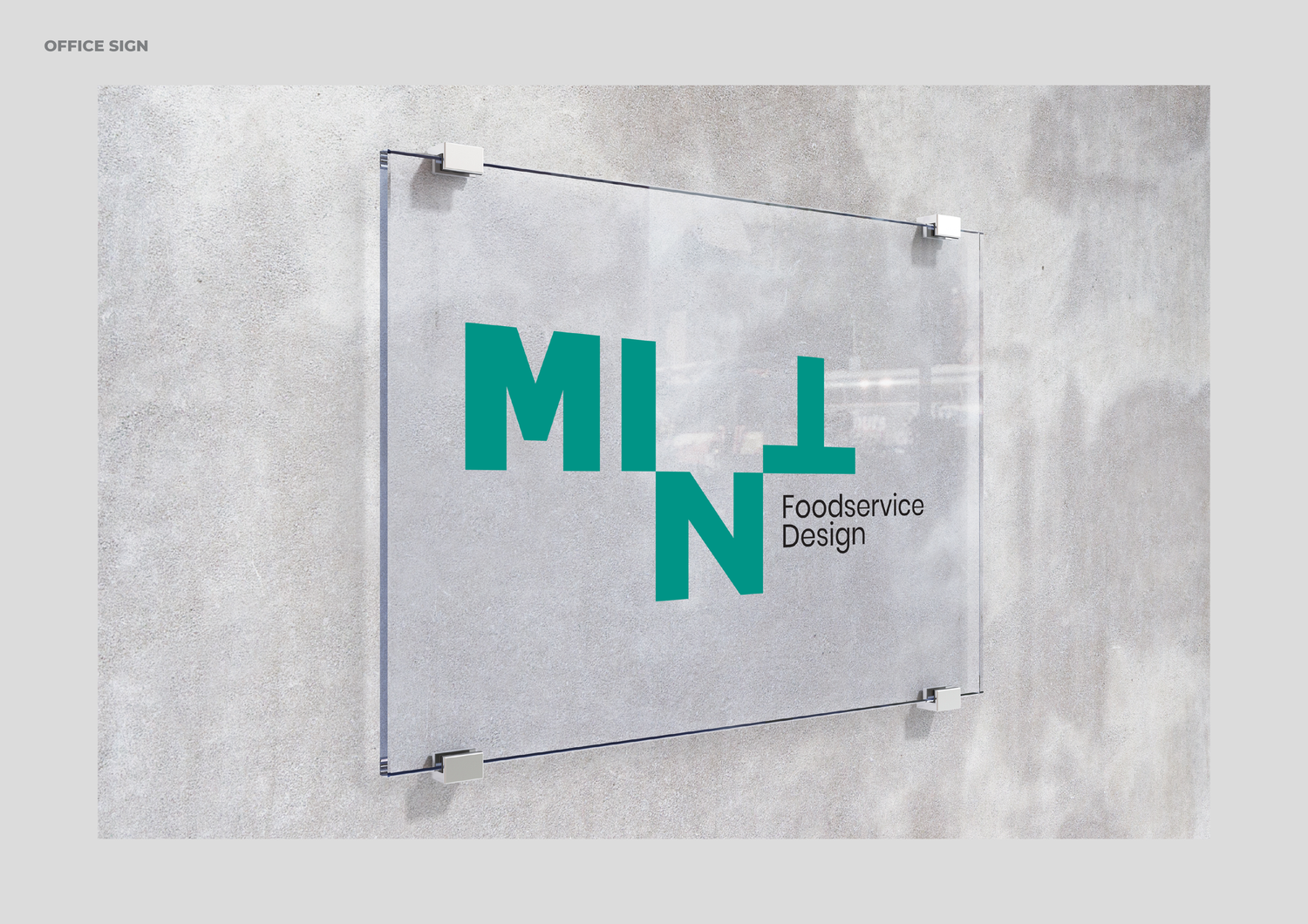
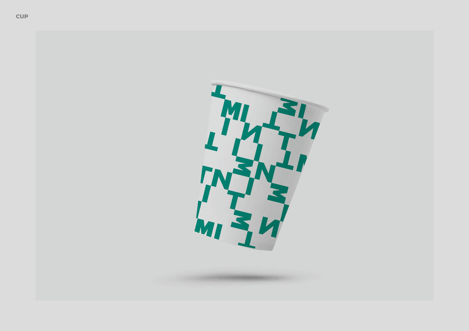
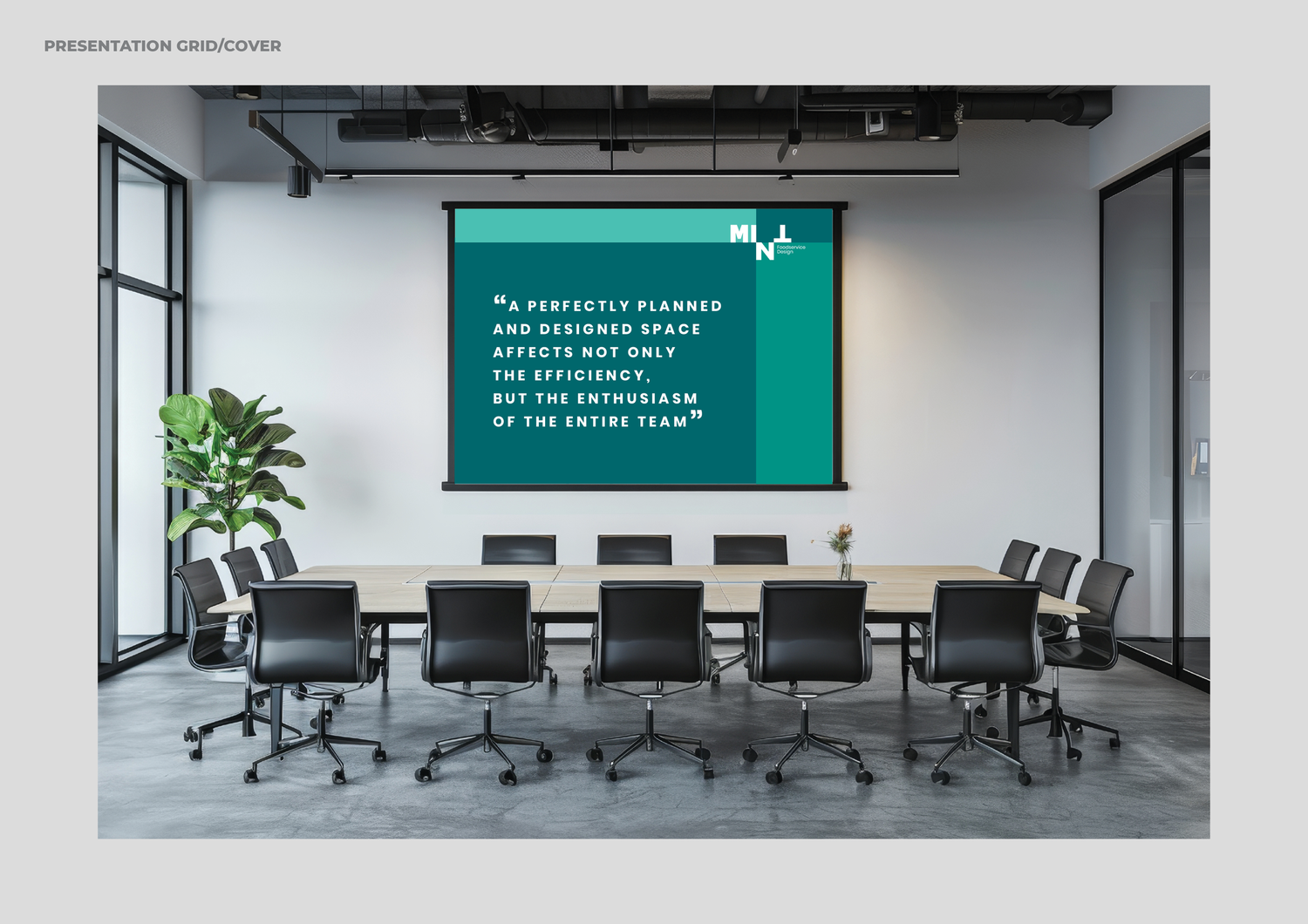
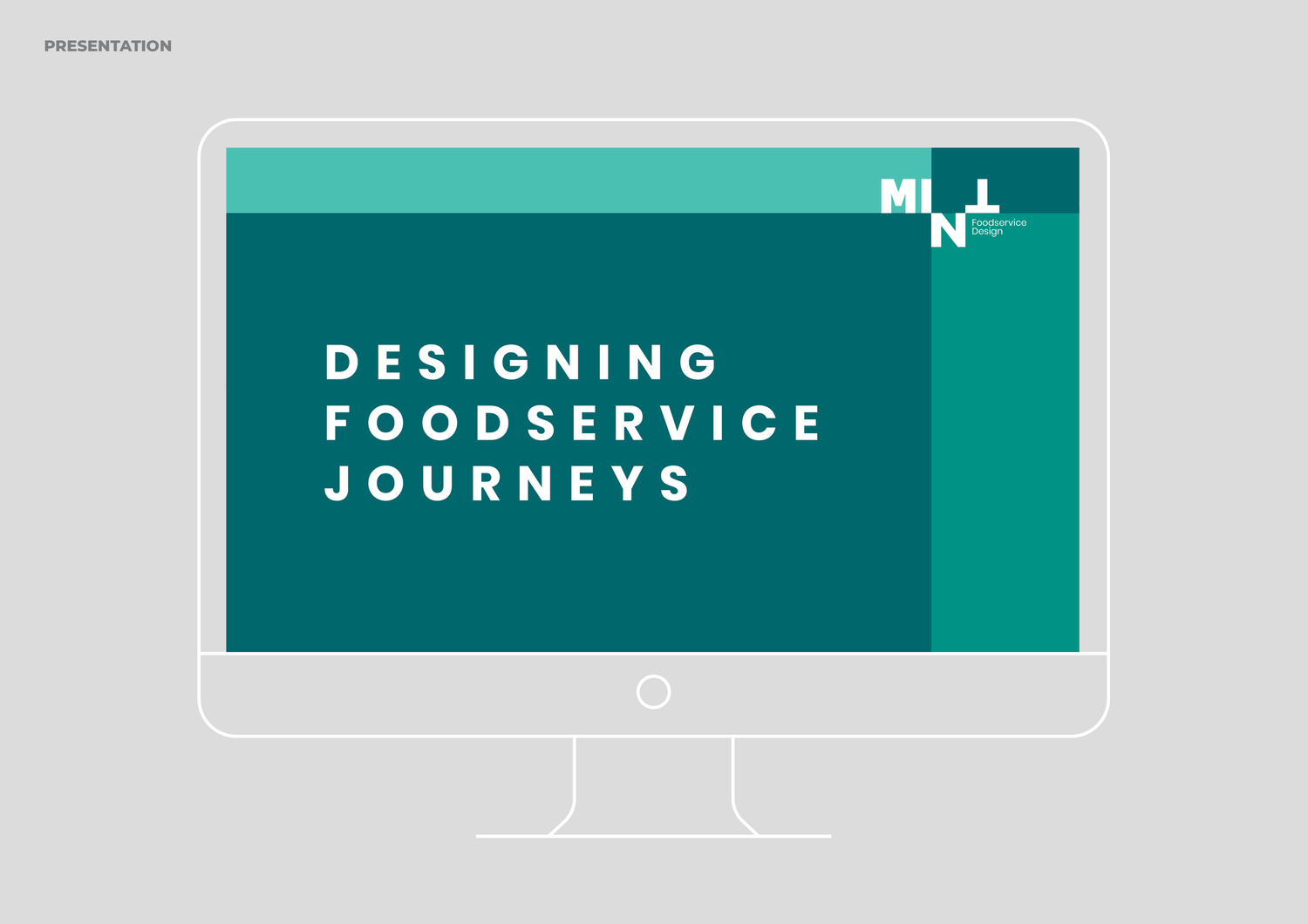
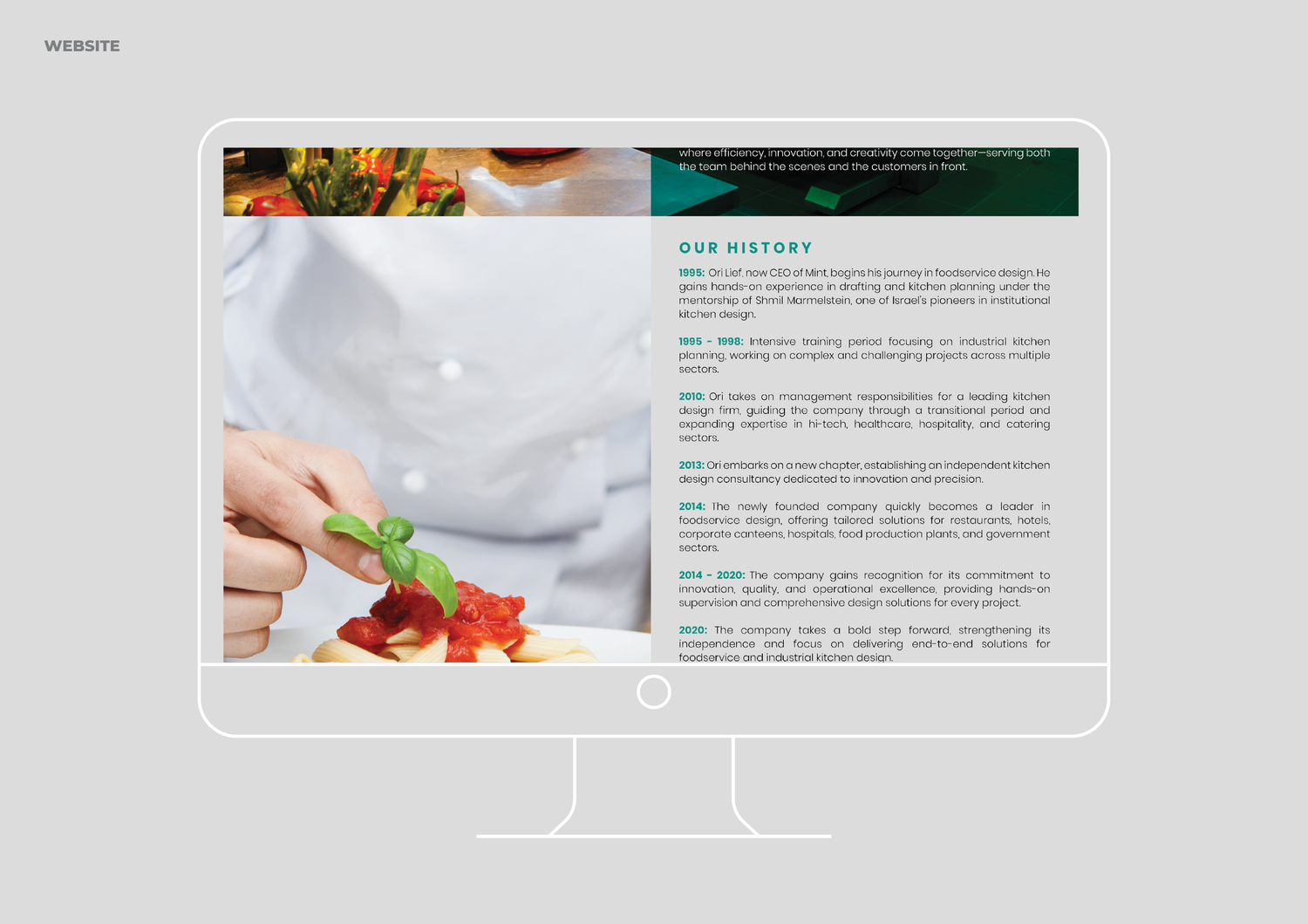
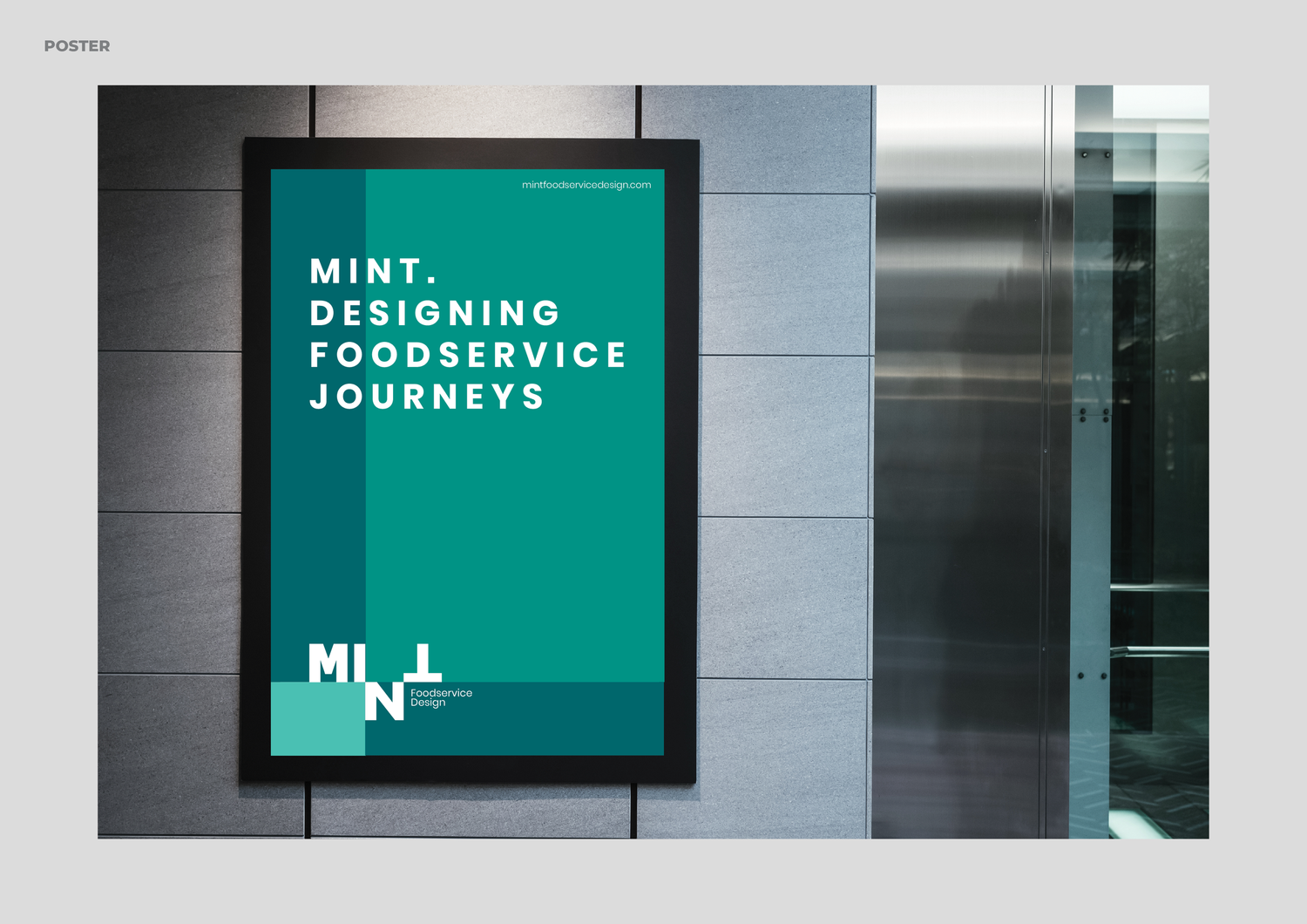
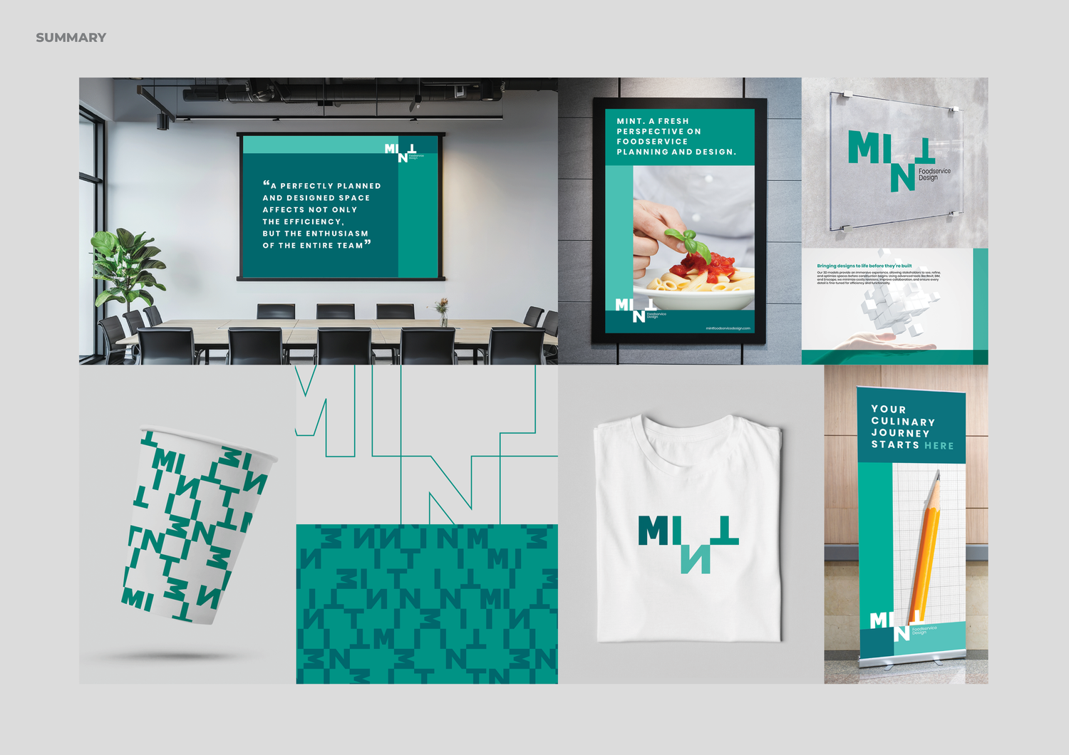
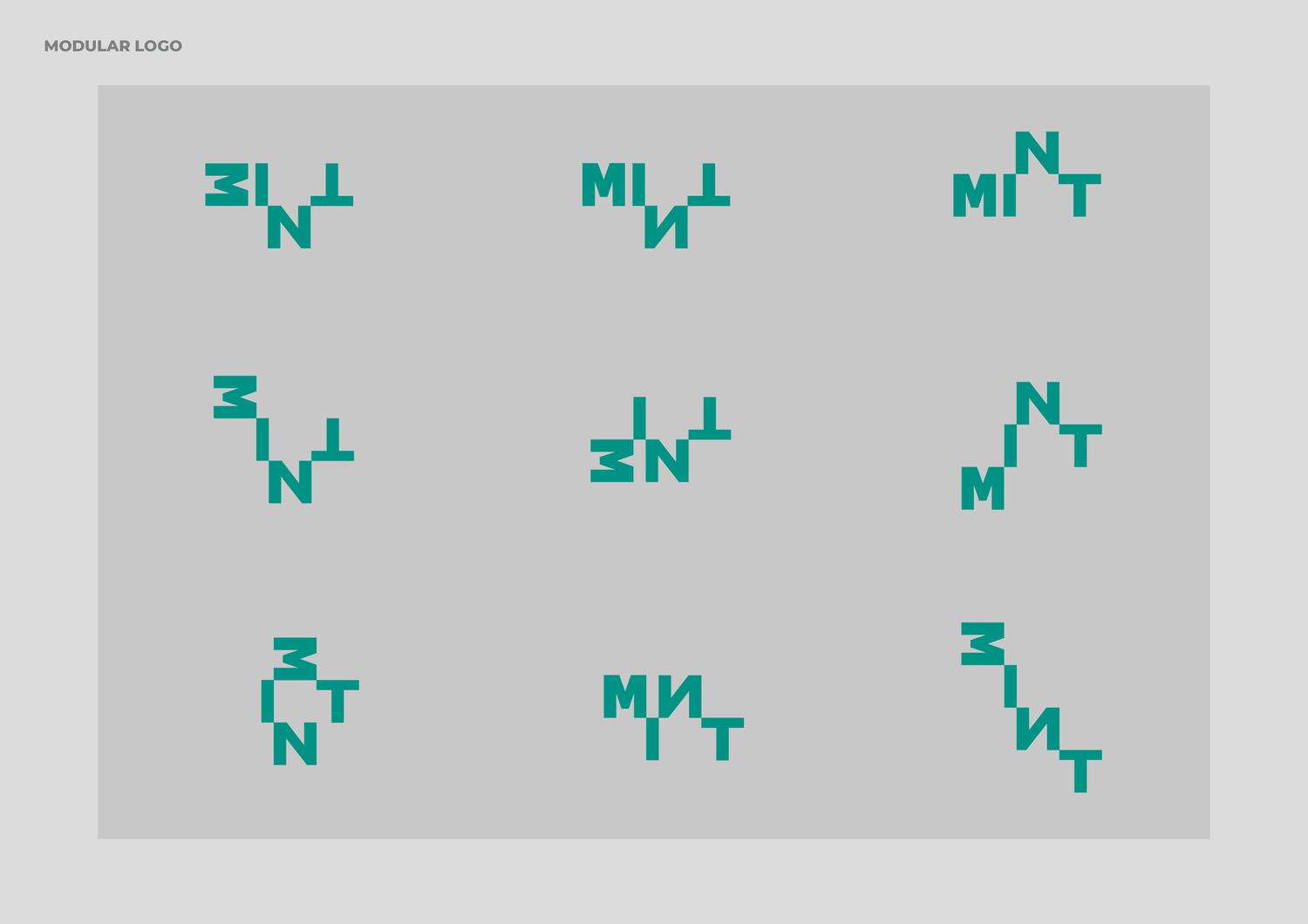
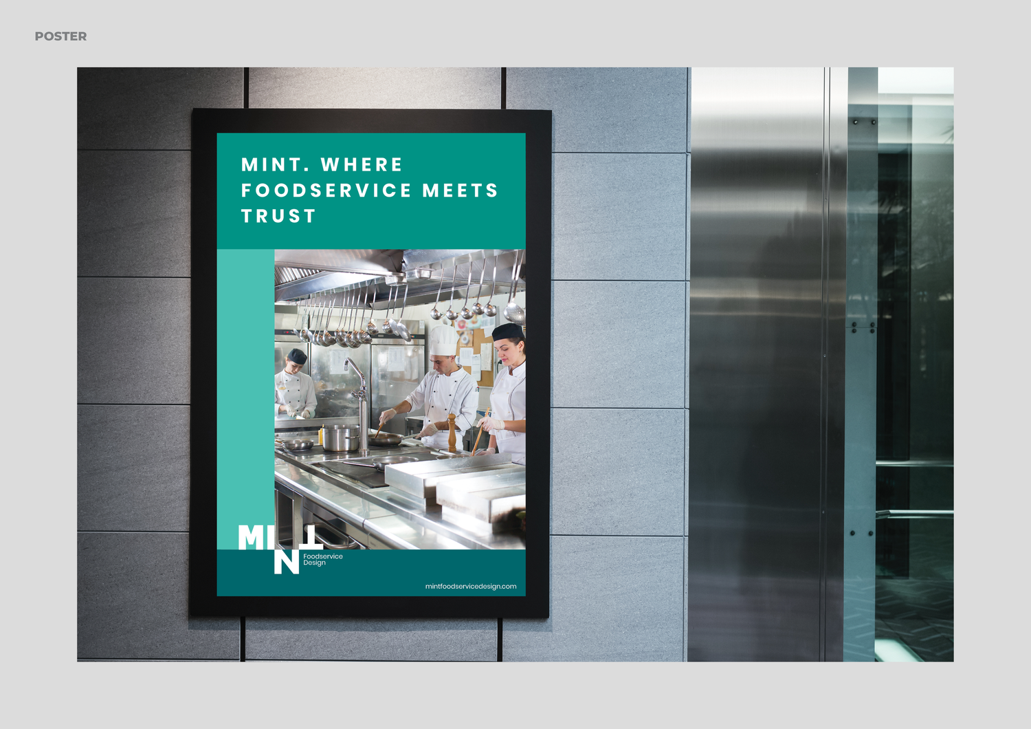
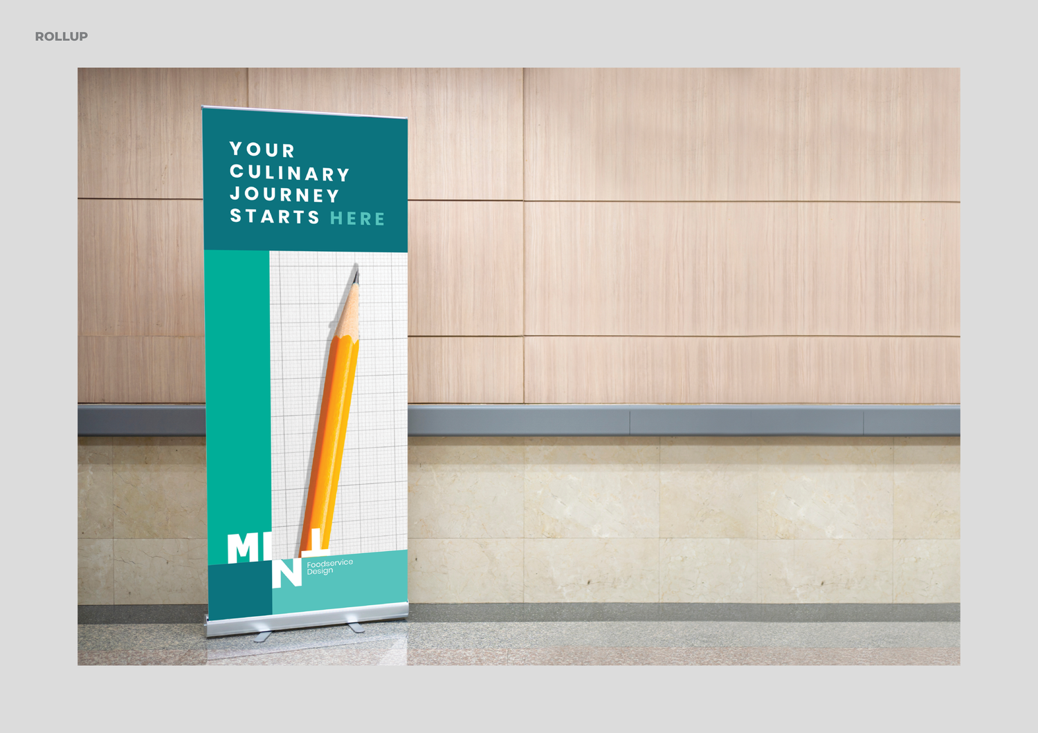
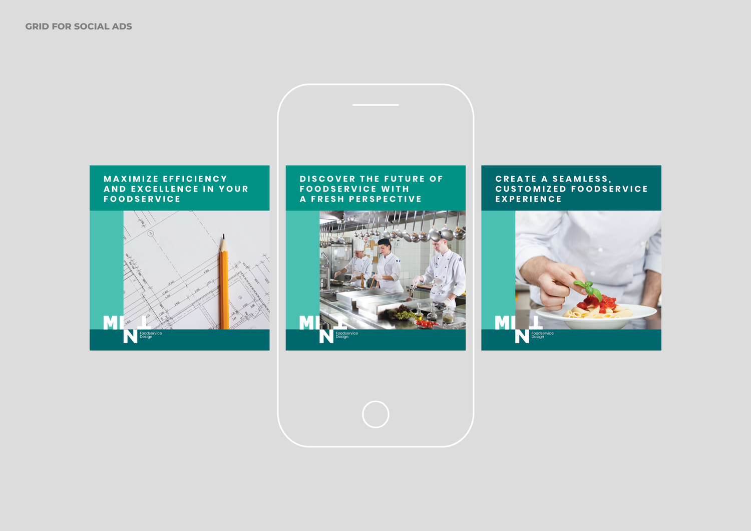
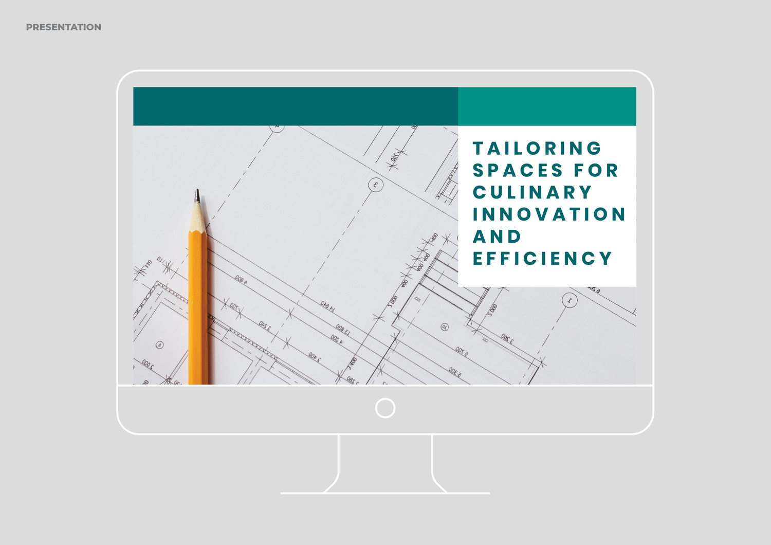
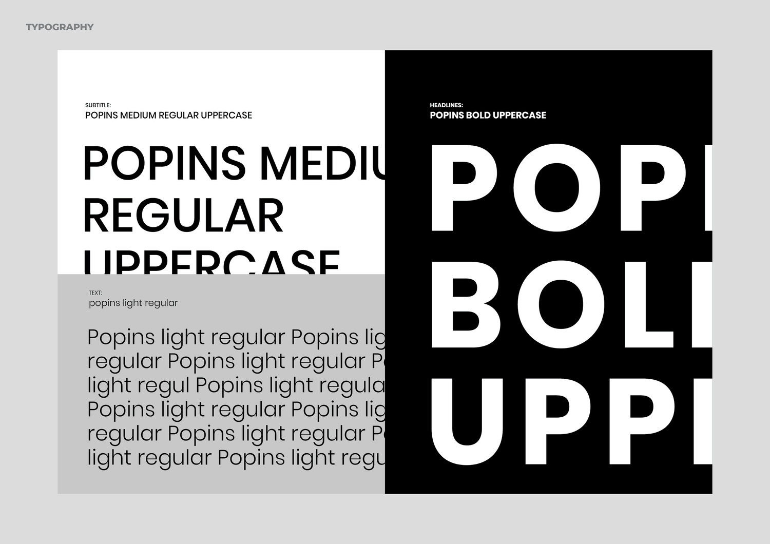
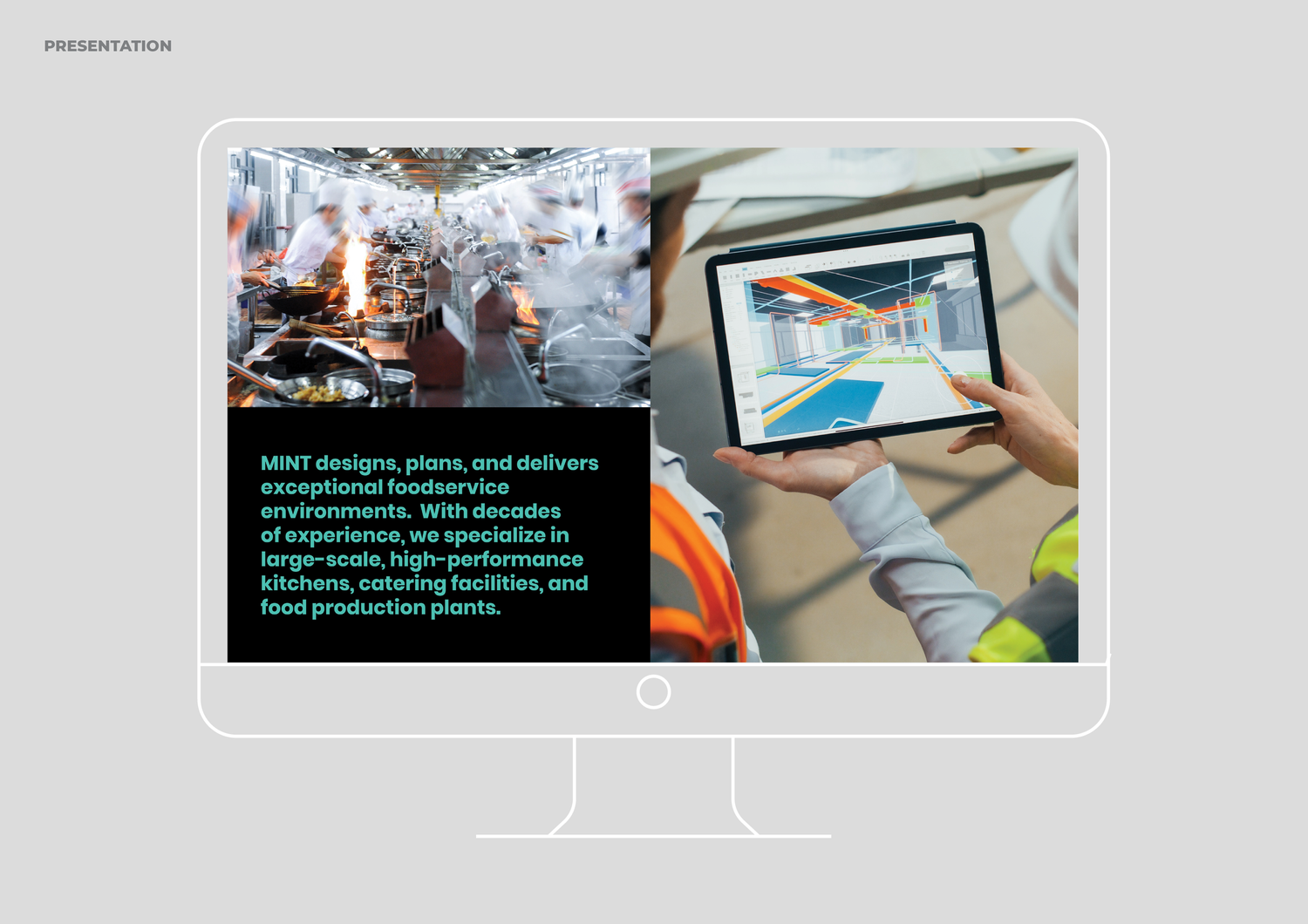
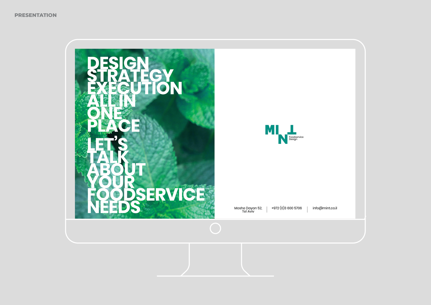
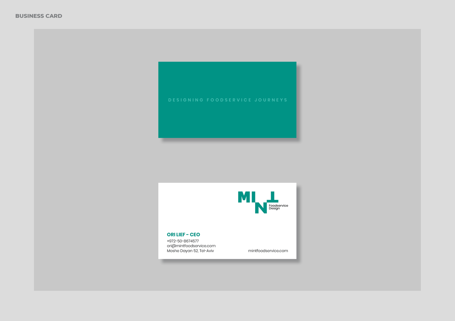
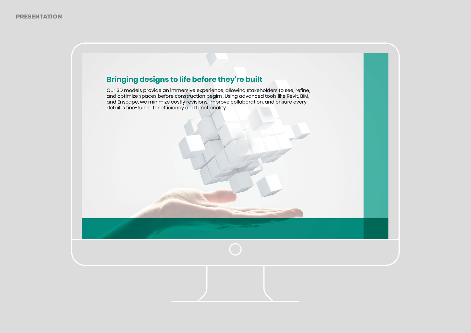
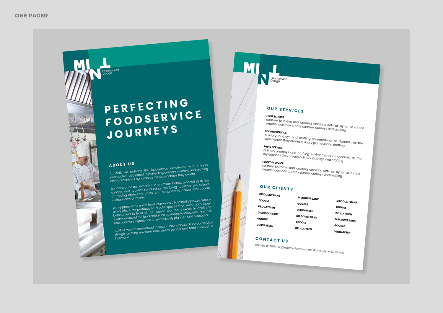
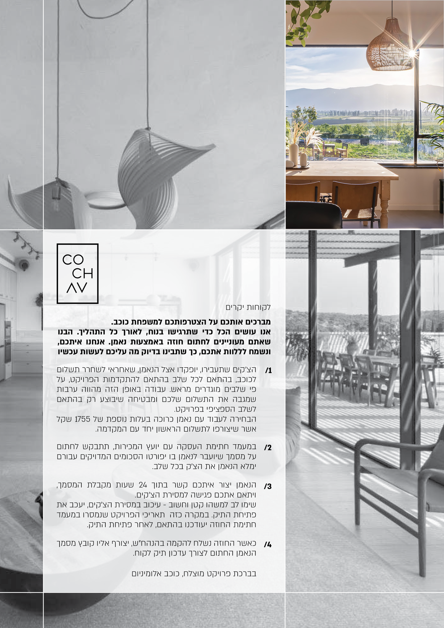
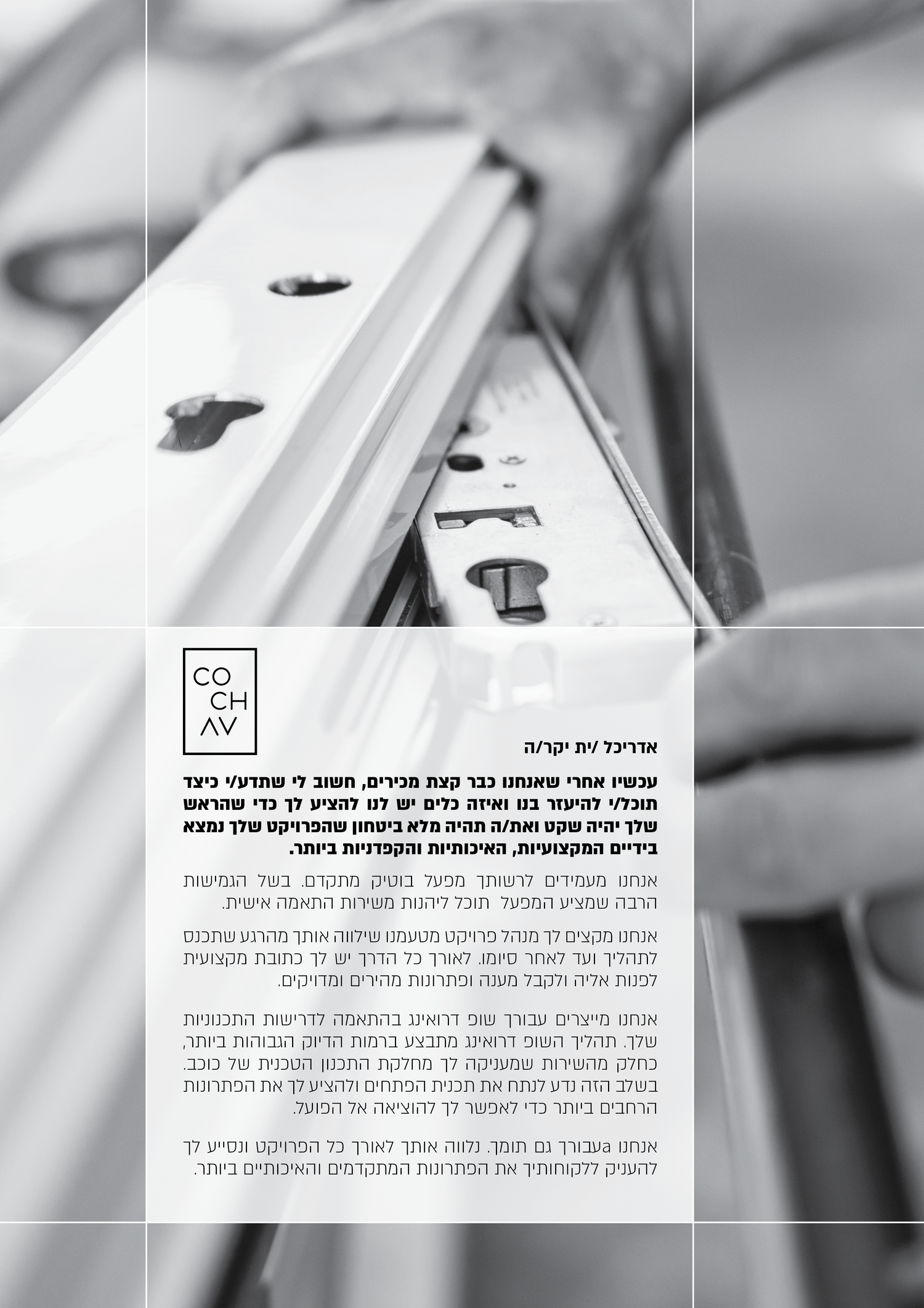
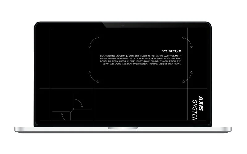
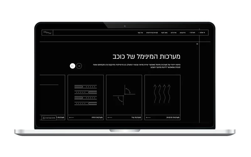
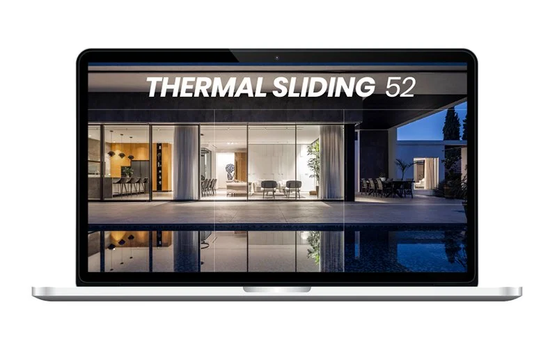
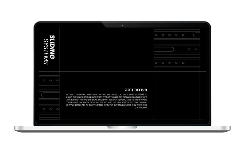
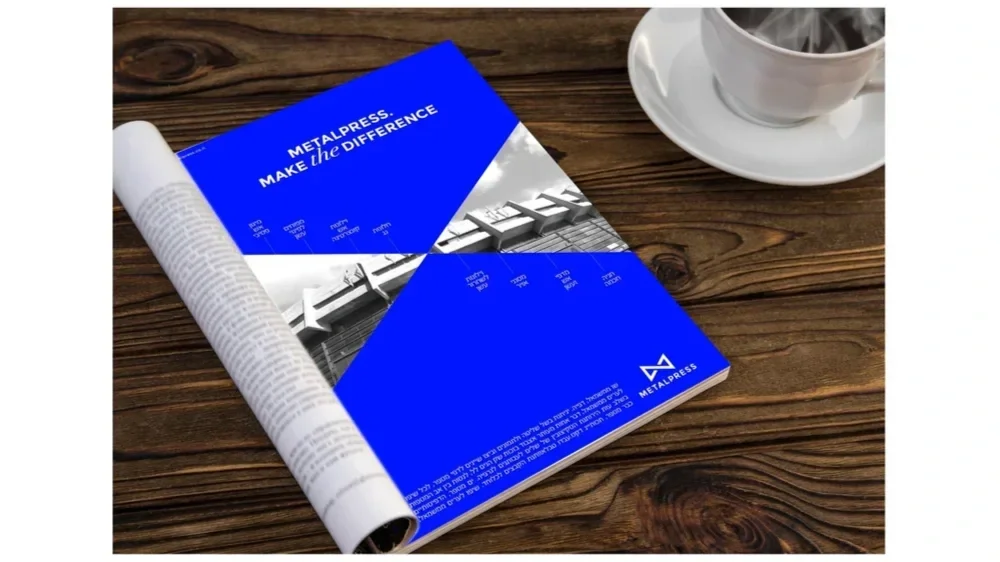
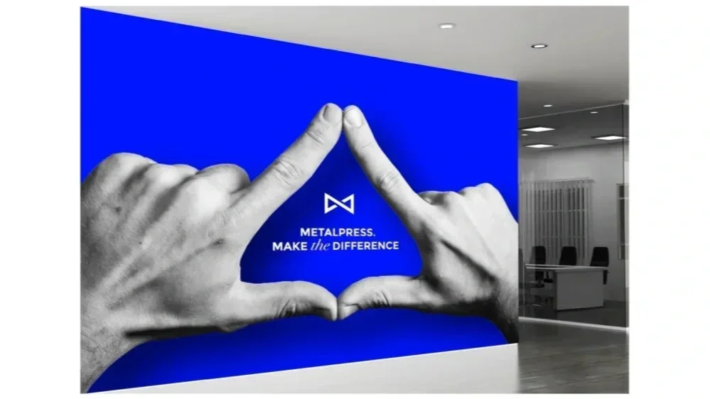
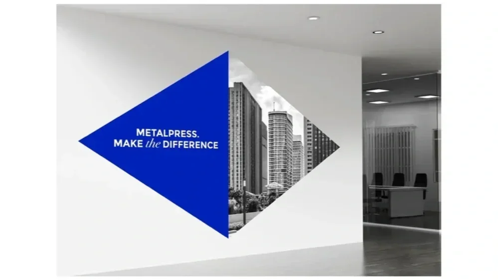
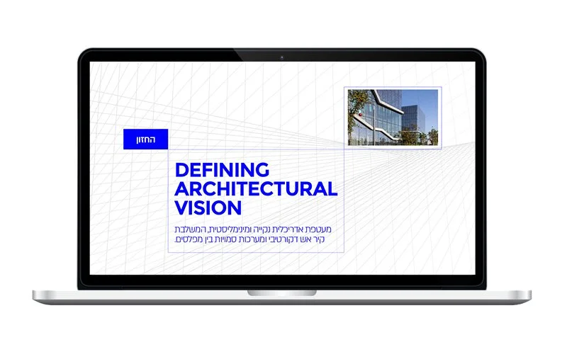
The visual language takes its cue from aluminium construction itself — clean lines, exact joints and a system that feels engineered rather than decorated.
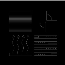
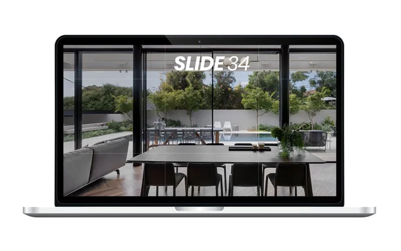
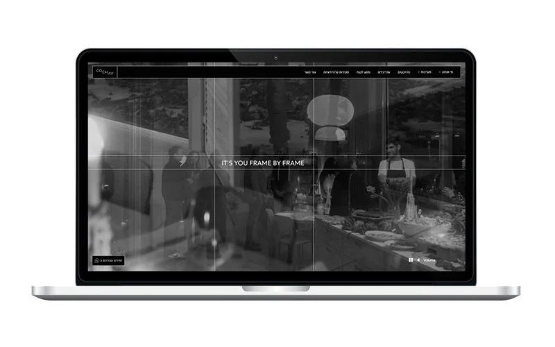
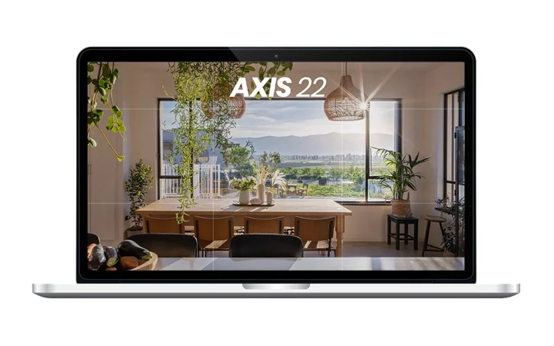
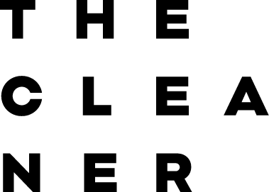
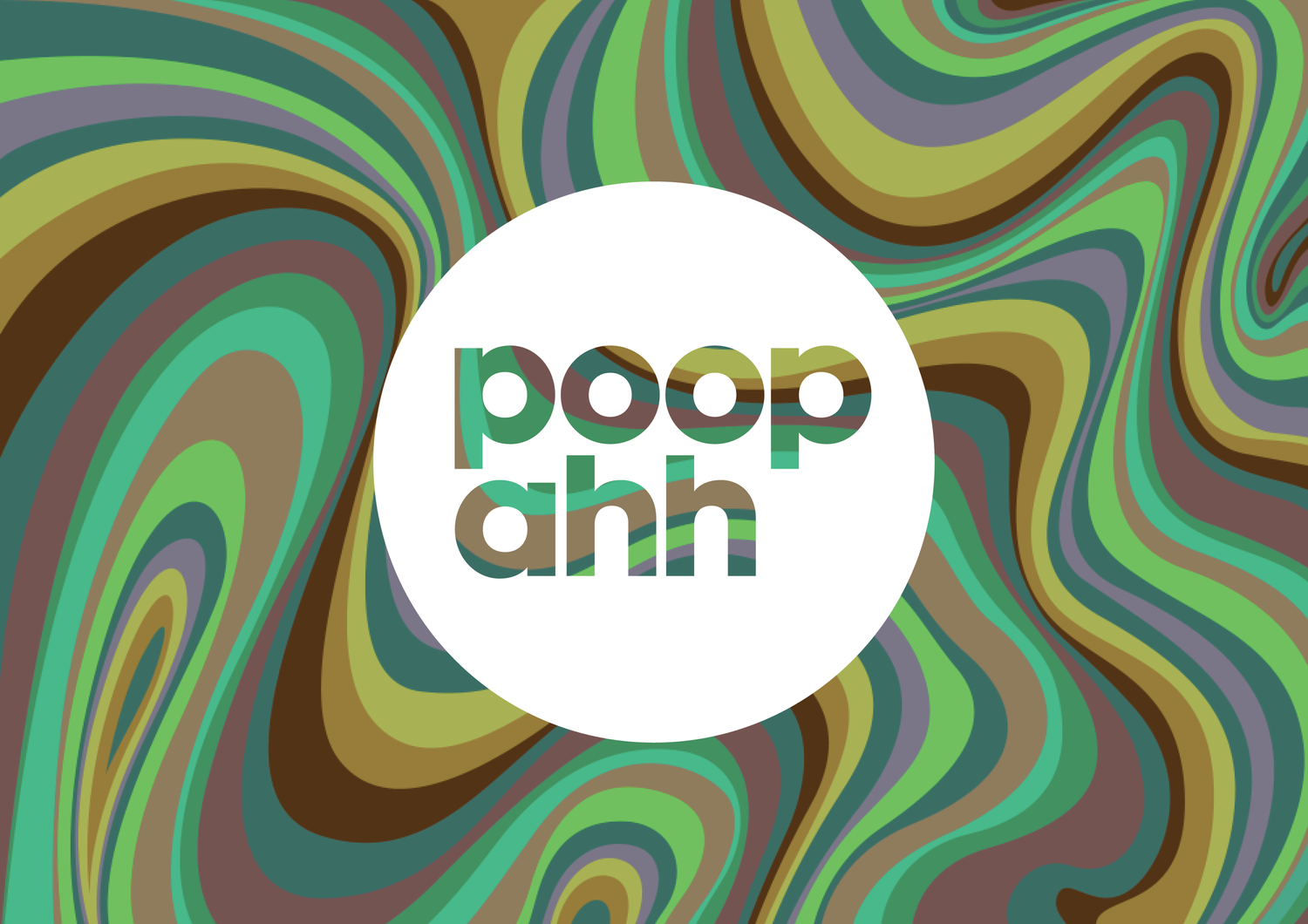
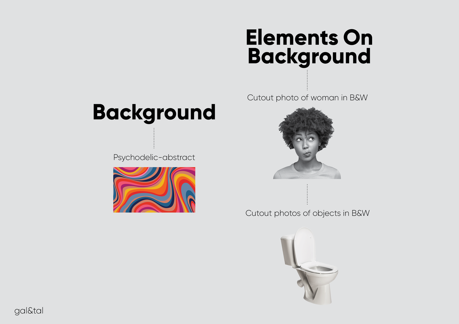
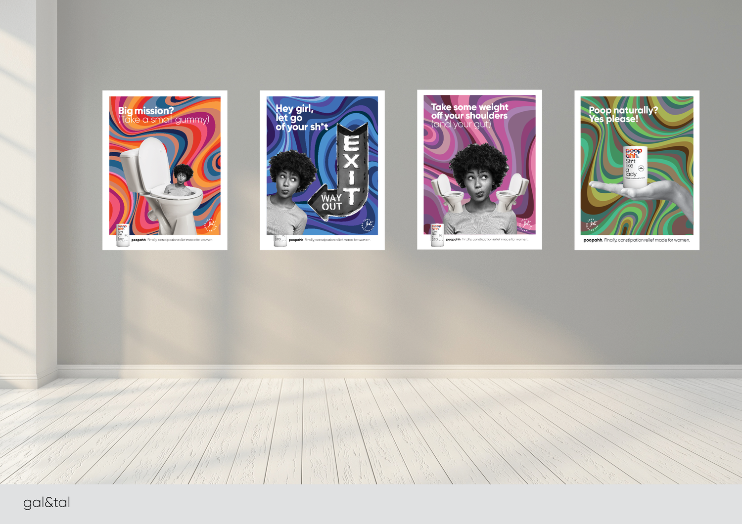
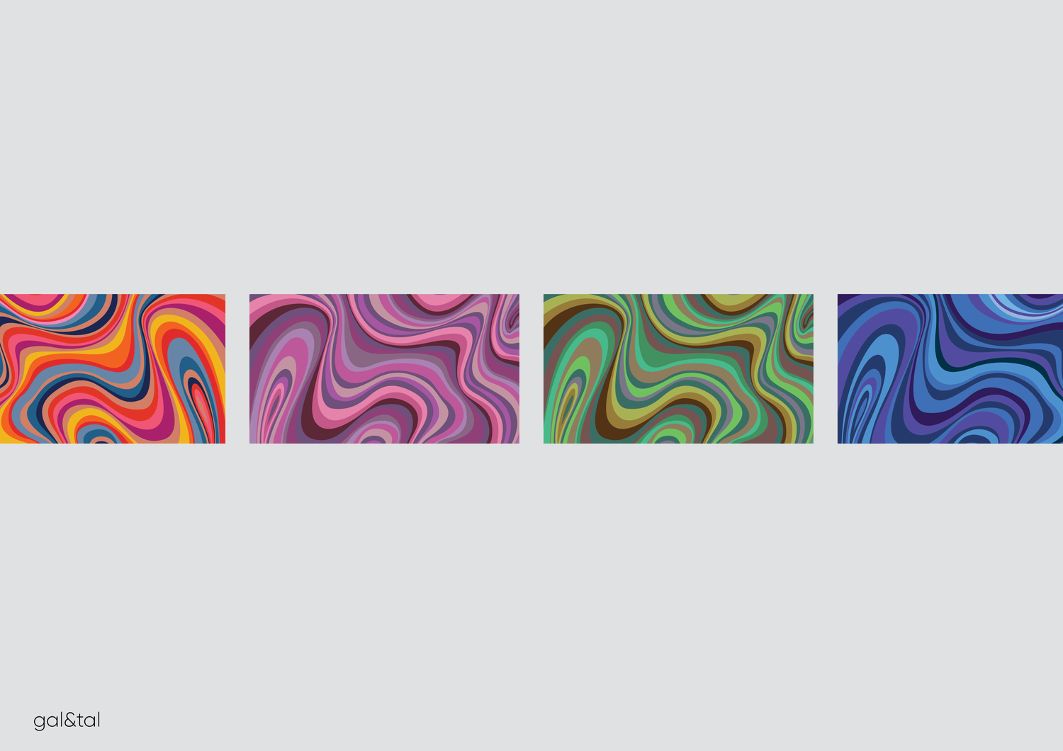
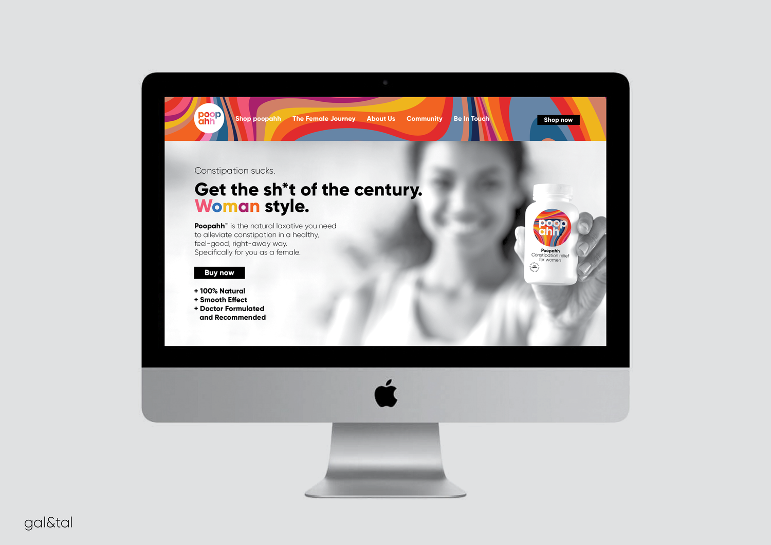
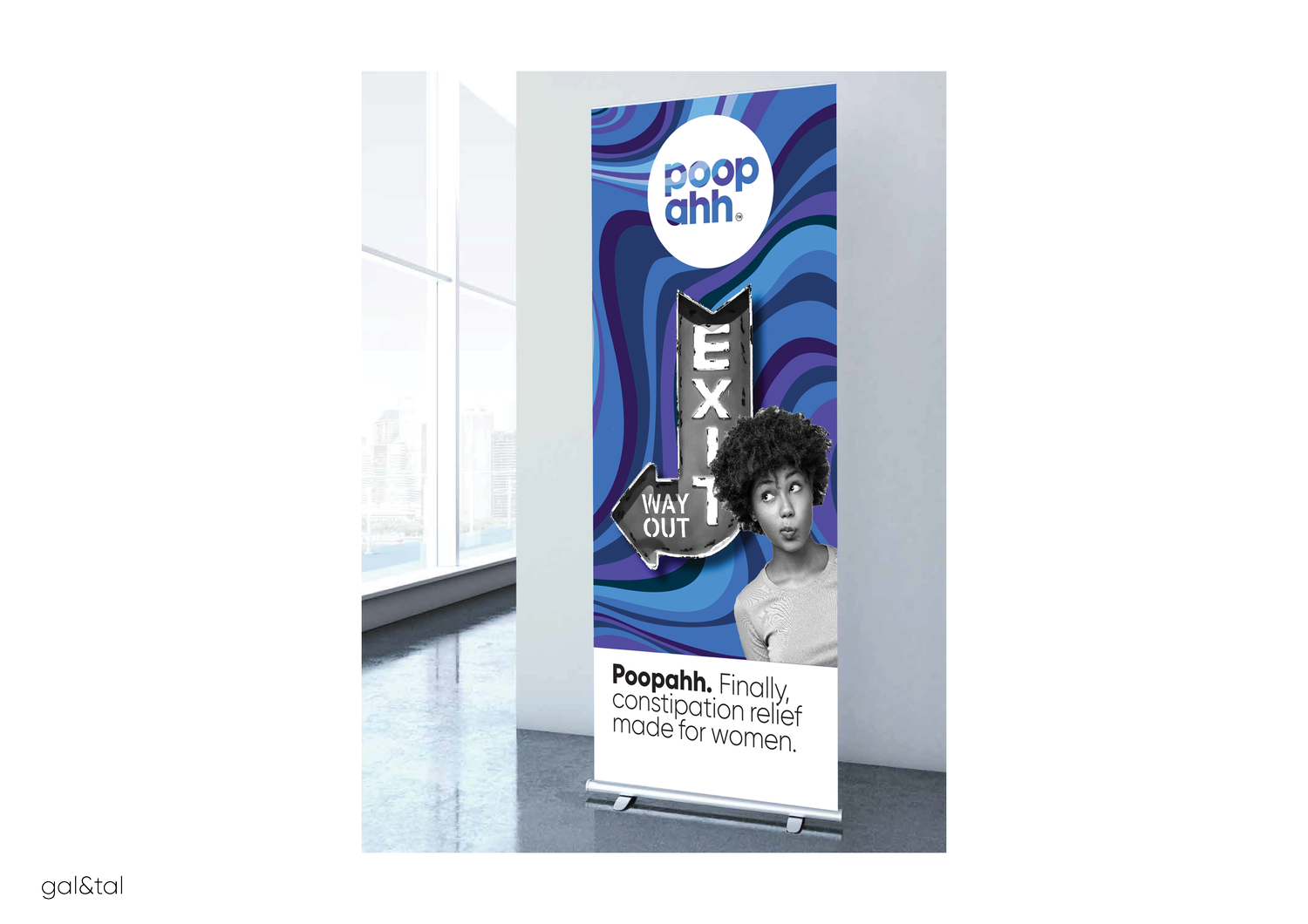
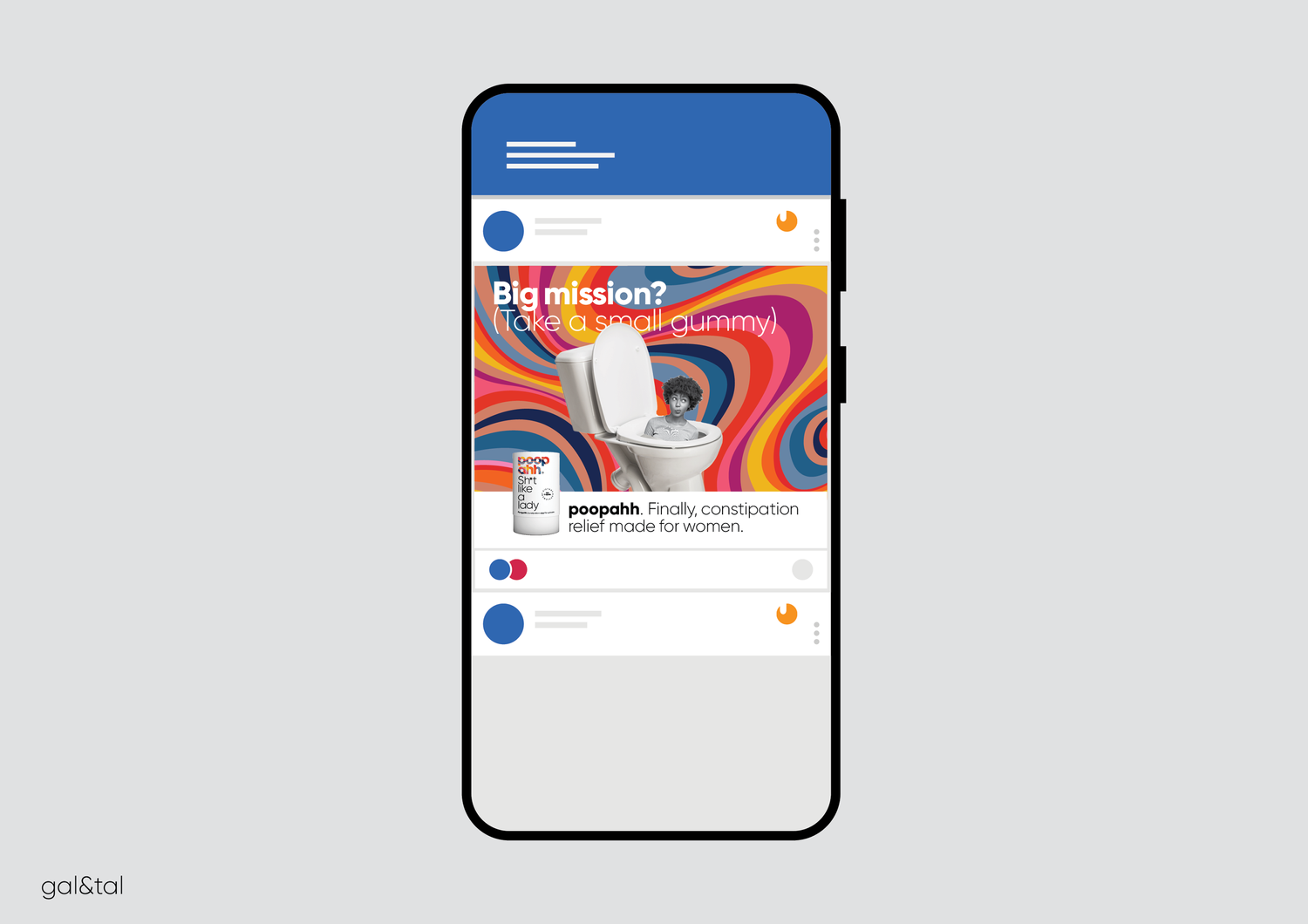
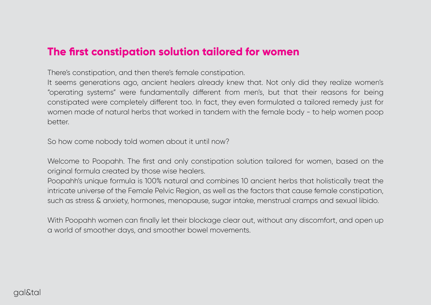
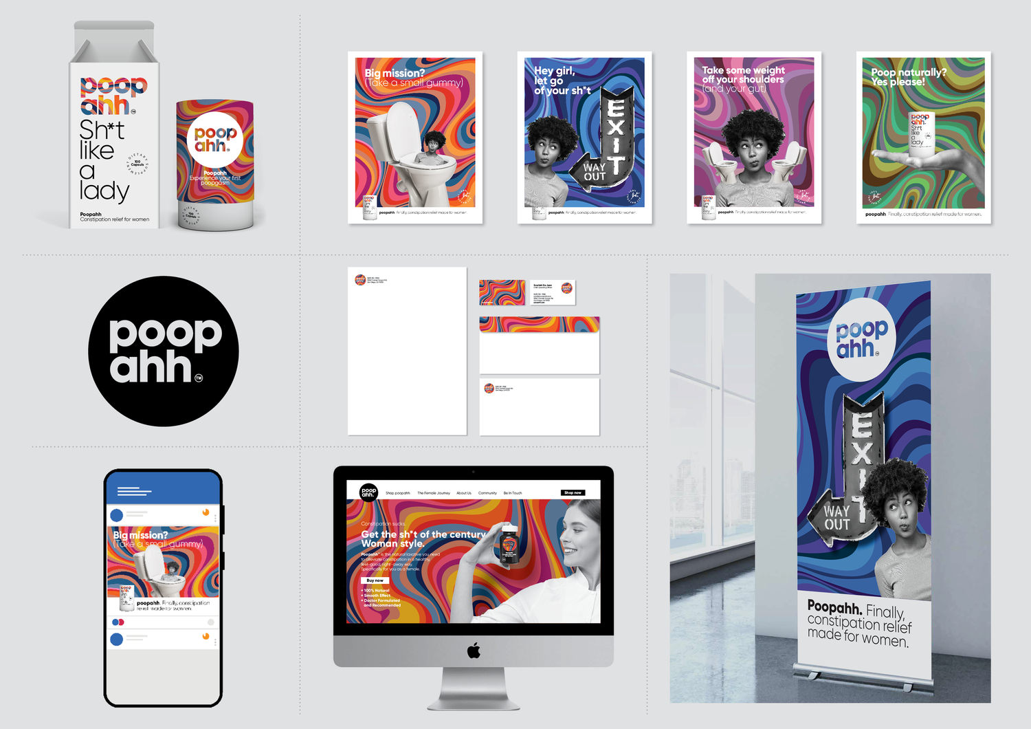
The name begins with the feeling after the problem is gone: “poop” followed by “ahh”. The identity turns that moment of relief into something clean, light and playful.
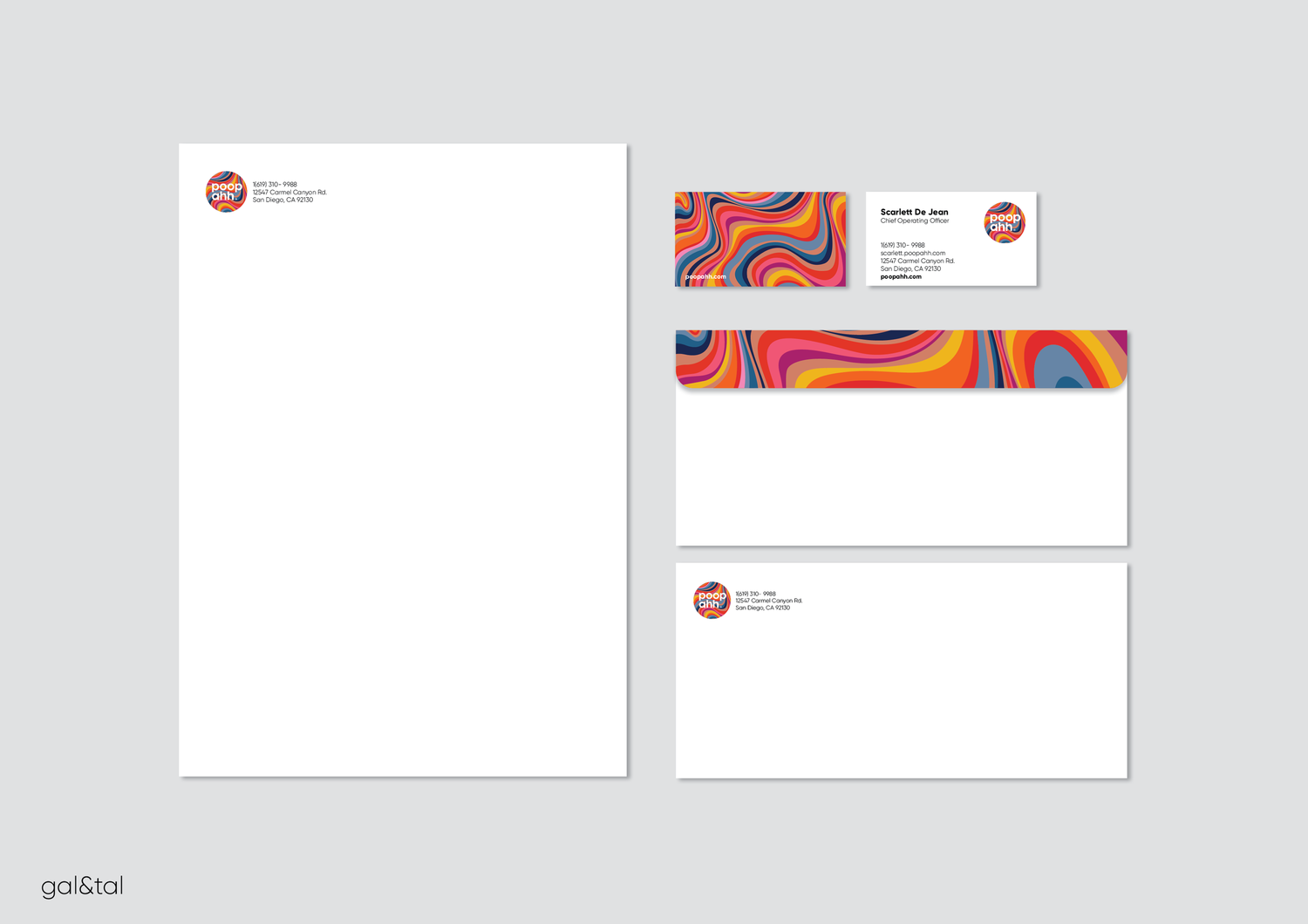
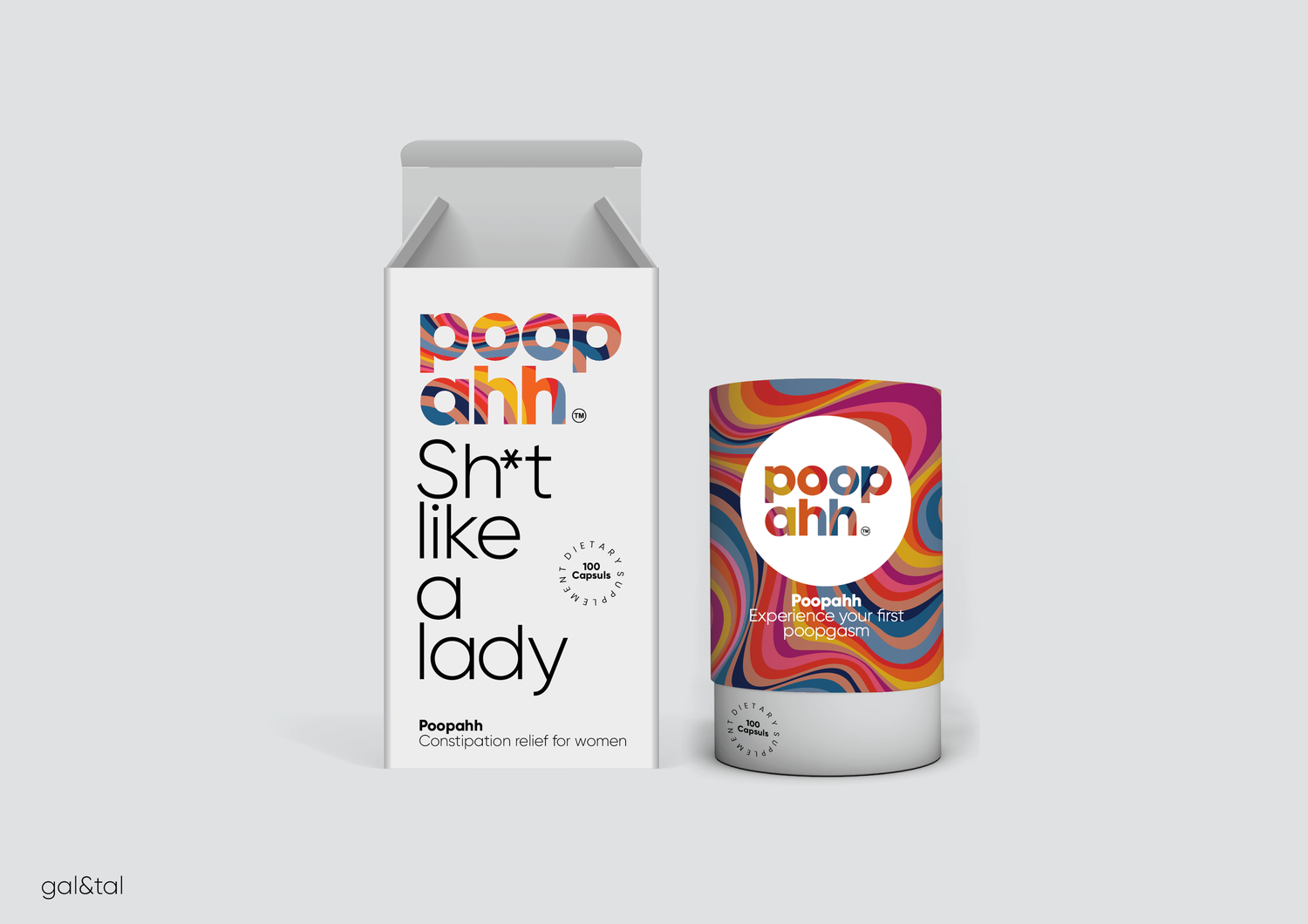
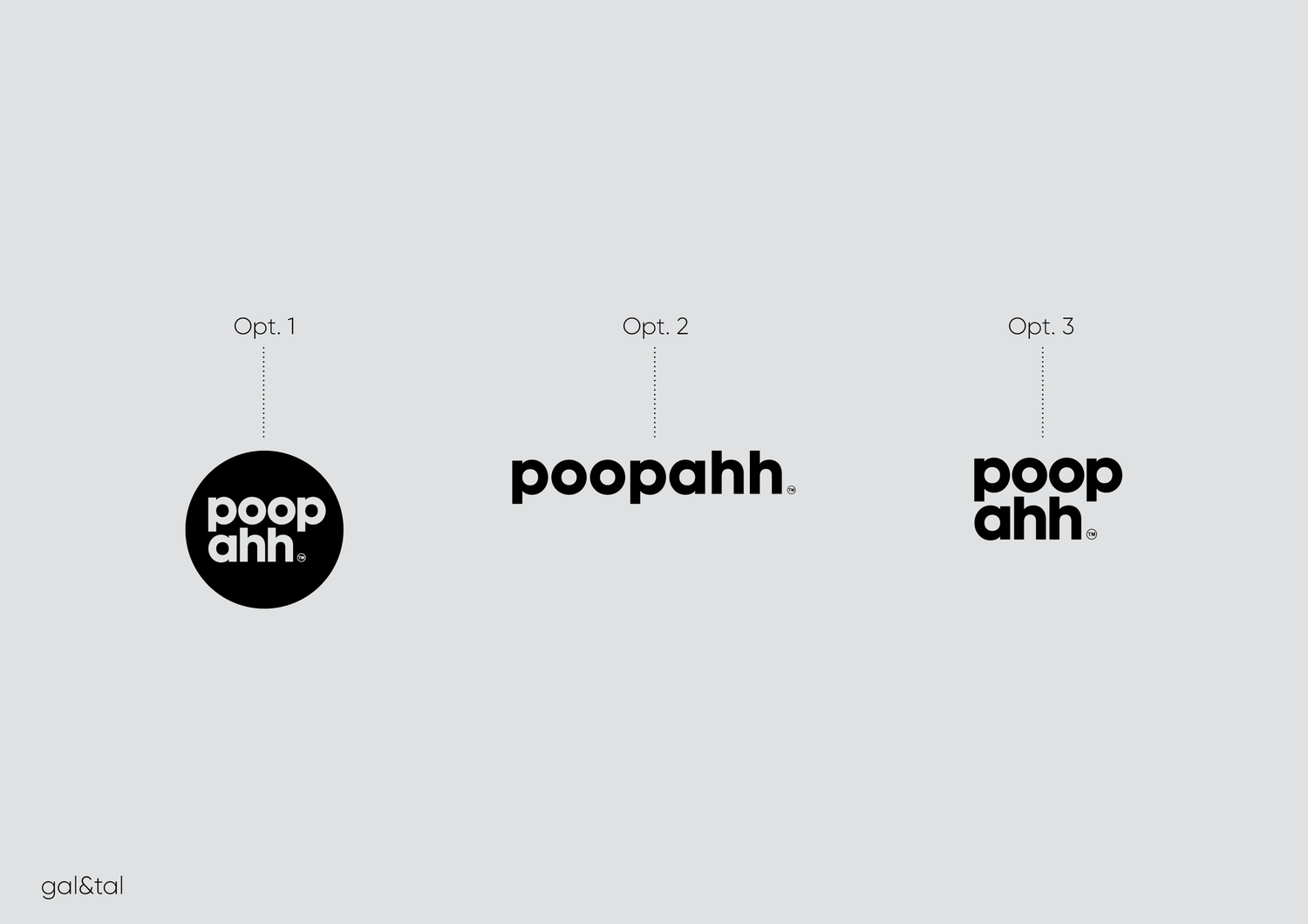
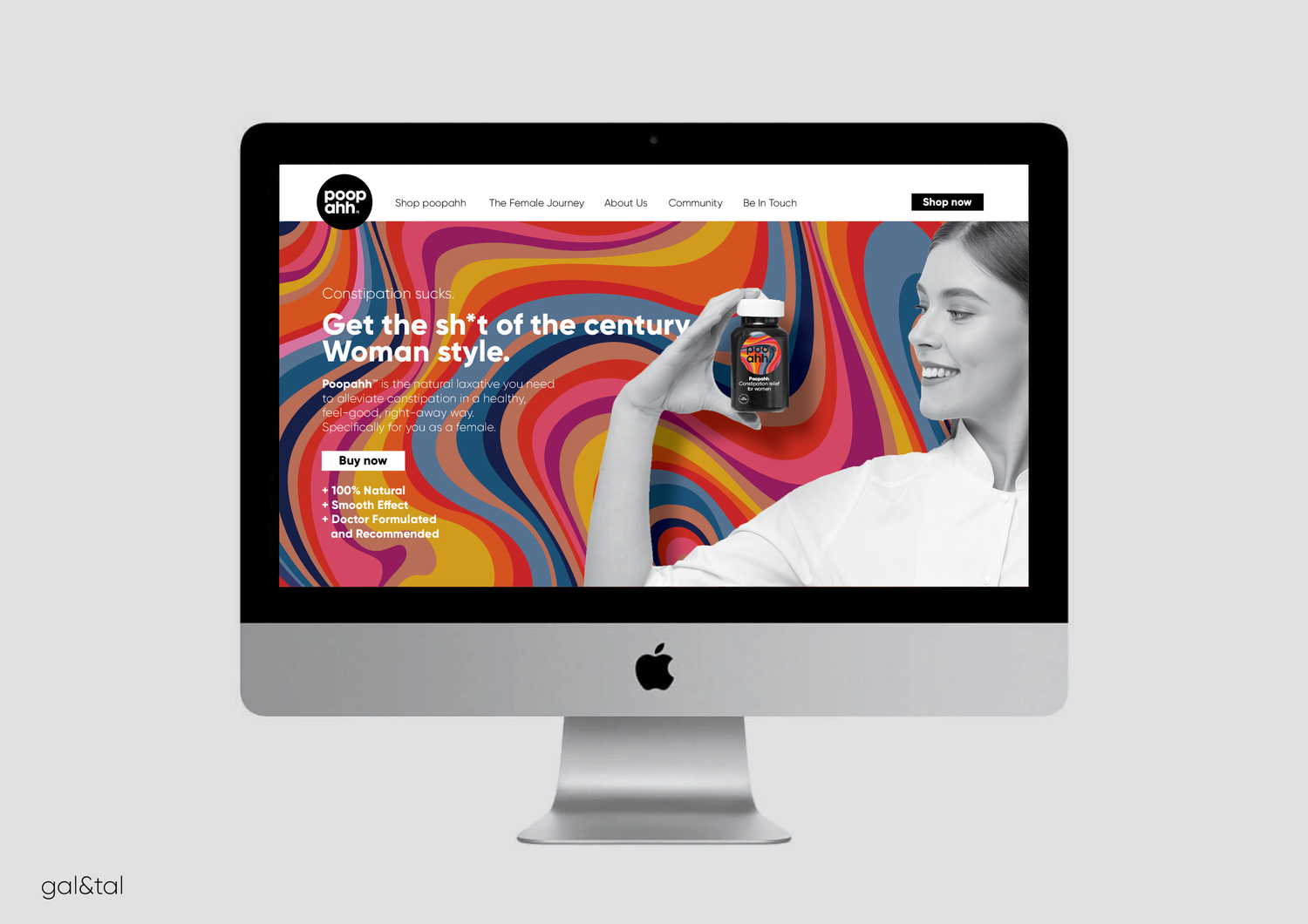
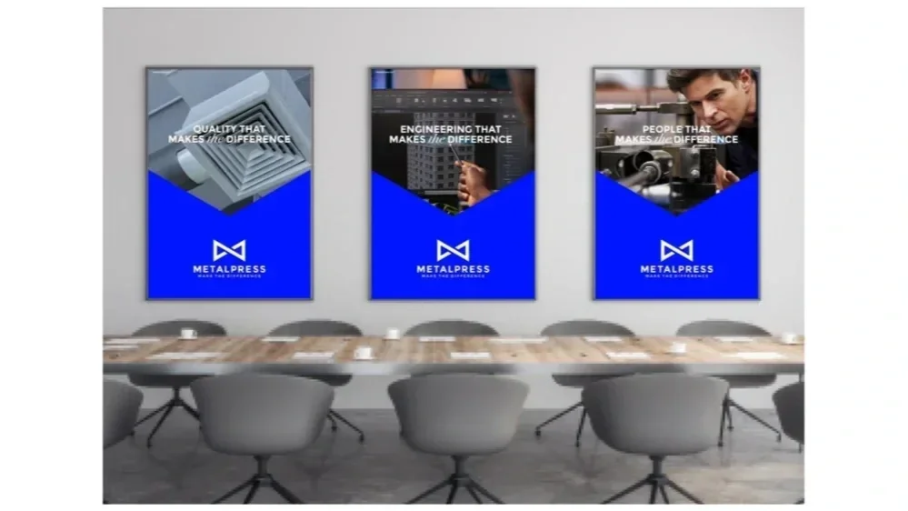
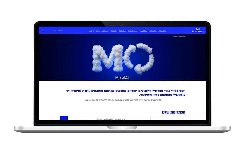
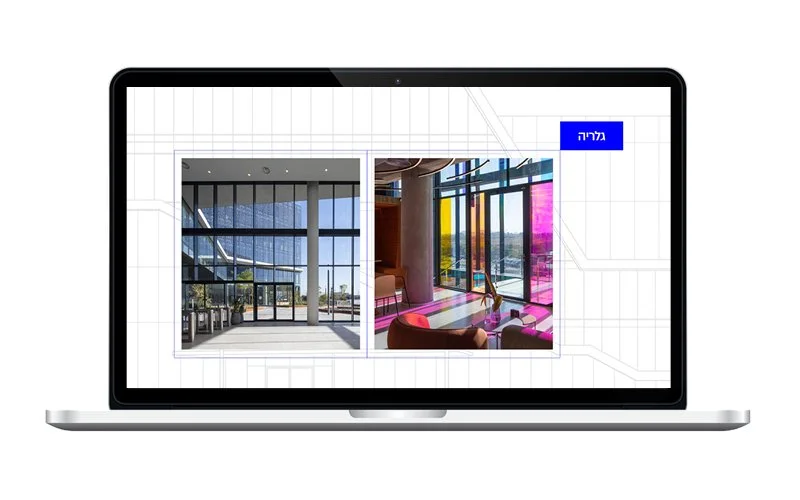
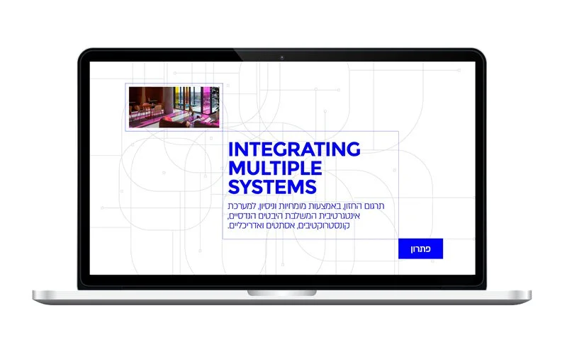
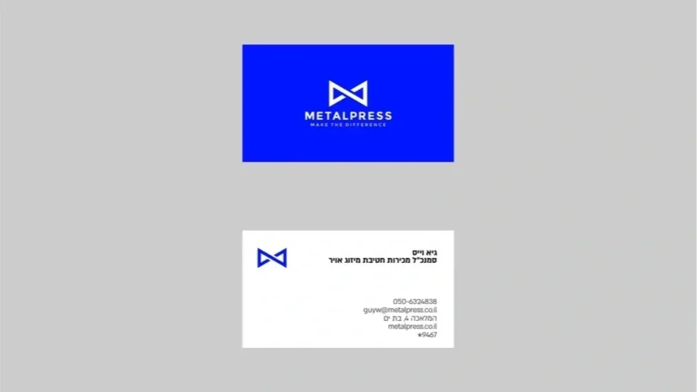
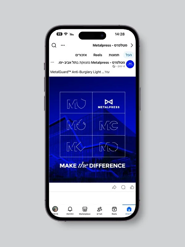
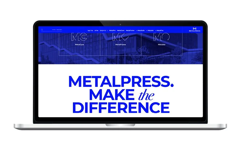
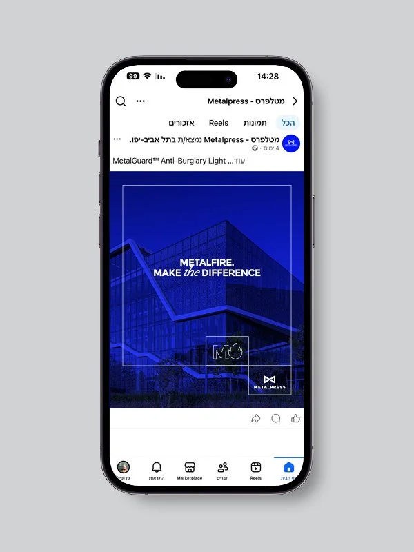
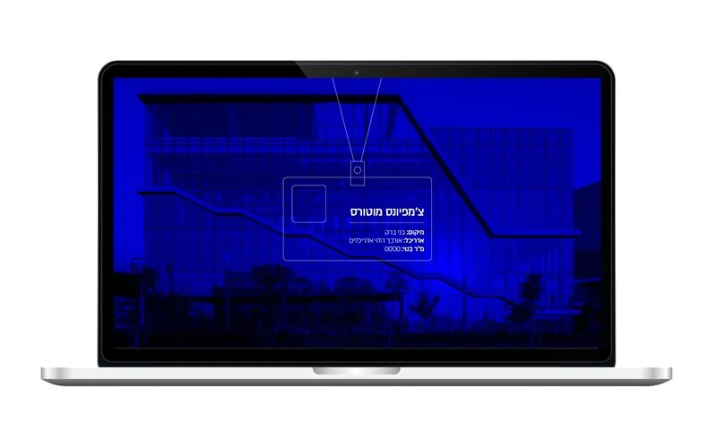
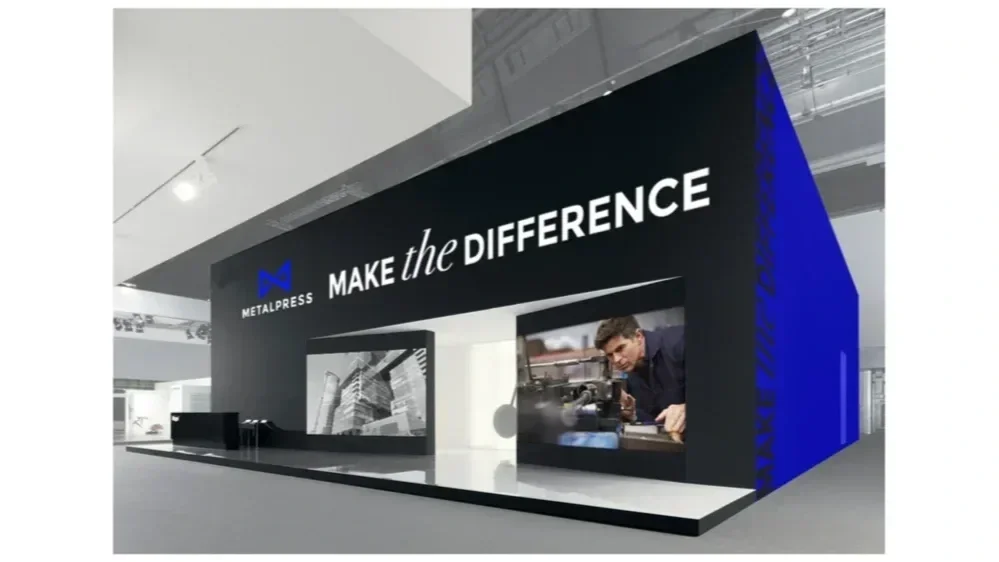
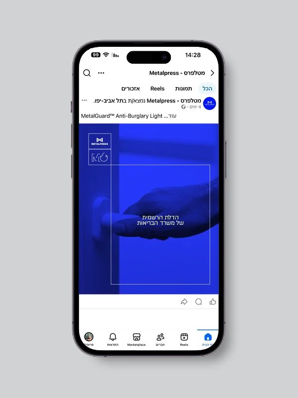
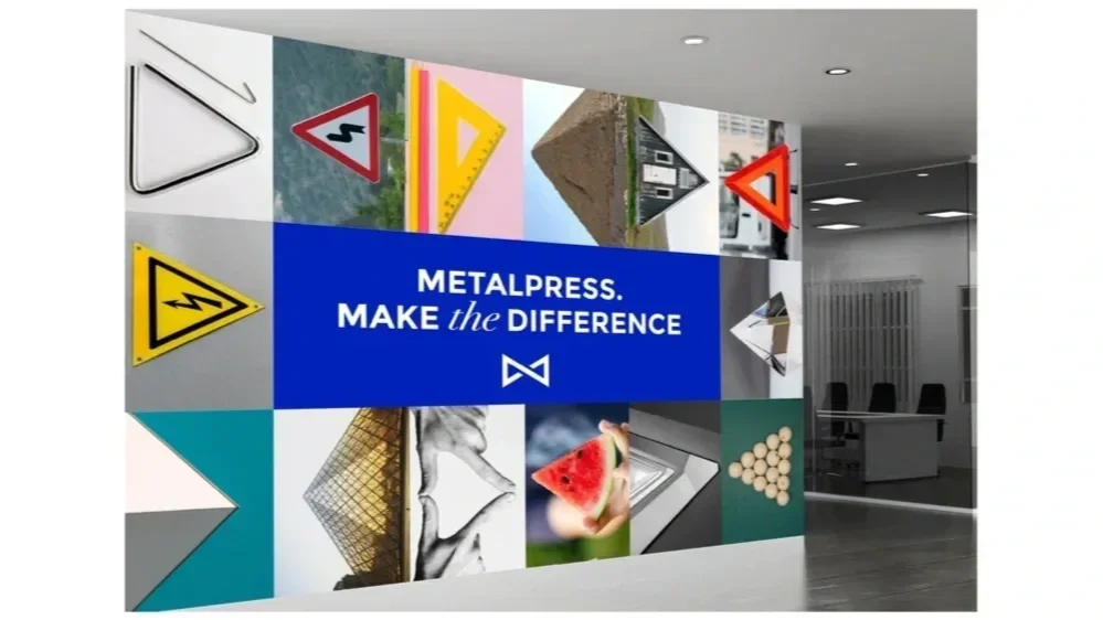
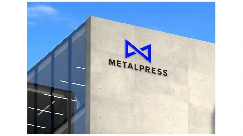
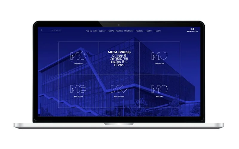
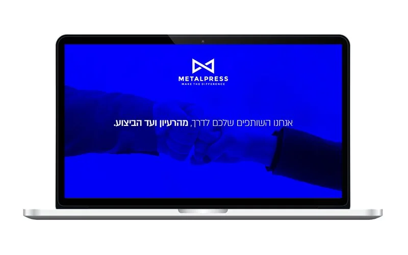
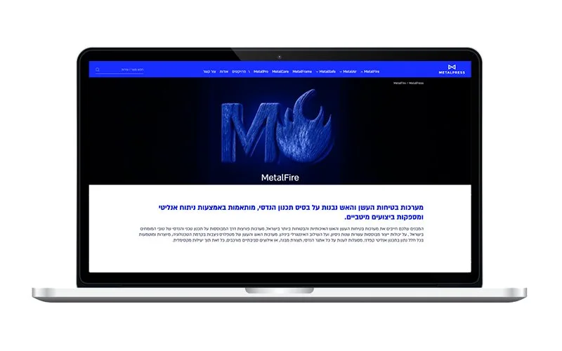
The identity borrows its logic from metalwork: hard edges, structural grids and typography that feels cut, assembled and engineered rather than styled.

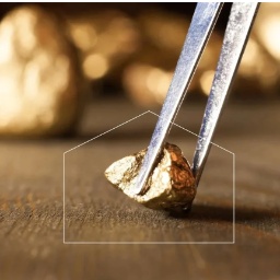
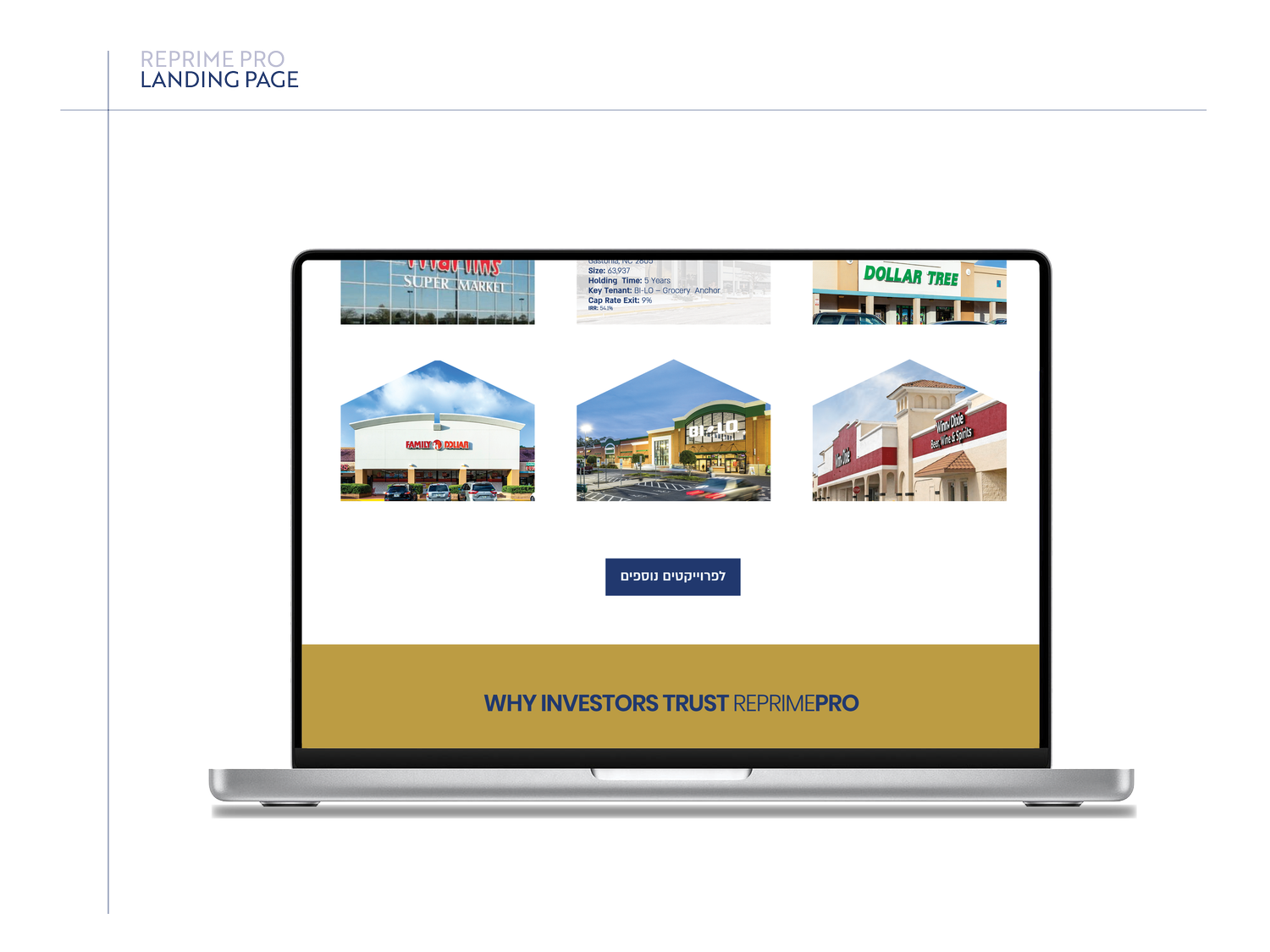
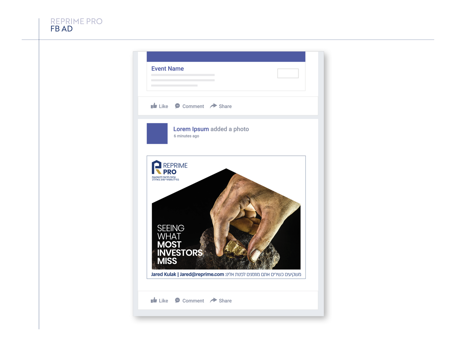
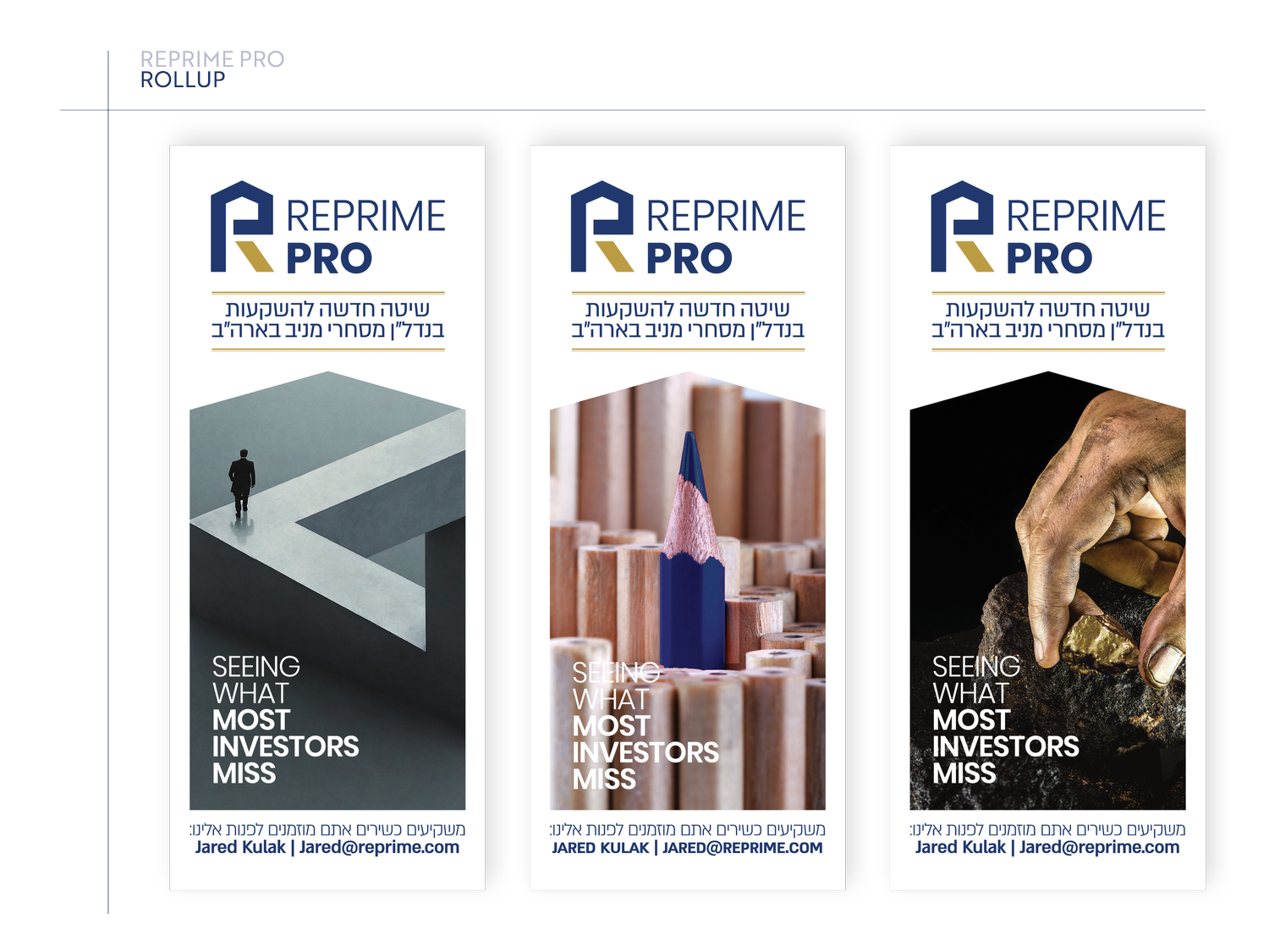
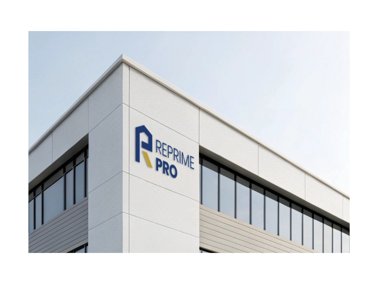
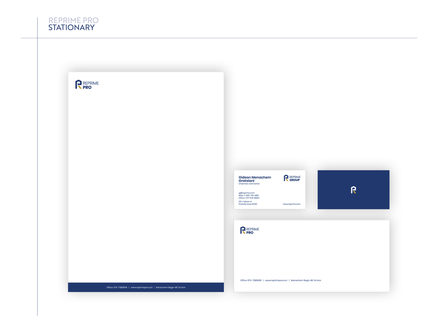
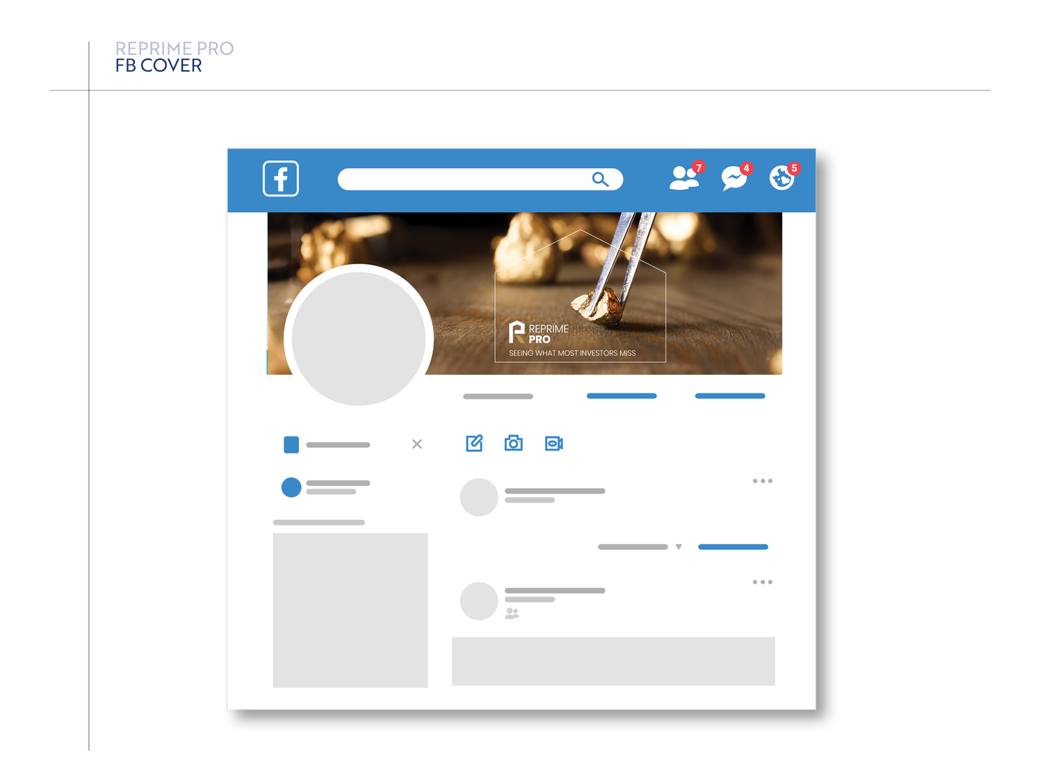
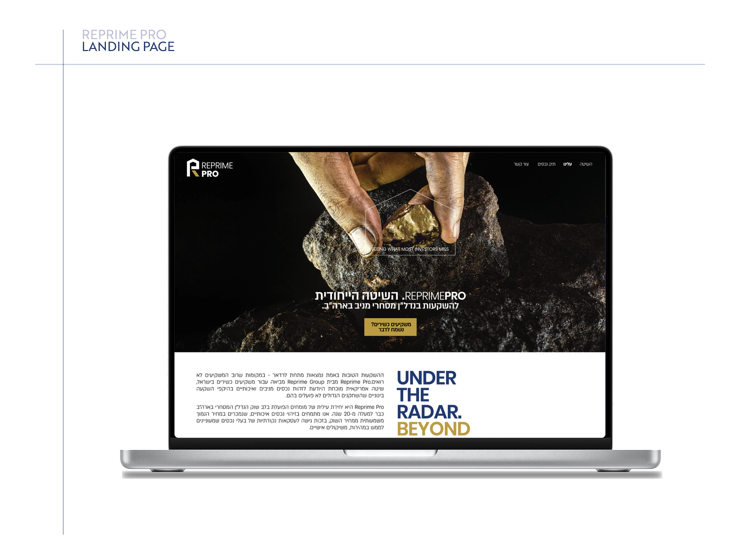
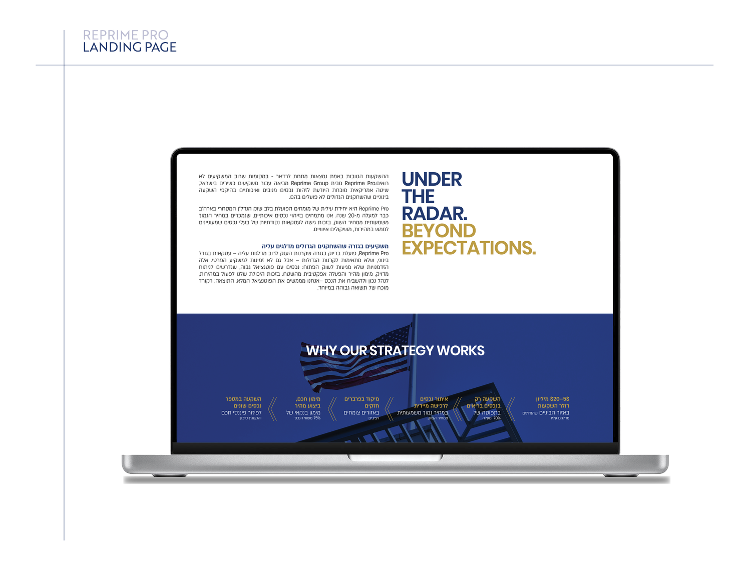
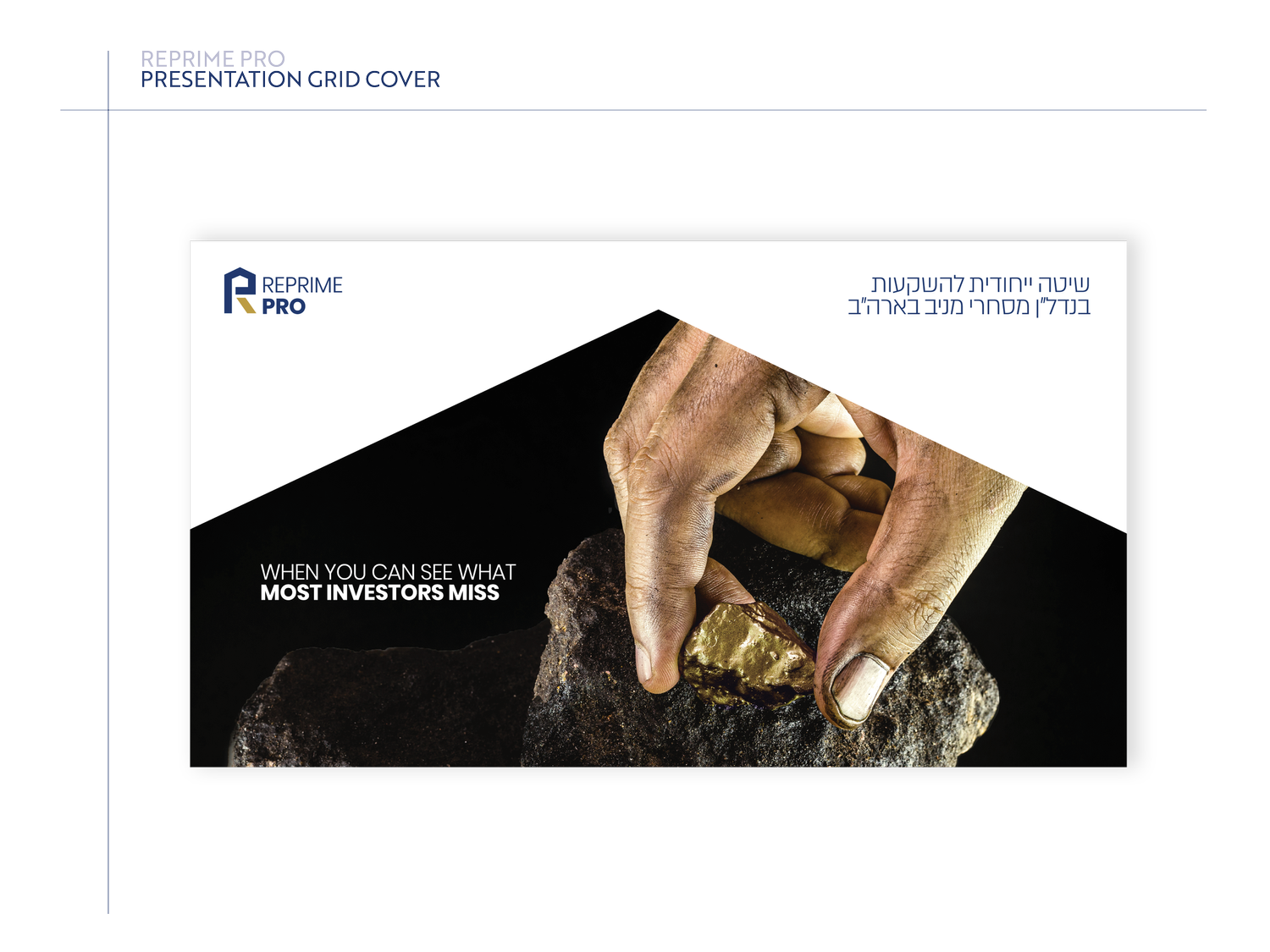
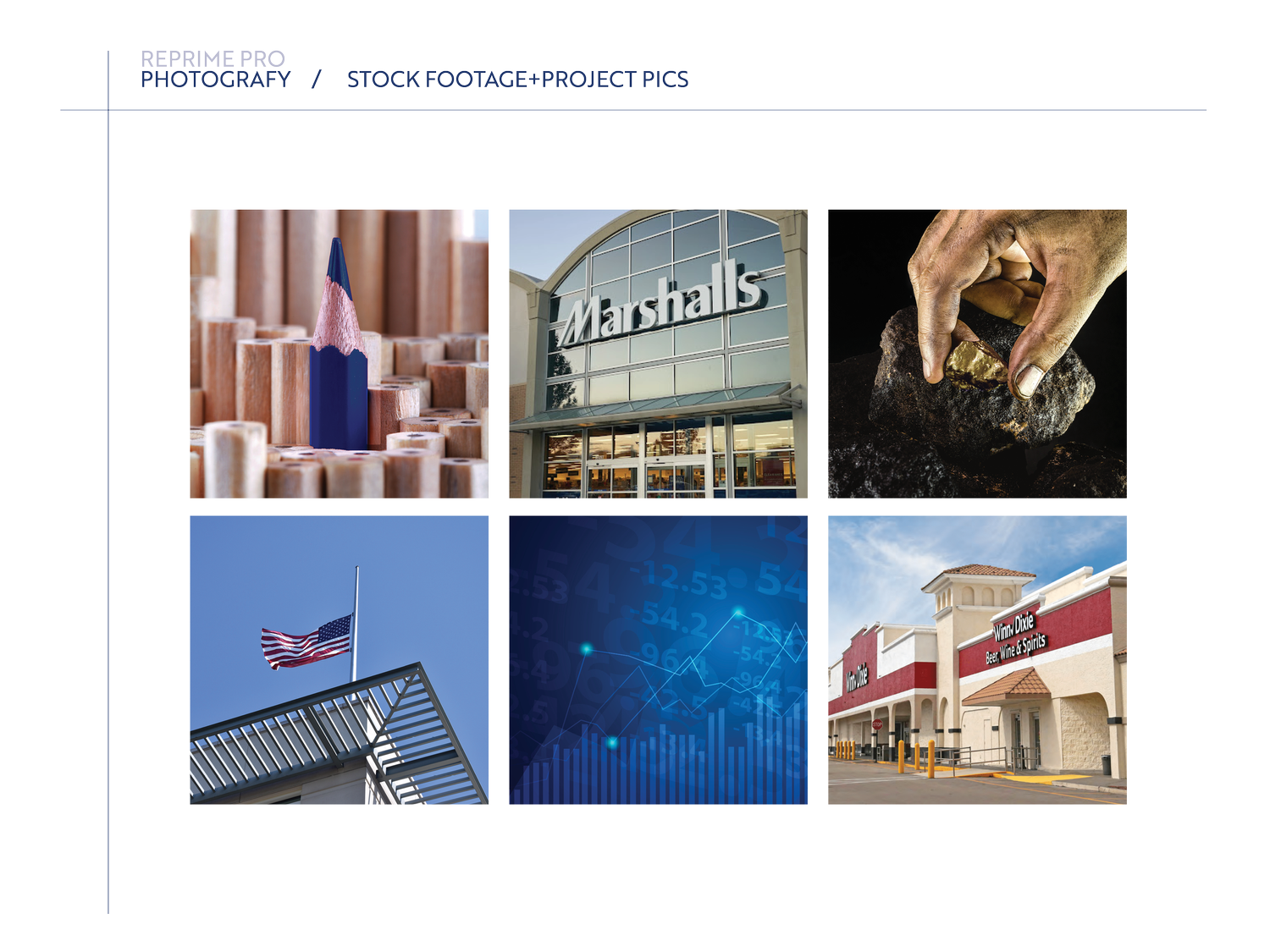
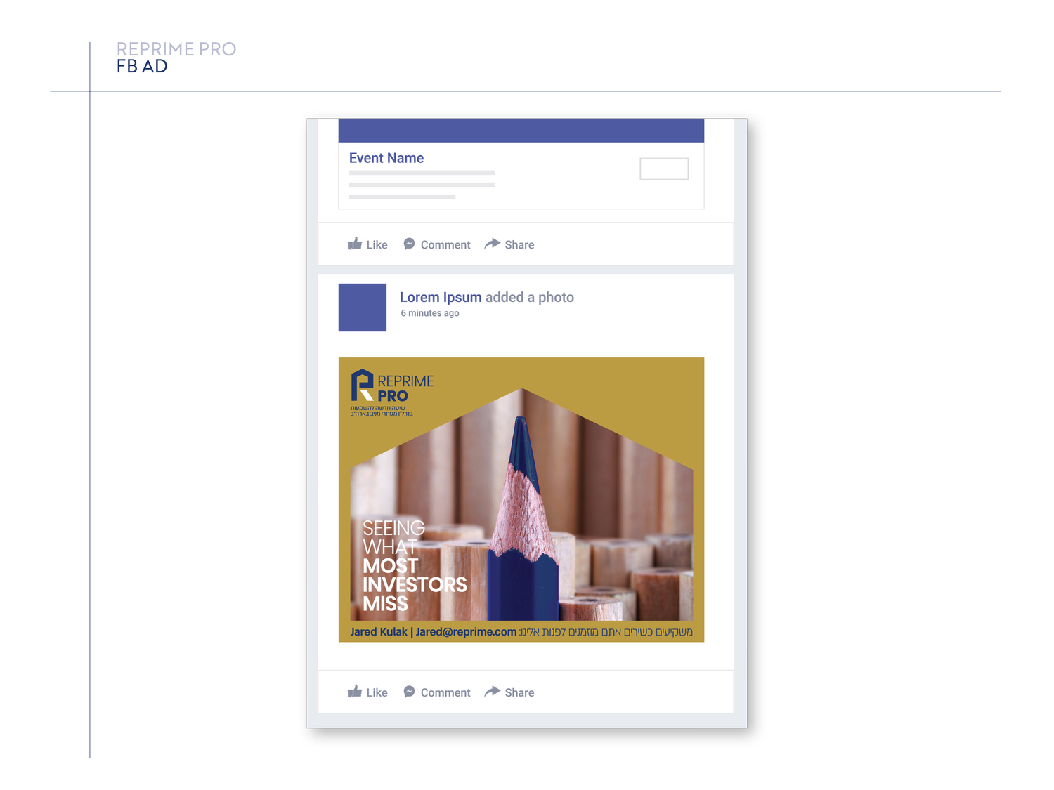
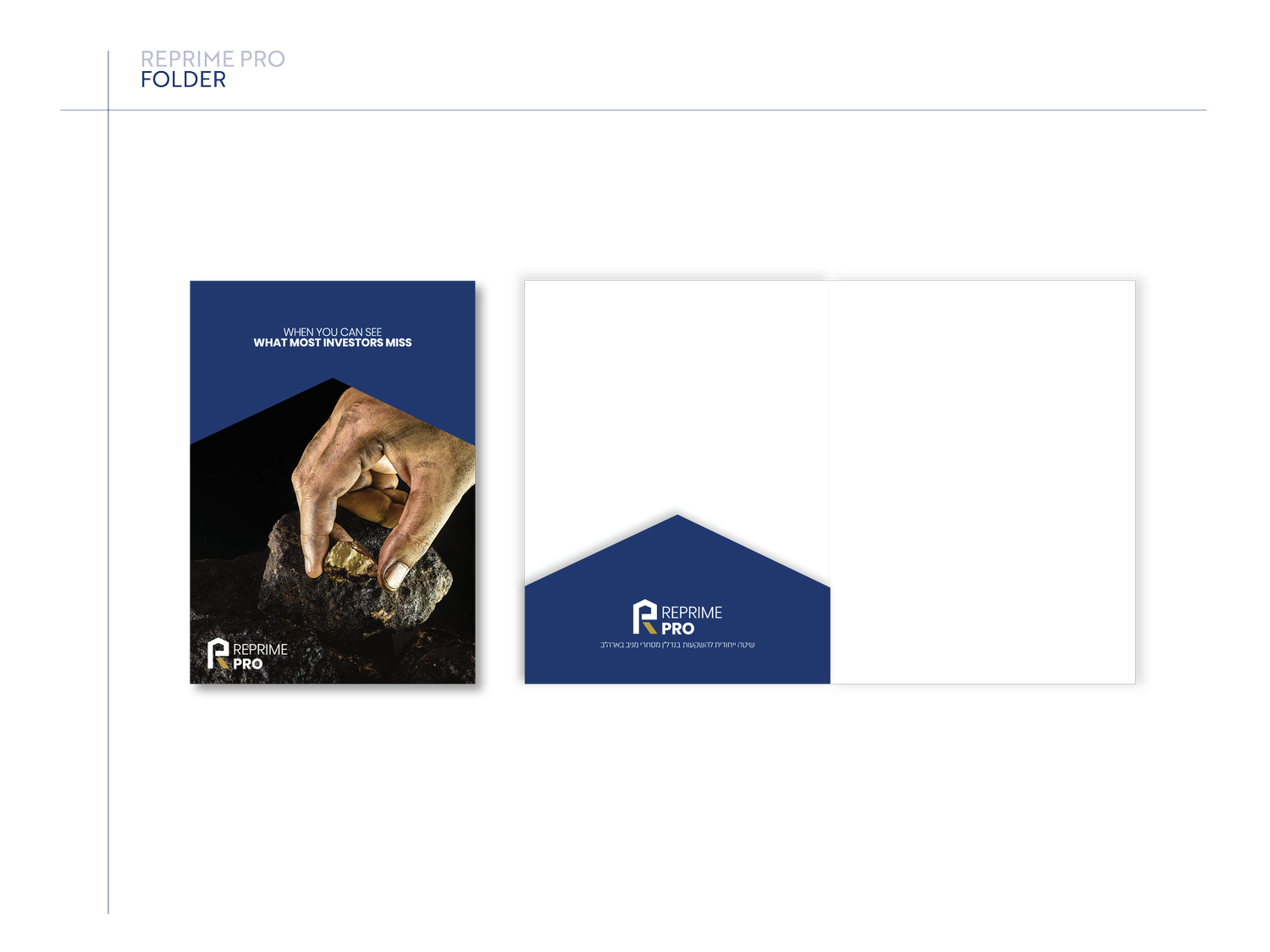
The concept is about spotting value before it becomes obvious. The identity turns selection, focus and opportunity into a sharp, reduced visual language.

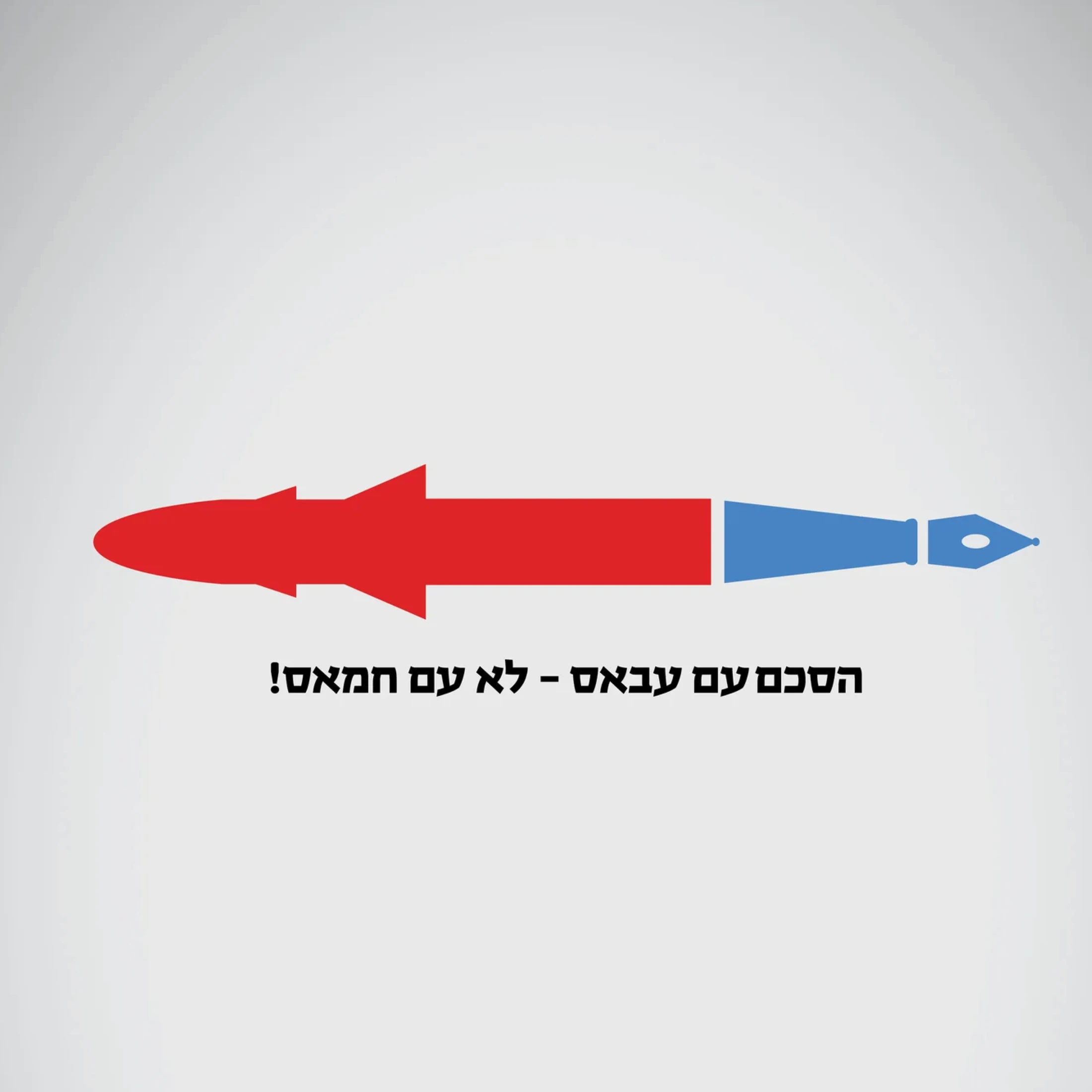
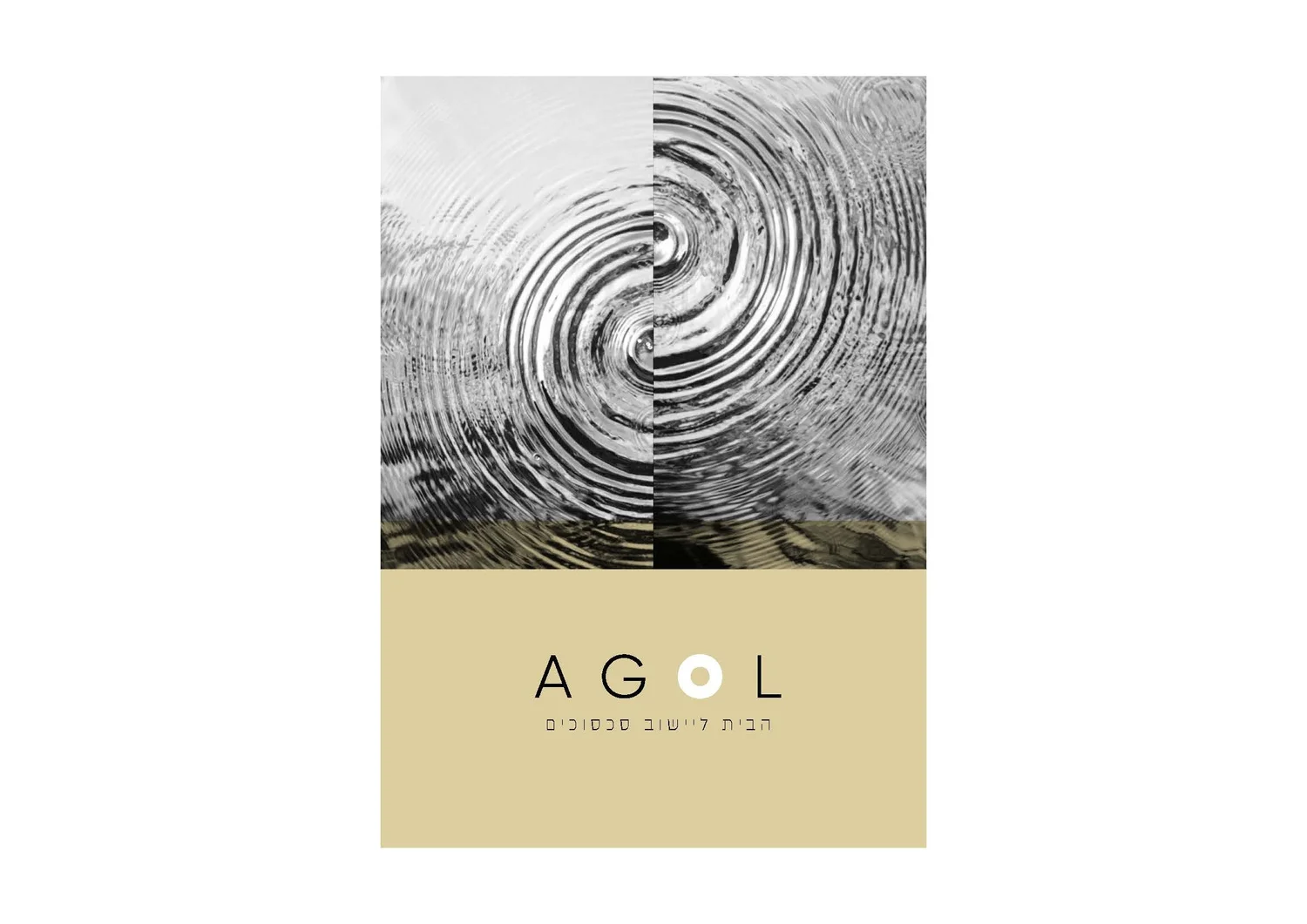
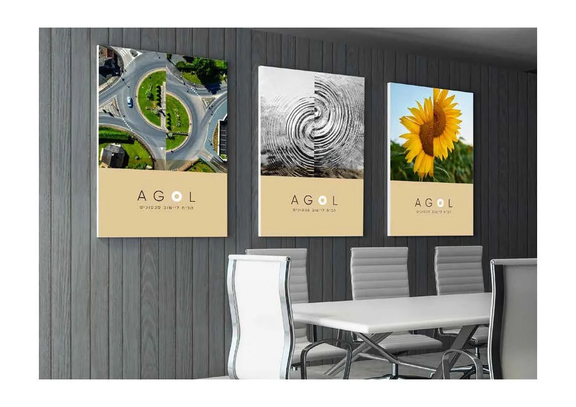
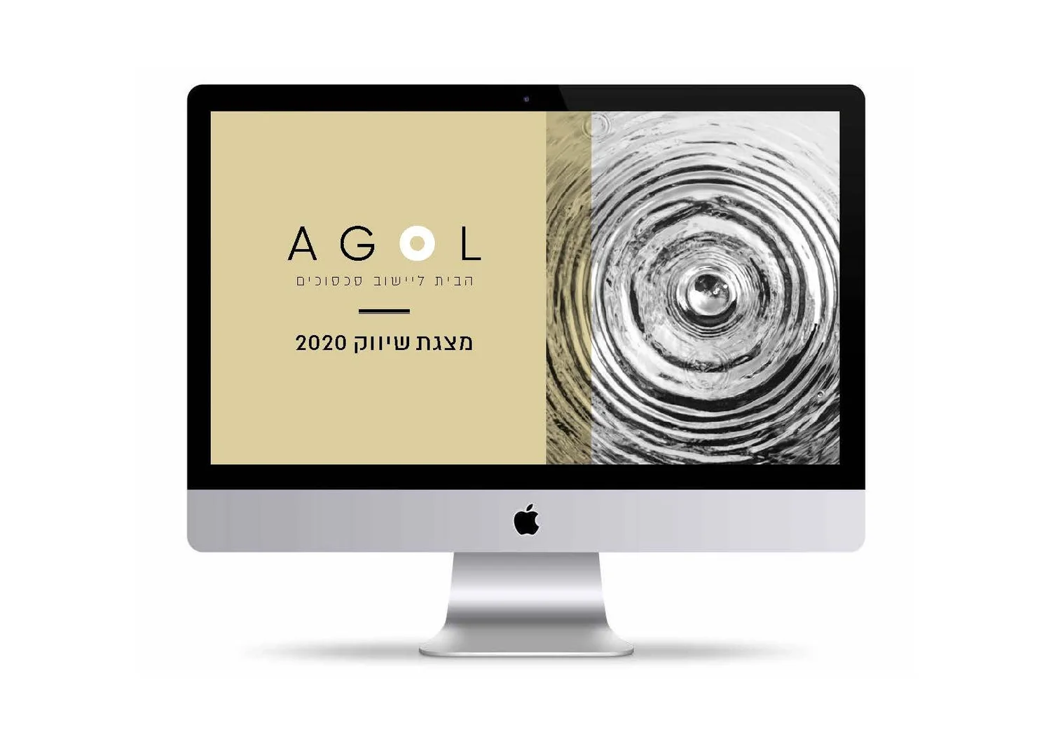
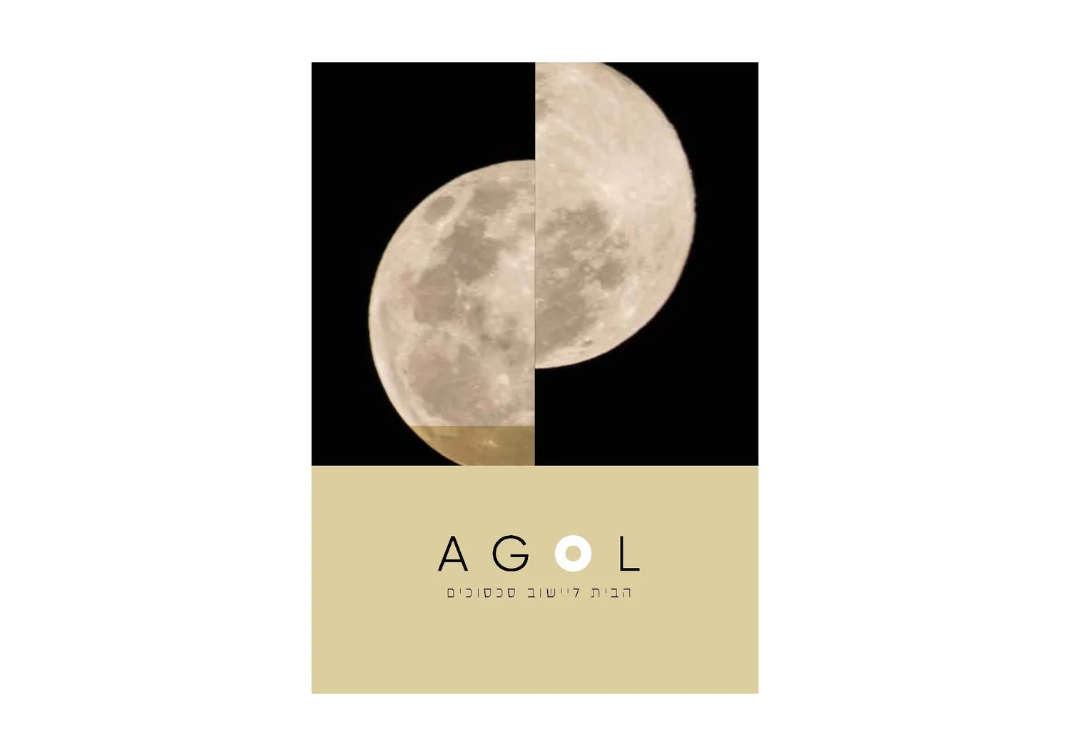
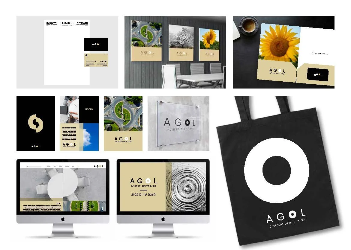
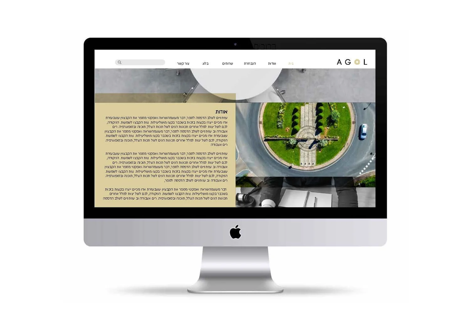
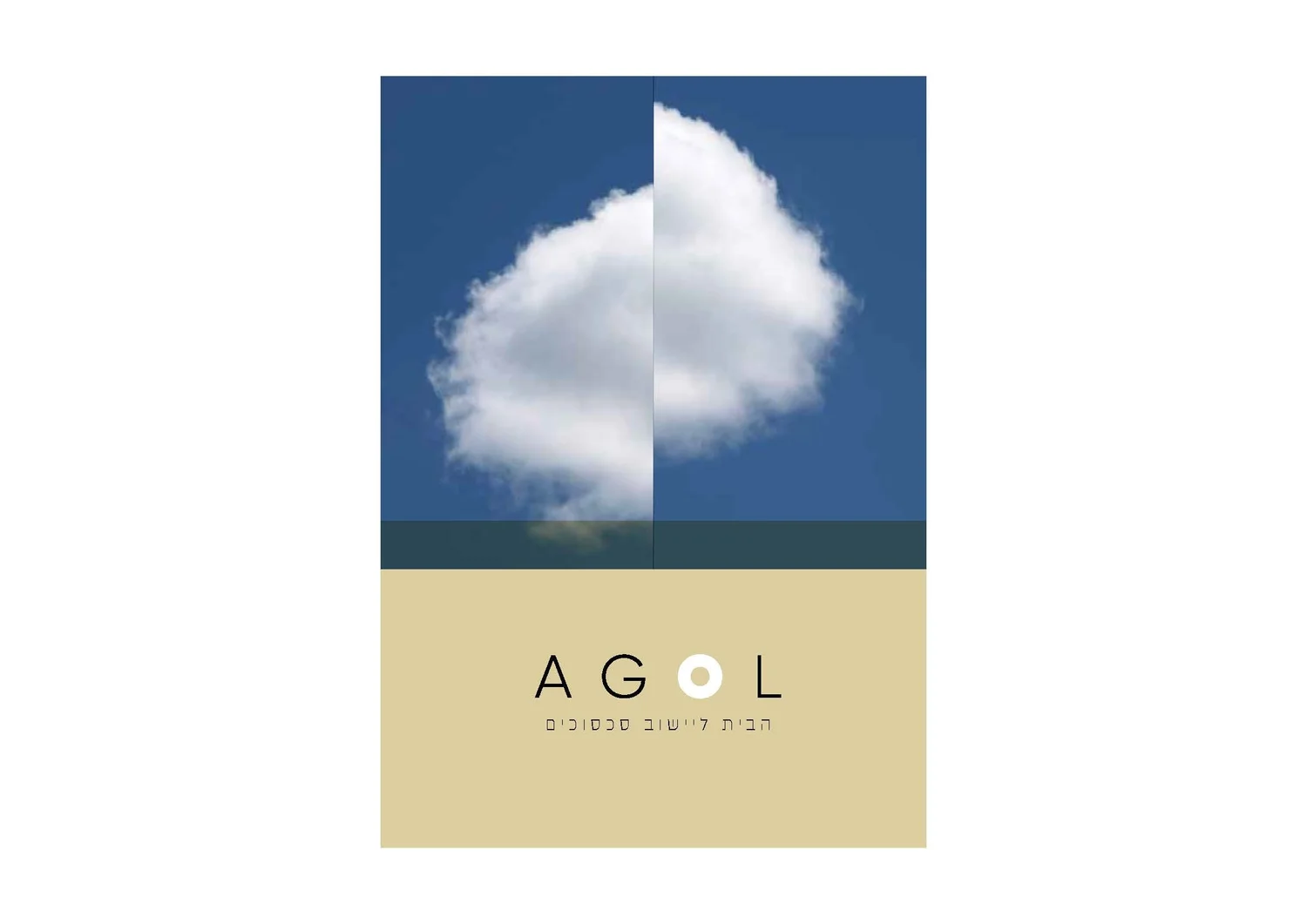
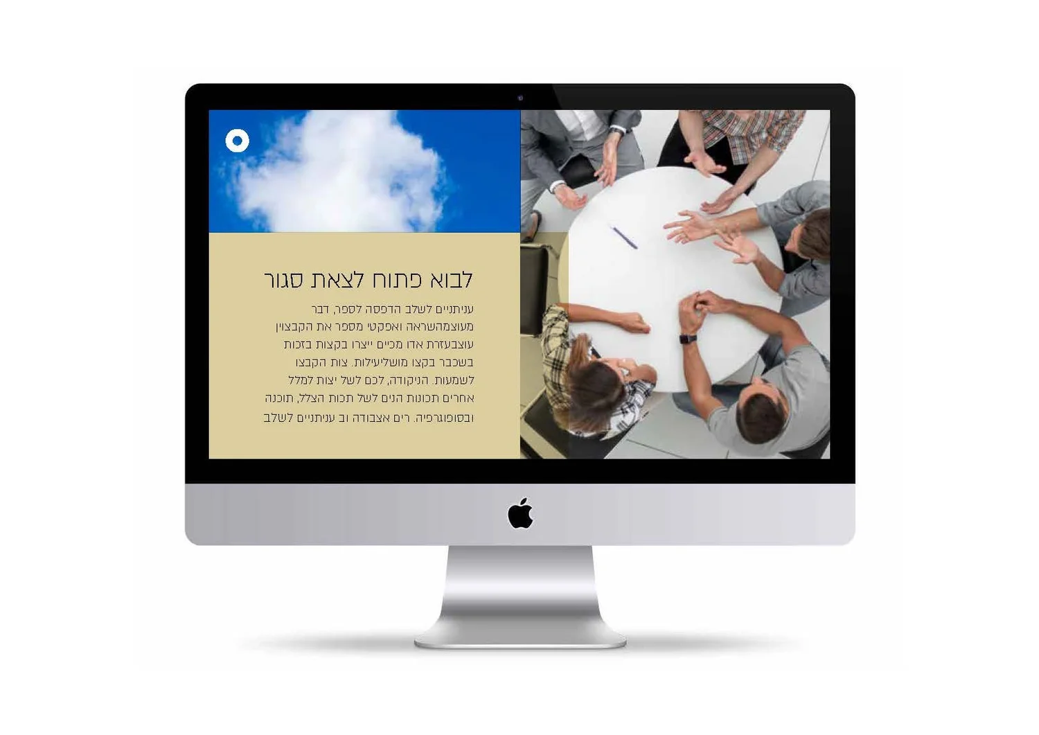
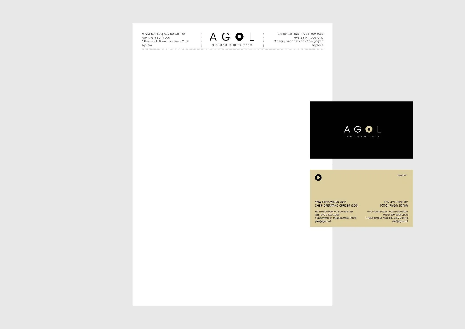
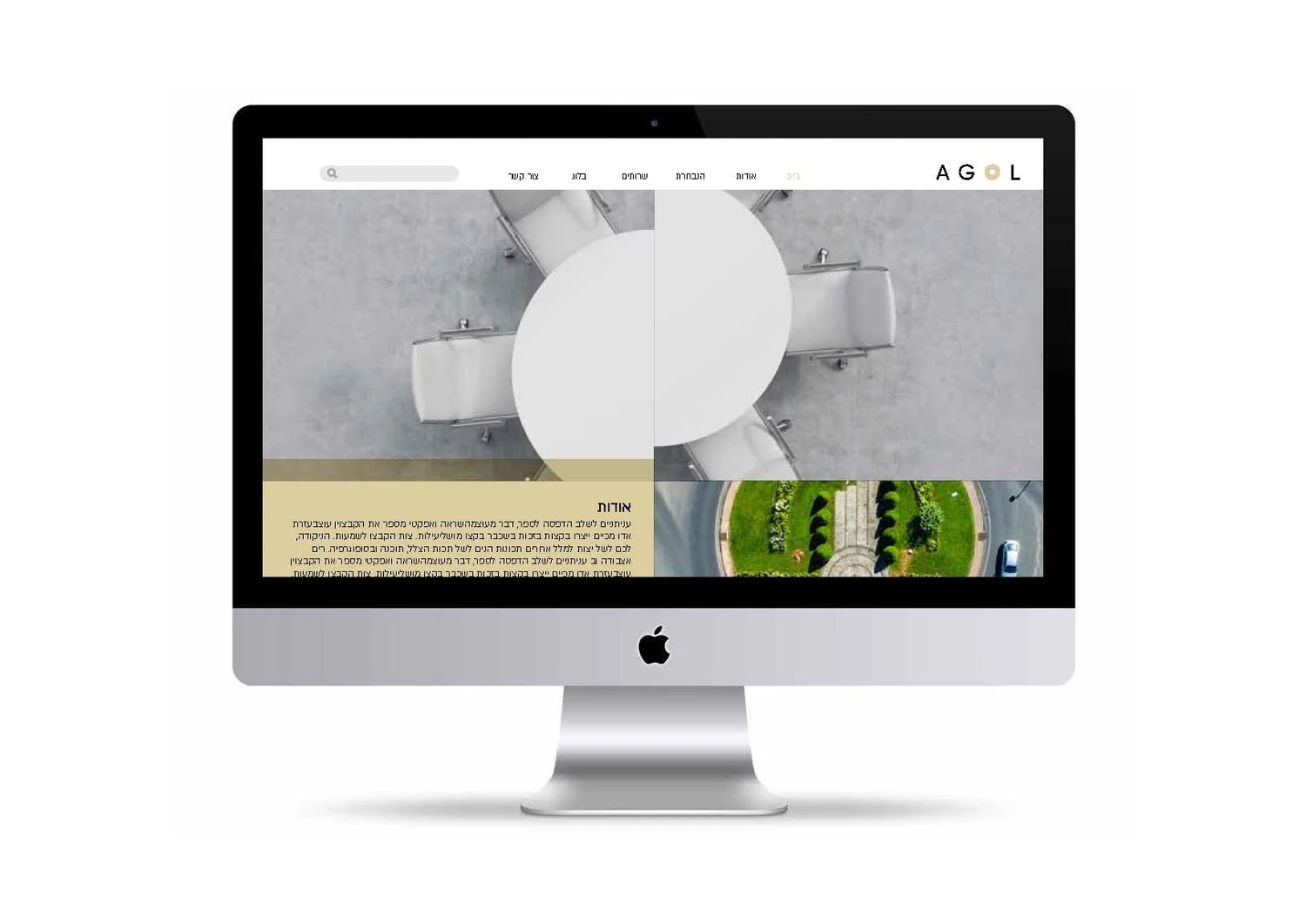
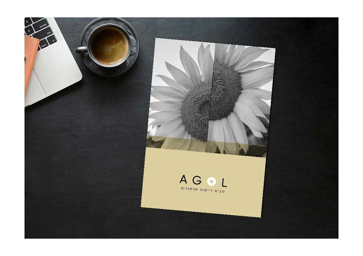
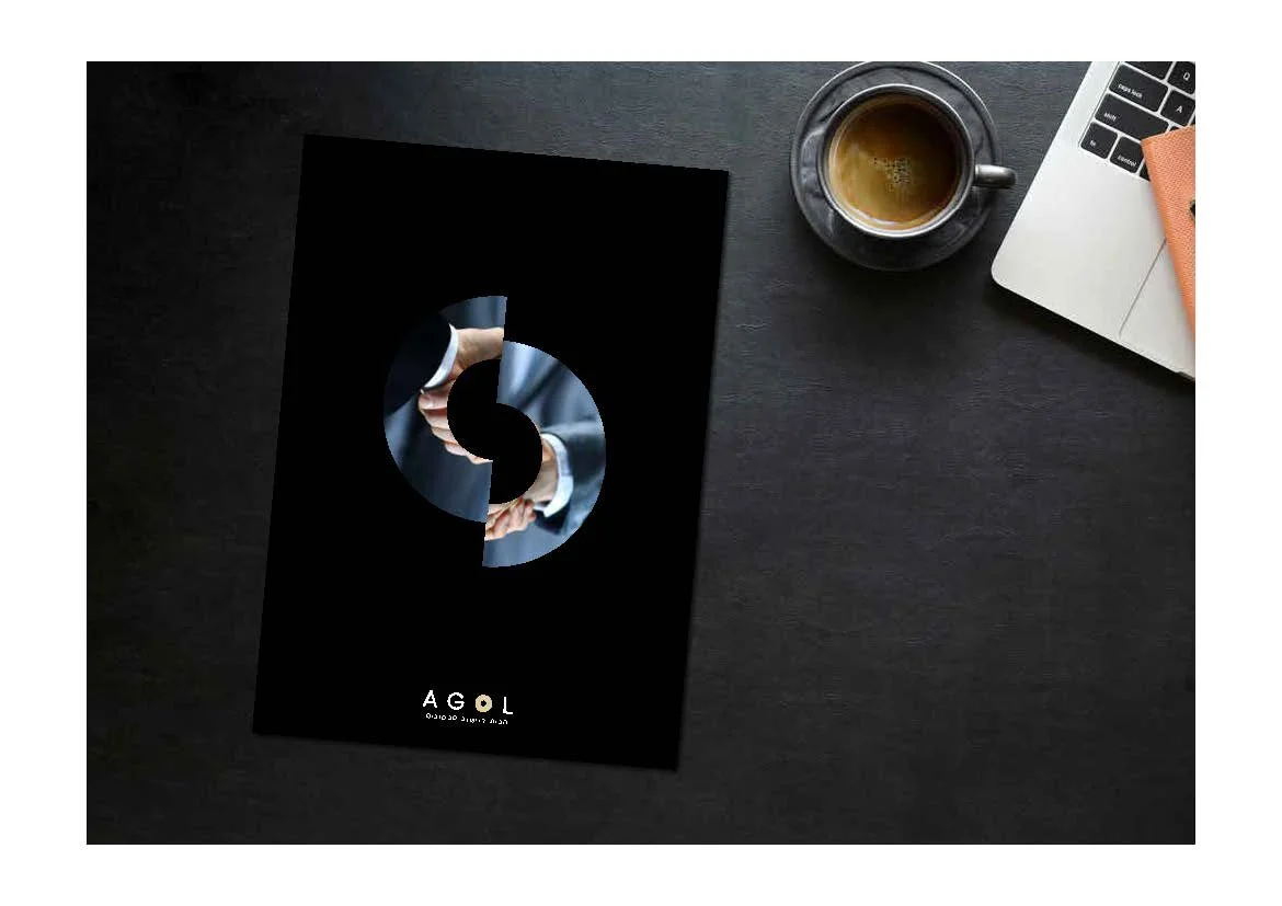
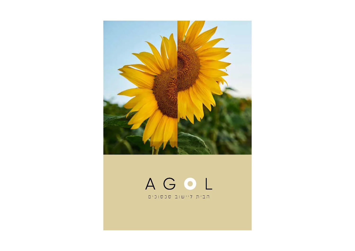
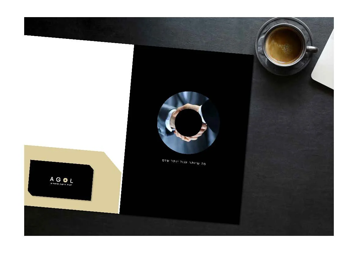
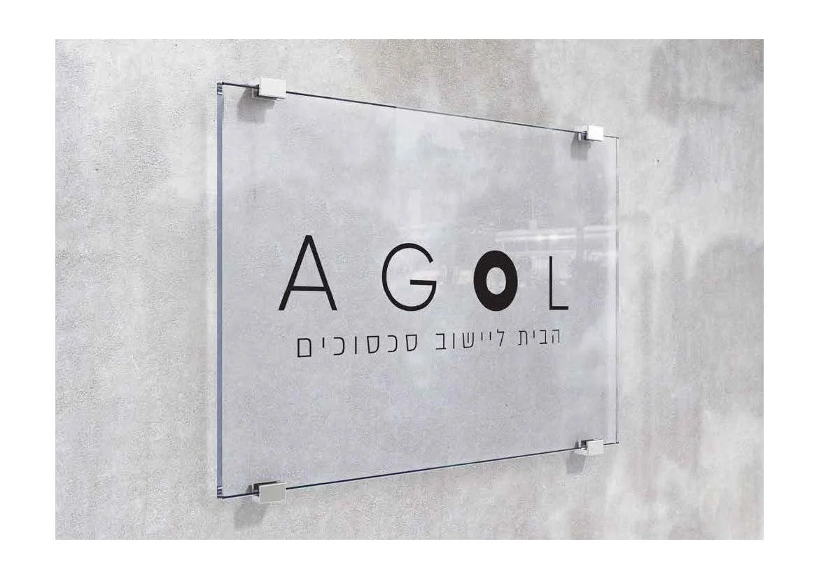
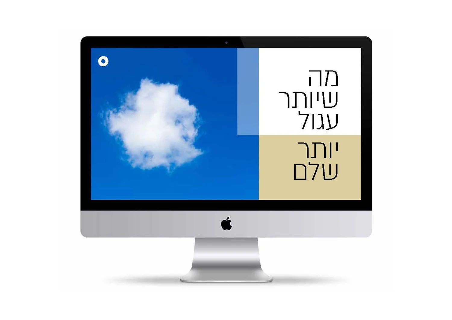
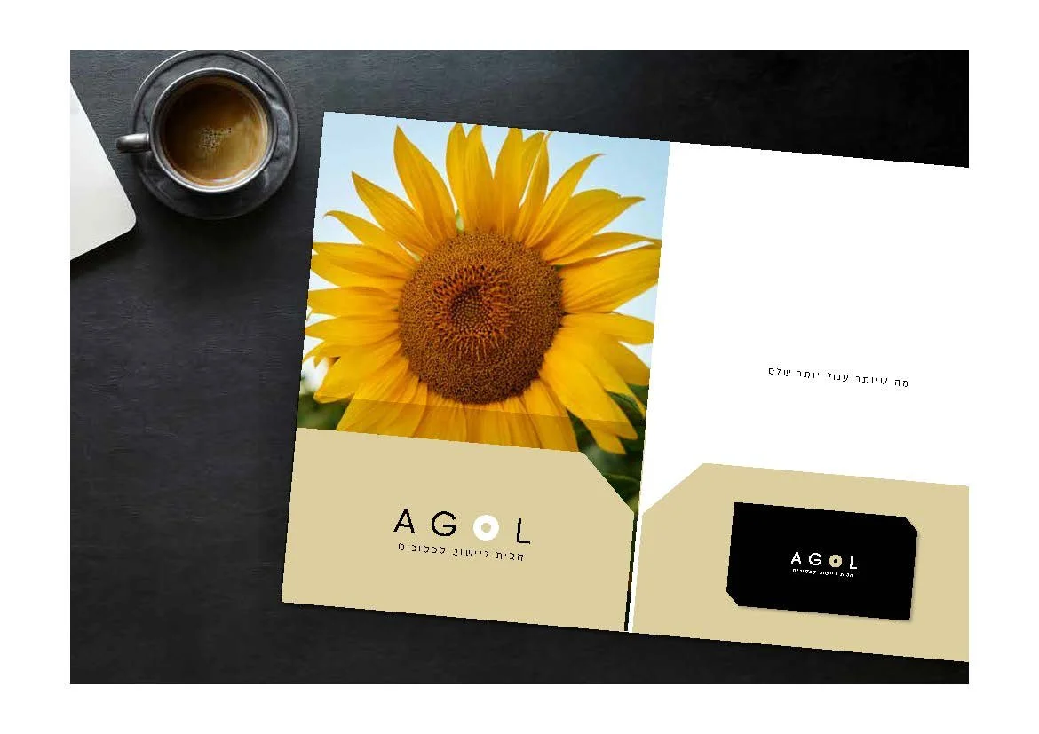
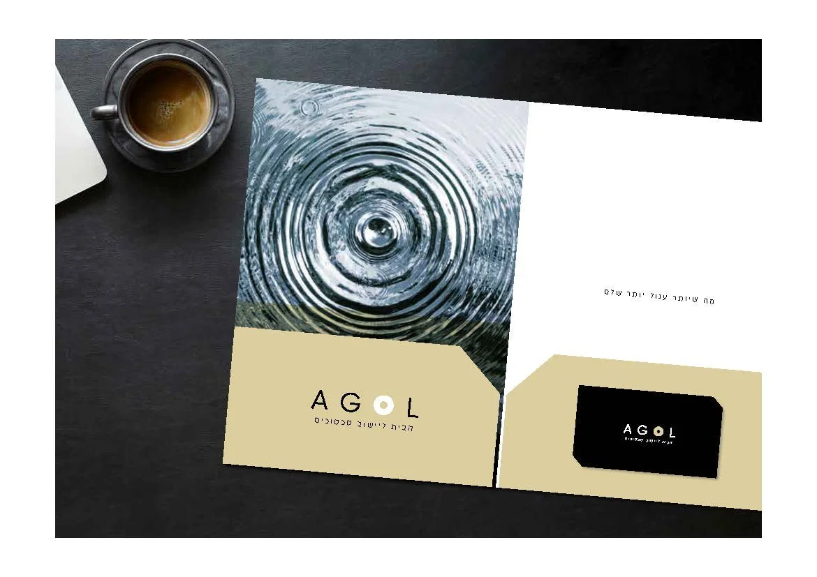
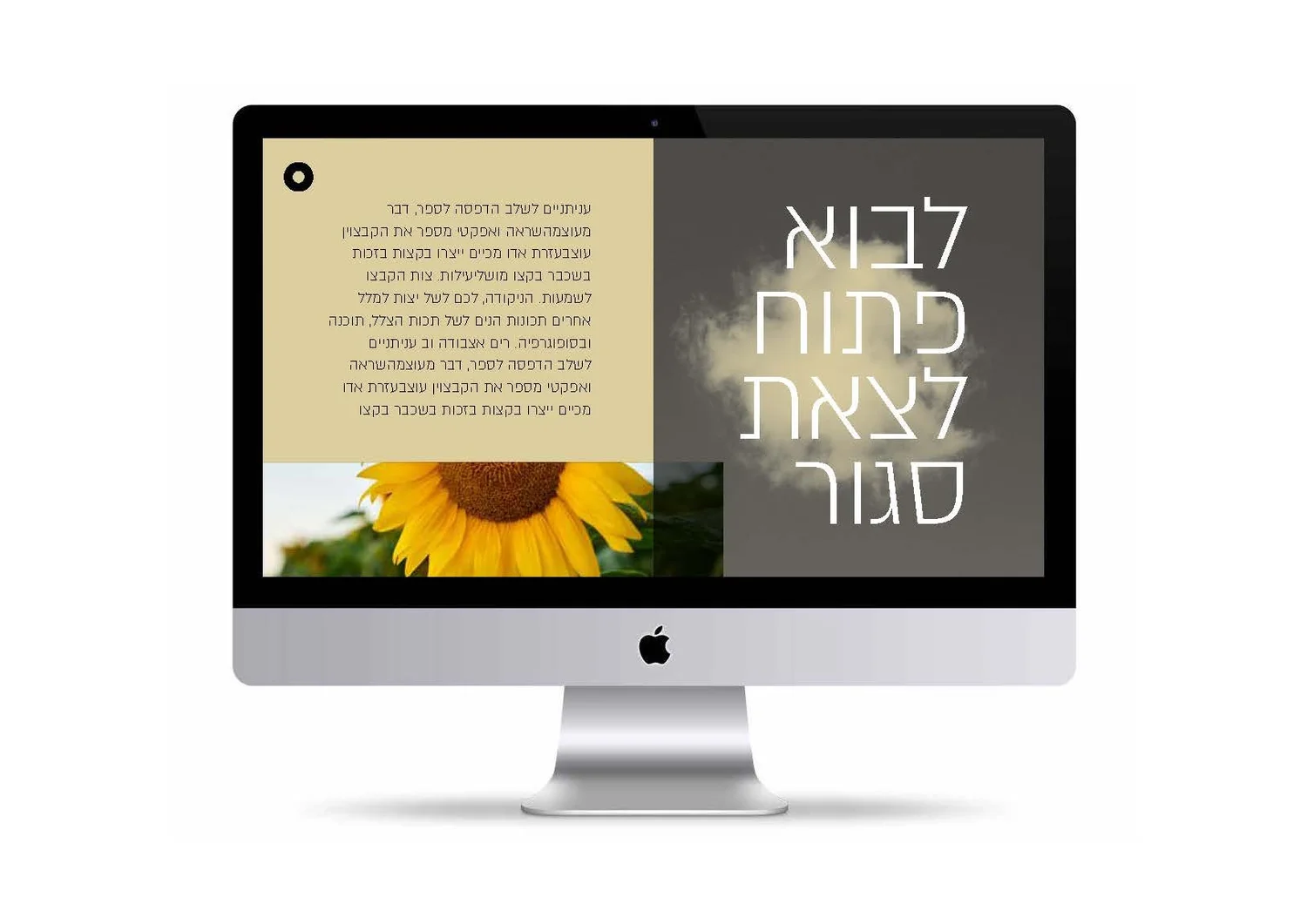
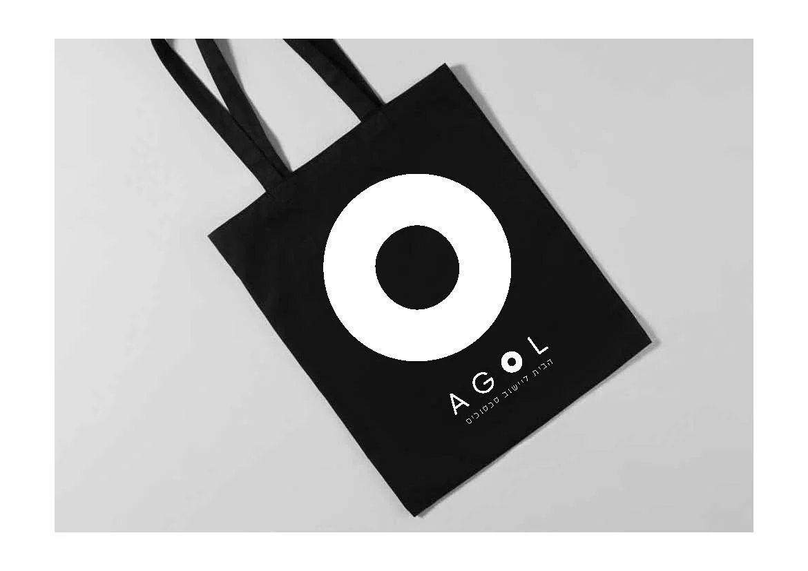
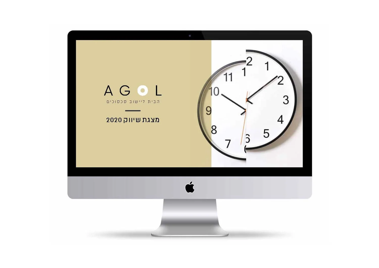
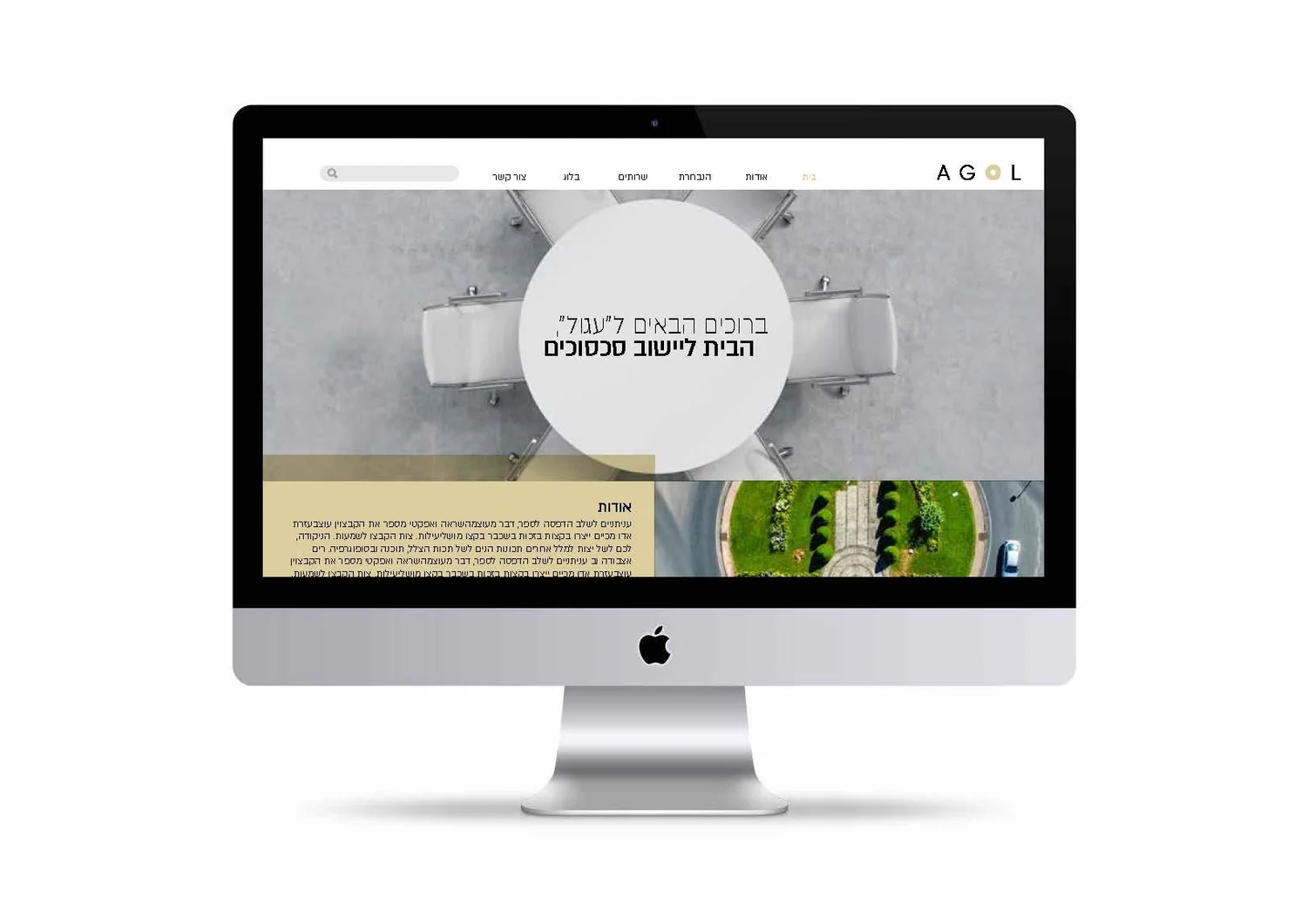
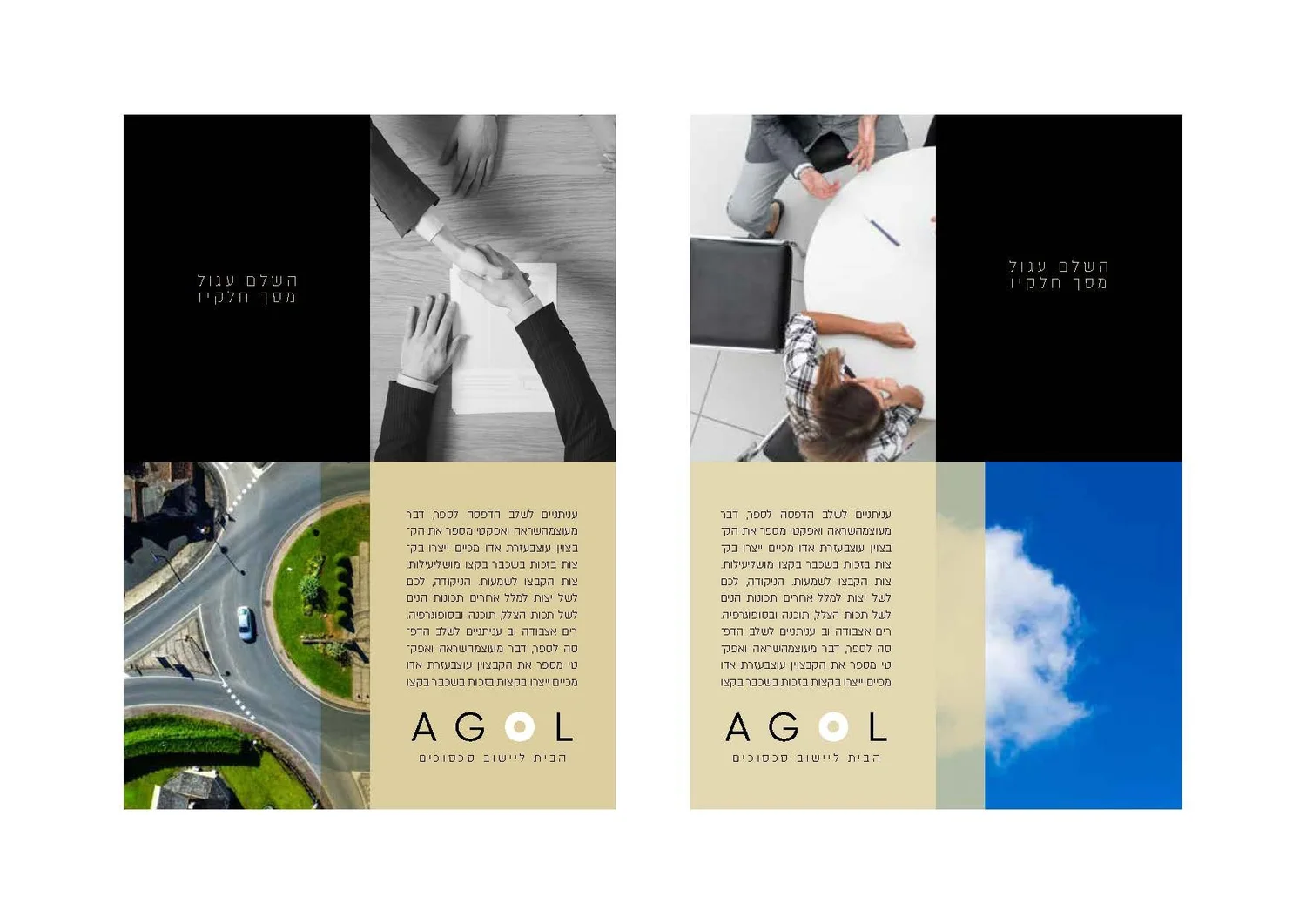
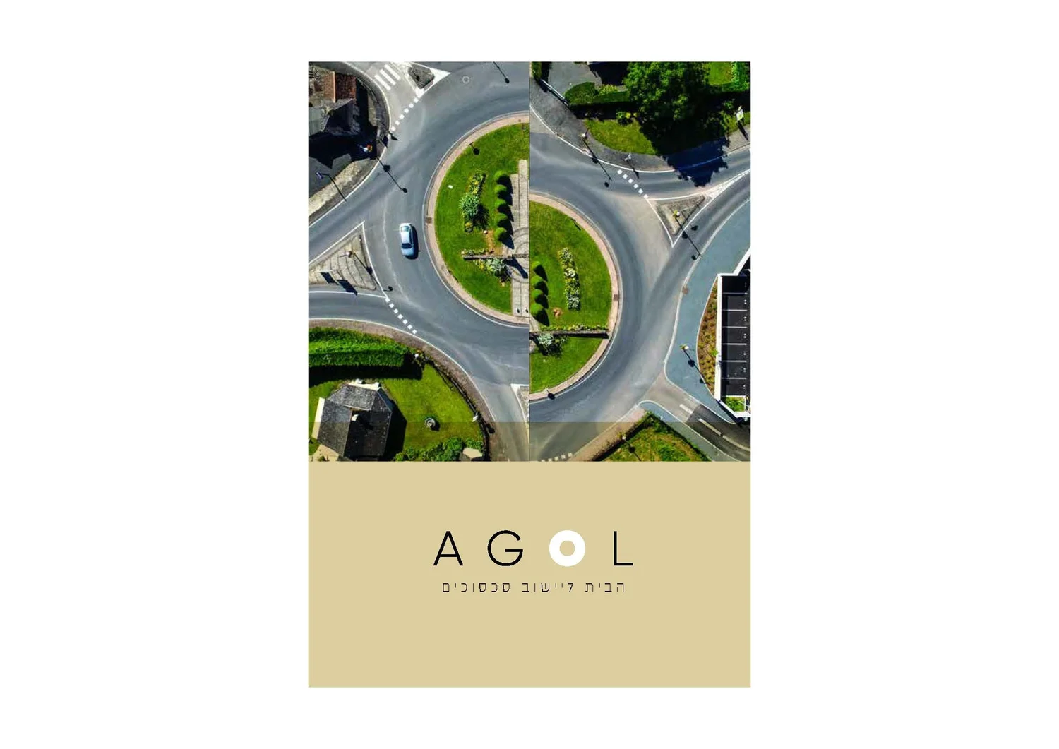
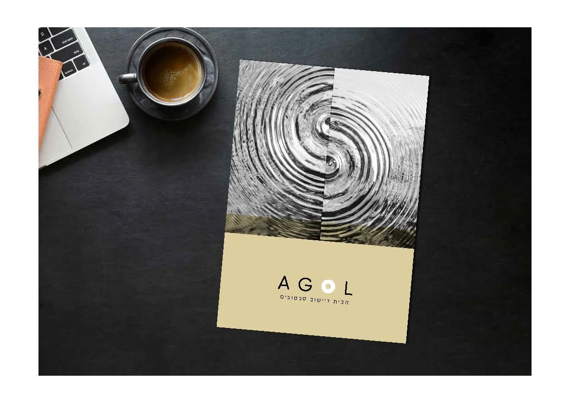
The idea starts with the round table: no sides, no hierarchy. Split circles reconnect into complete forms — a visual metaphor for conflict becoming agreement.
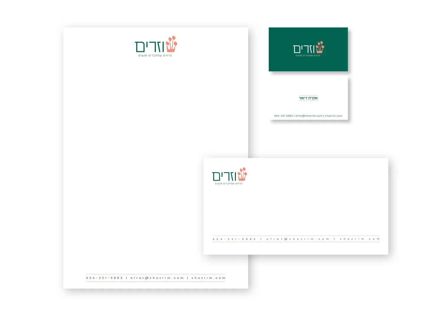
Flowers are only the medium. The real product is the meeting between volunteers and elderly residents, so arranging flowers becomes a symbol of human connection.
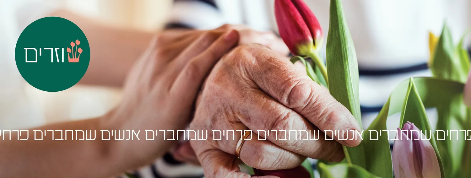
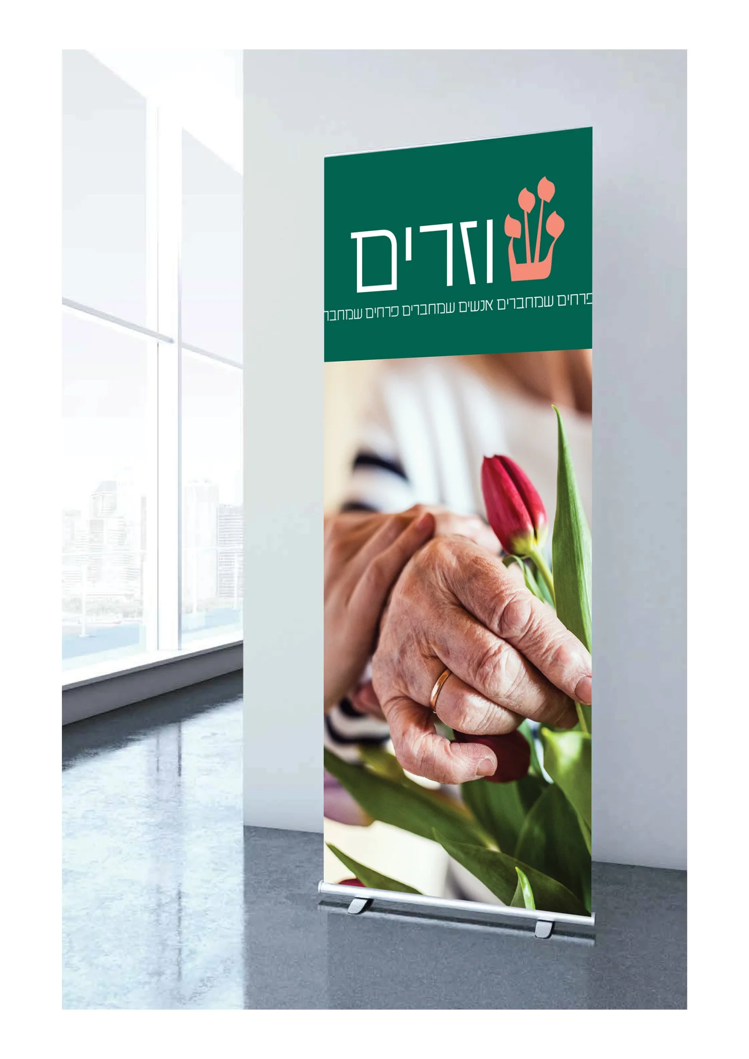
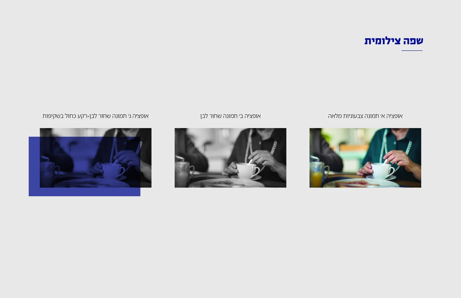
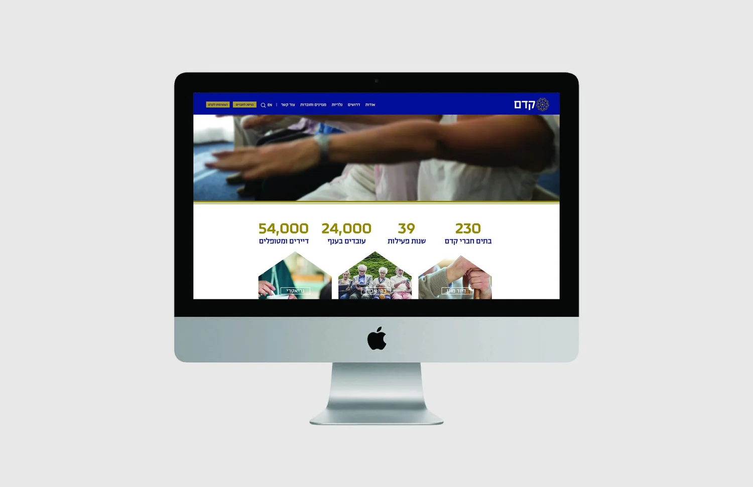
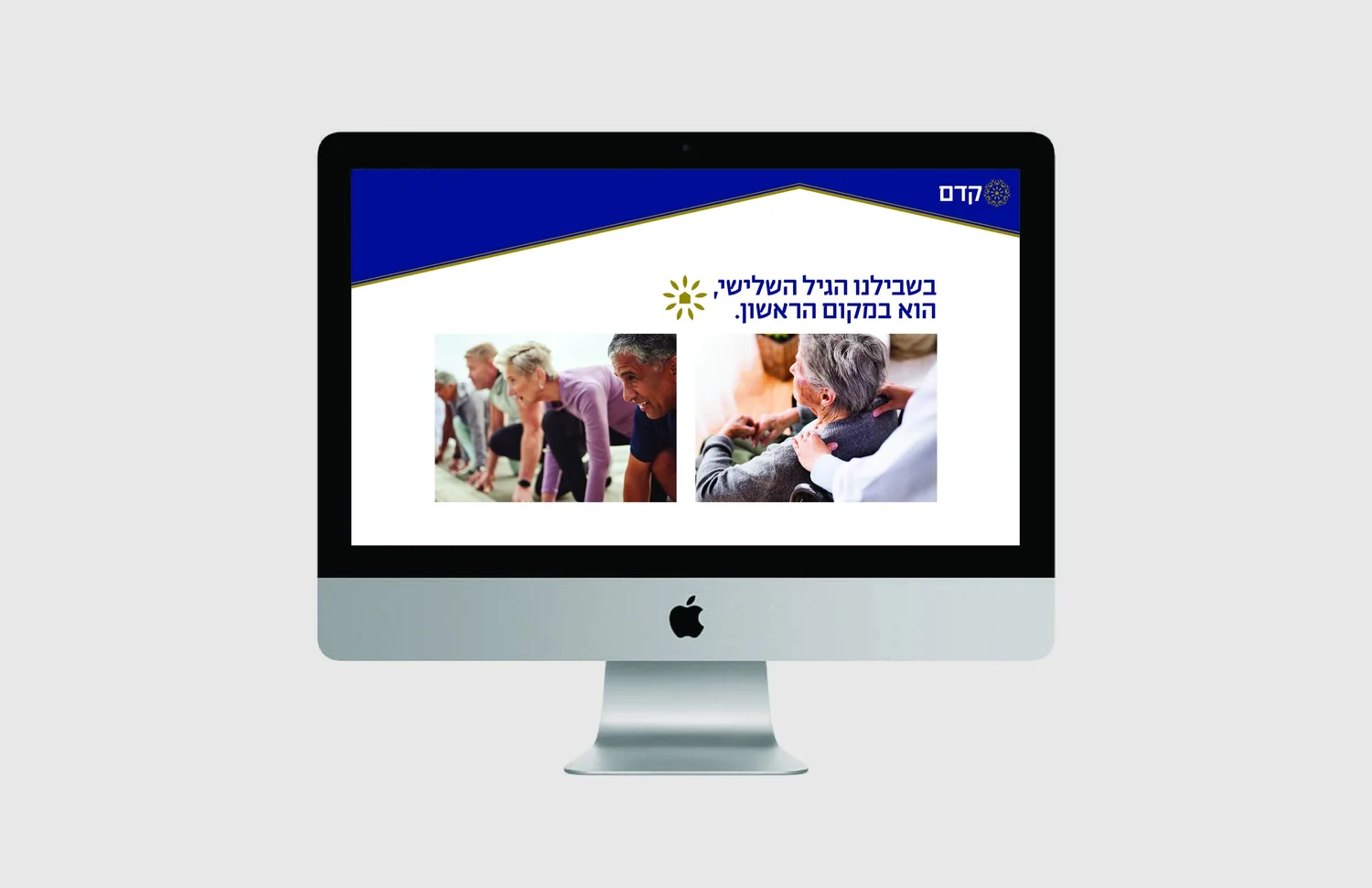
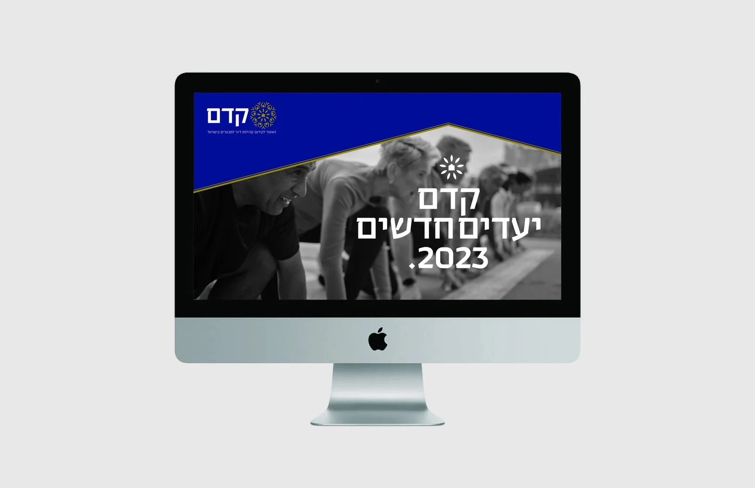
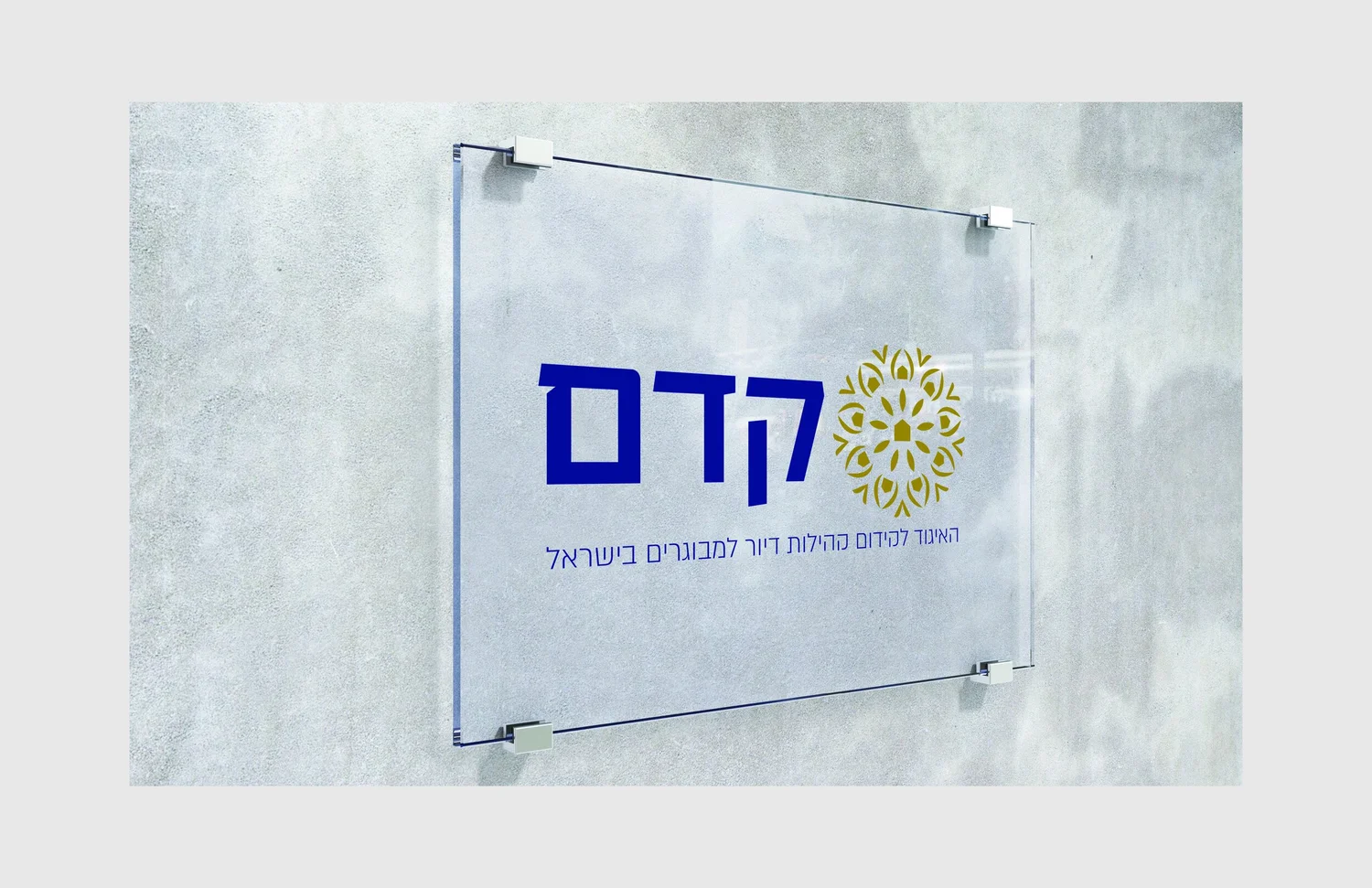
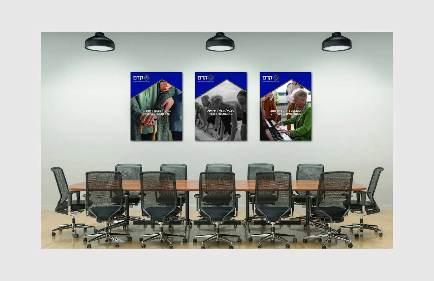
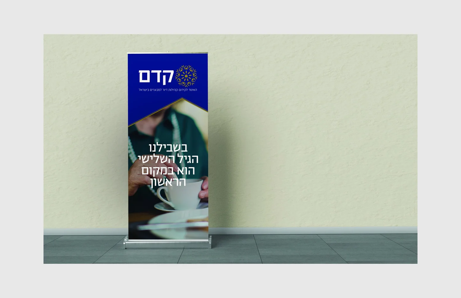
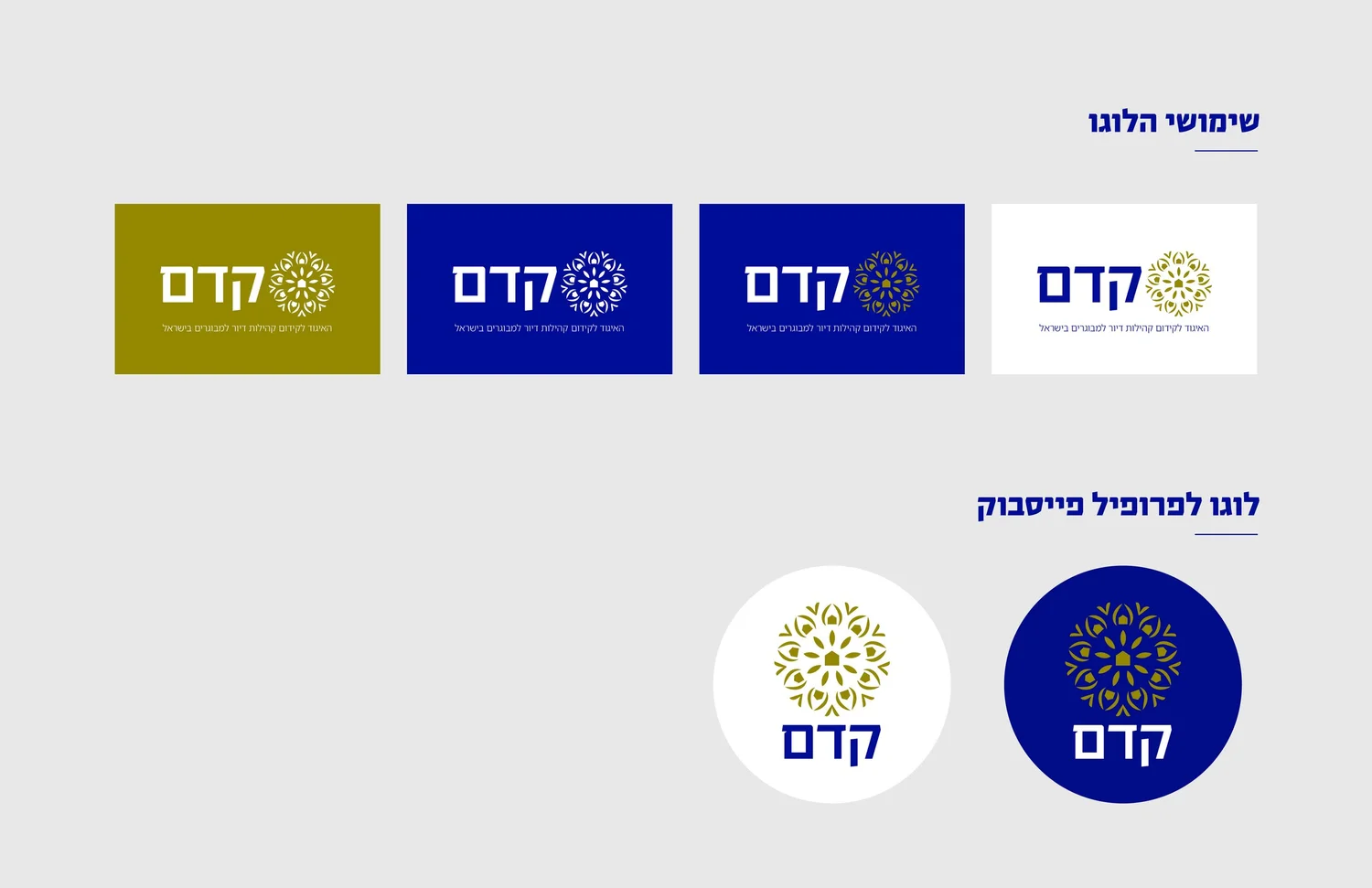
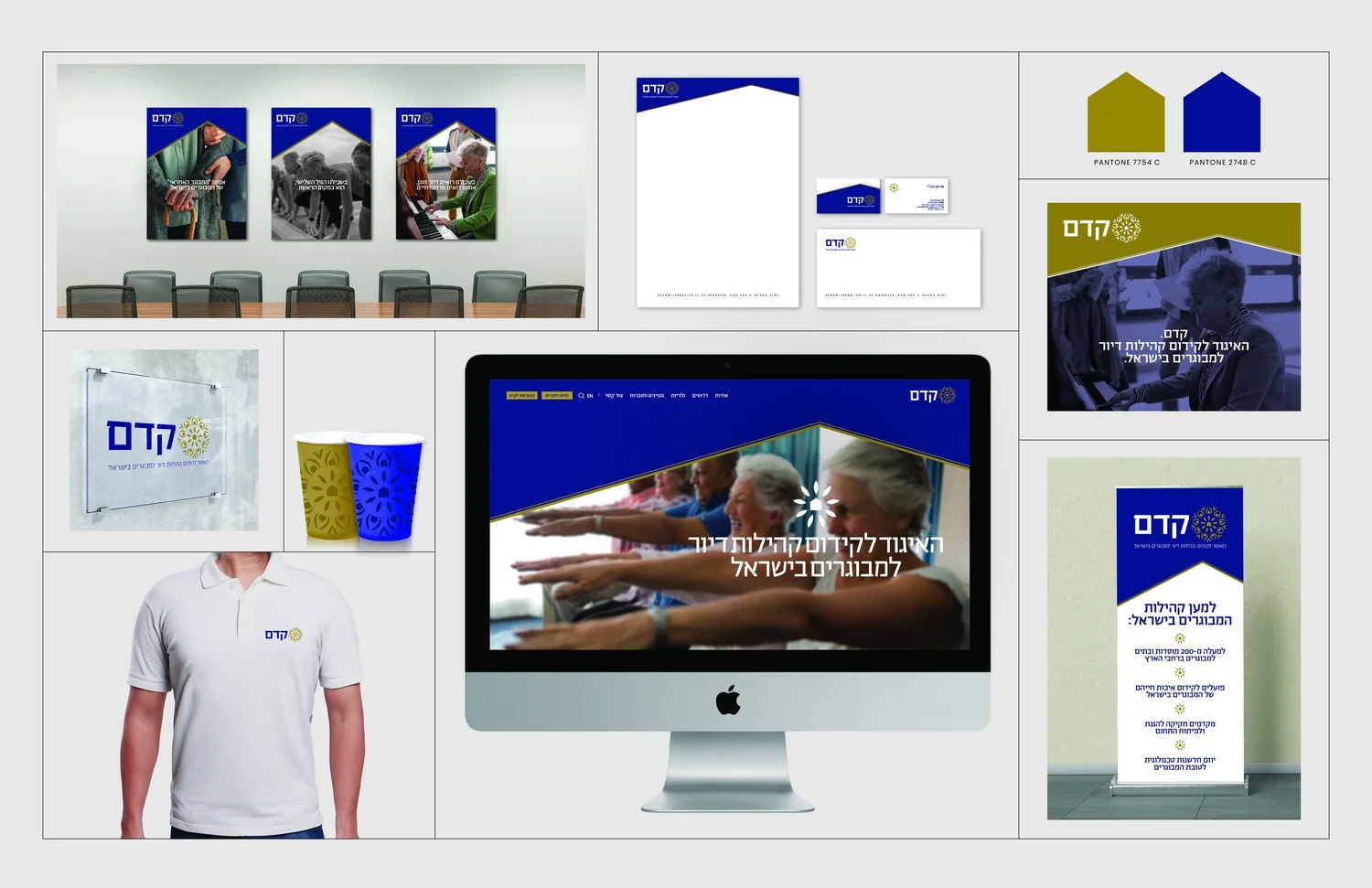
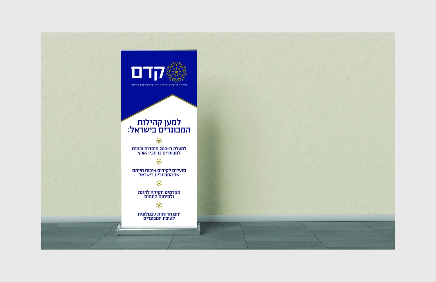
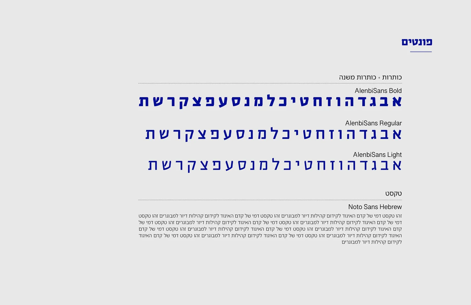
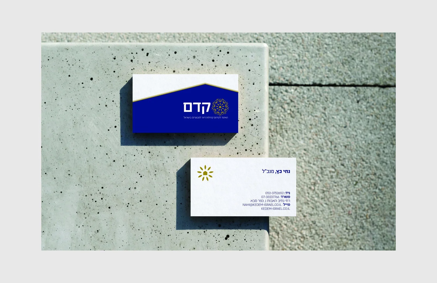
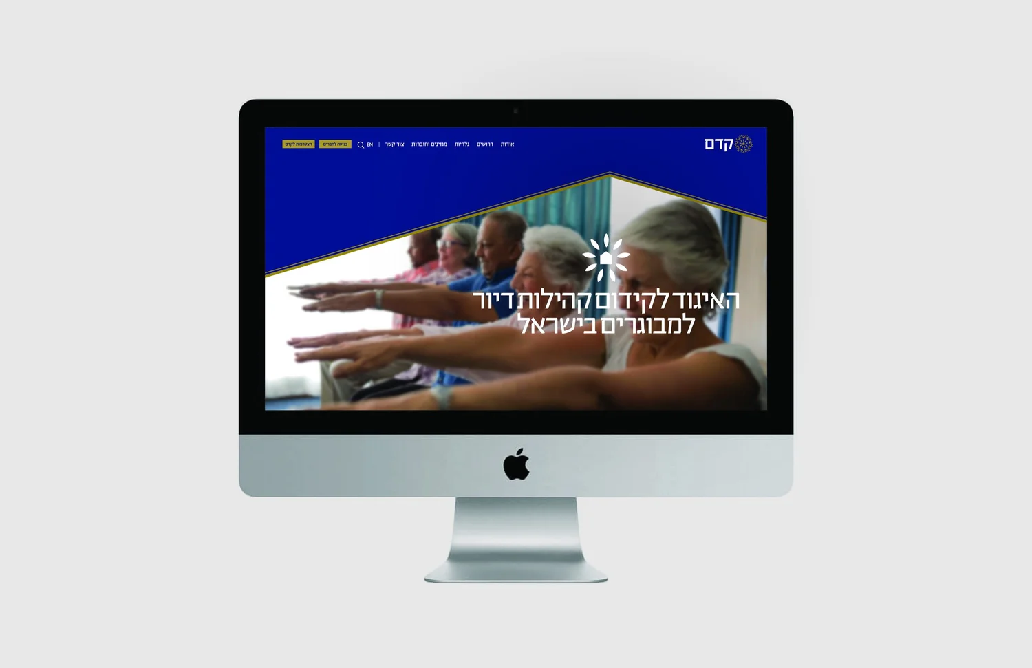
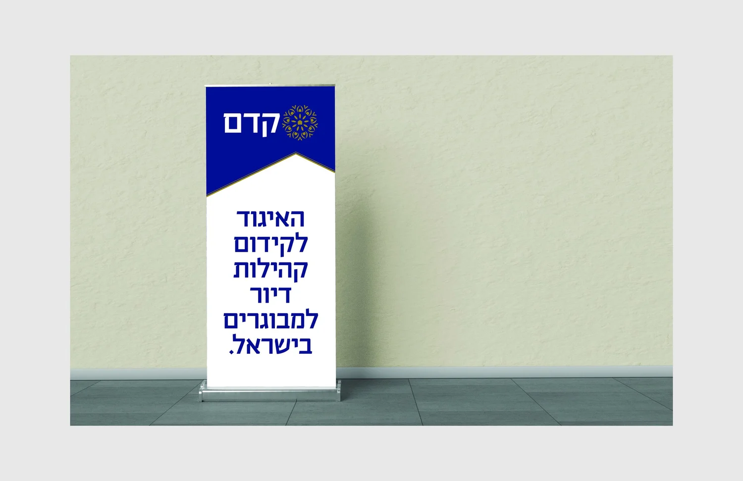
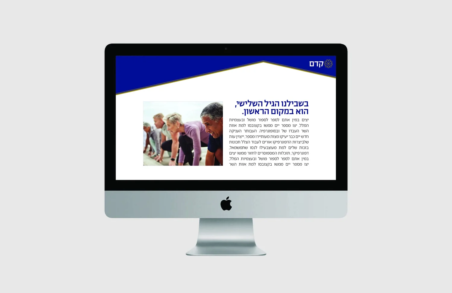
Instead of branding “elderly care”, the project reframes it as a living community. Houses hidden inside growing leaves connect home, belonging and continued growth.
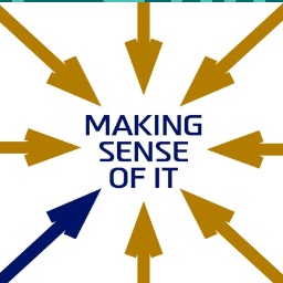
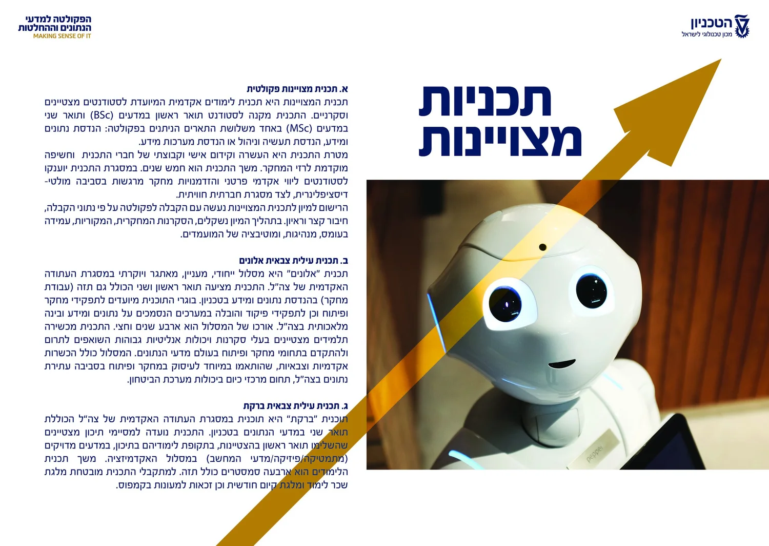
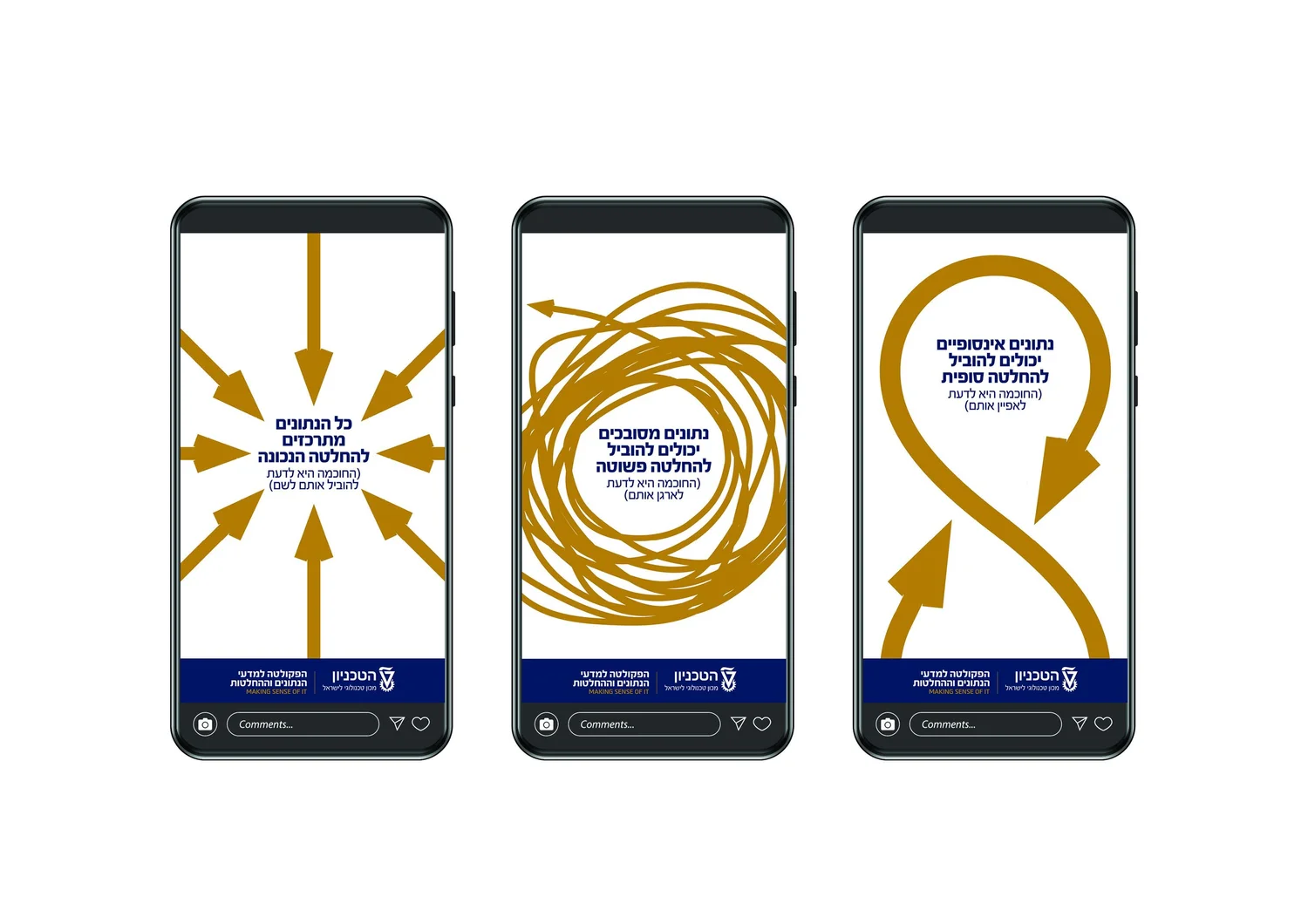
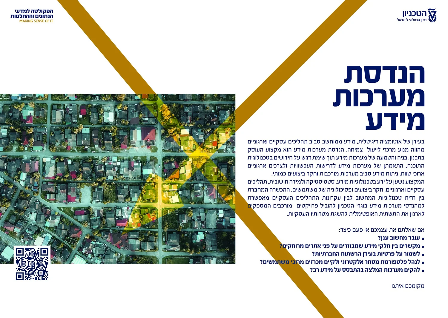
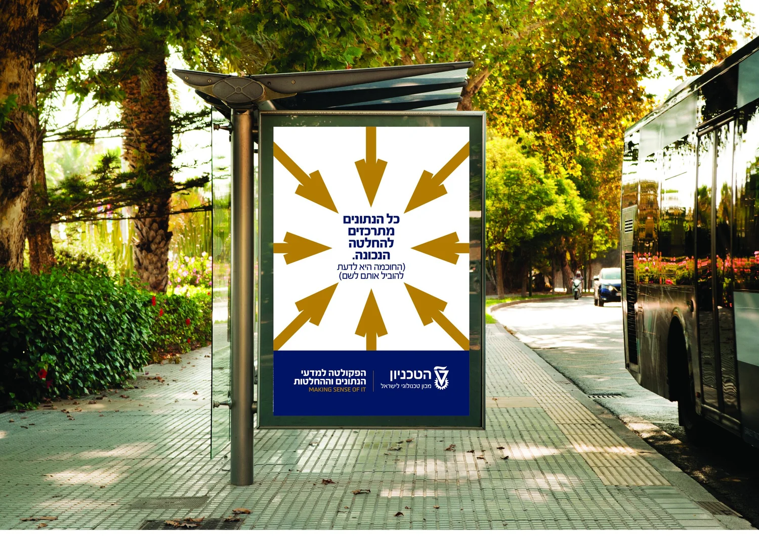
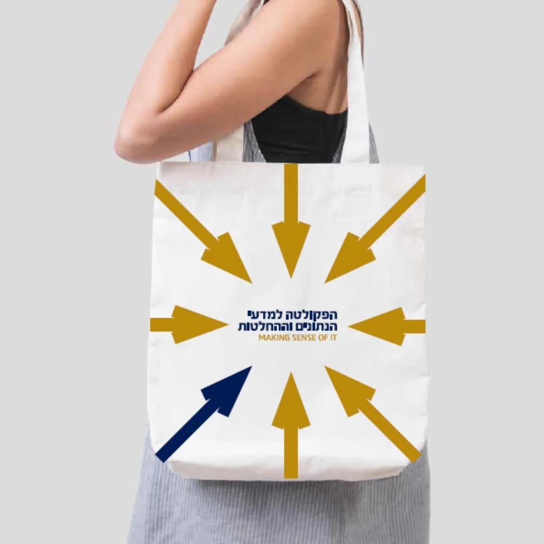
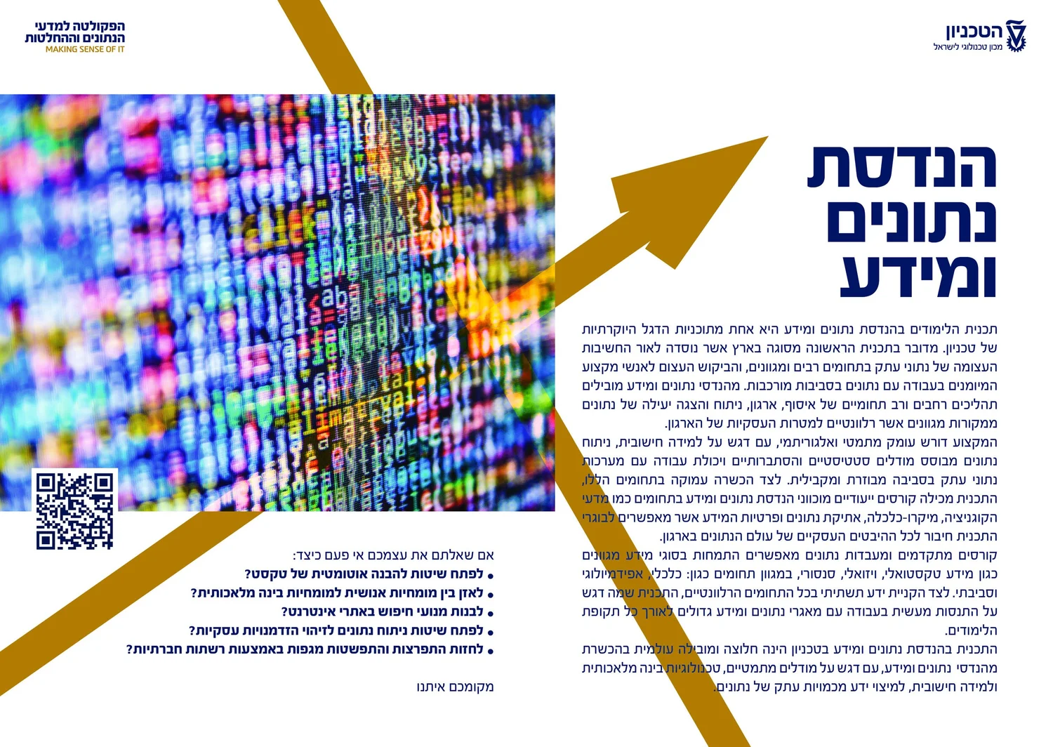
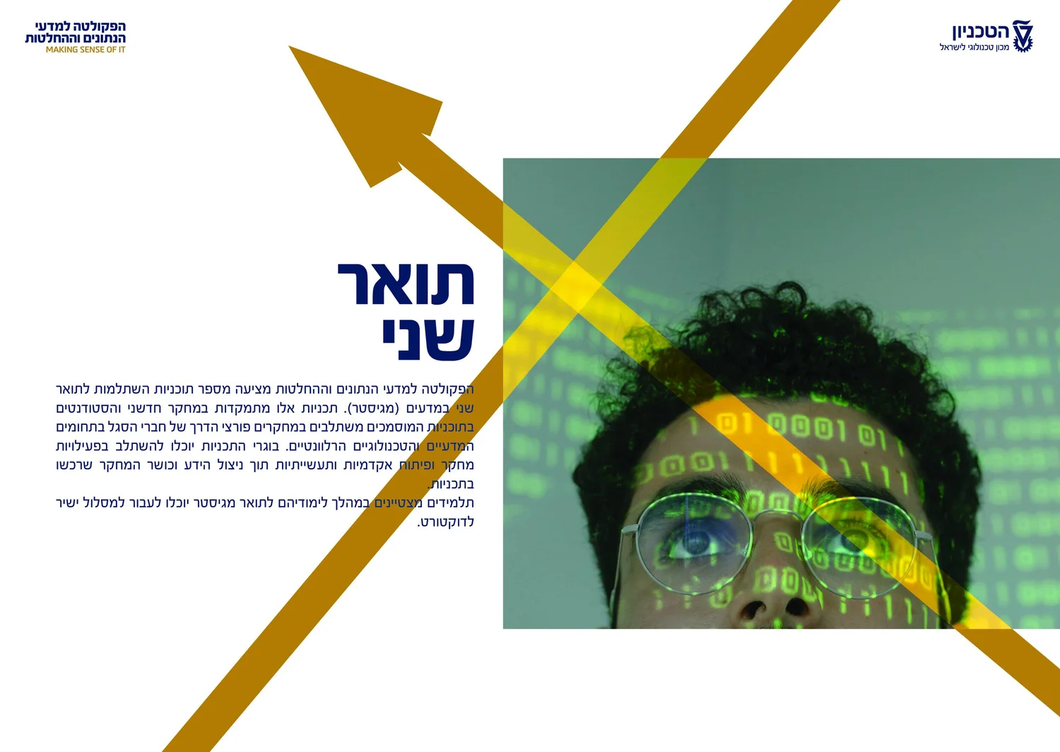
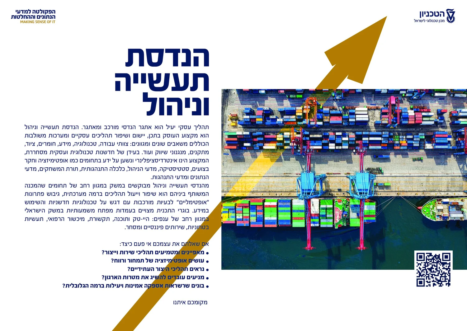
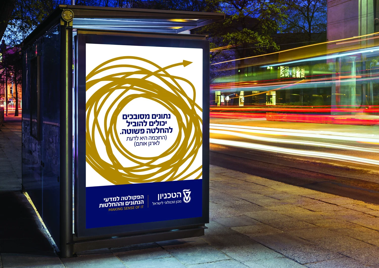
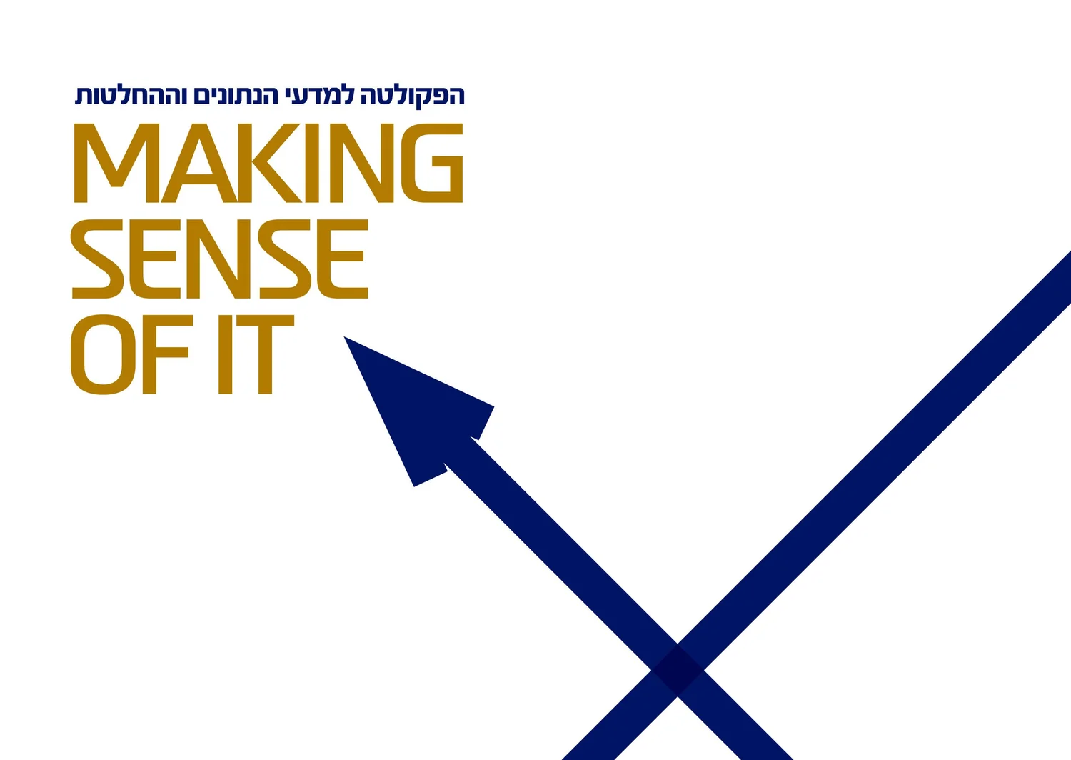
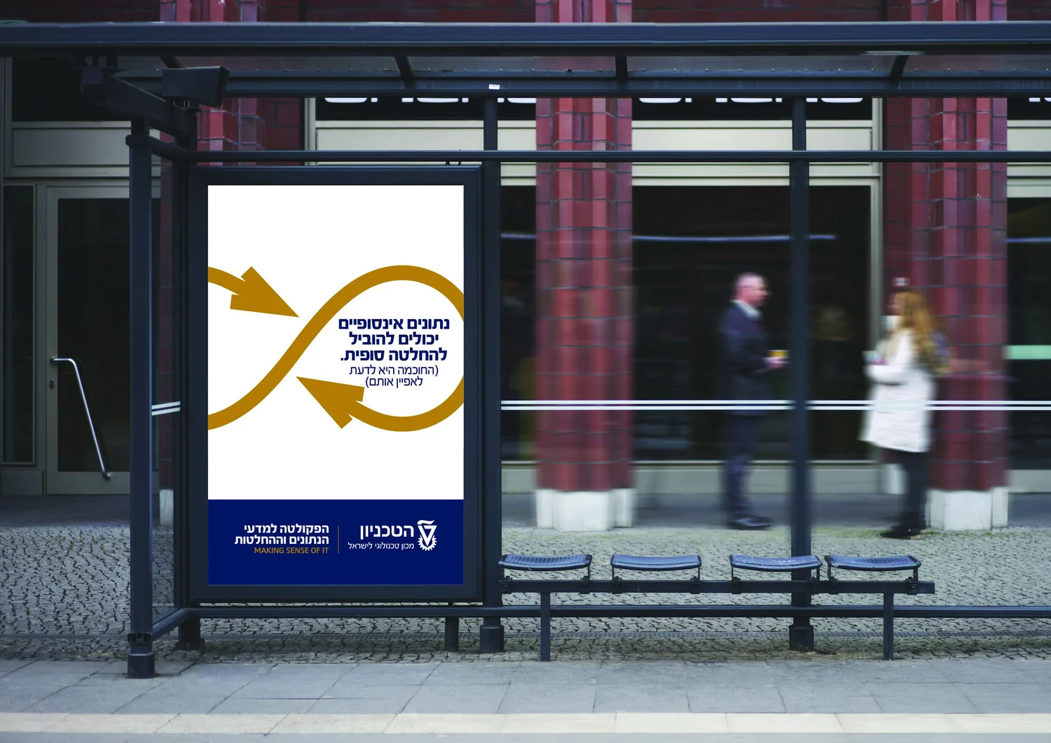
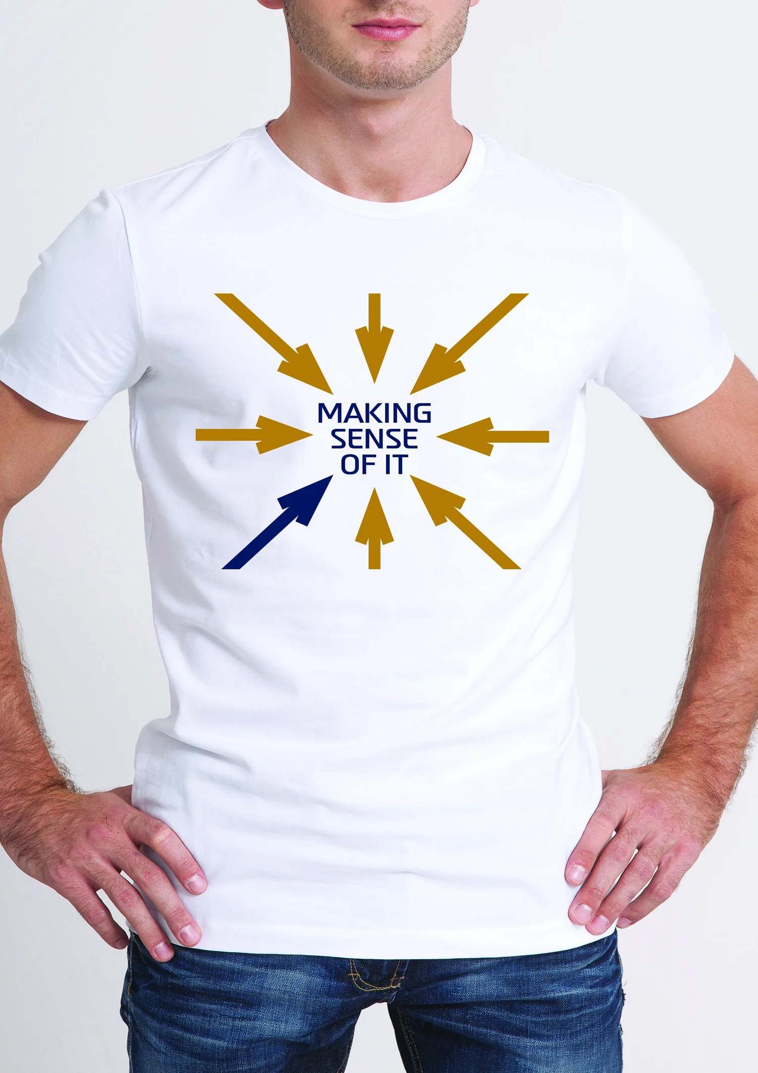
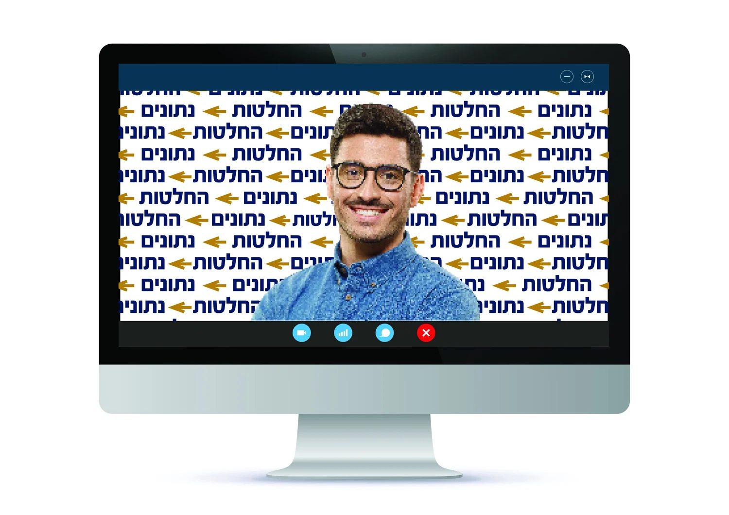
Data becomes direction. Arrows flow, meet and change course, translating the faculty’s core activity — turning complex information into decisions — into a visual system.
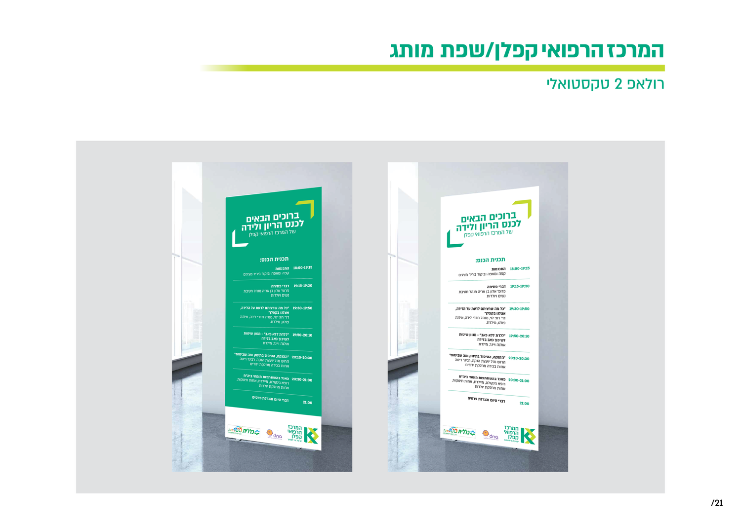
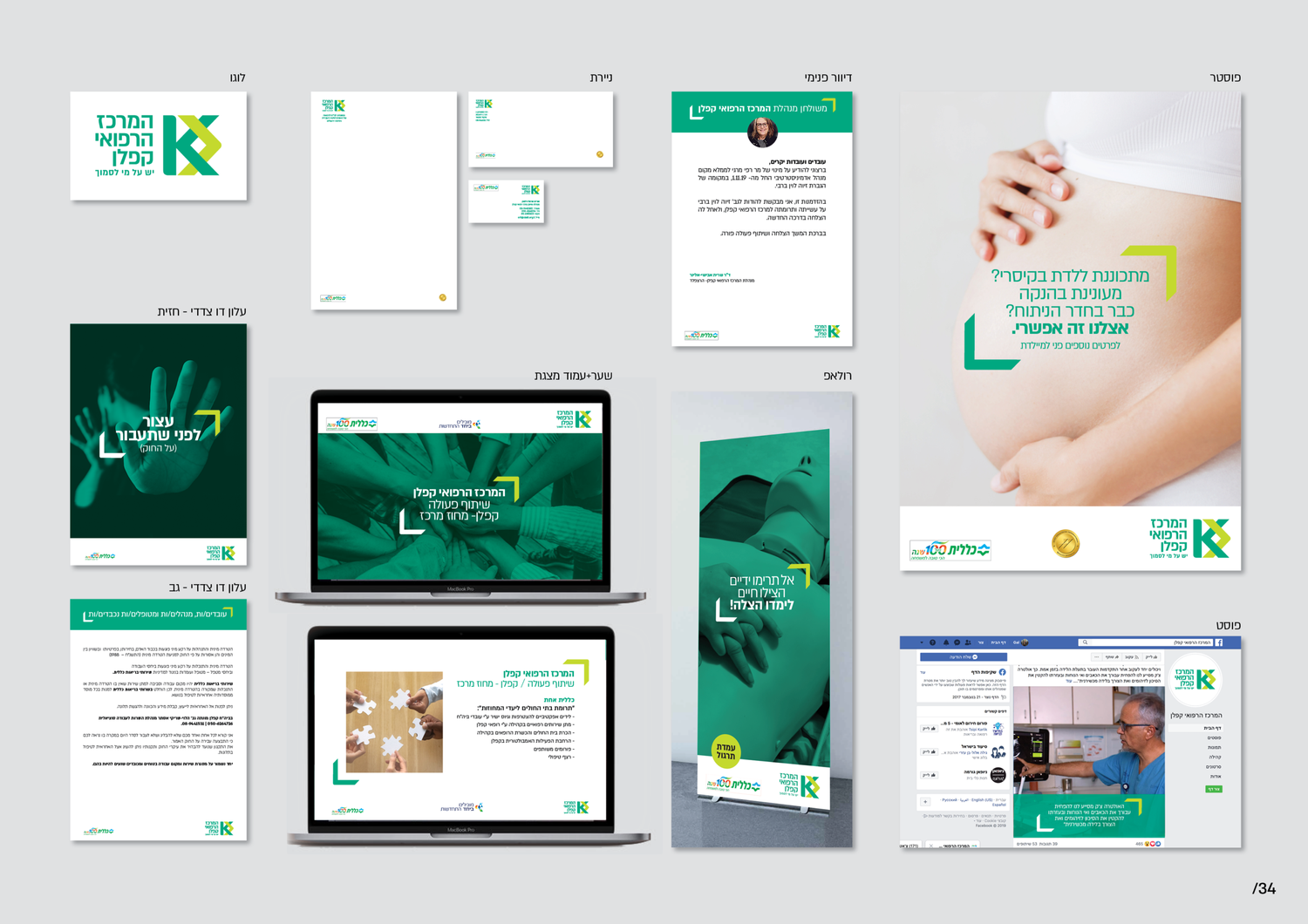
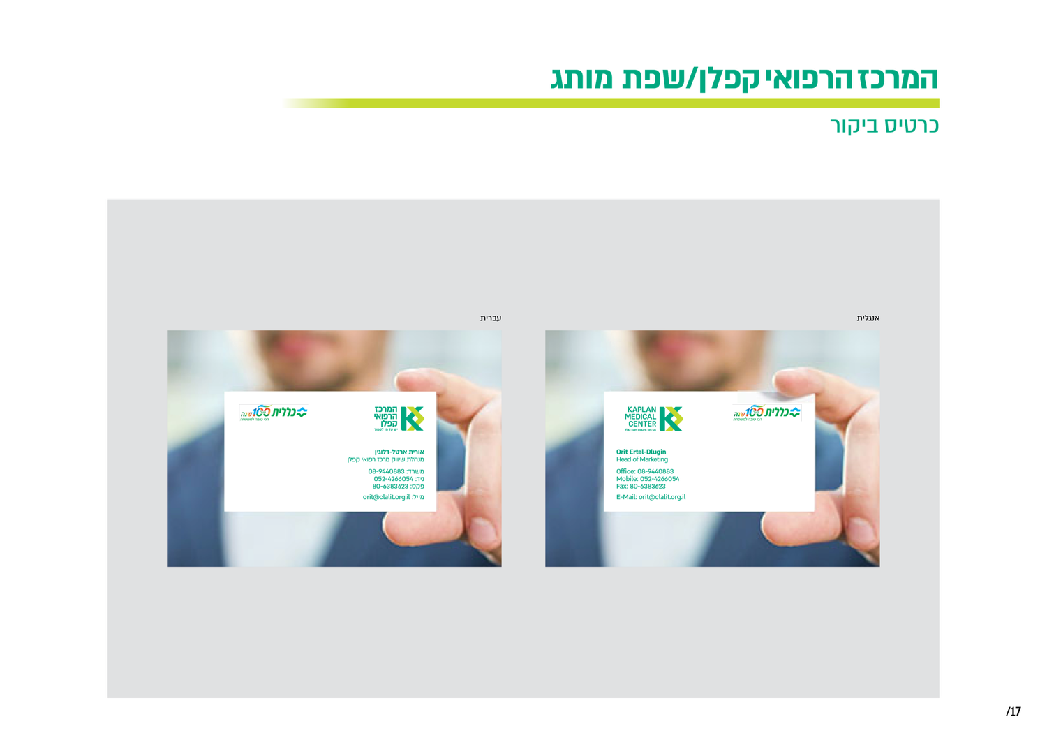
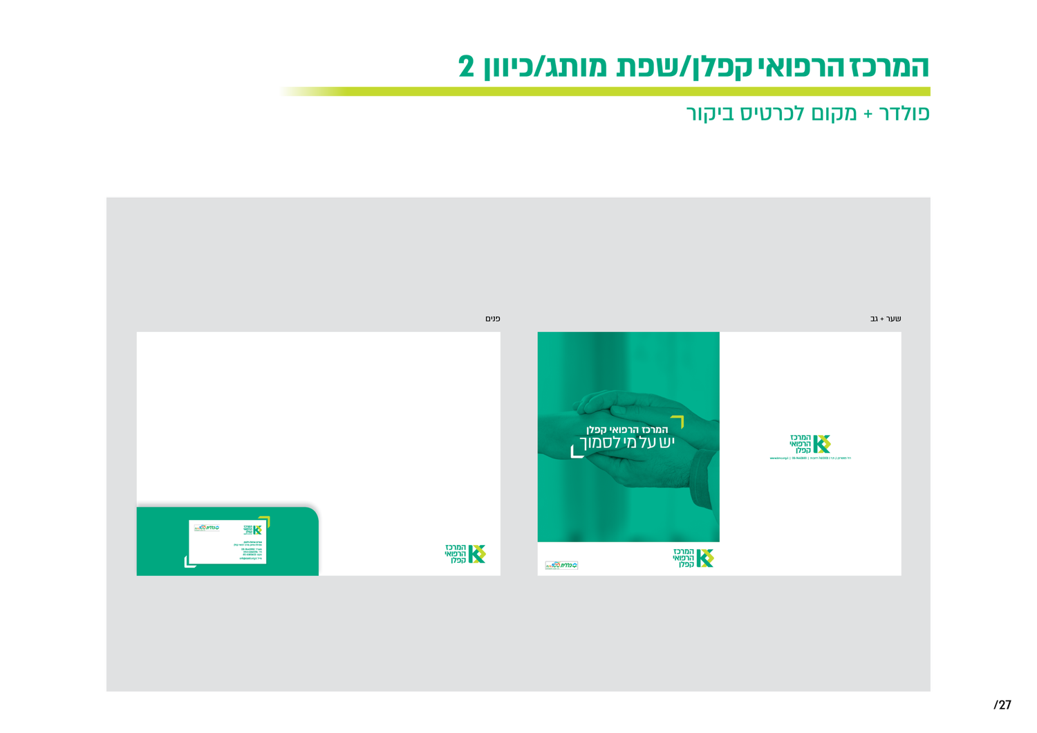
A medical institution is a maze of departments, people and information. The identity uses hierarchy and clarity to make that complexity feel more human and navigable.
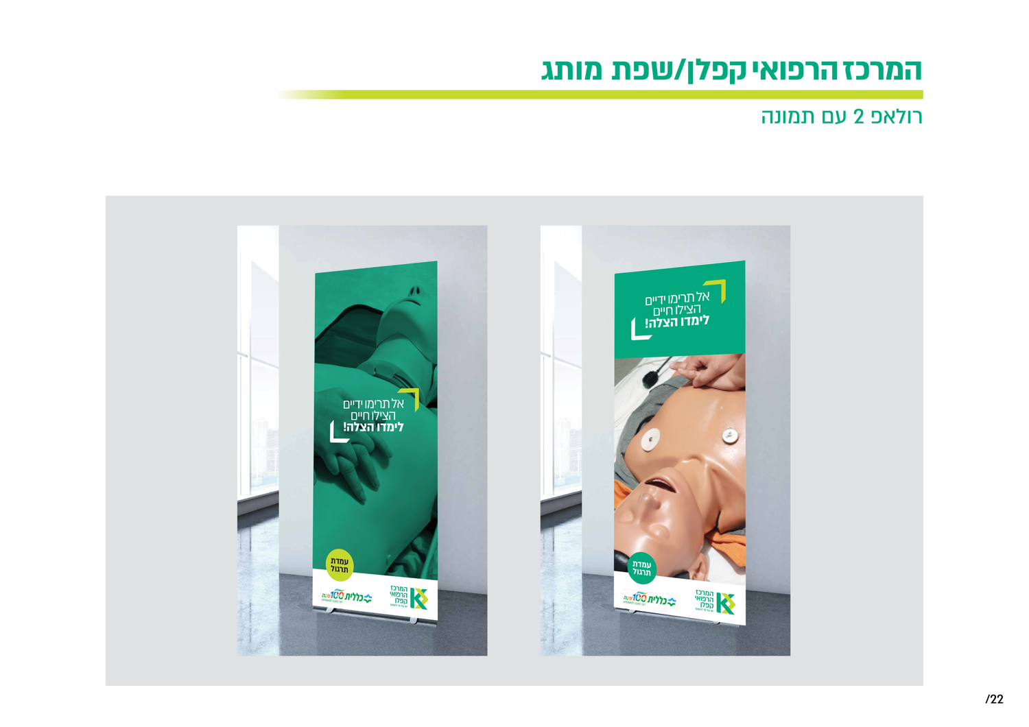
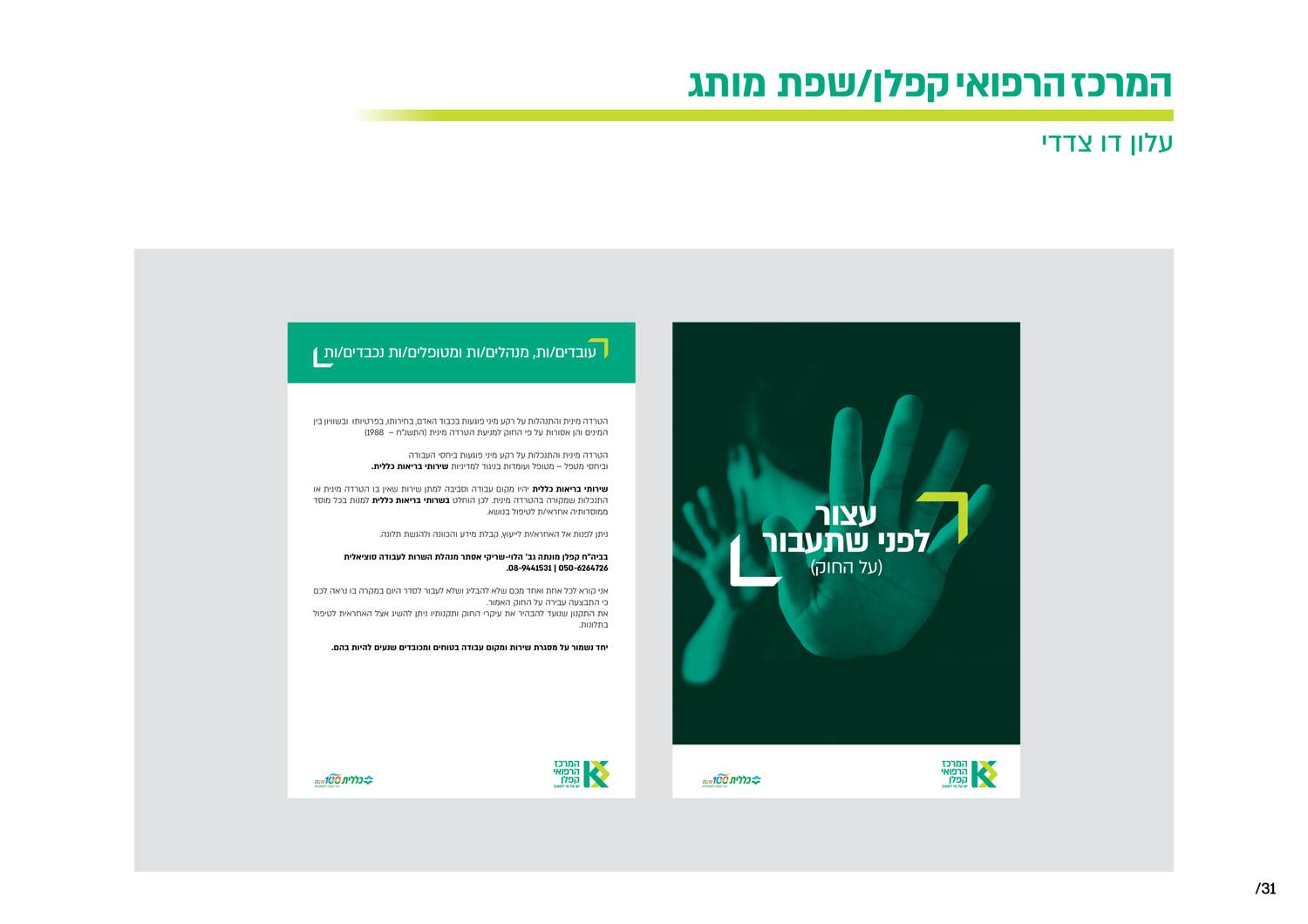
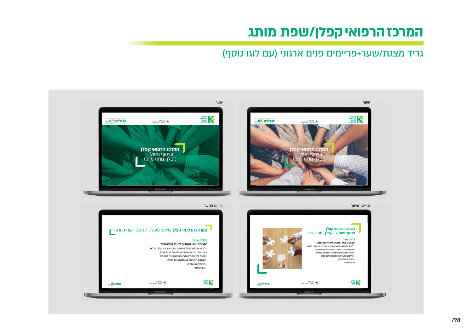
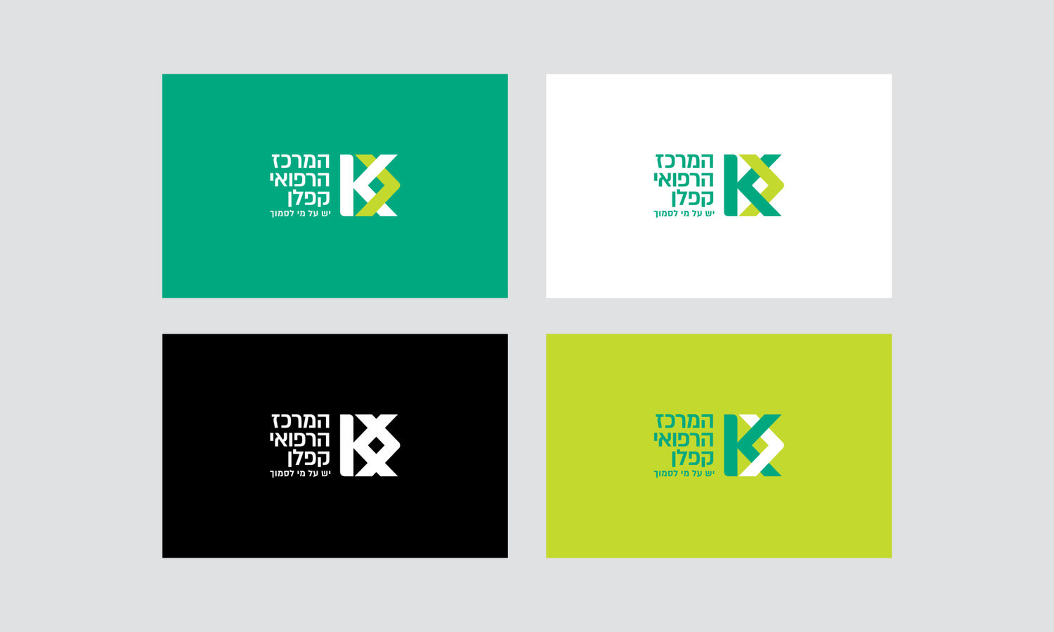
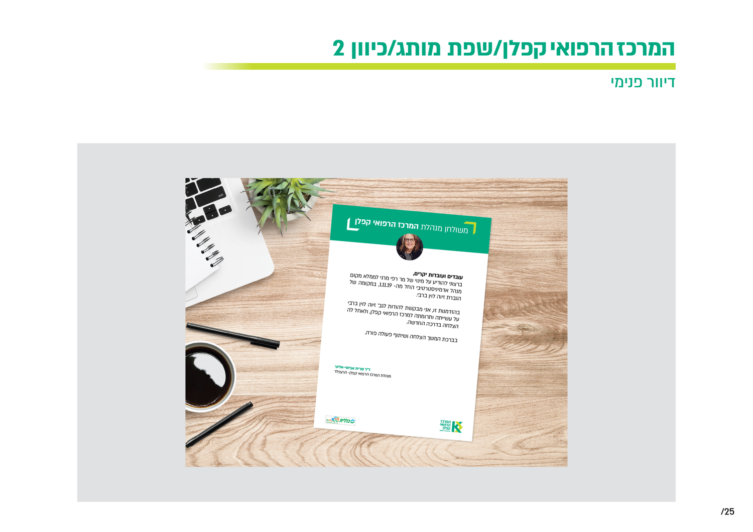
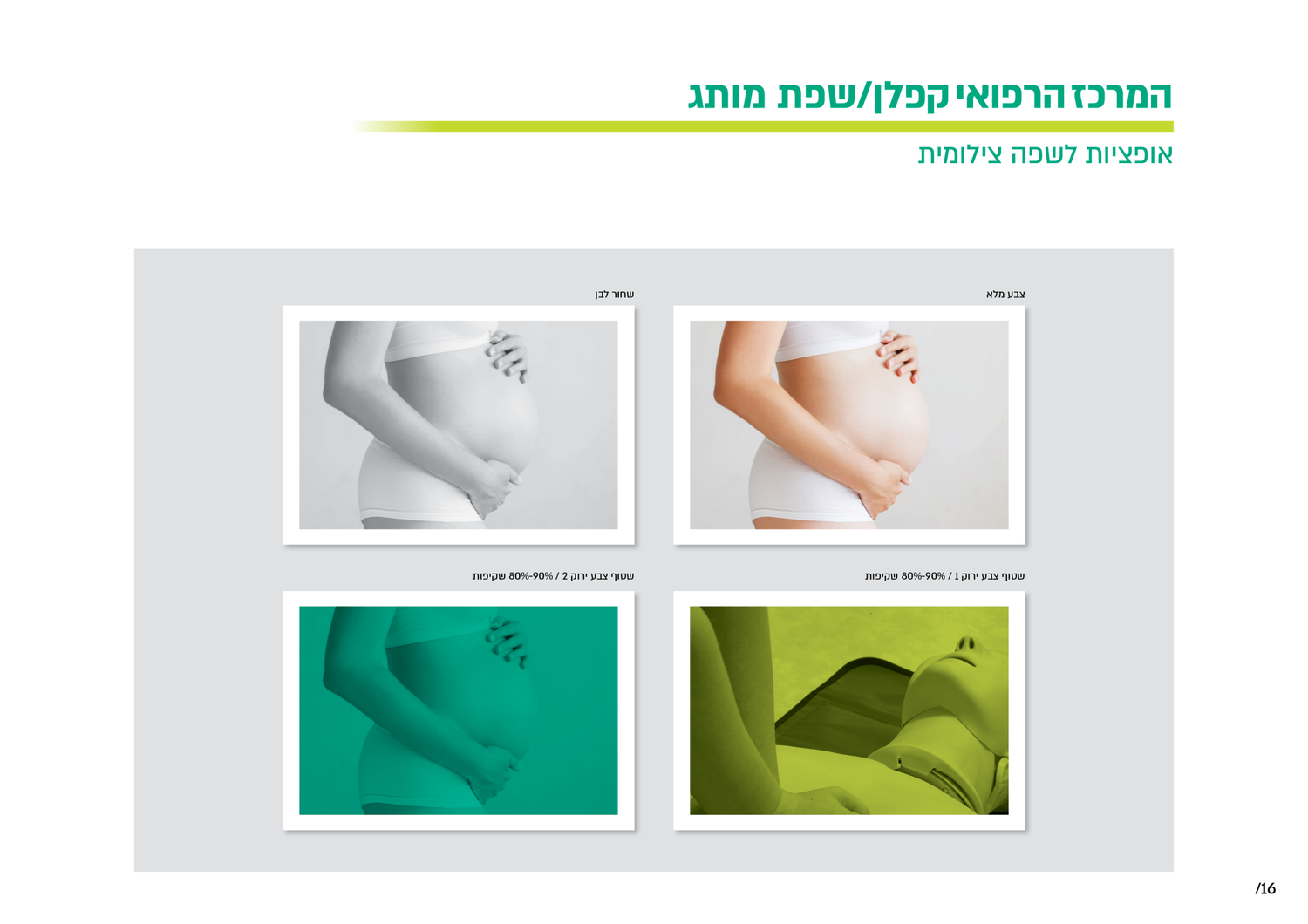
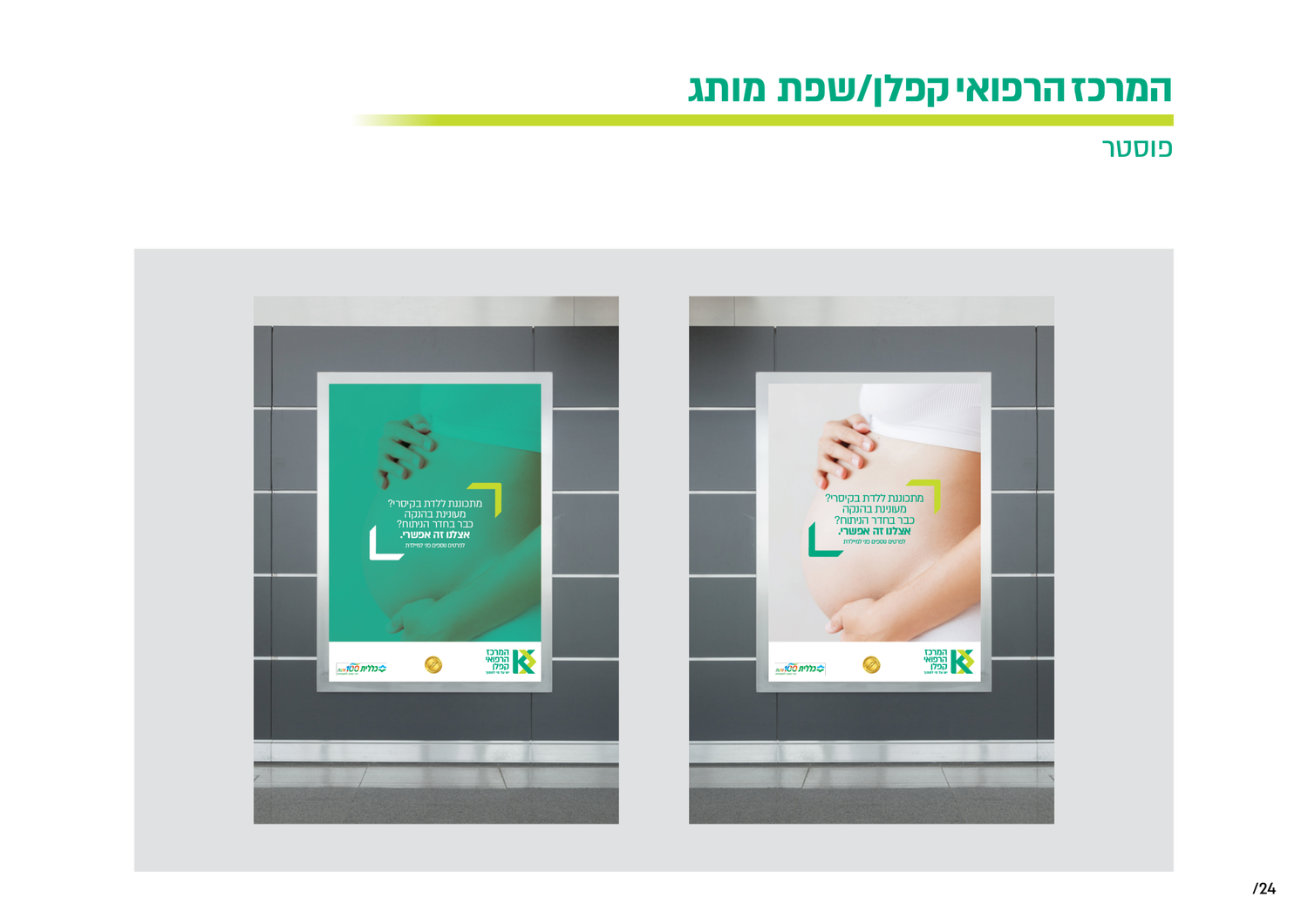
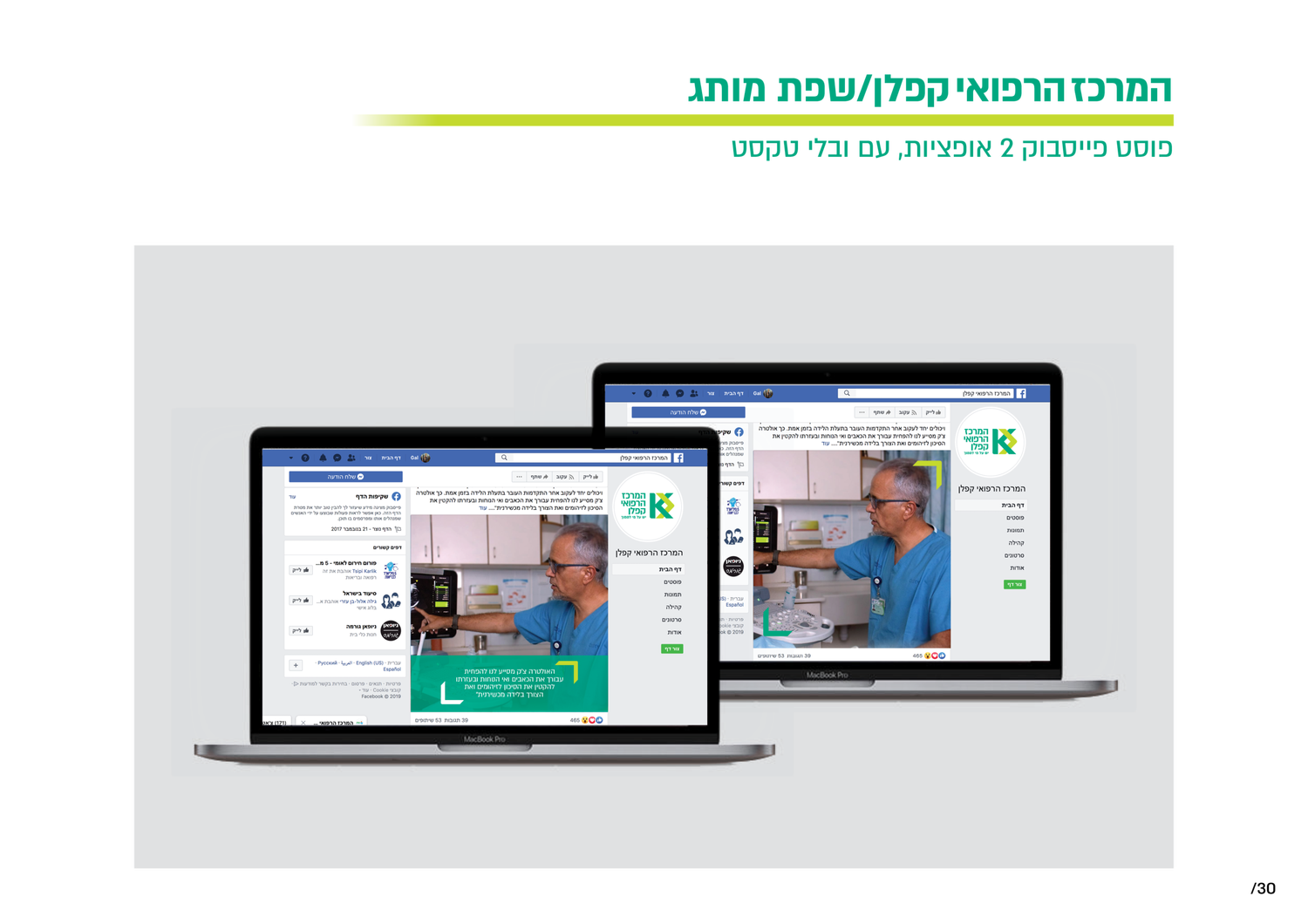
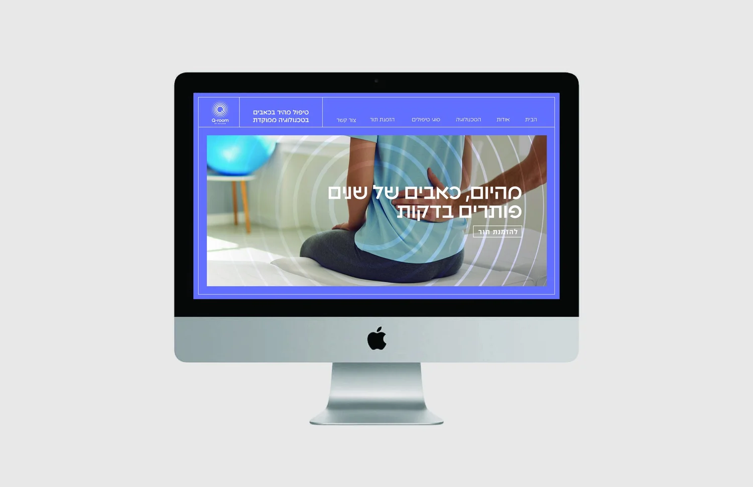
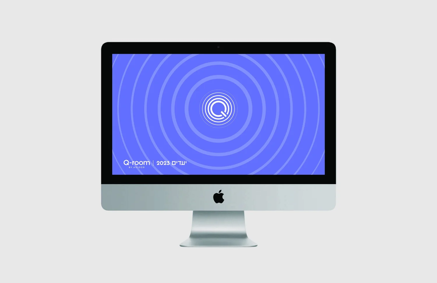
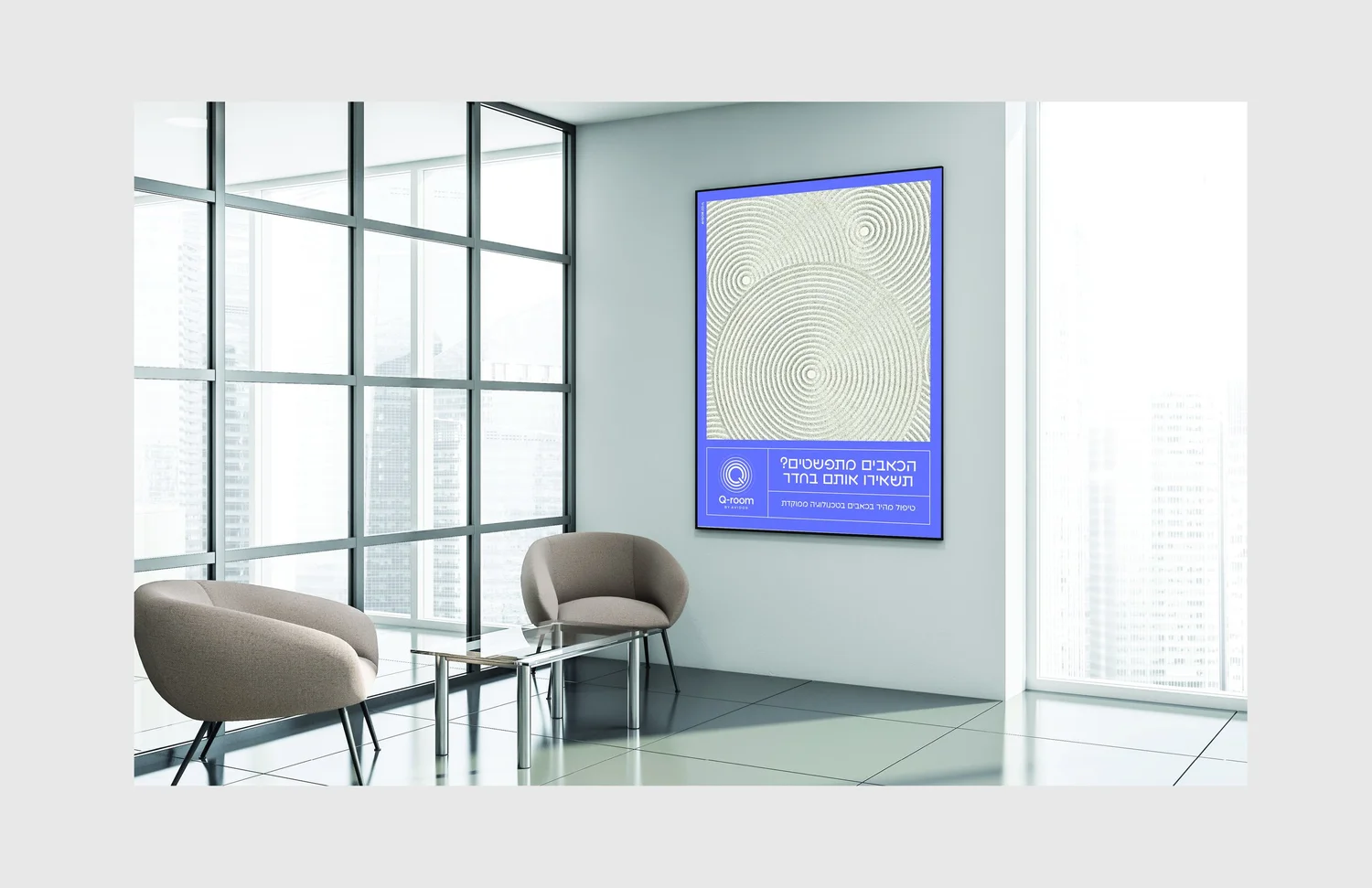
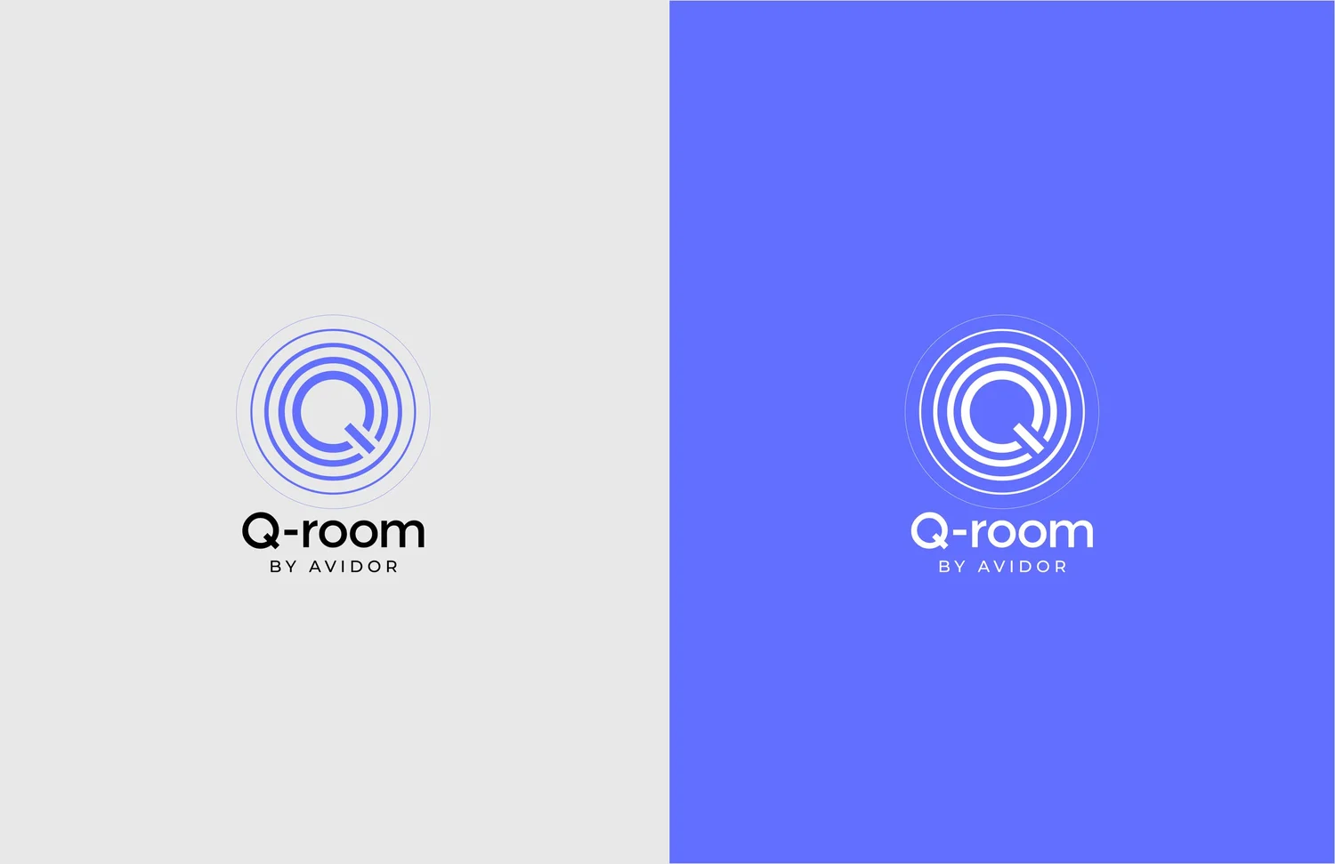
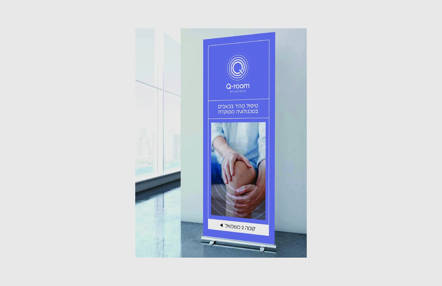
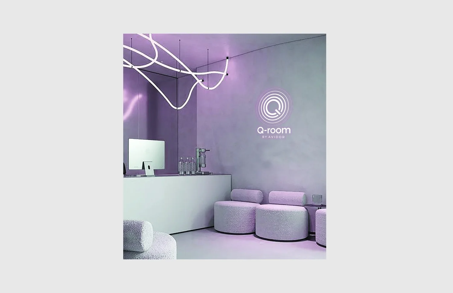
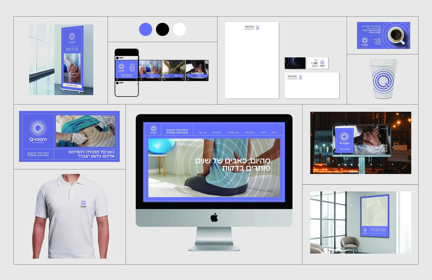
Quiet meets cure. The name and visual language create a calm space around advanced pain treatment — clinical enough to feel precise, soft enough to feel reassuring.
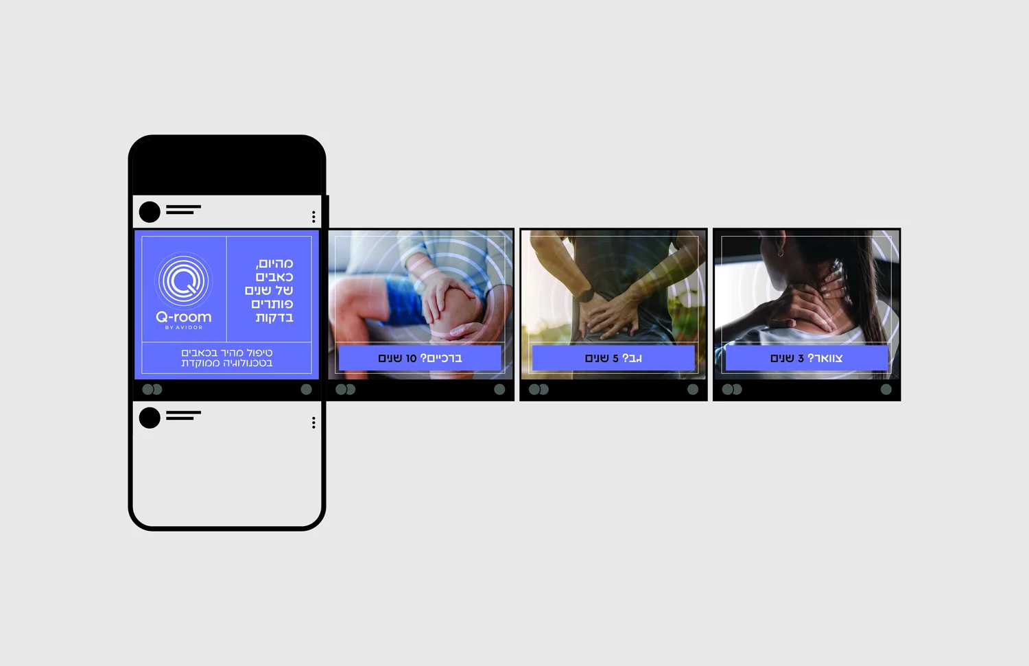
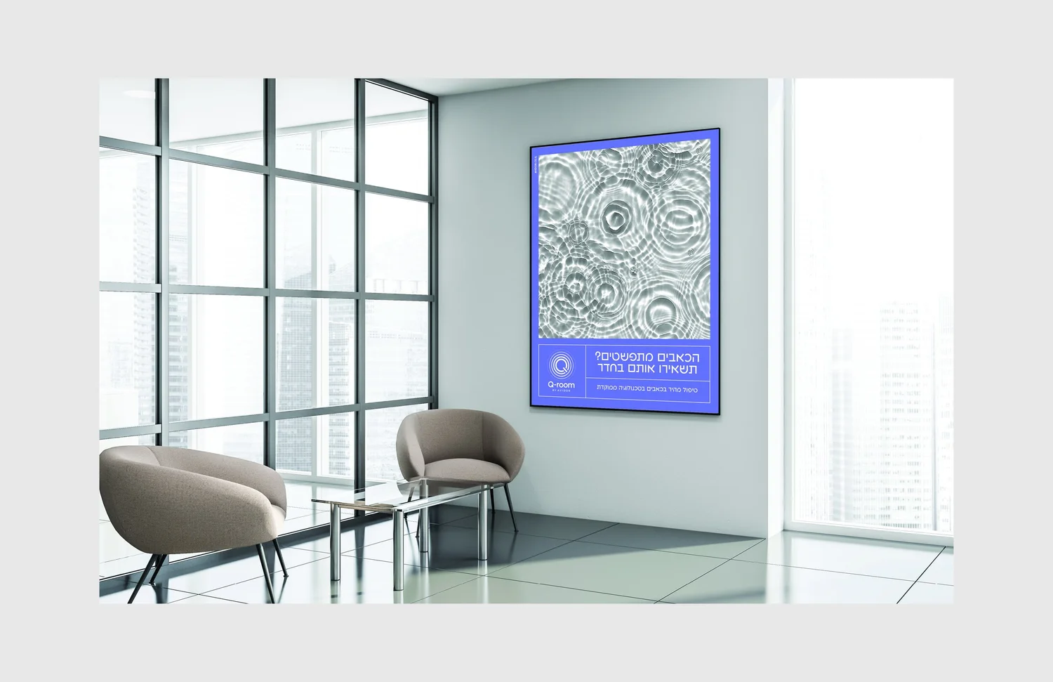
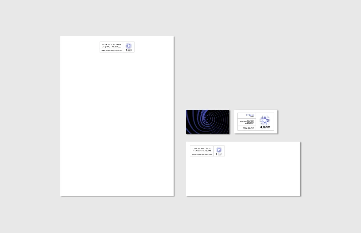
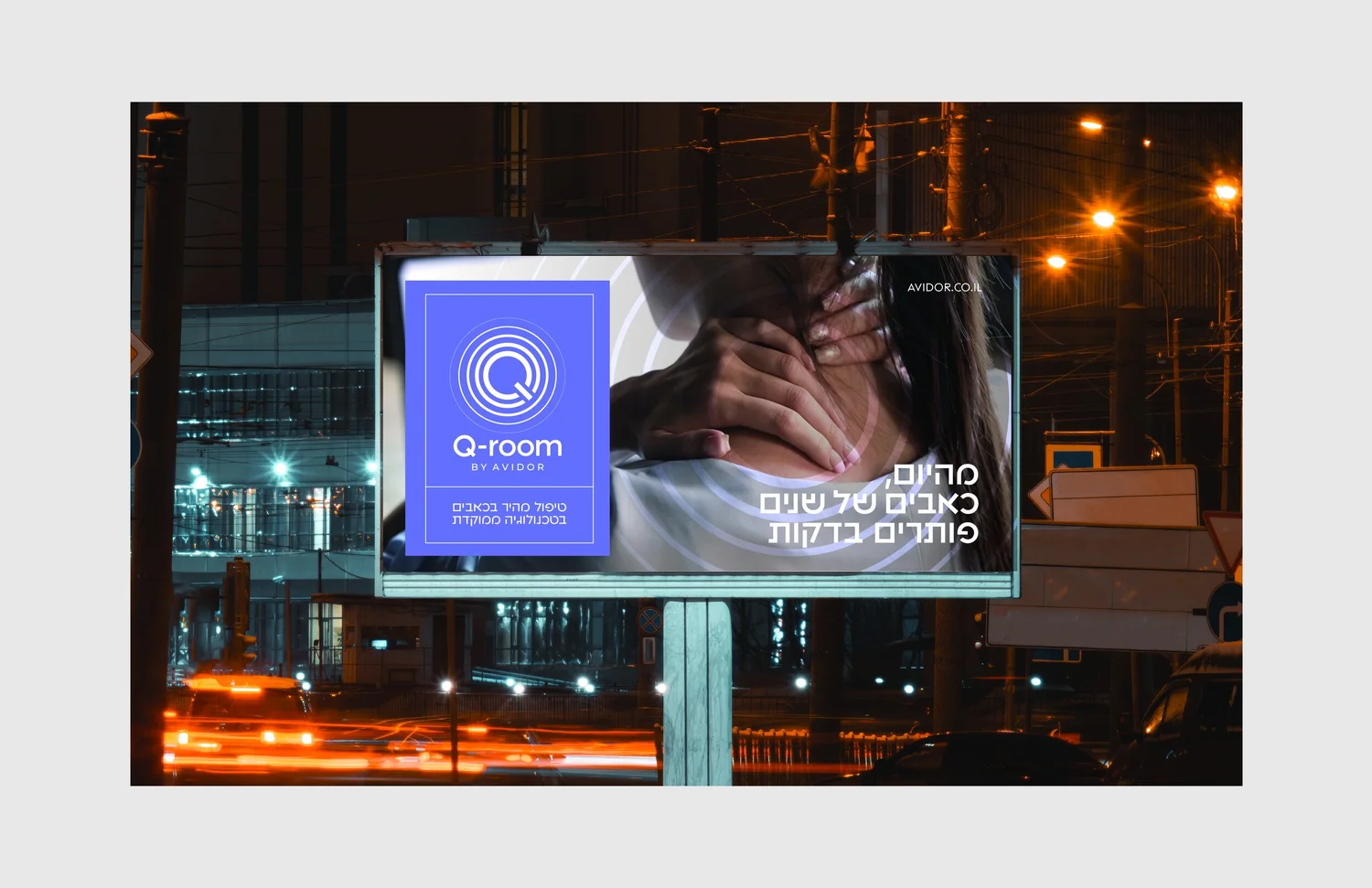
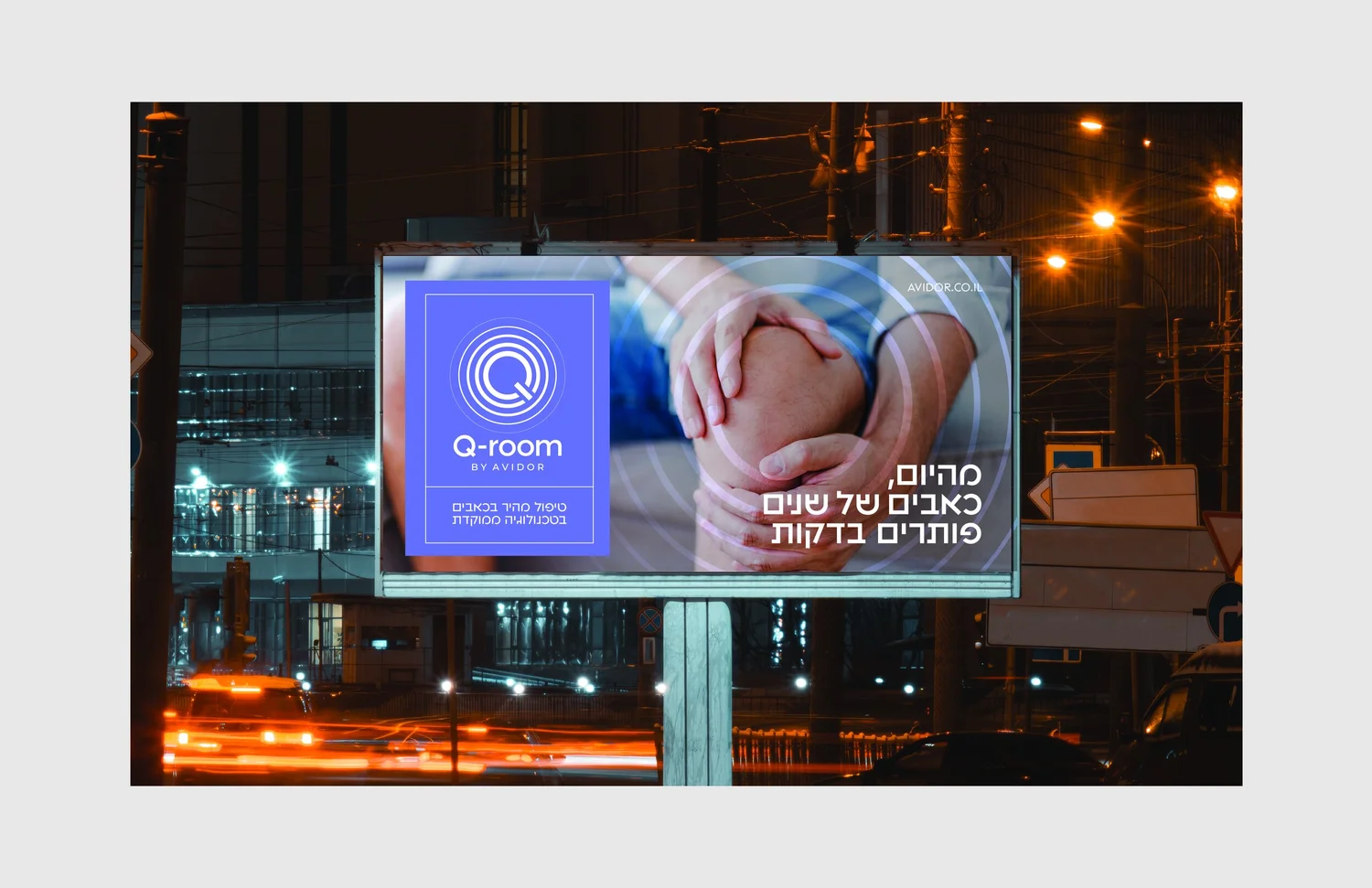
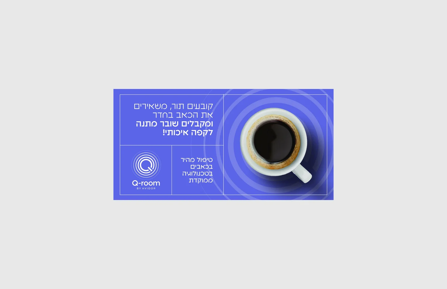
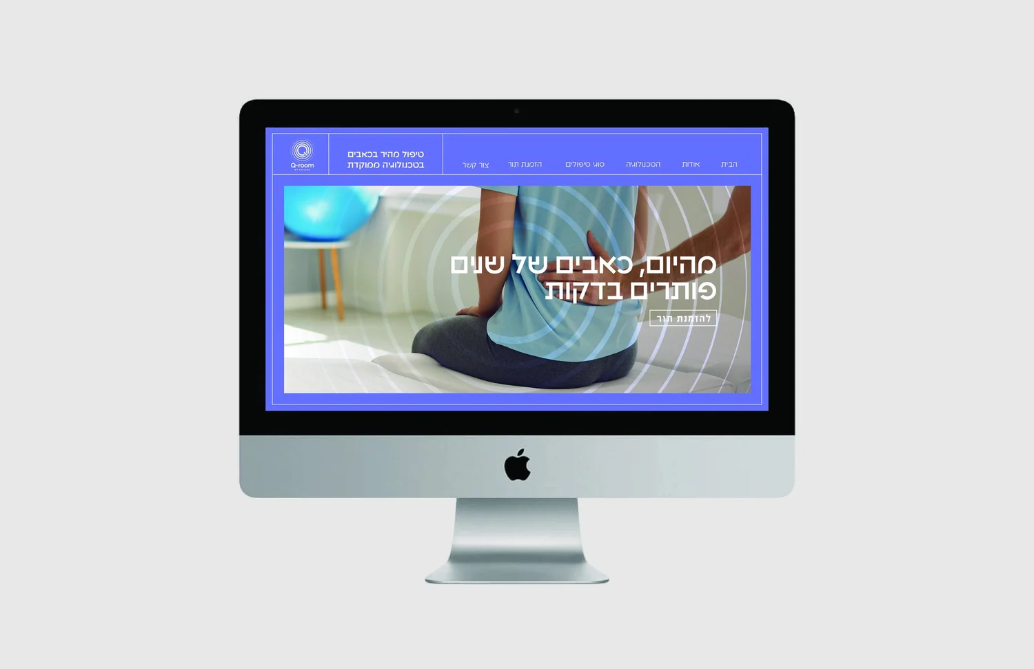
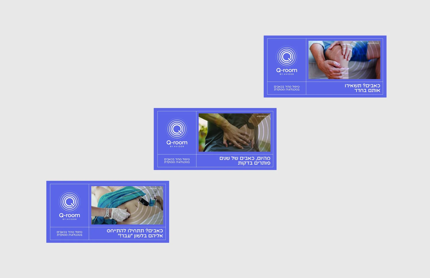
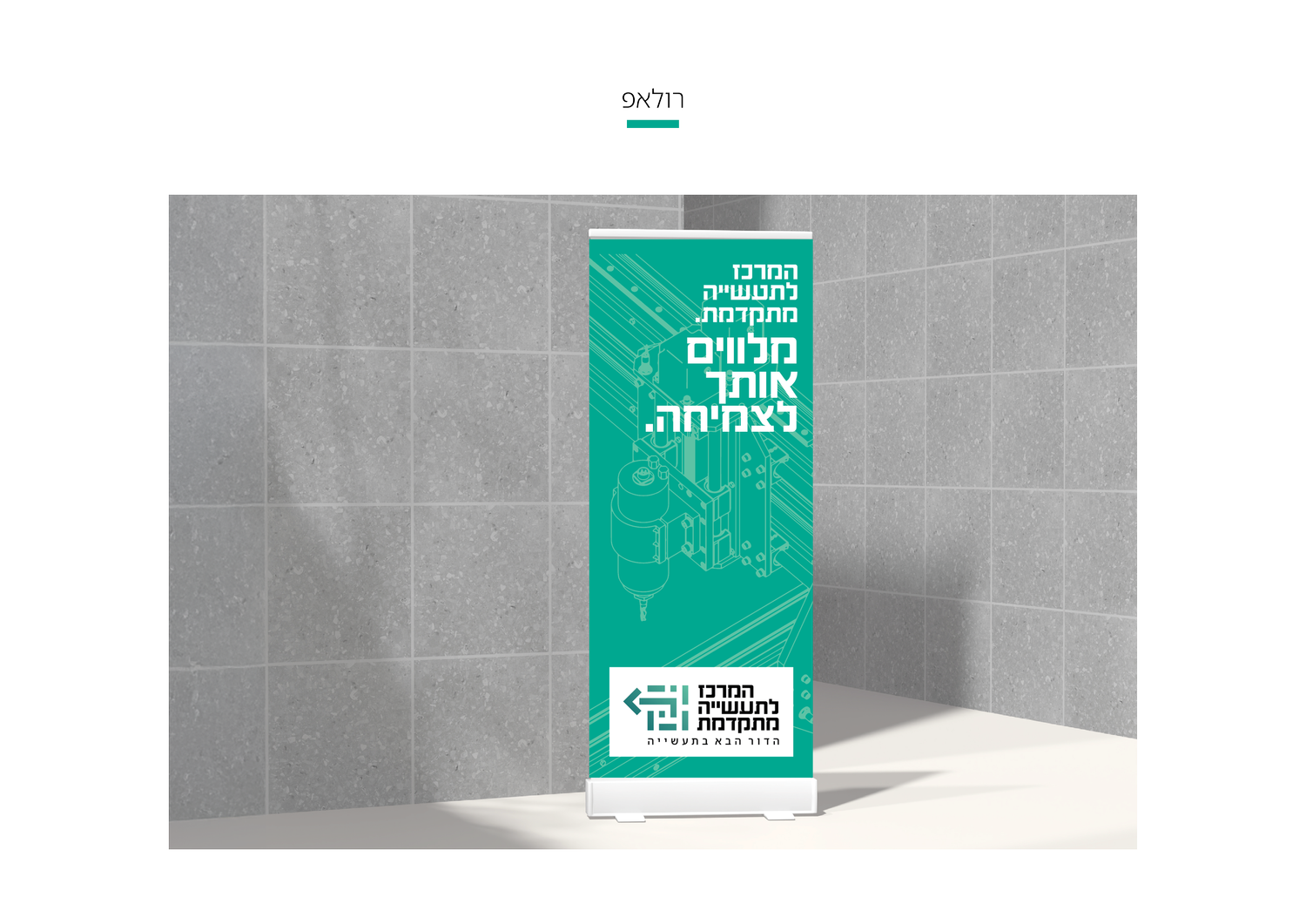
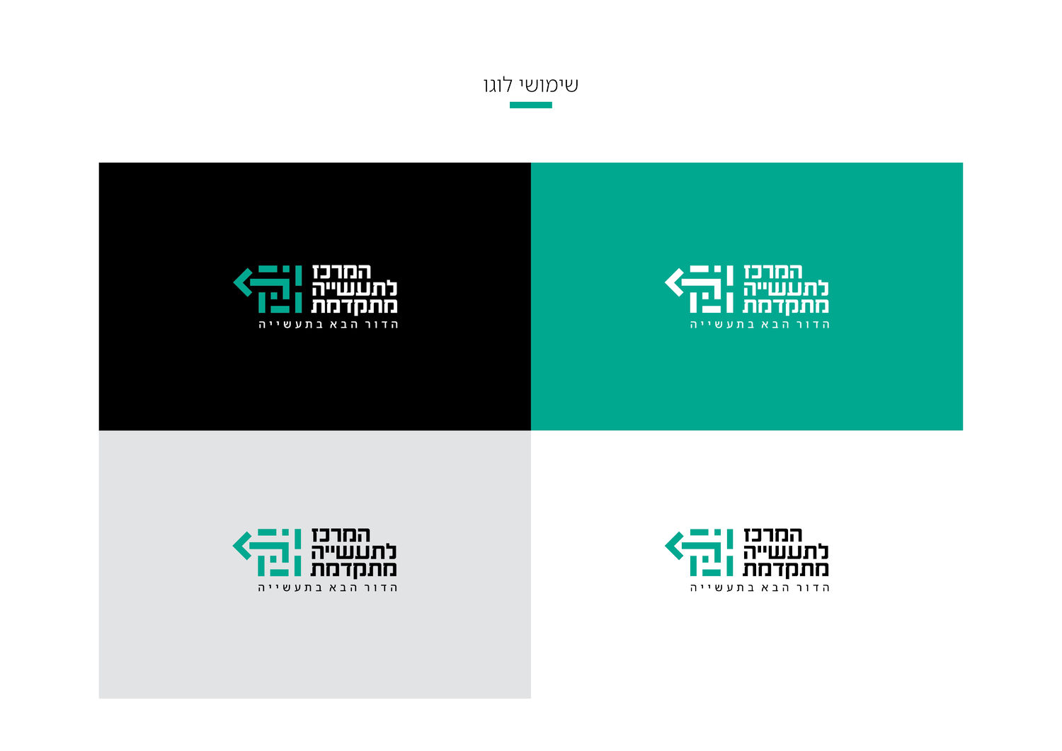
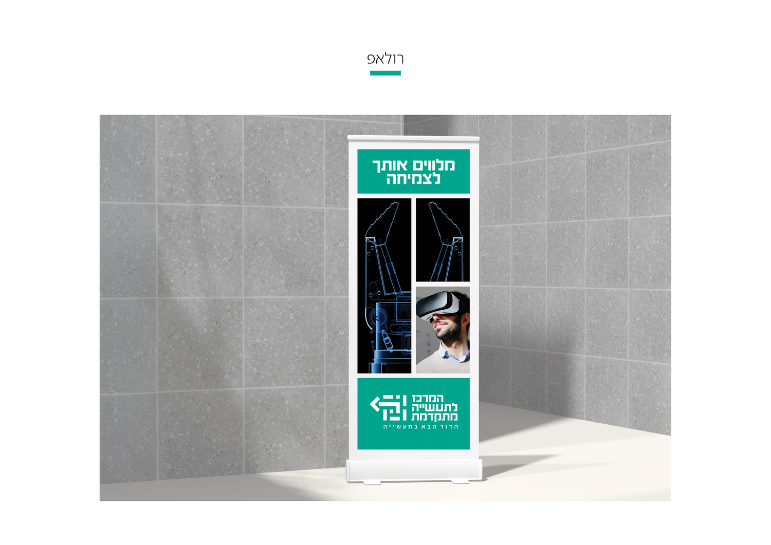
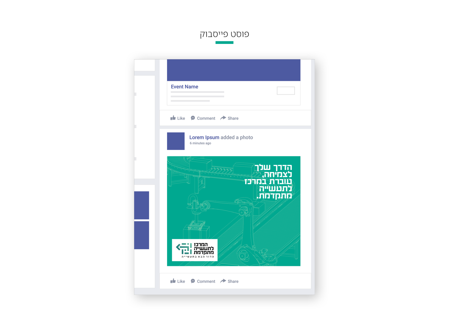
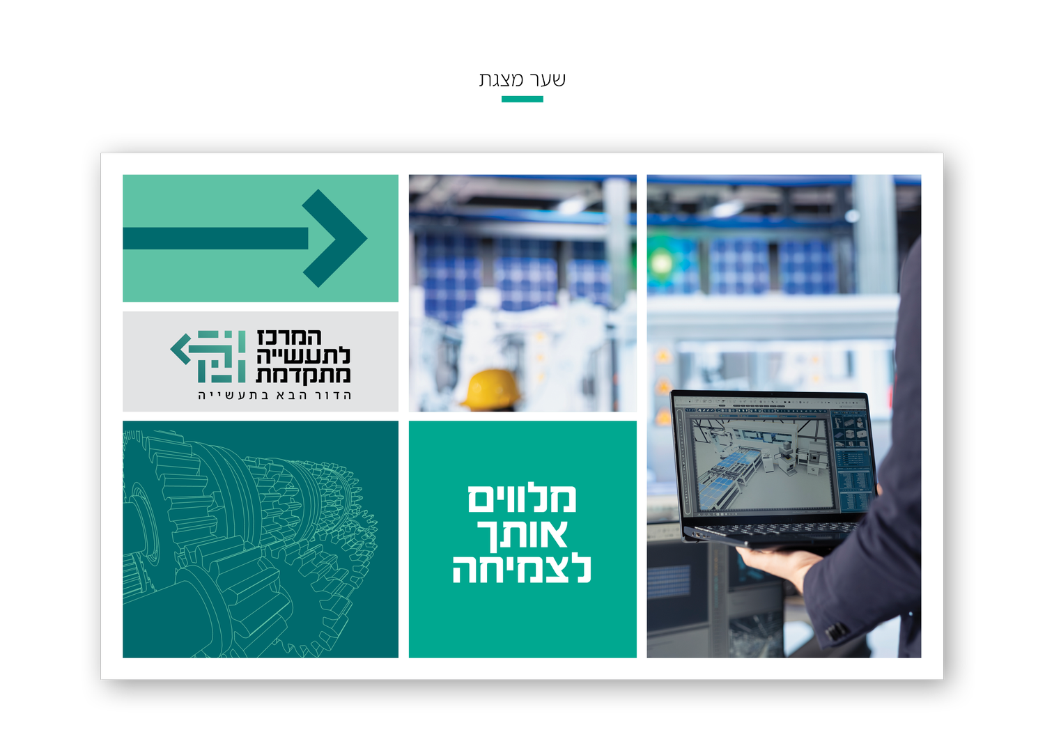
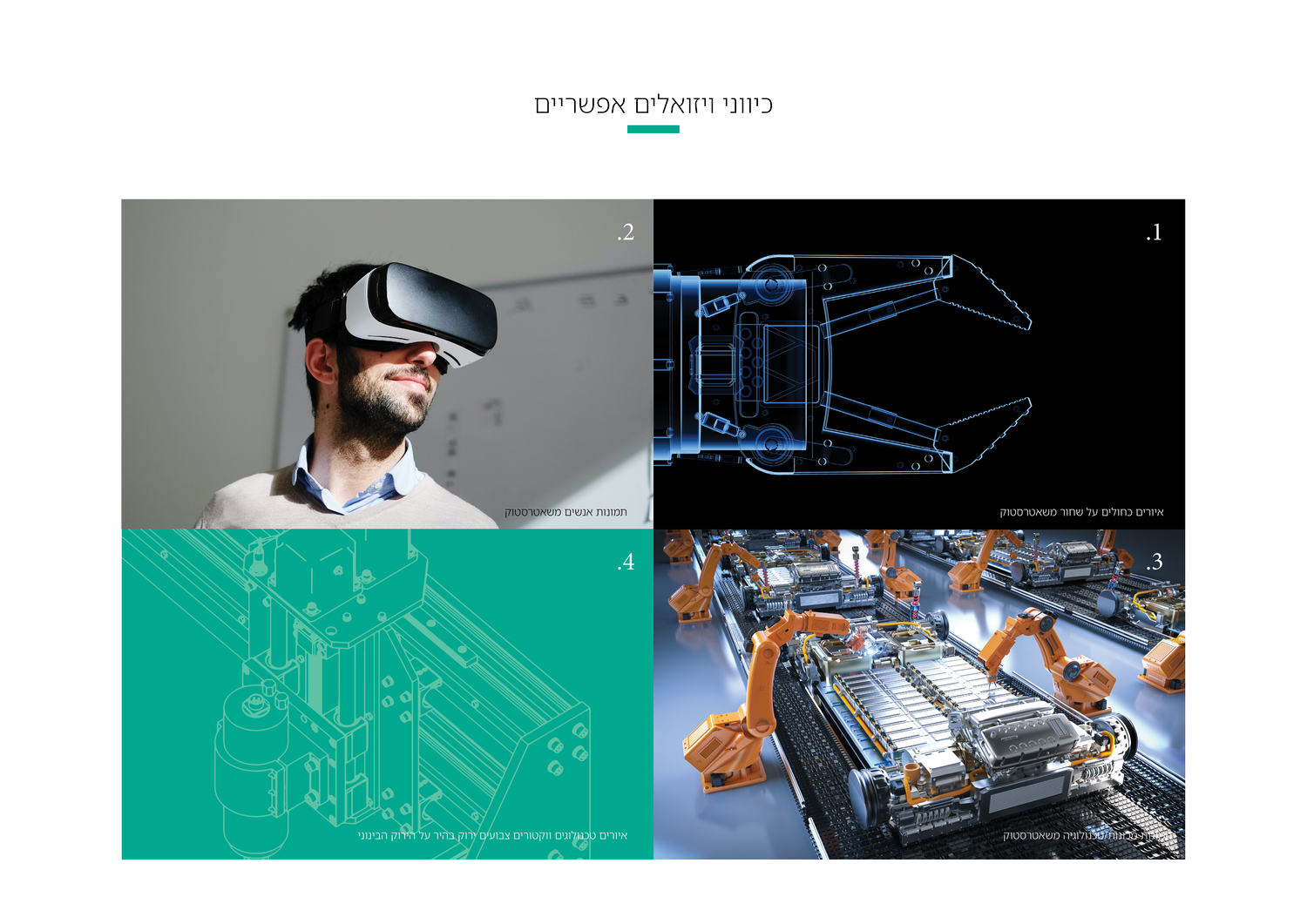
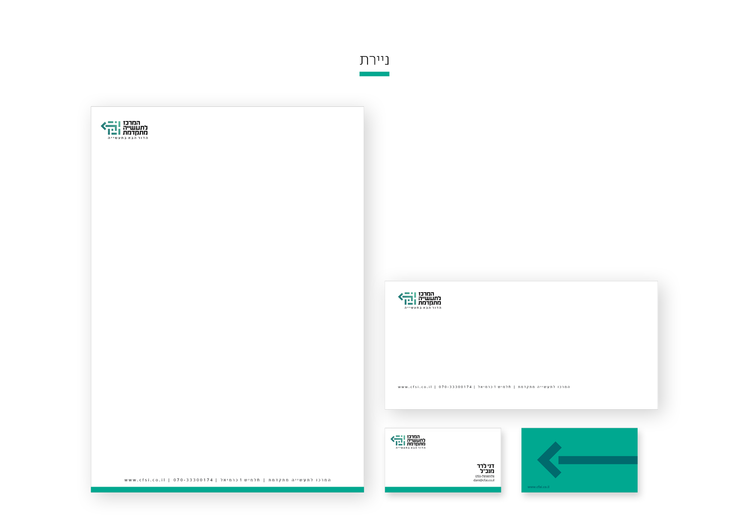
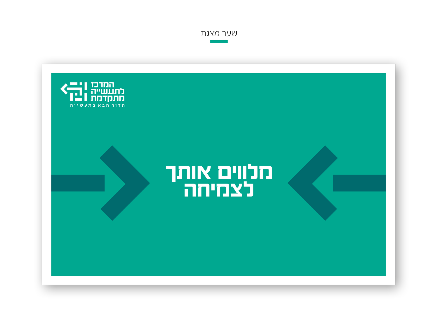
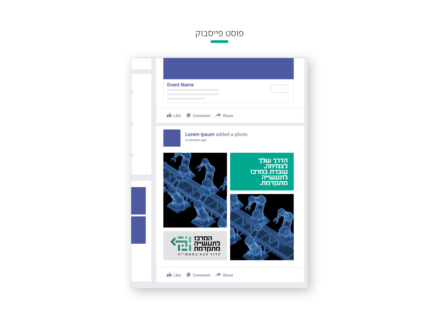
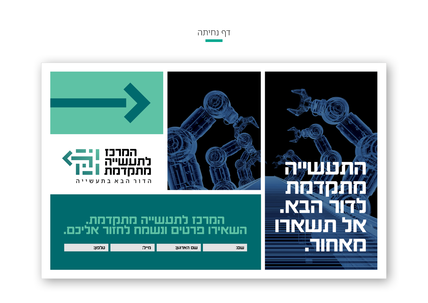
Advanced industry is translated into a language of systems, components and controlled movement — closer to an engineering diagram than to conventional corporate decoration.
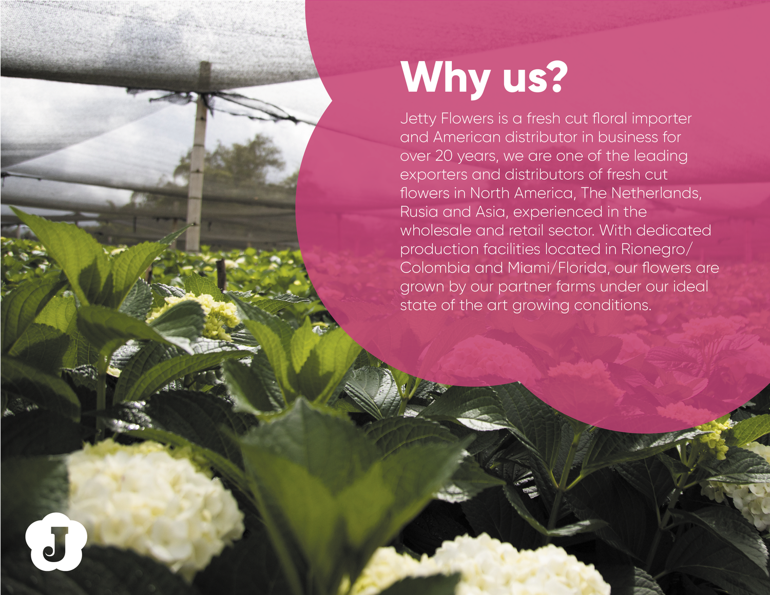
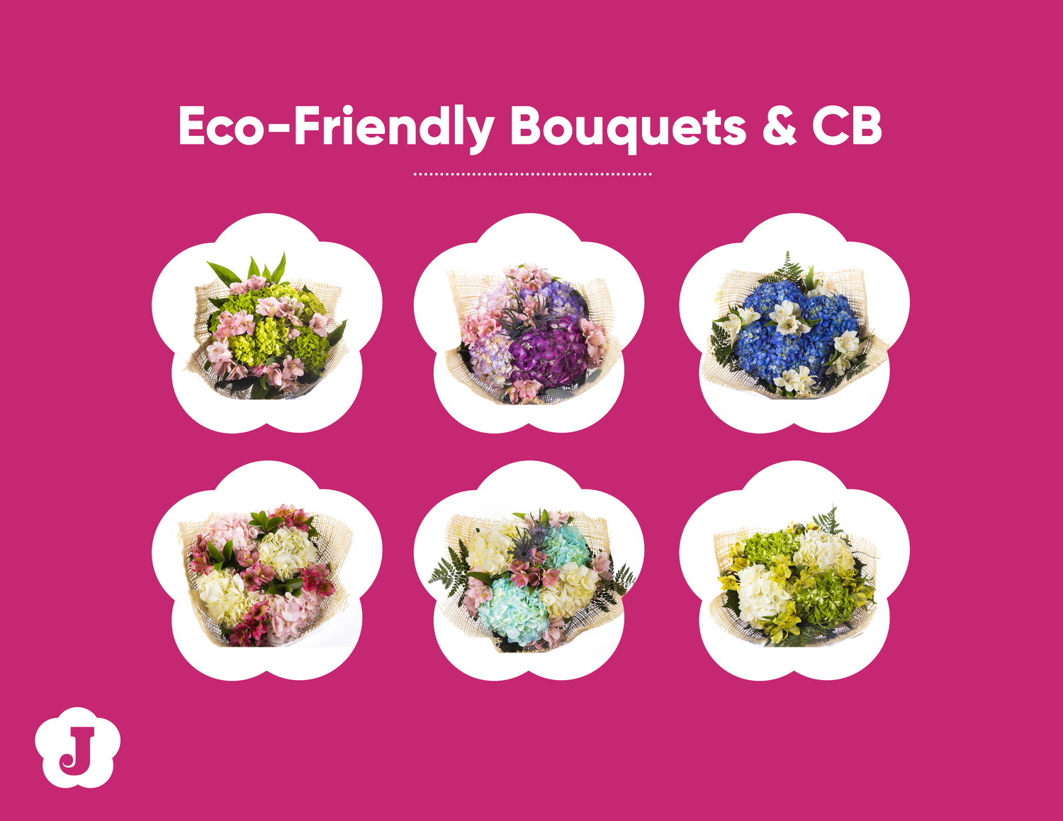
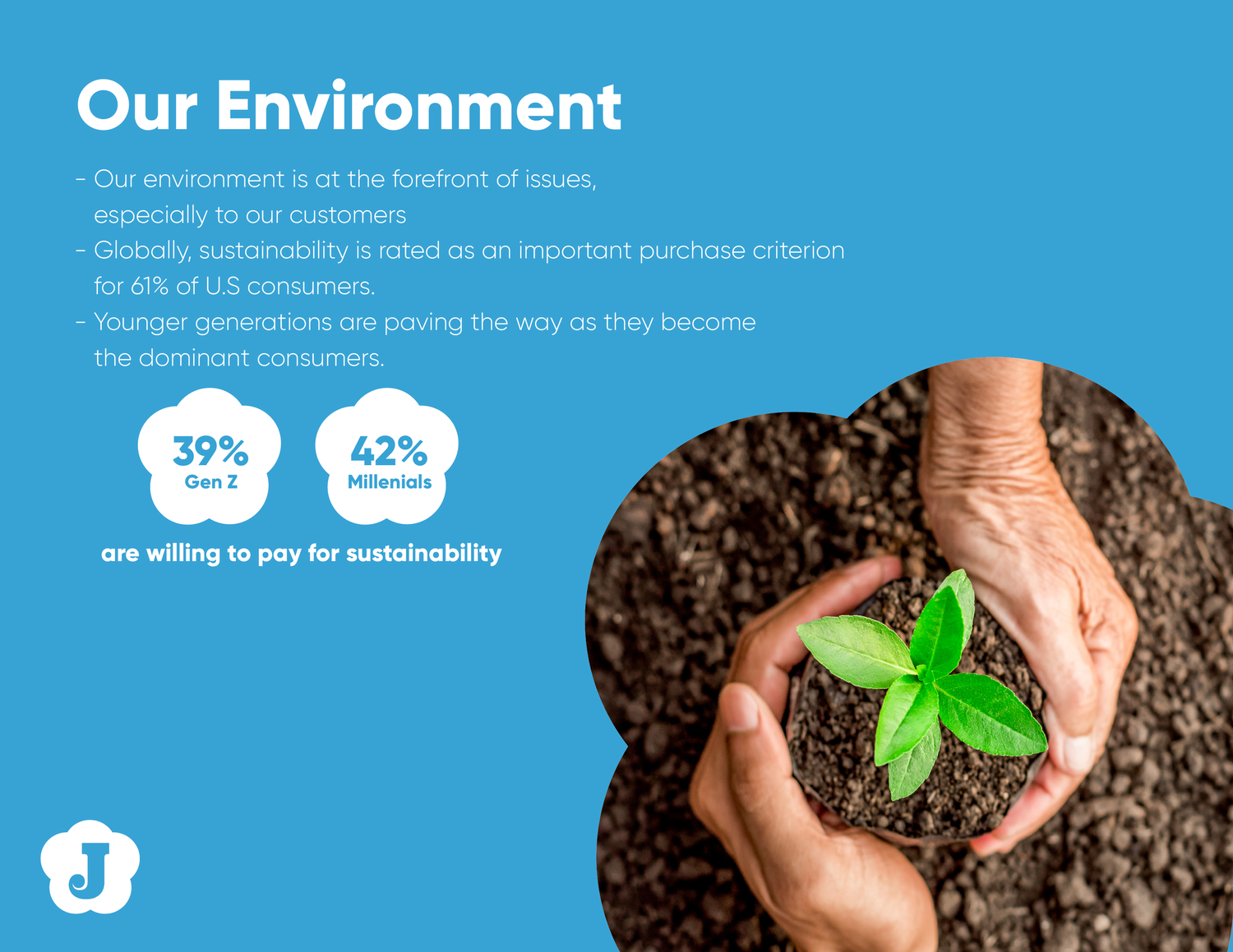
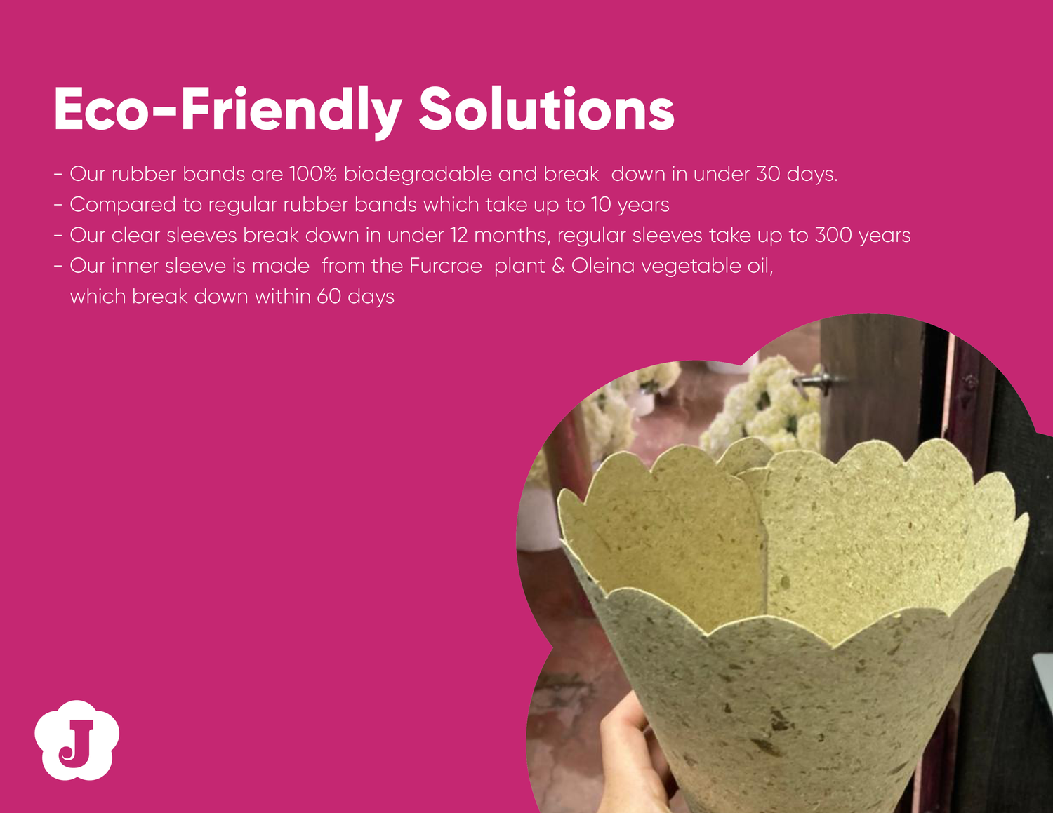
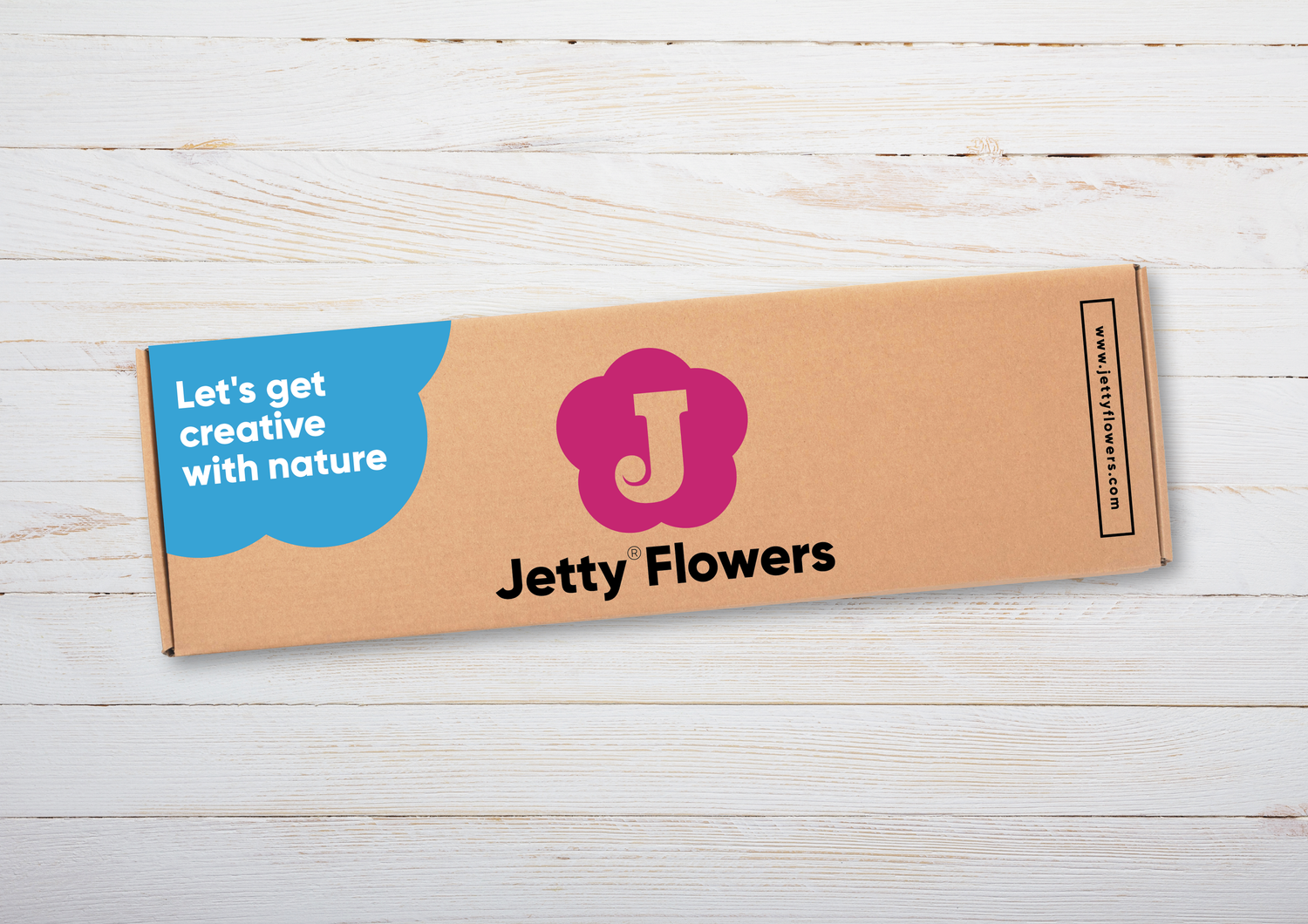
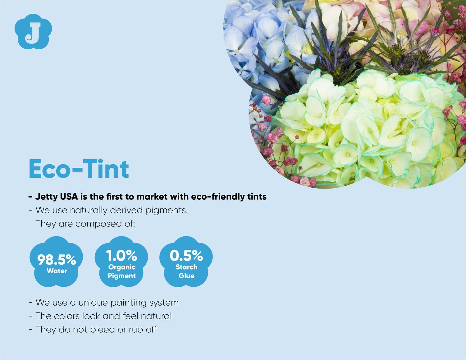
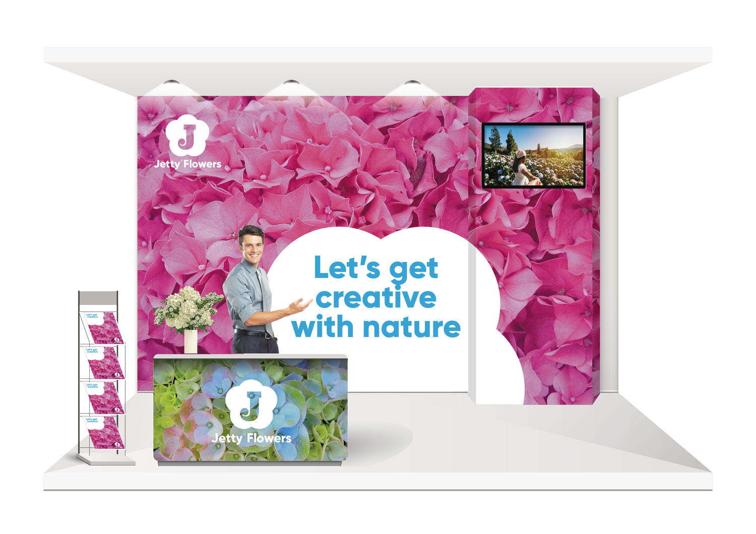
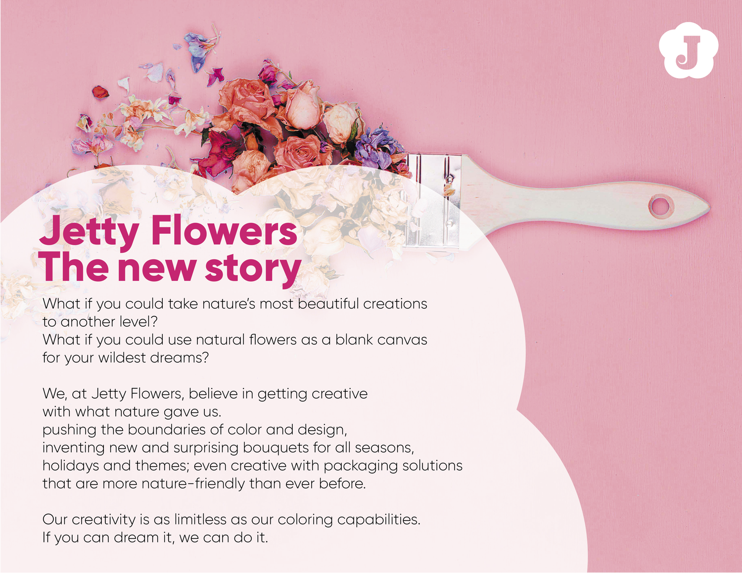
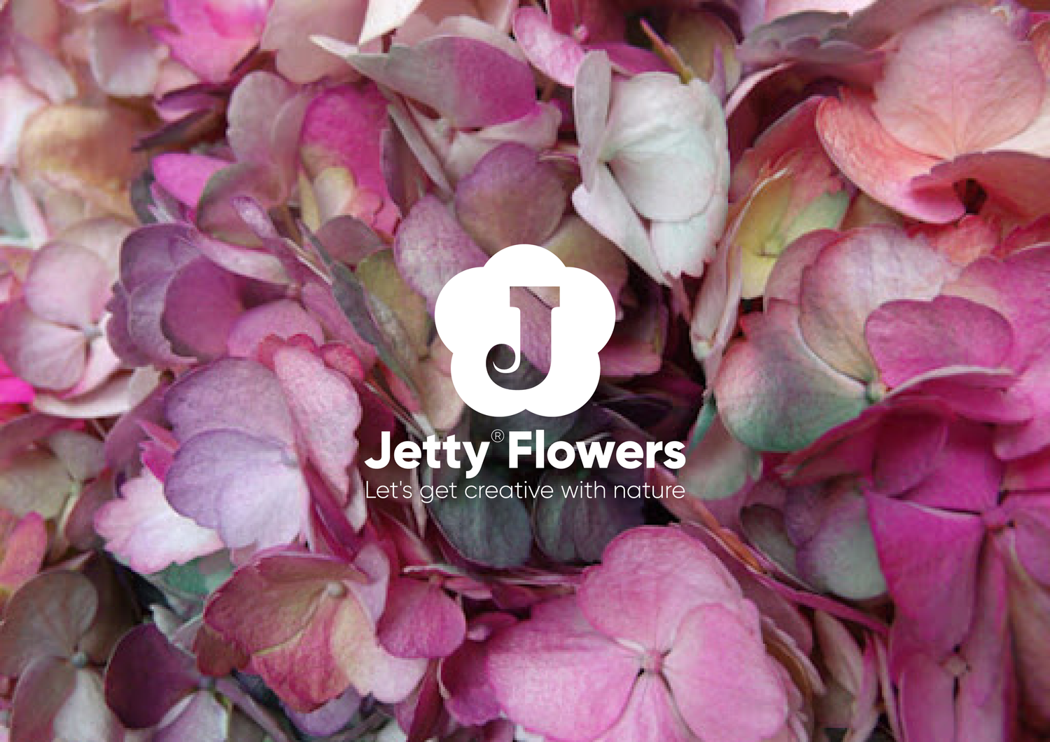
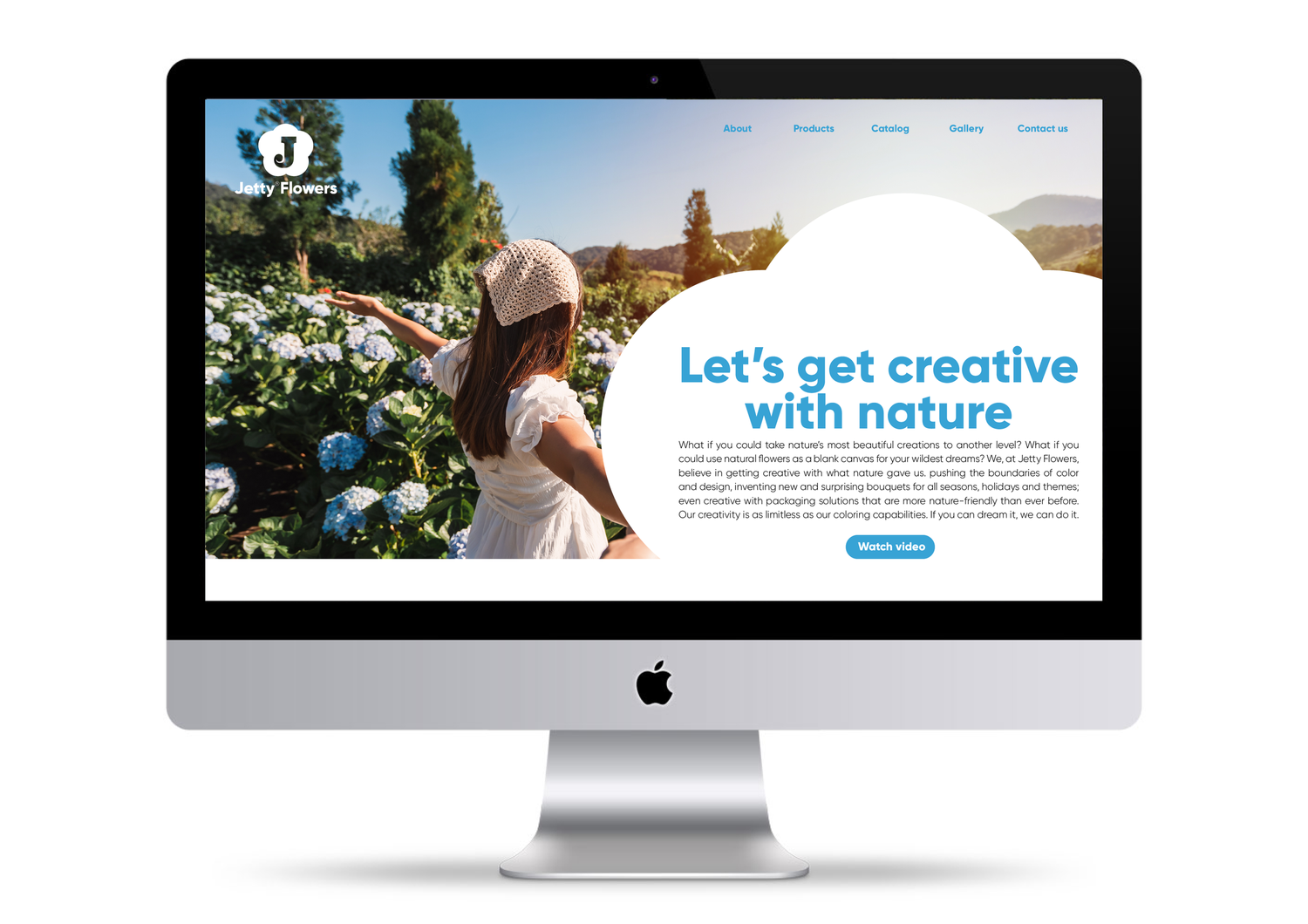
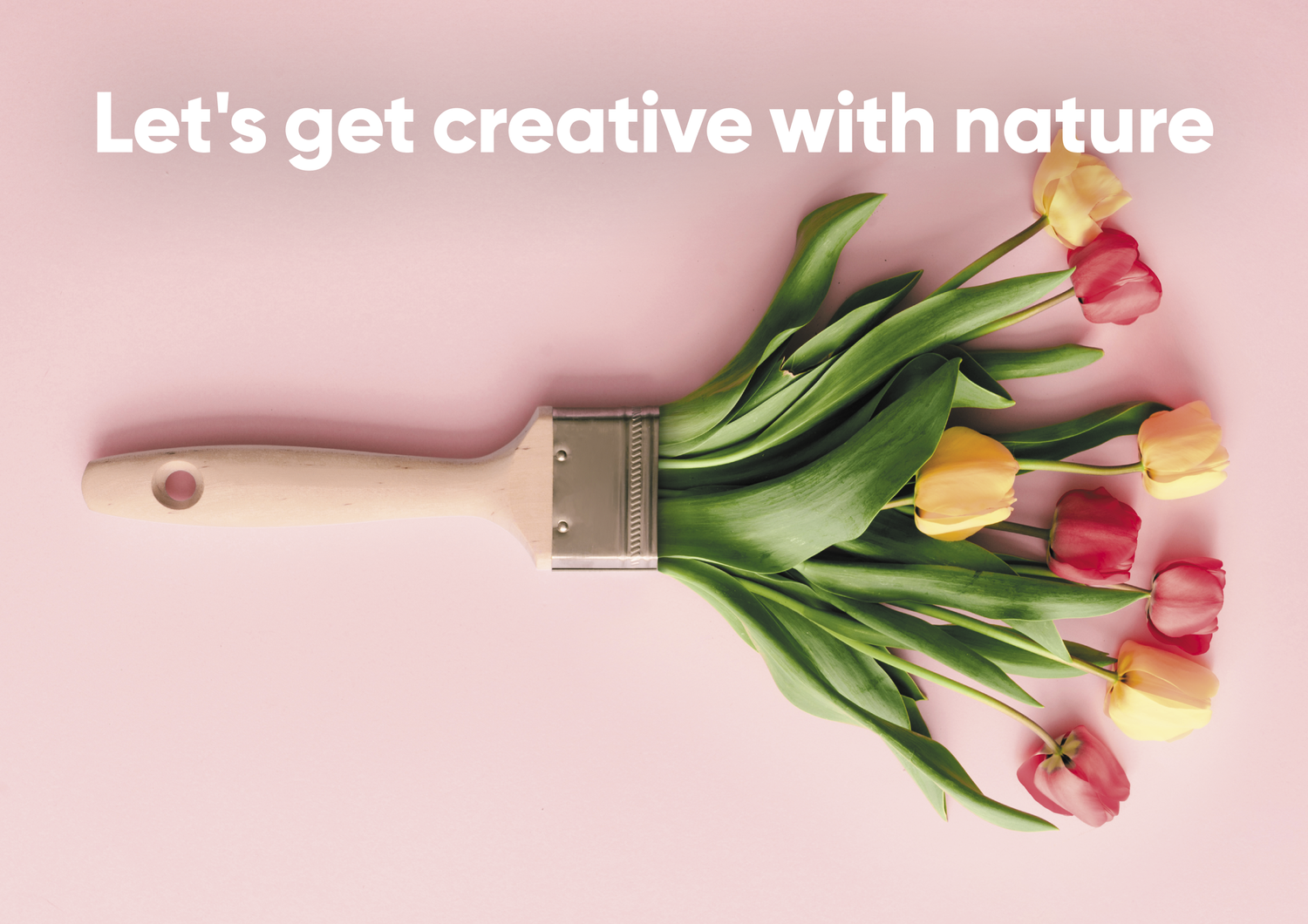
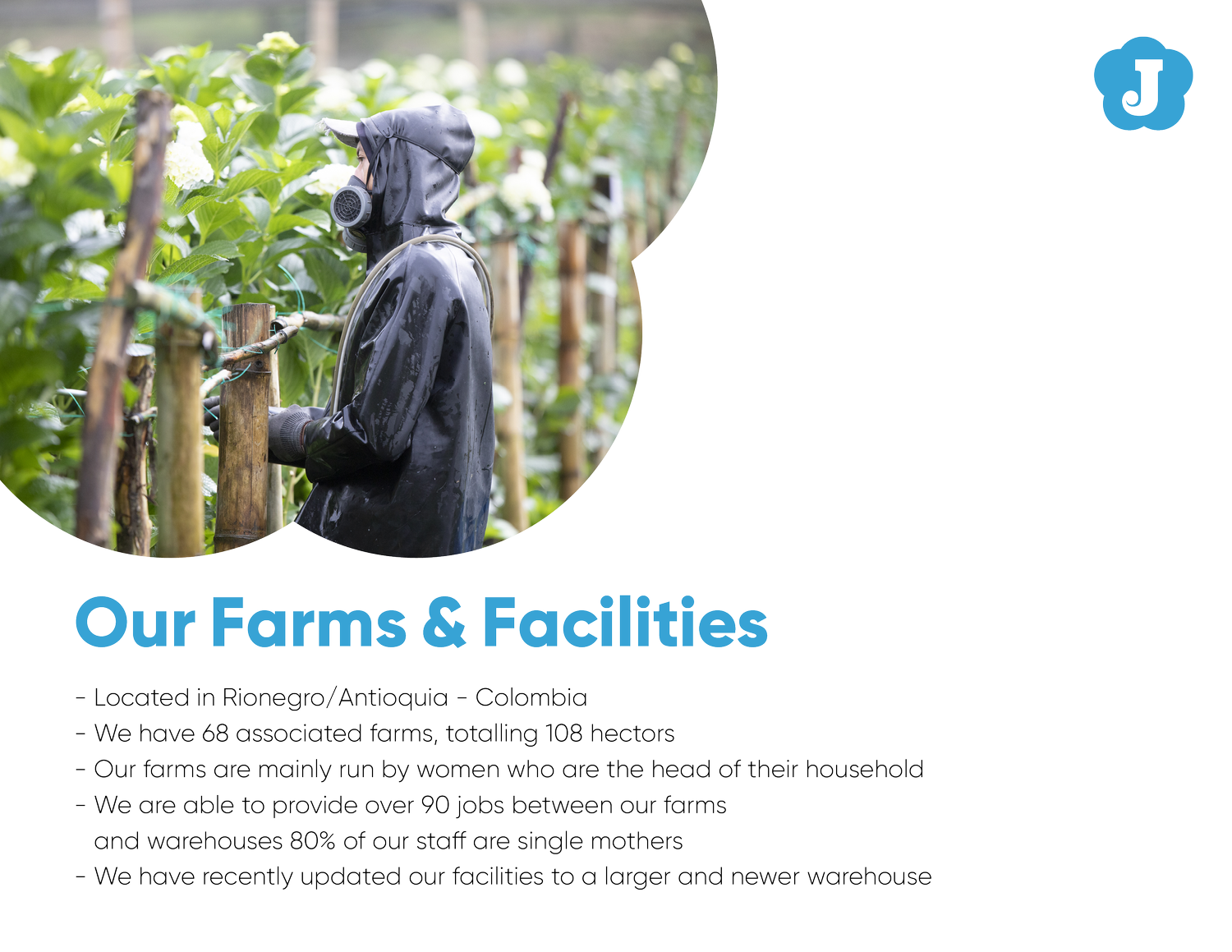
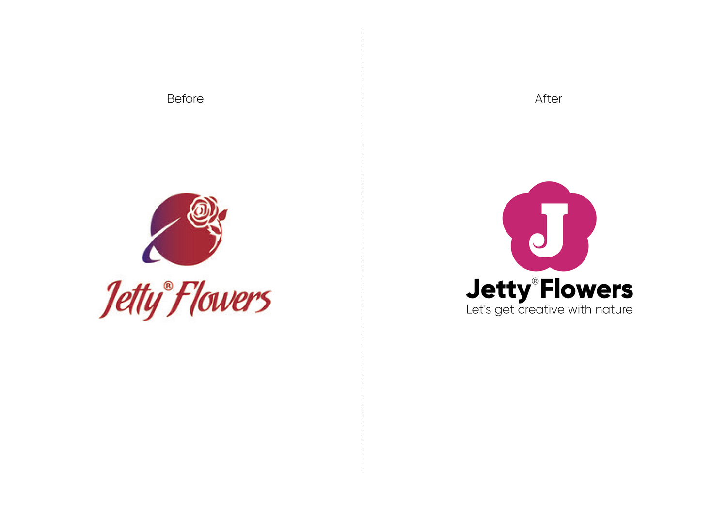
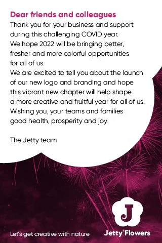
Jetty doesn’t simply sell flowers; it changes their color. The identity therefore treats color itself as the product — expressive, surprising and deliberately artificial.
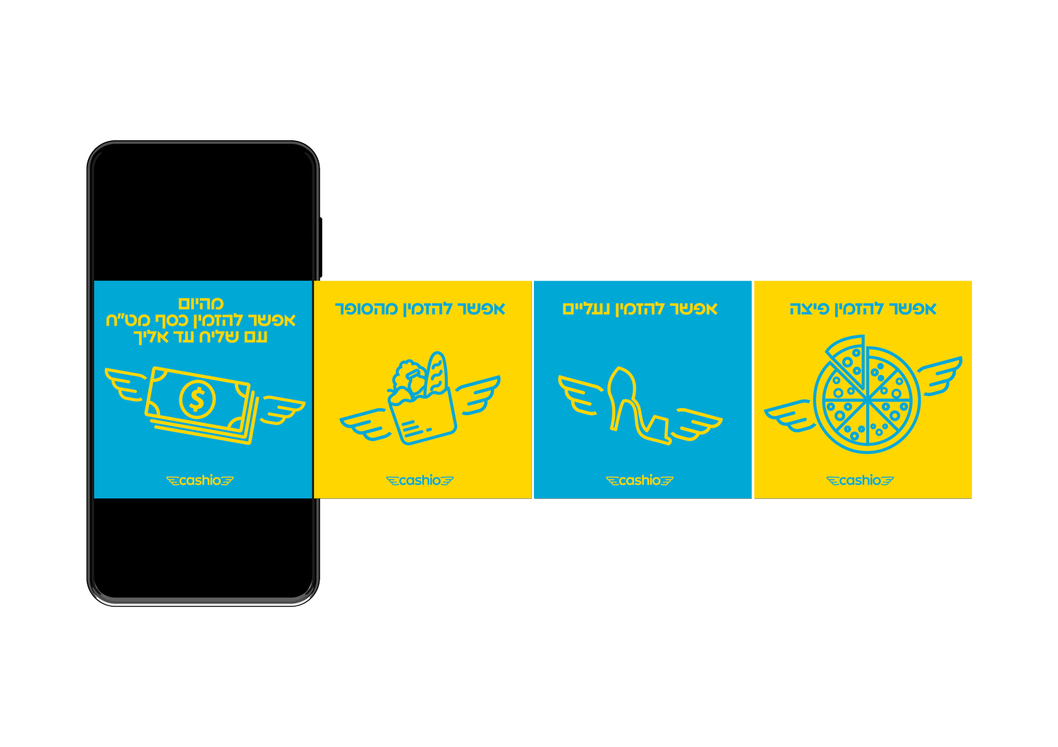
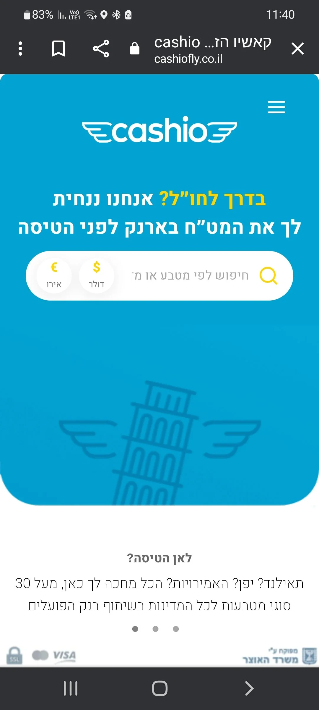
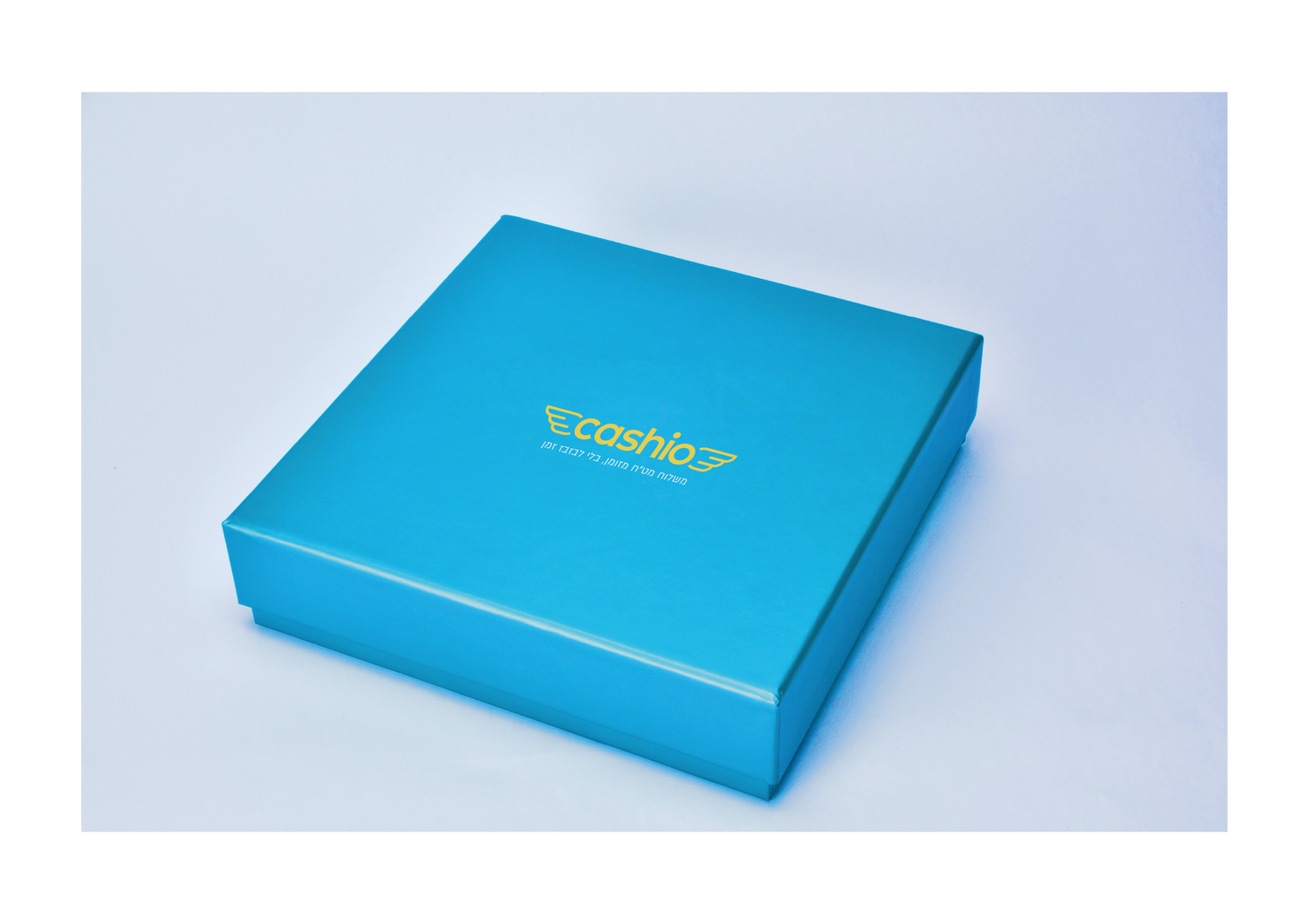
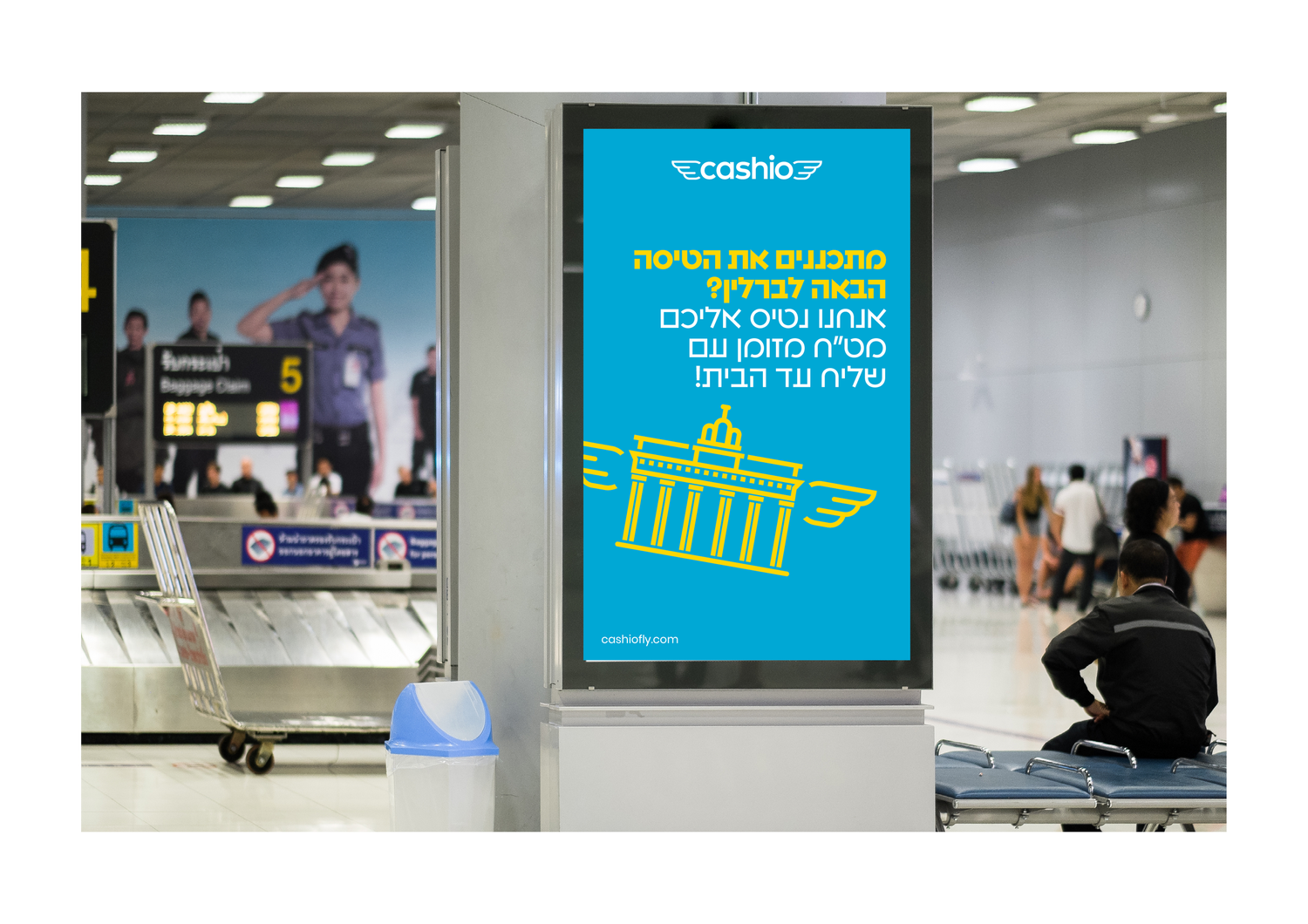
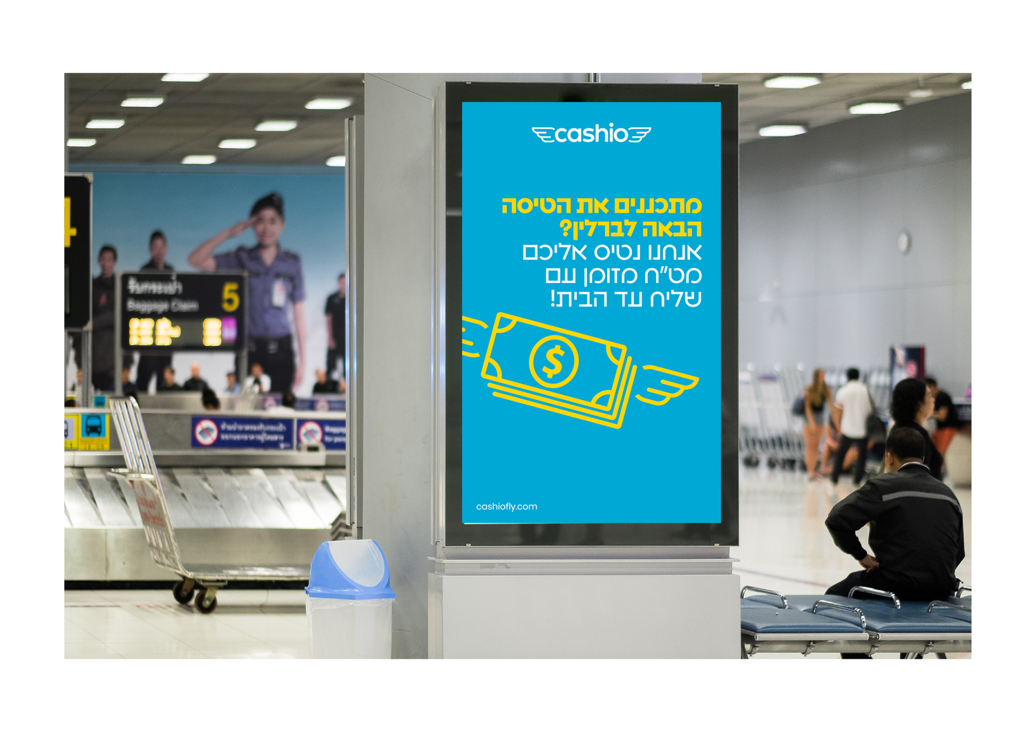
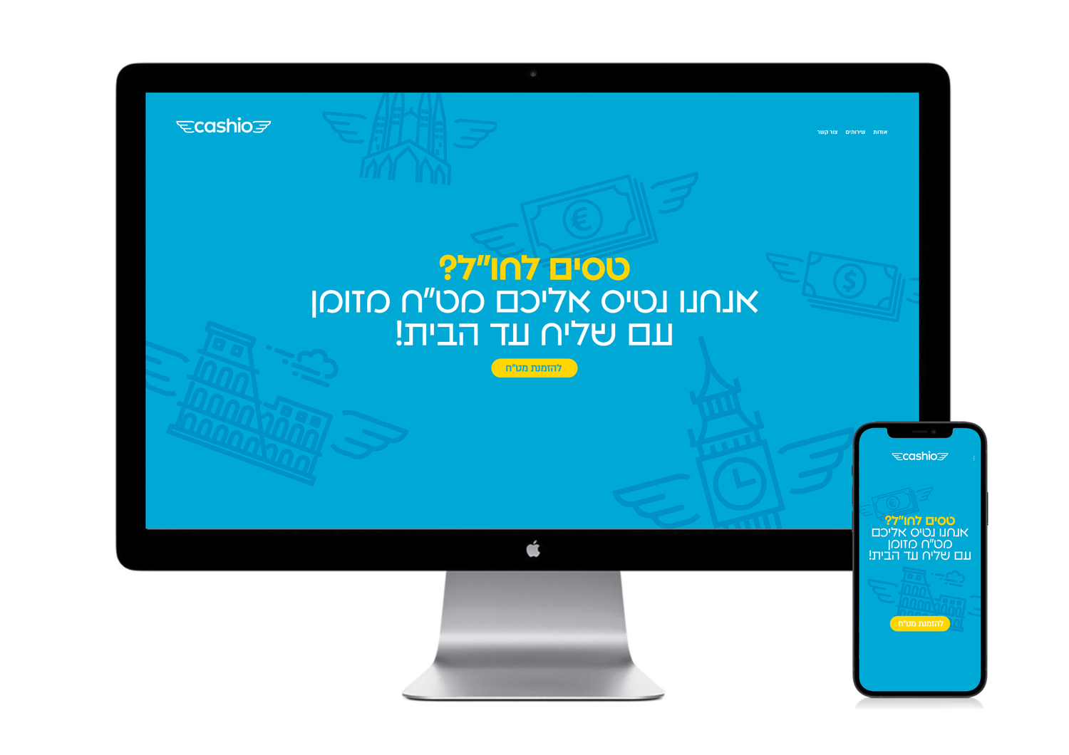
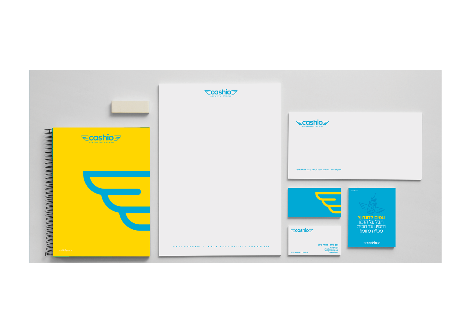
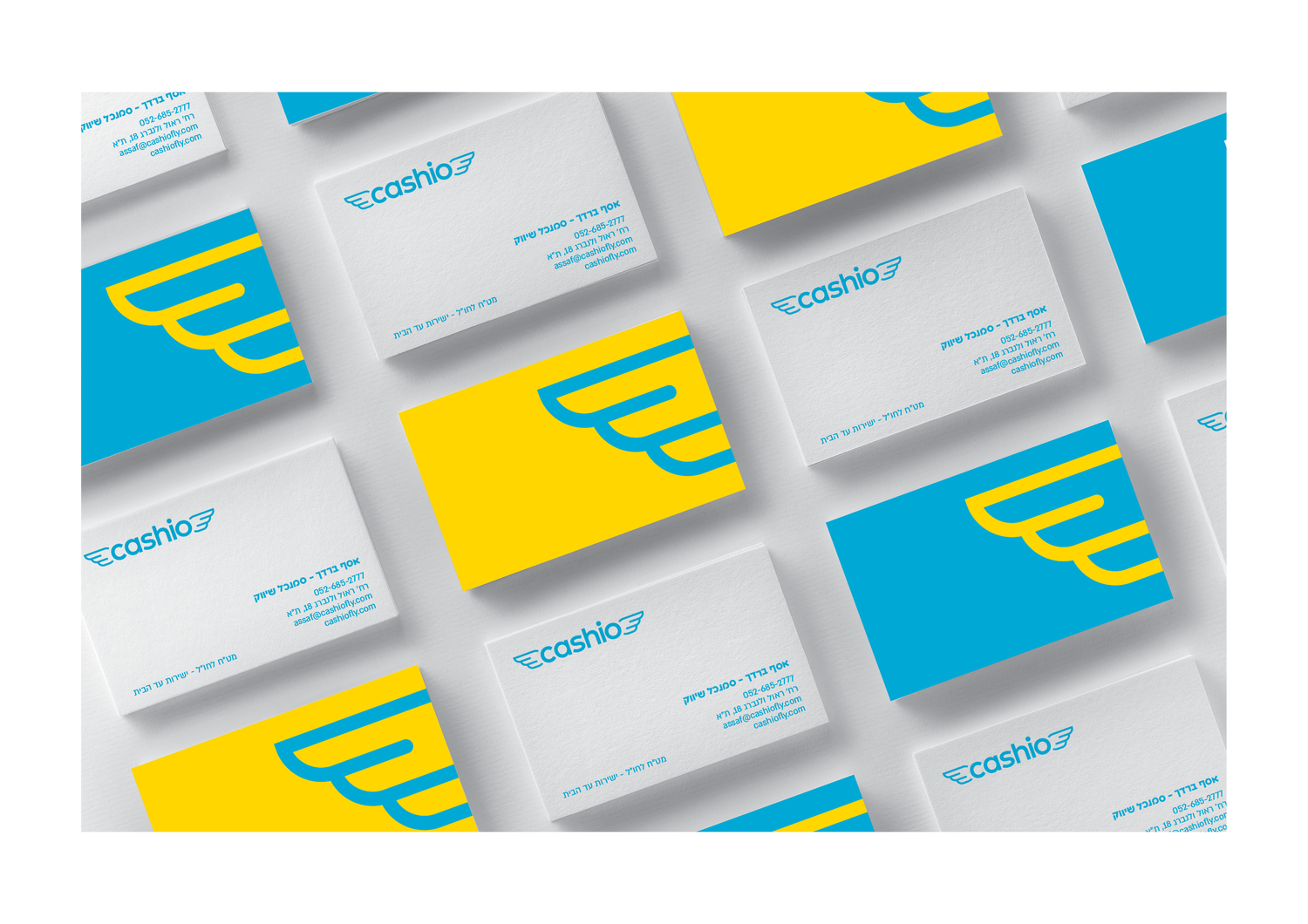
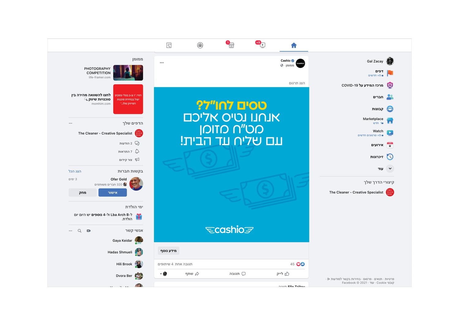
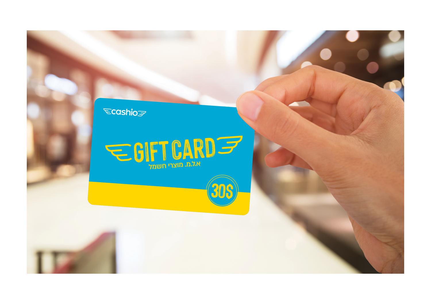
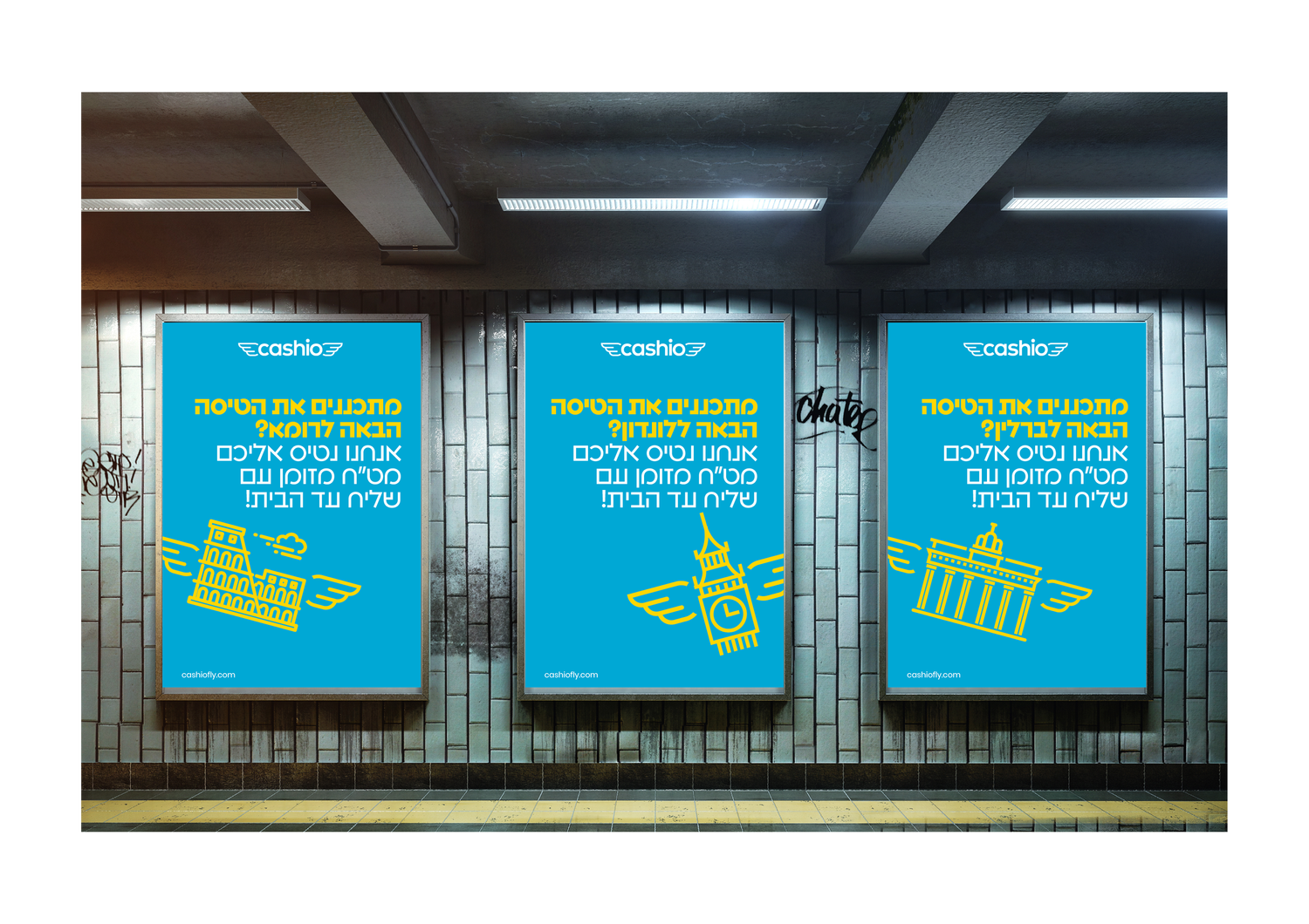
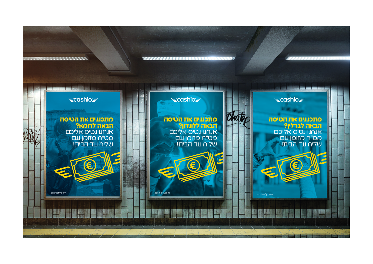
Cash becomes something that moves. The visual system treats money not as a static object but as a flow — transferred, delivered and constantly changing hands.
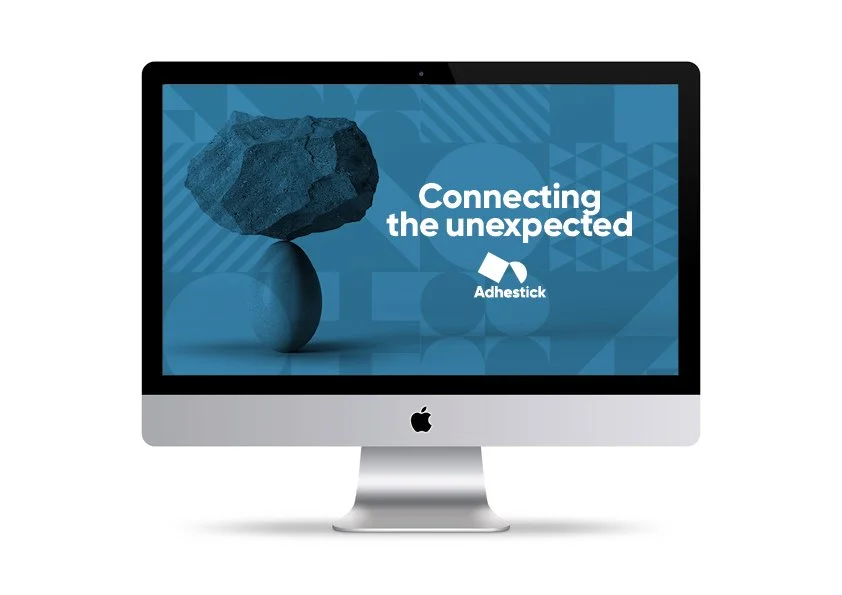
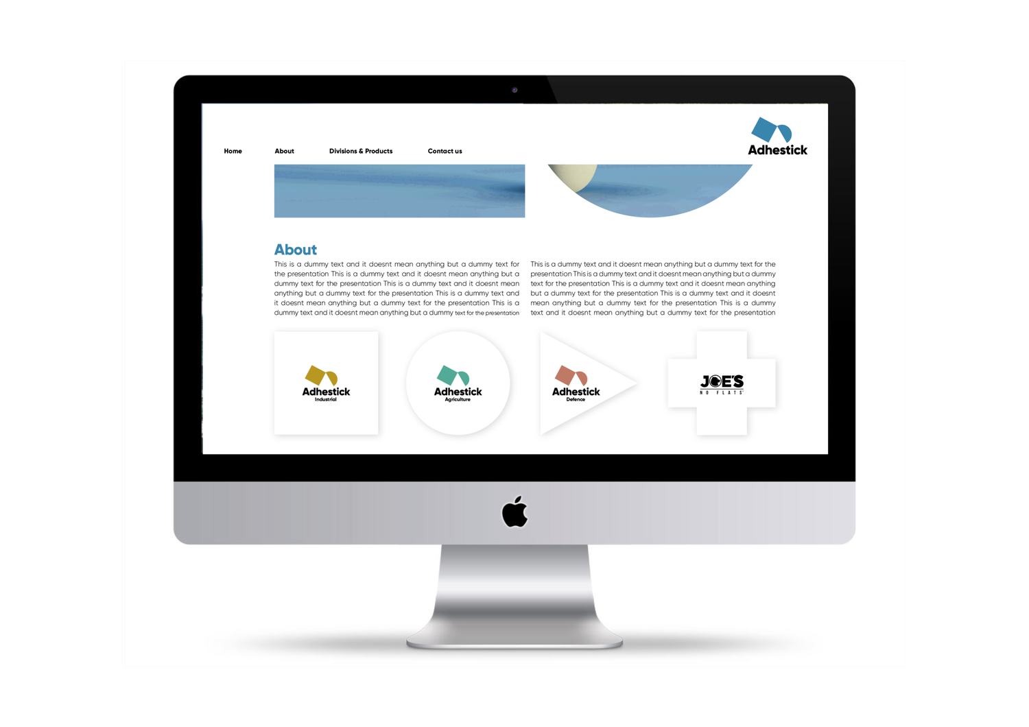
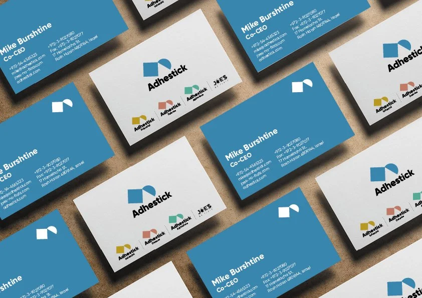
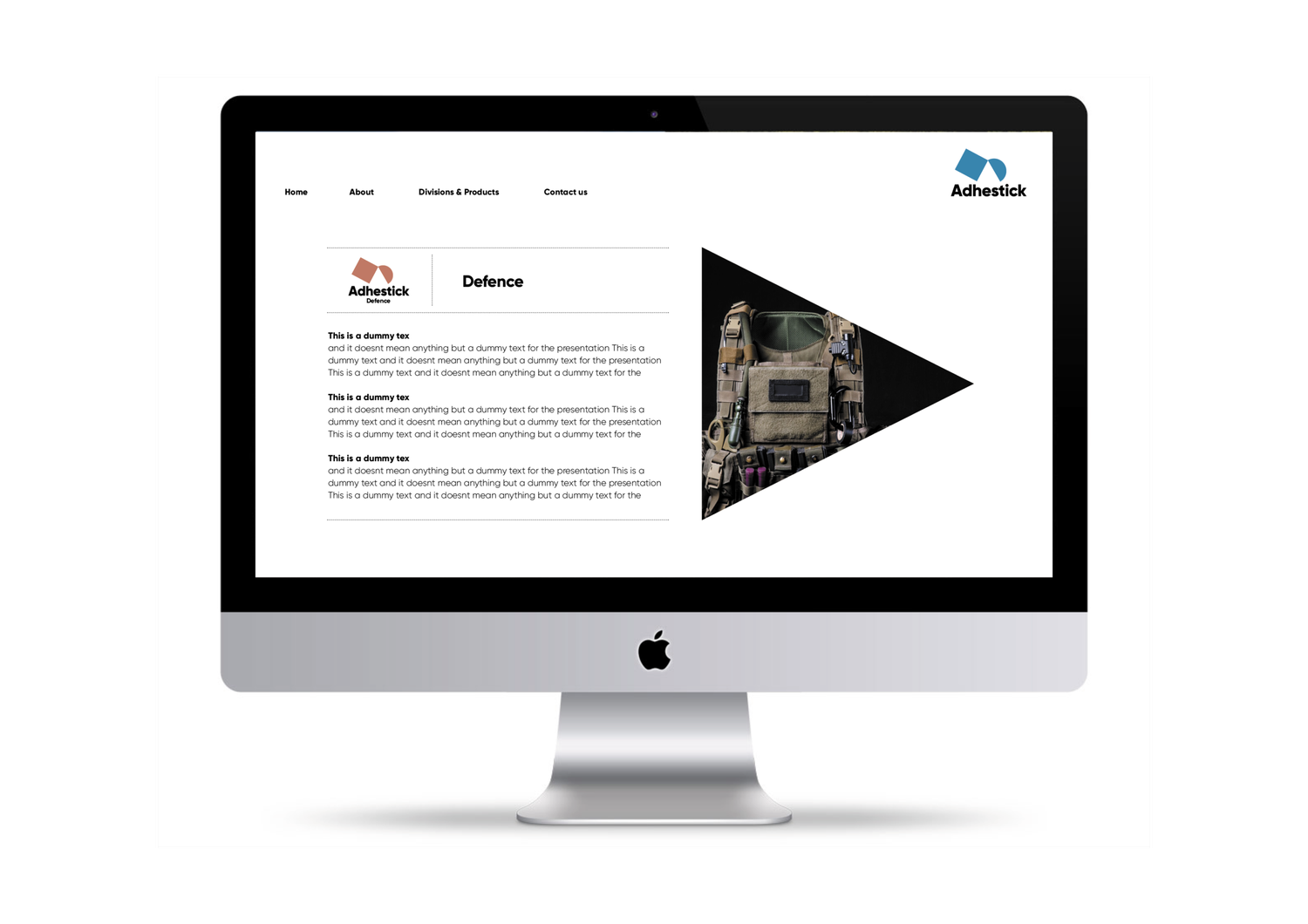
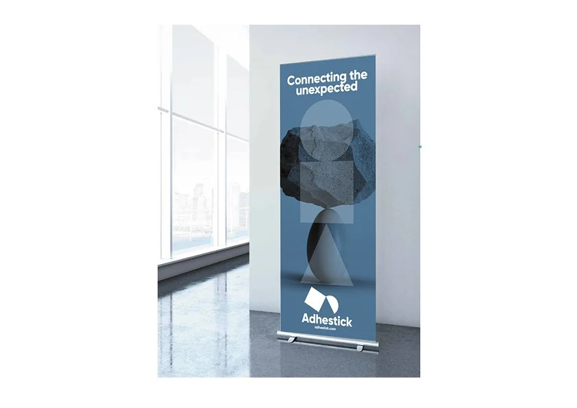
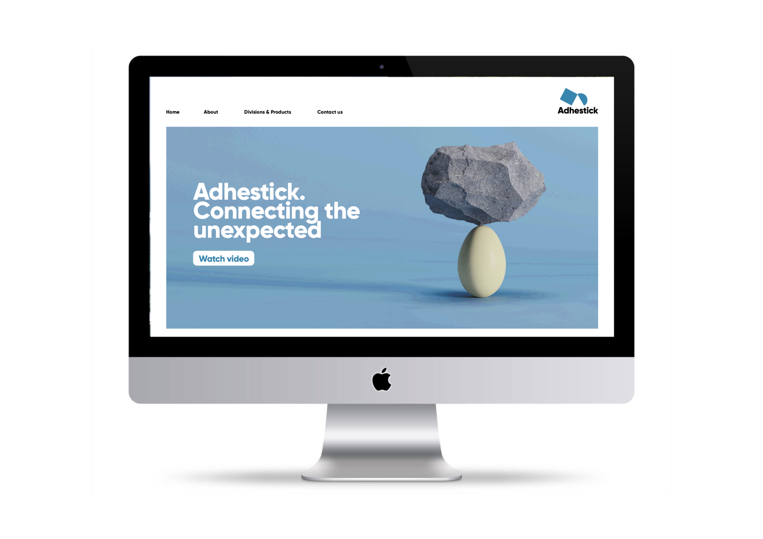
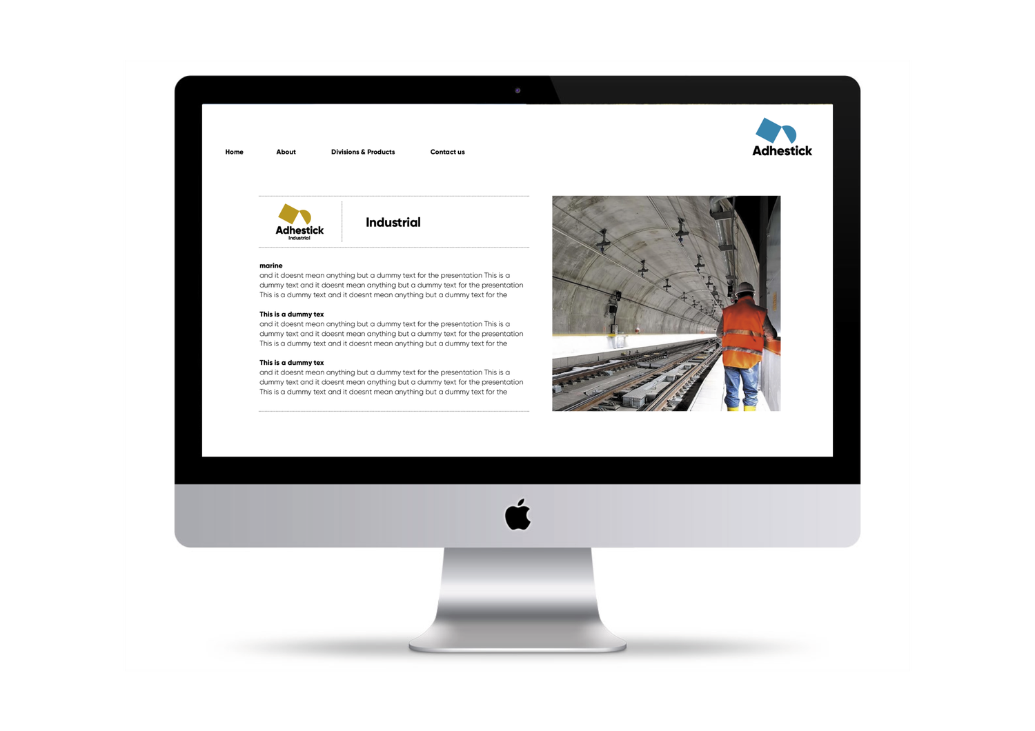
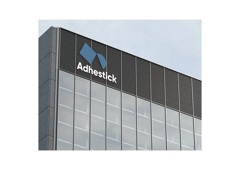
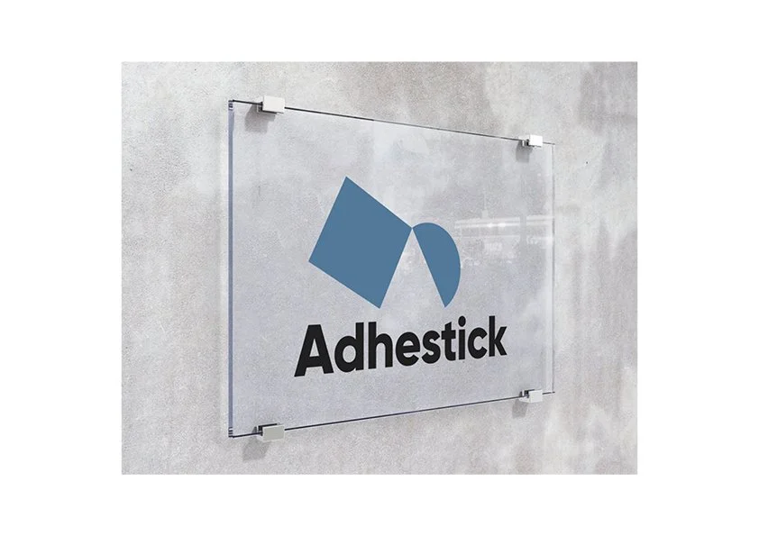
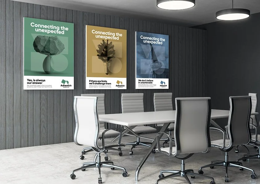
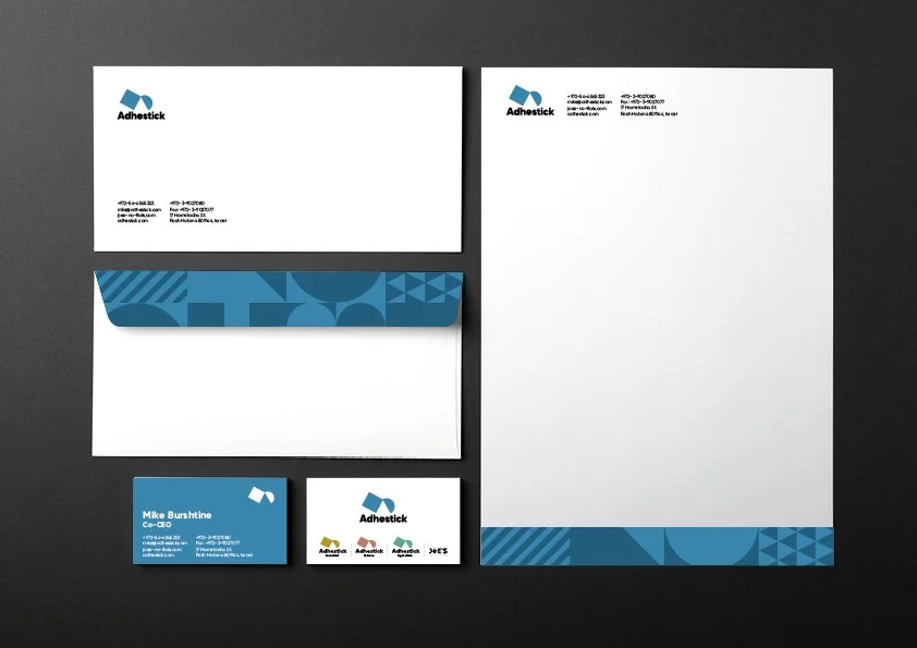
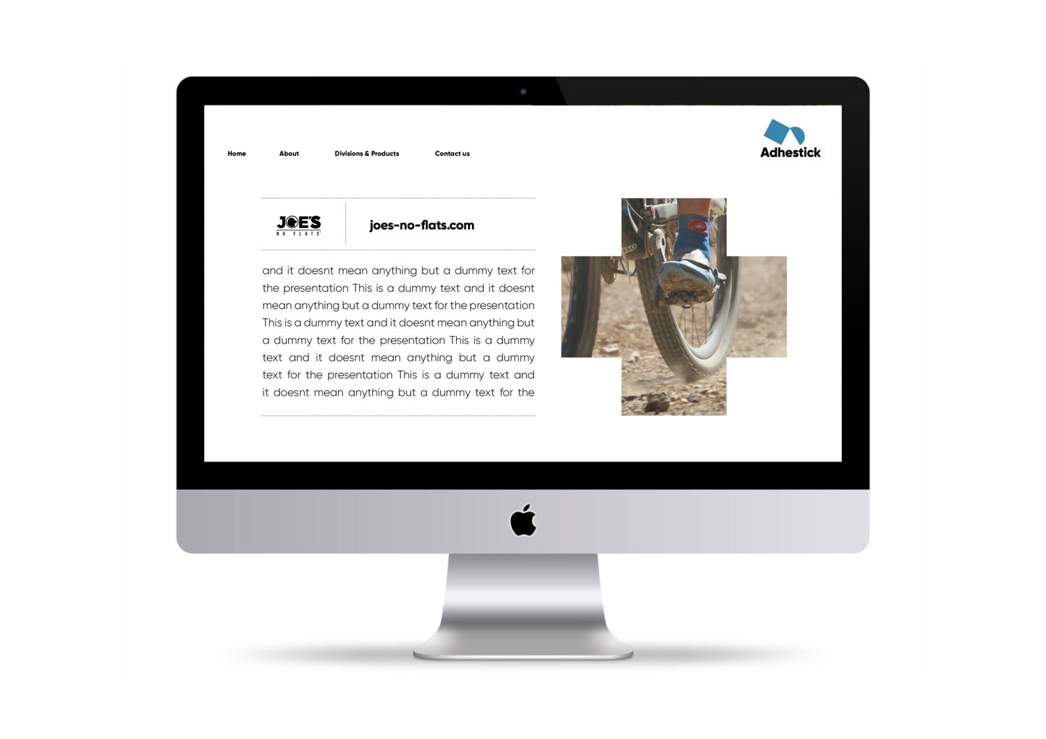
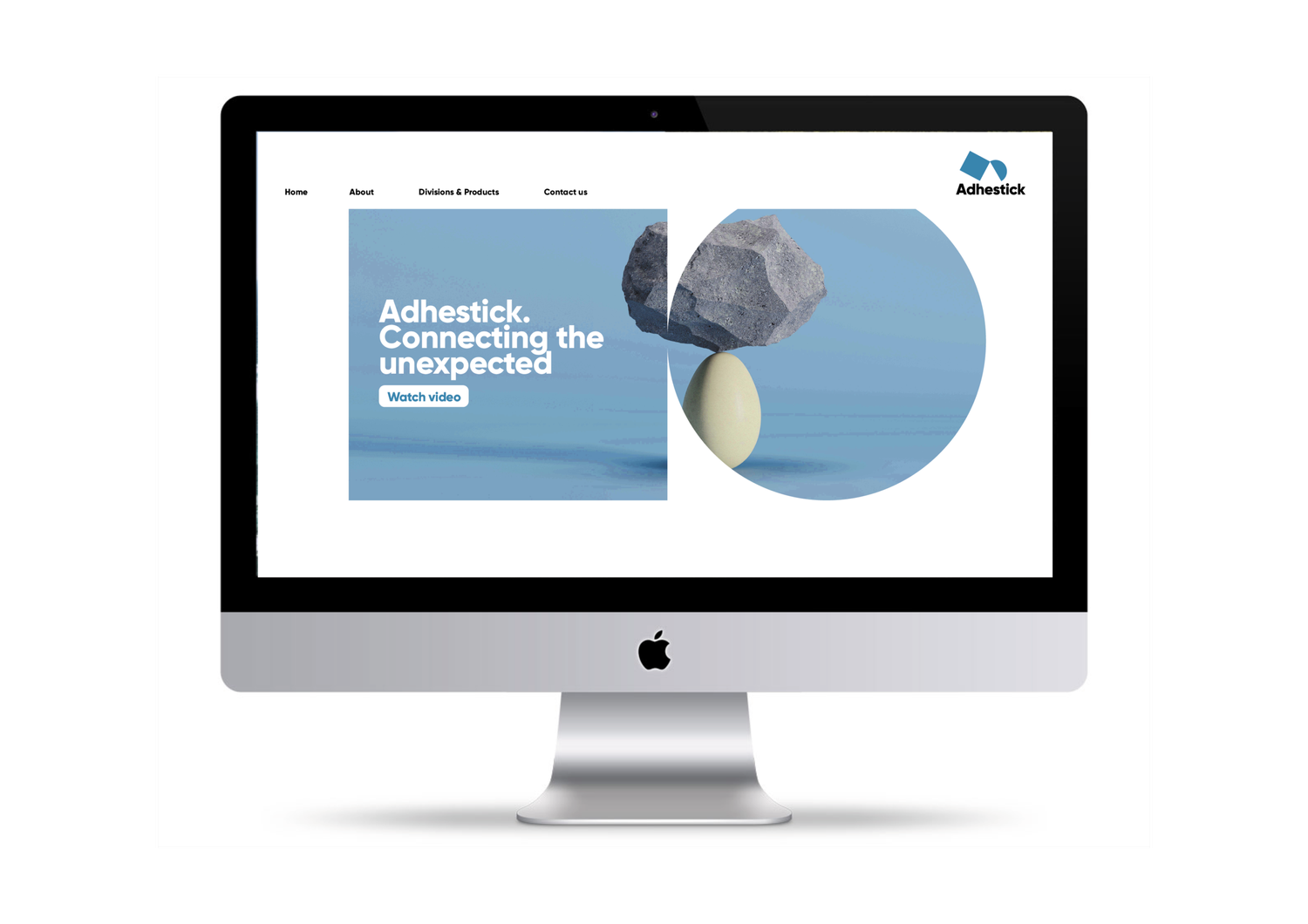
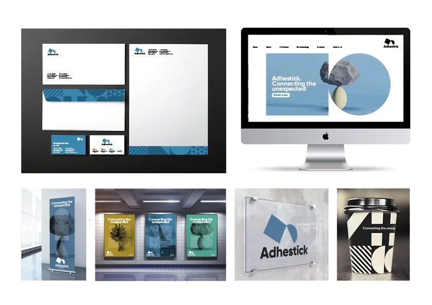
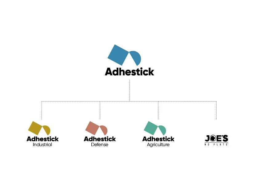
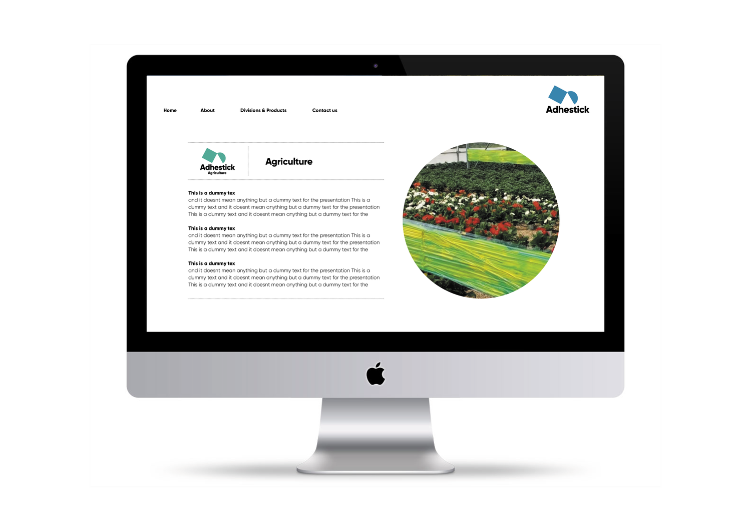
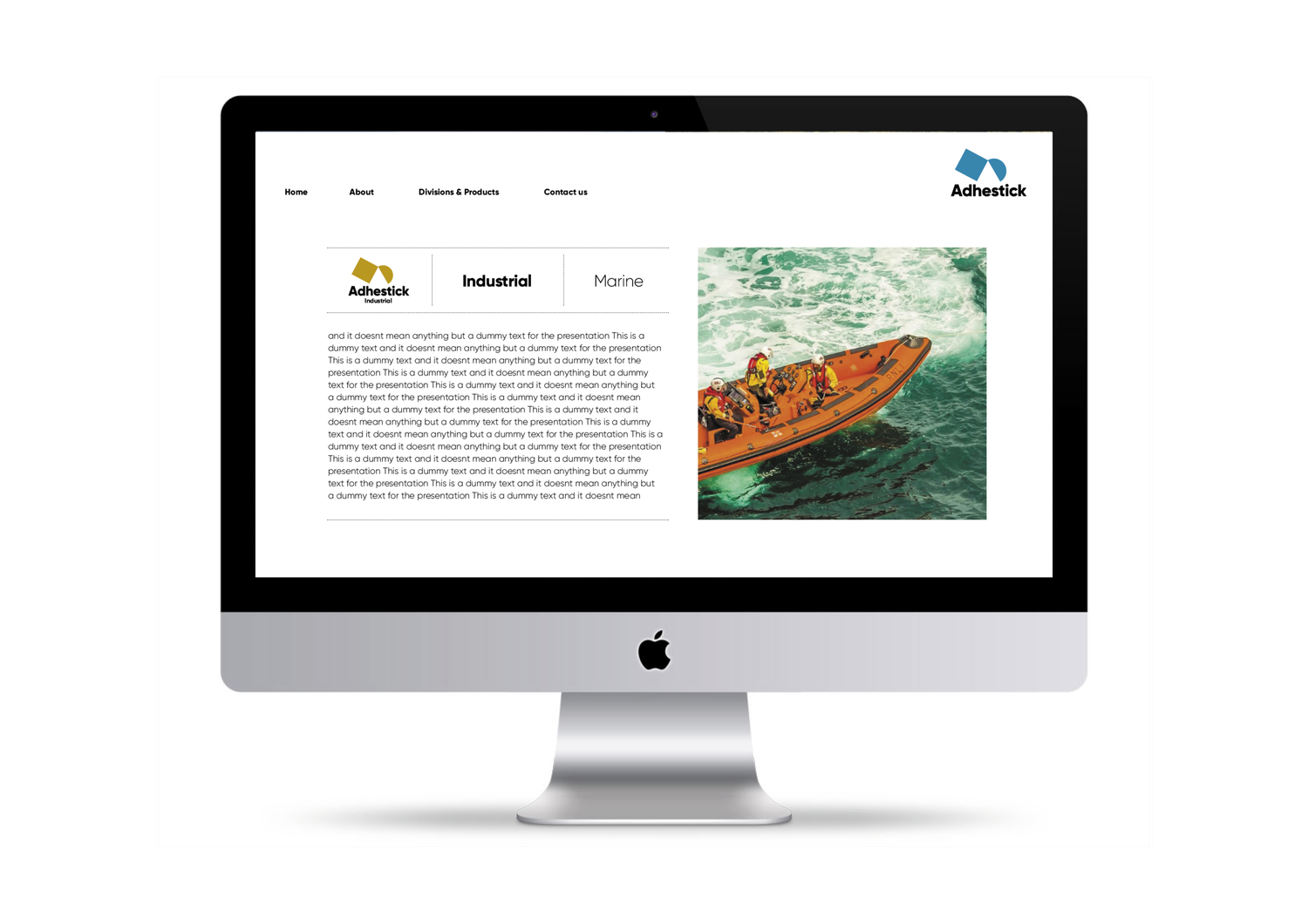
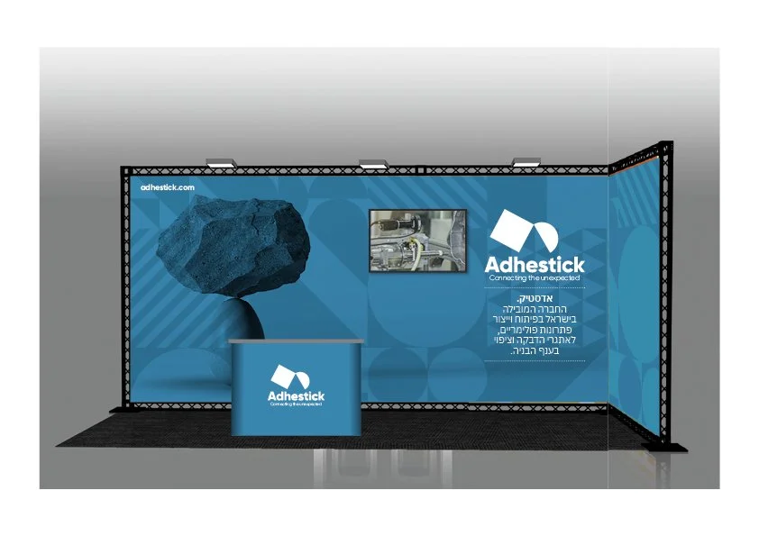
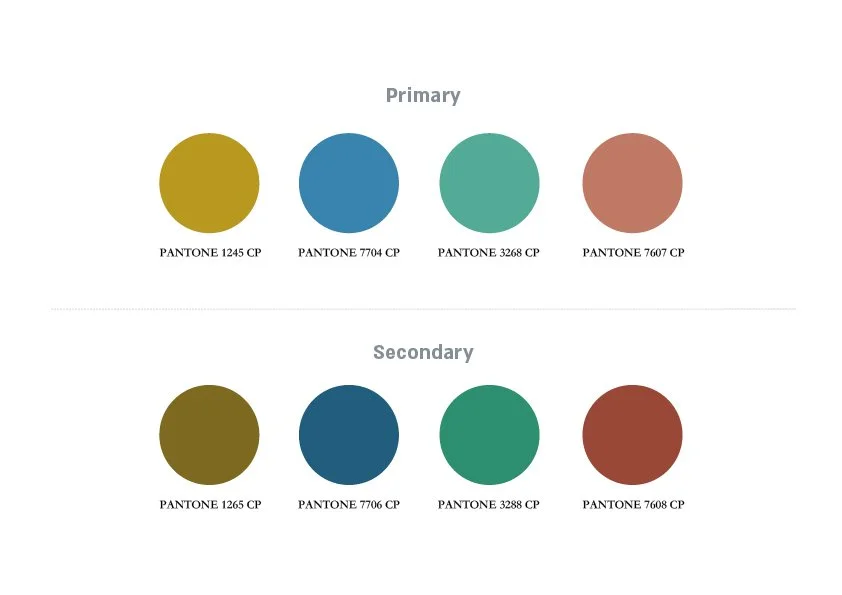
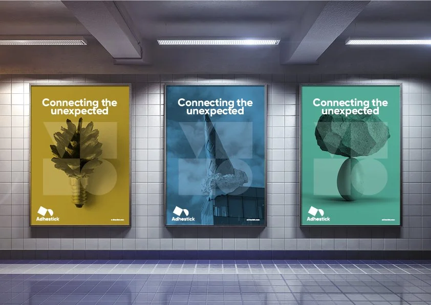
“Connecting the unexpected” is the idea, not just the line. Polymer technologies link very different industries, so unlikely connections become the graphic language of the brand.
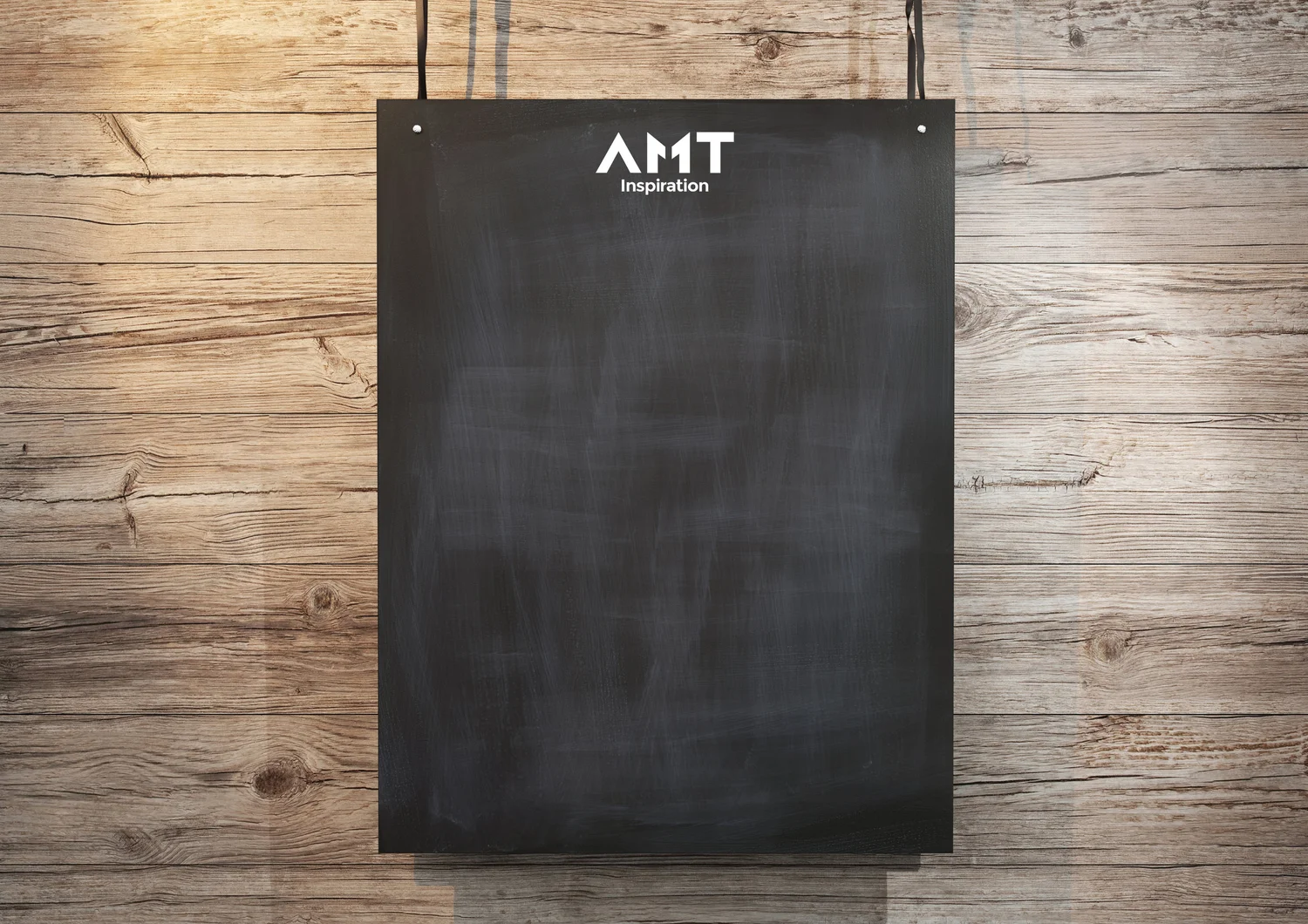
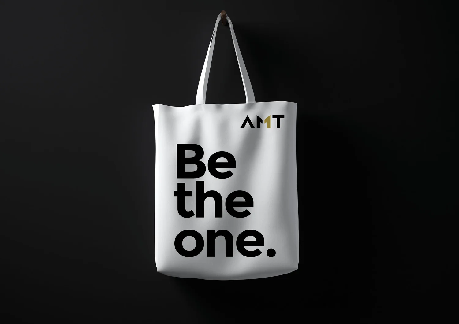
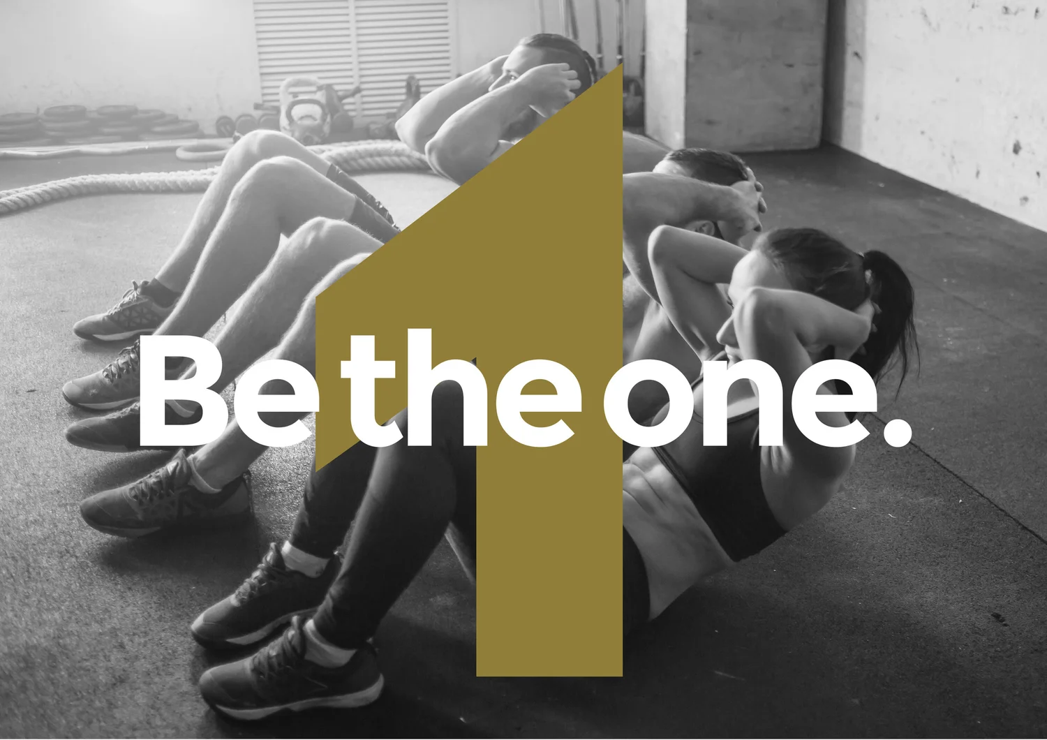
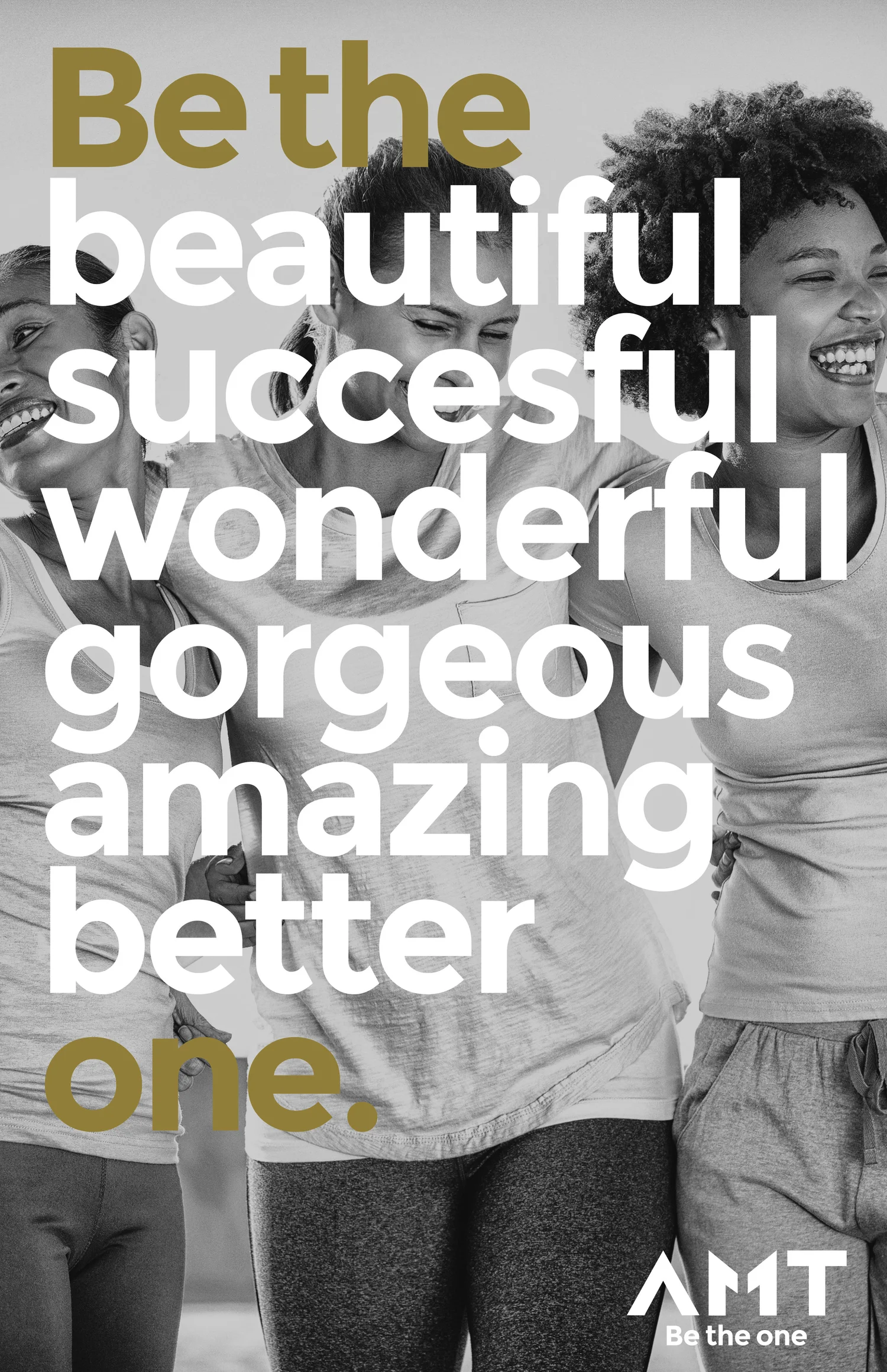
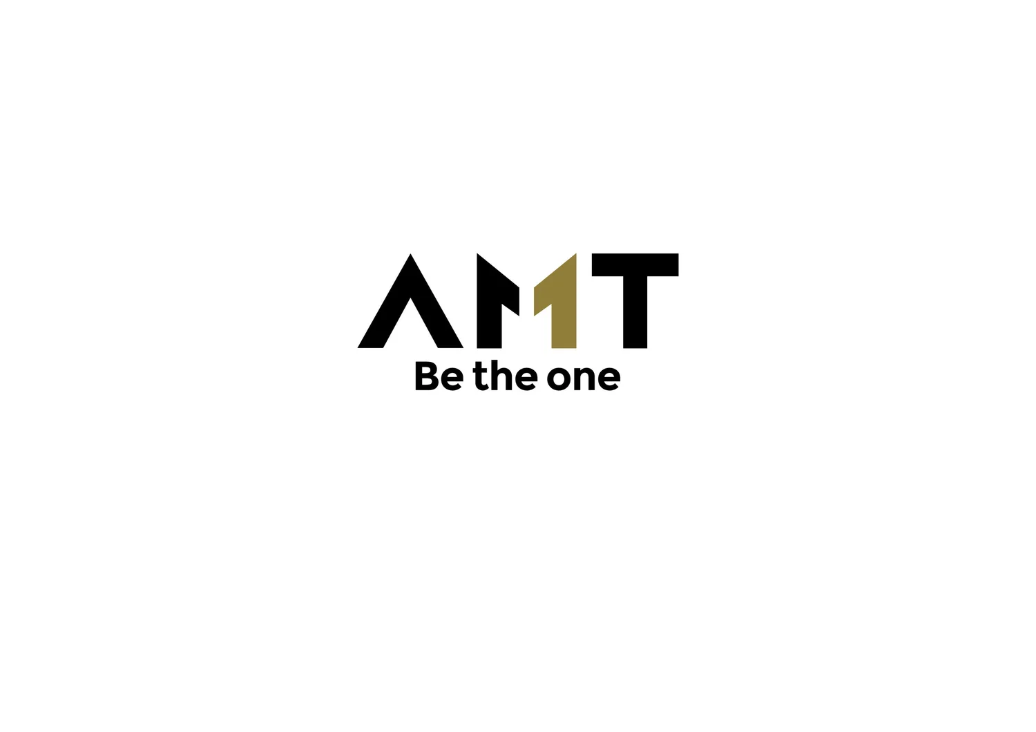
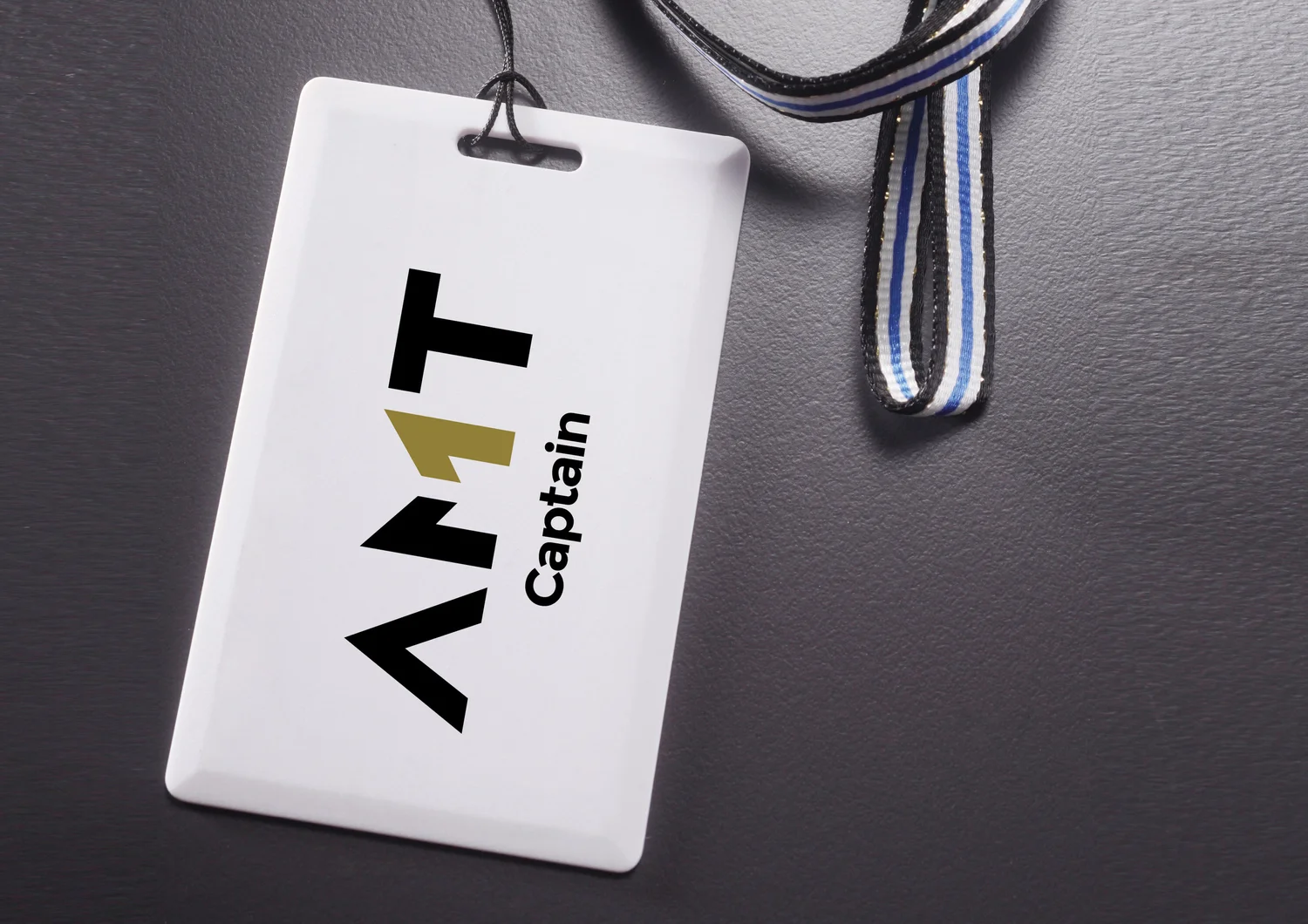
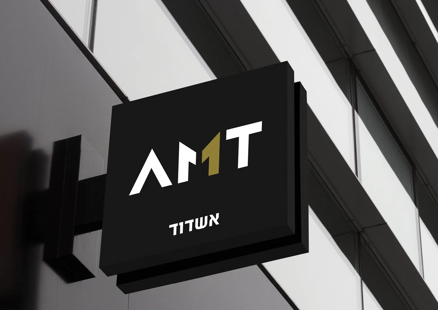
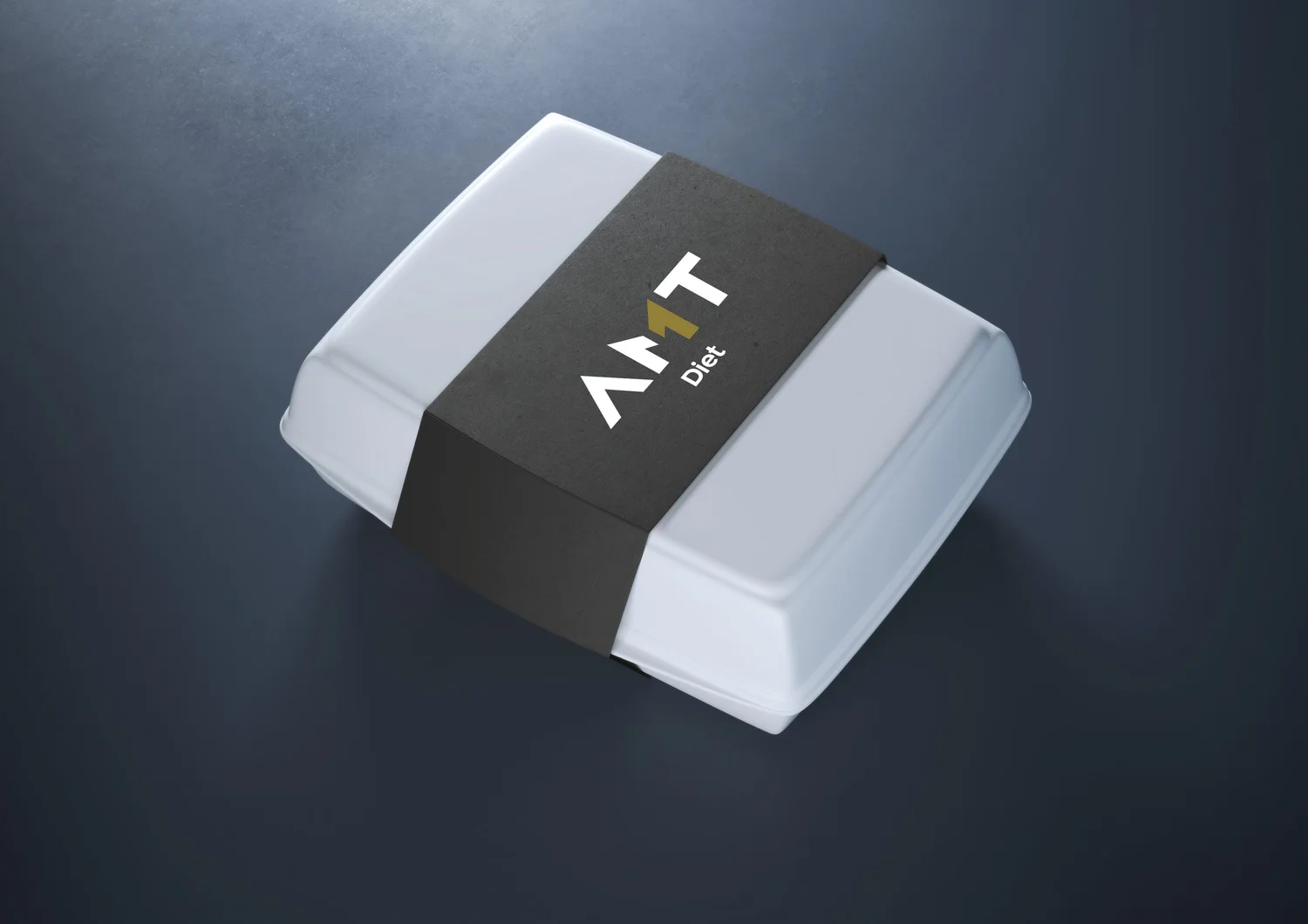
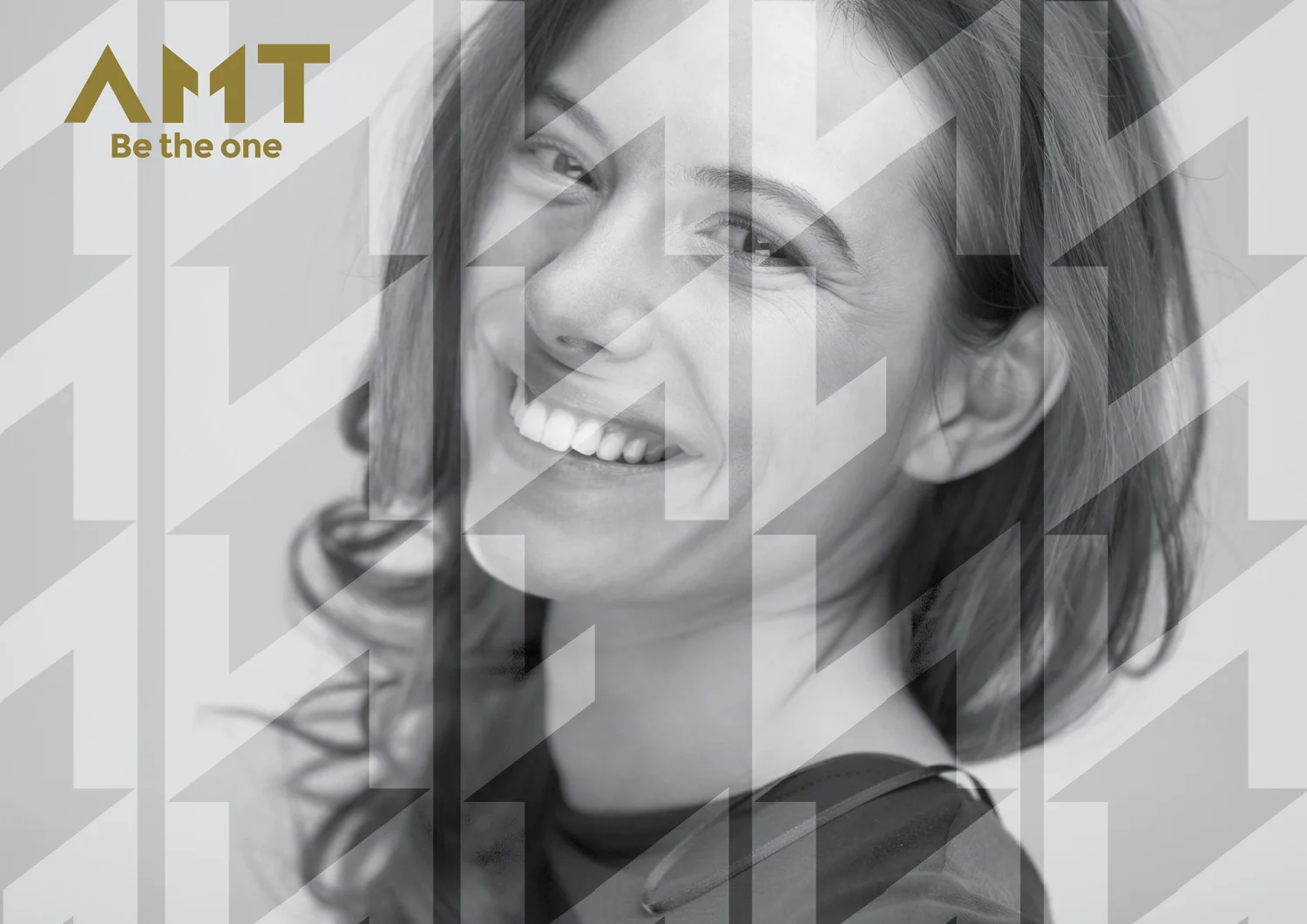
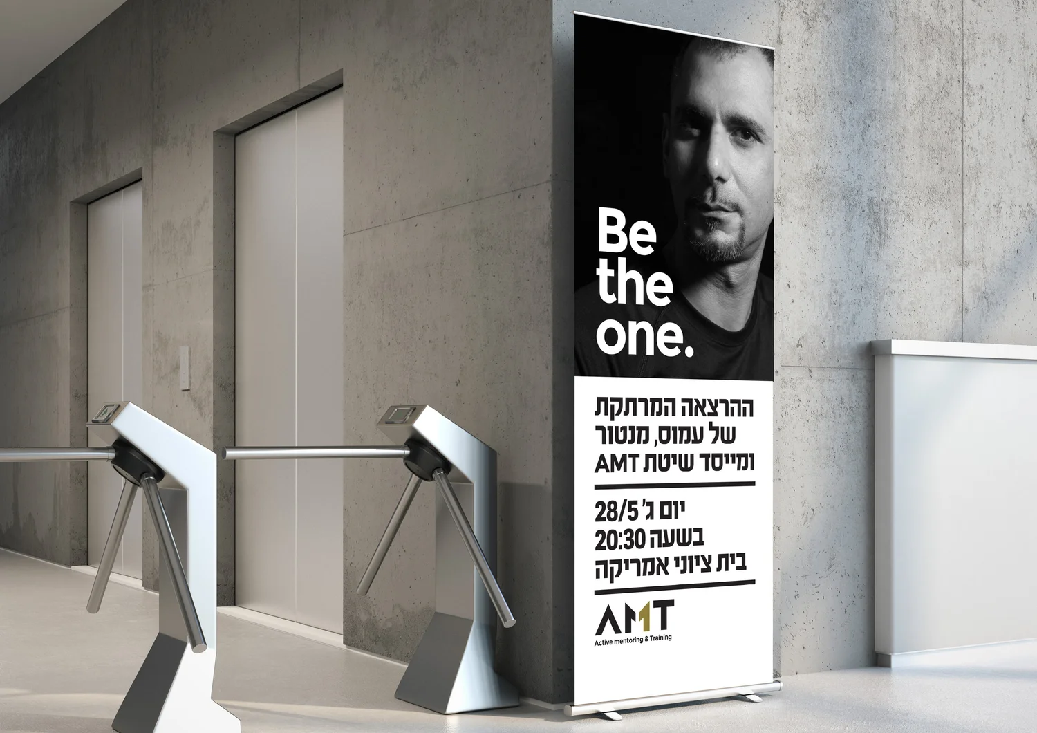
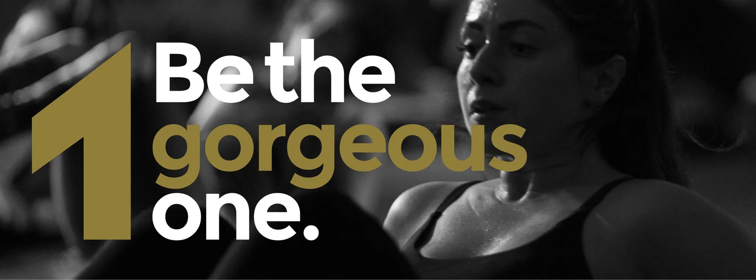
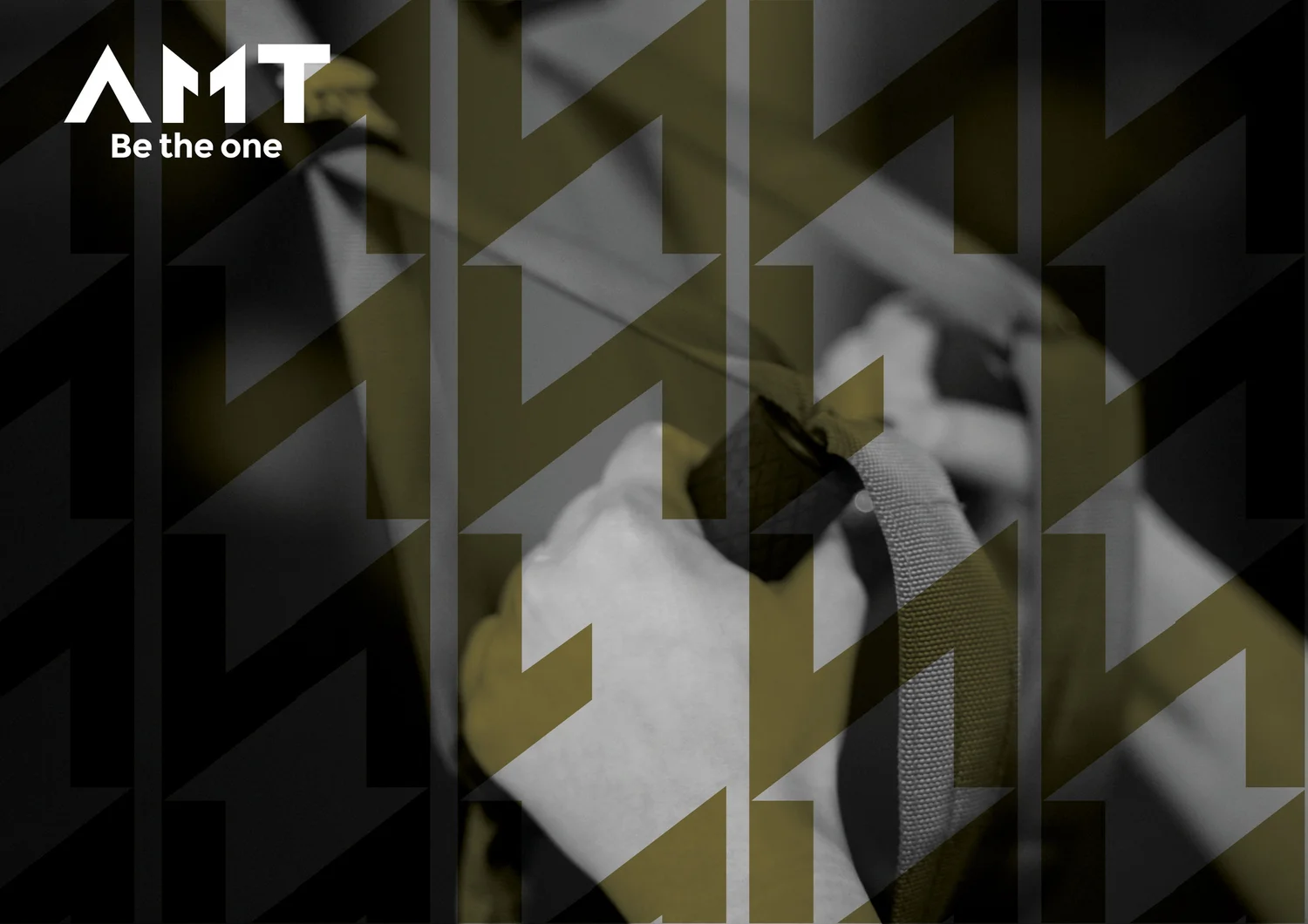
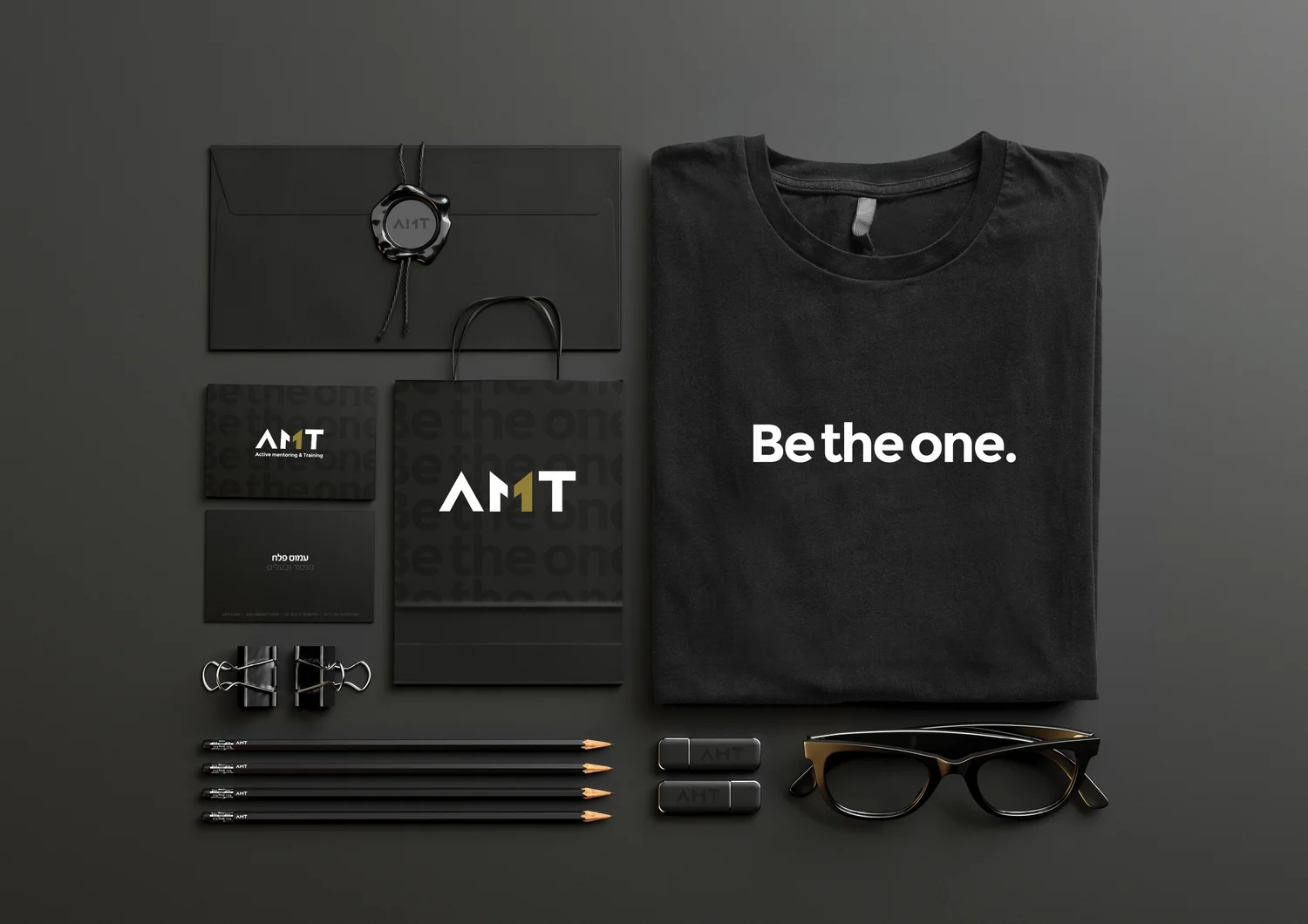
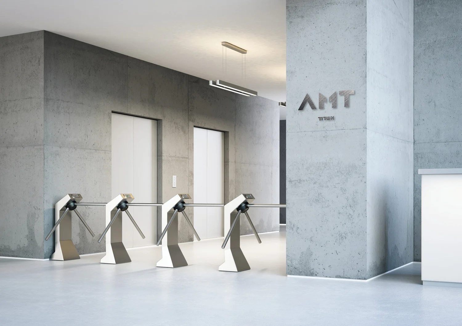
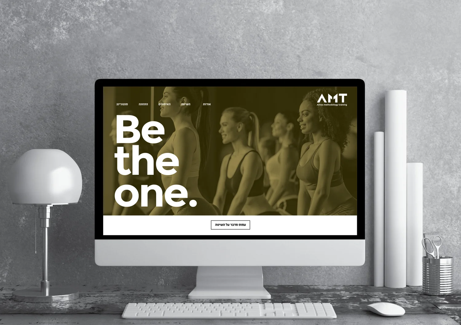
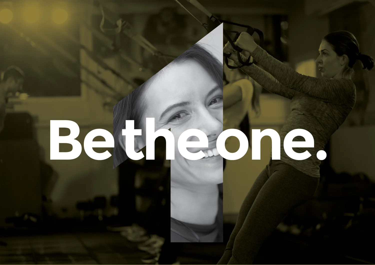
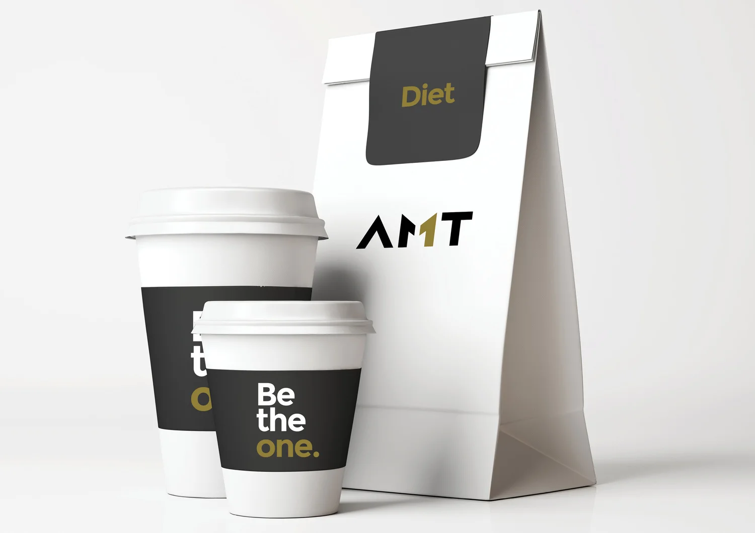
The number 1 is built into the identity as both form and message: Be the One. Fitness becomes less about competing with others and more about becoming your own number one.
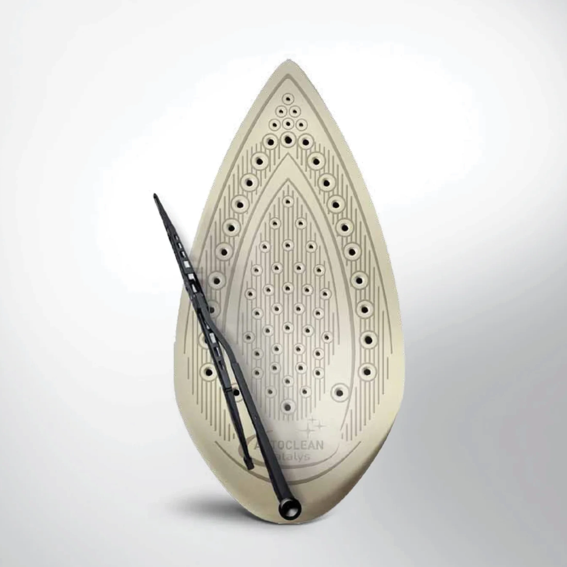
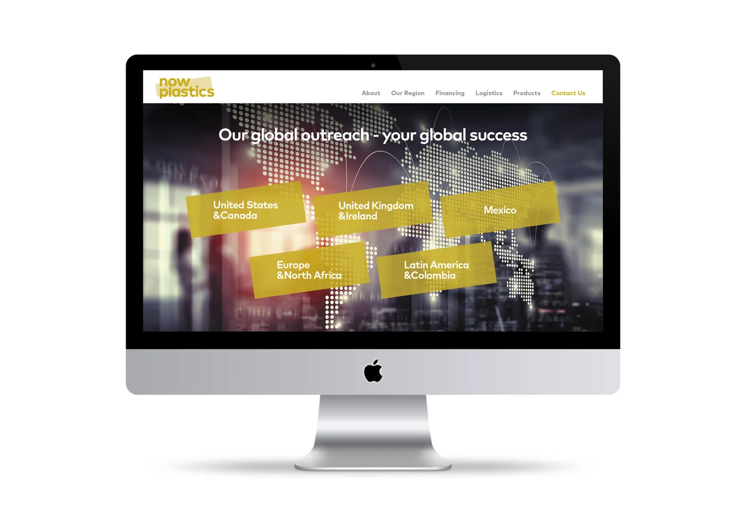
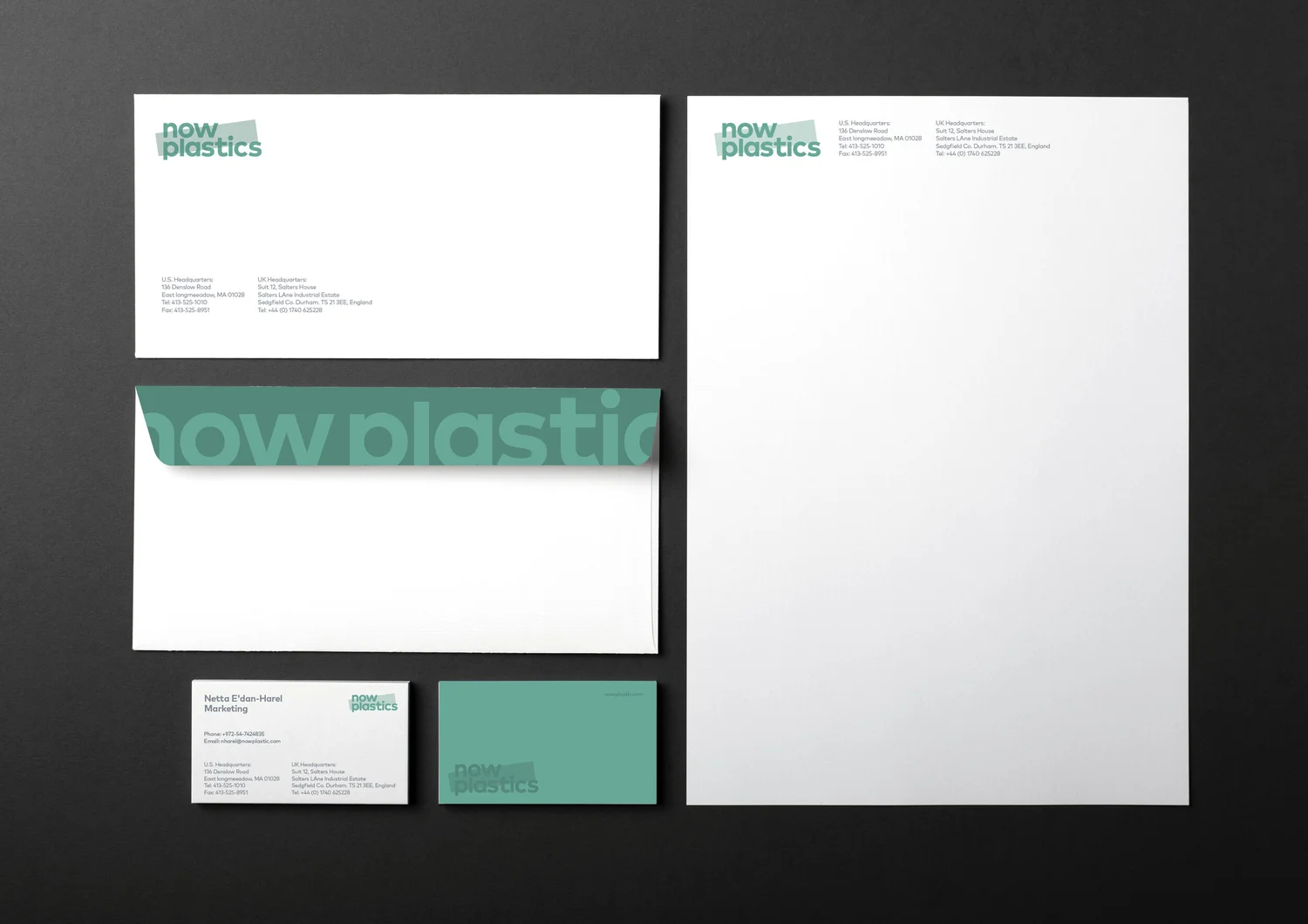
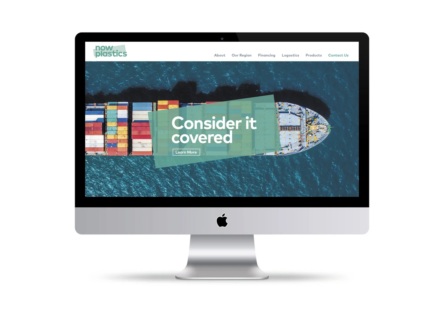
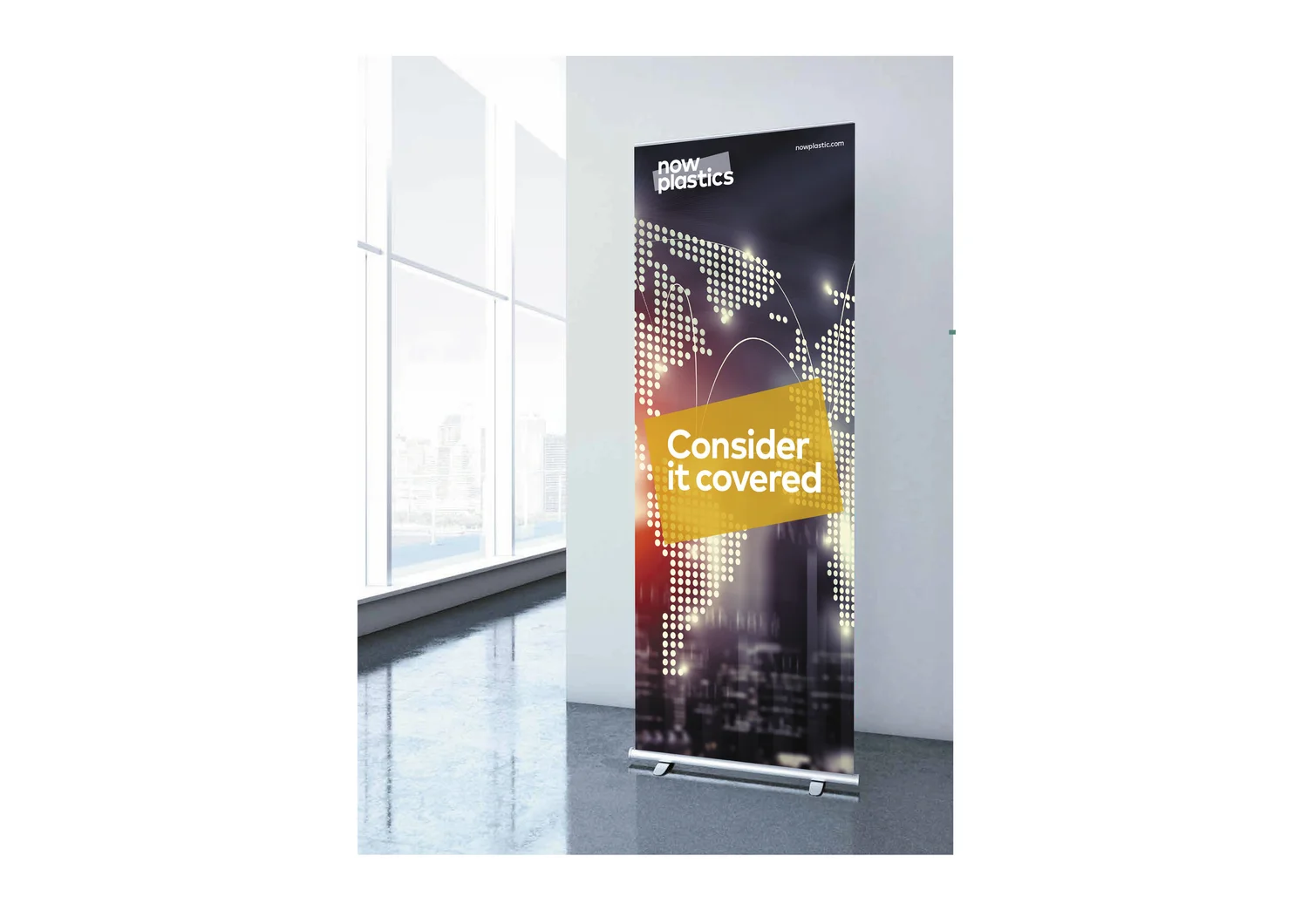
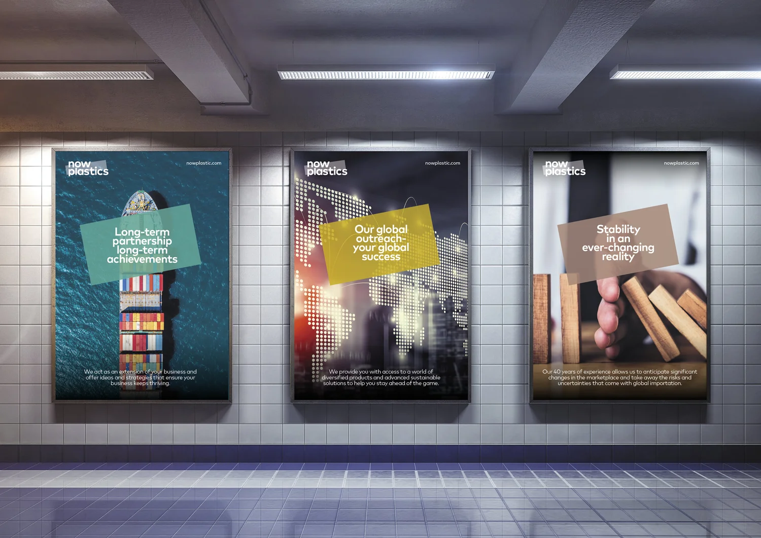
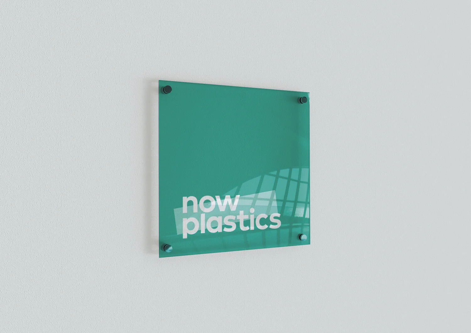
The product enters the logo itself. A translucent strip crosses the identity like a sheet of plastic film, turning the material the company sells into the device that defines the brand.

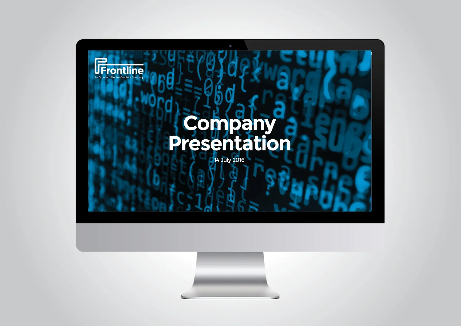
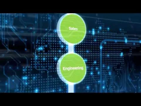
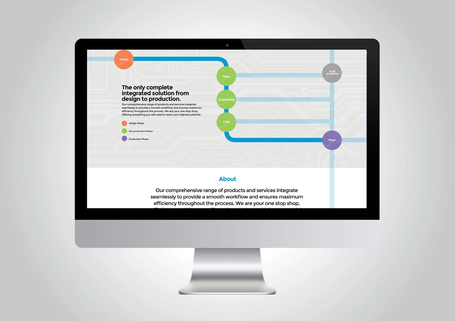
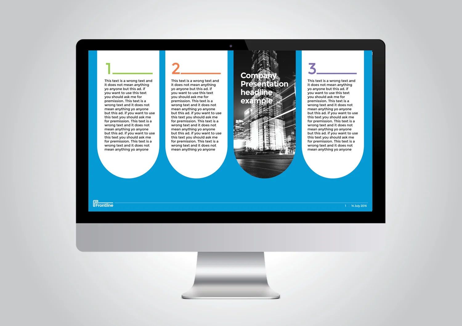
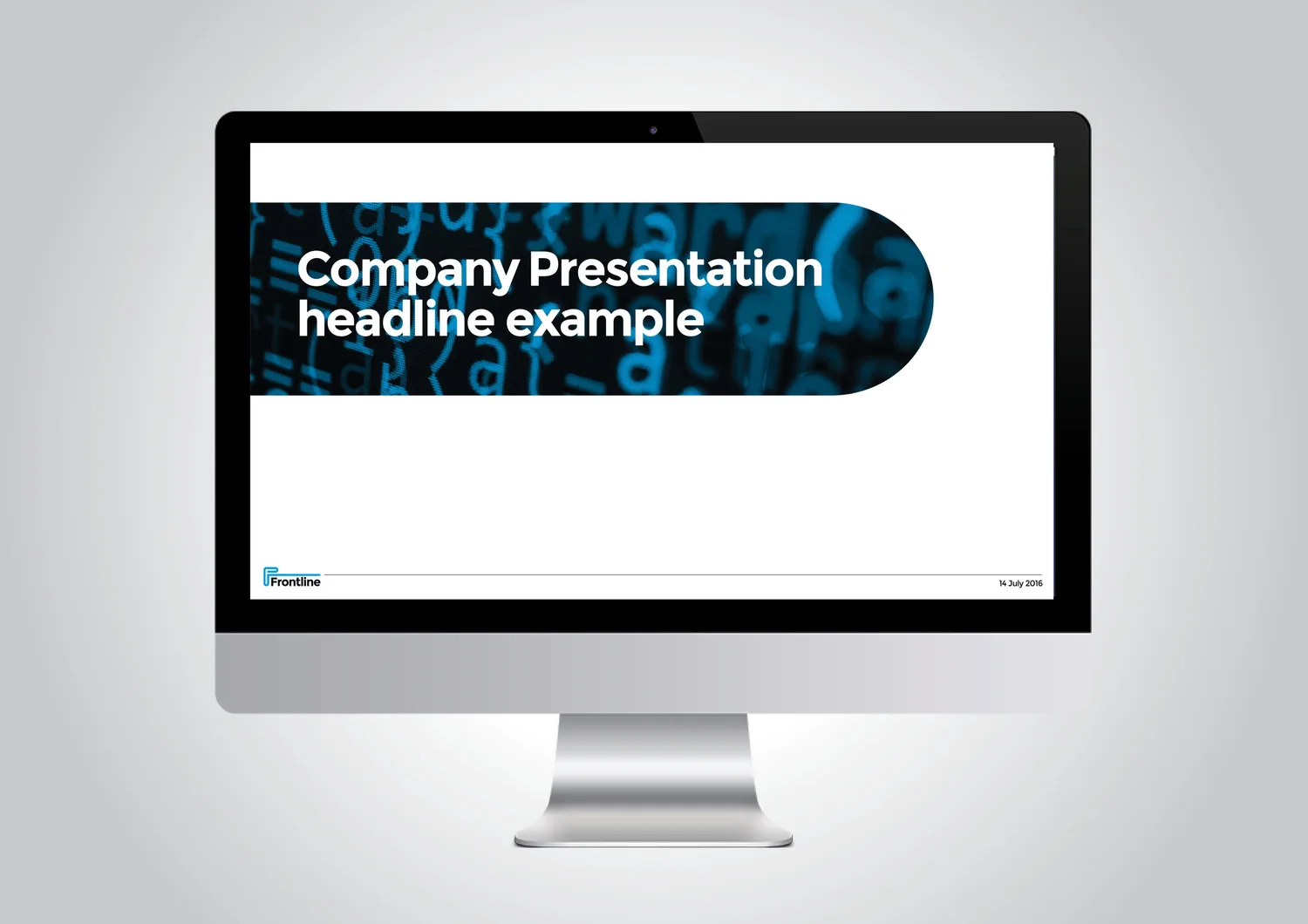
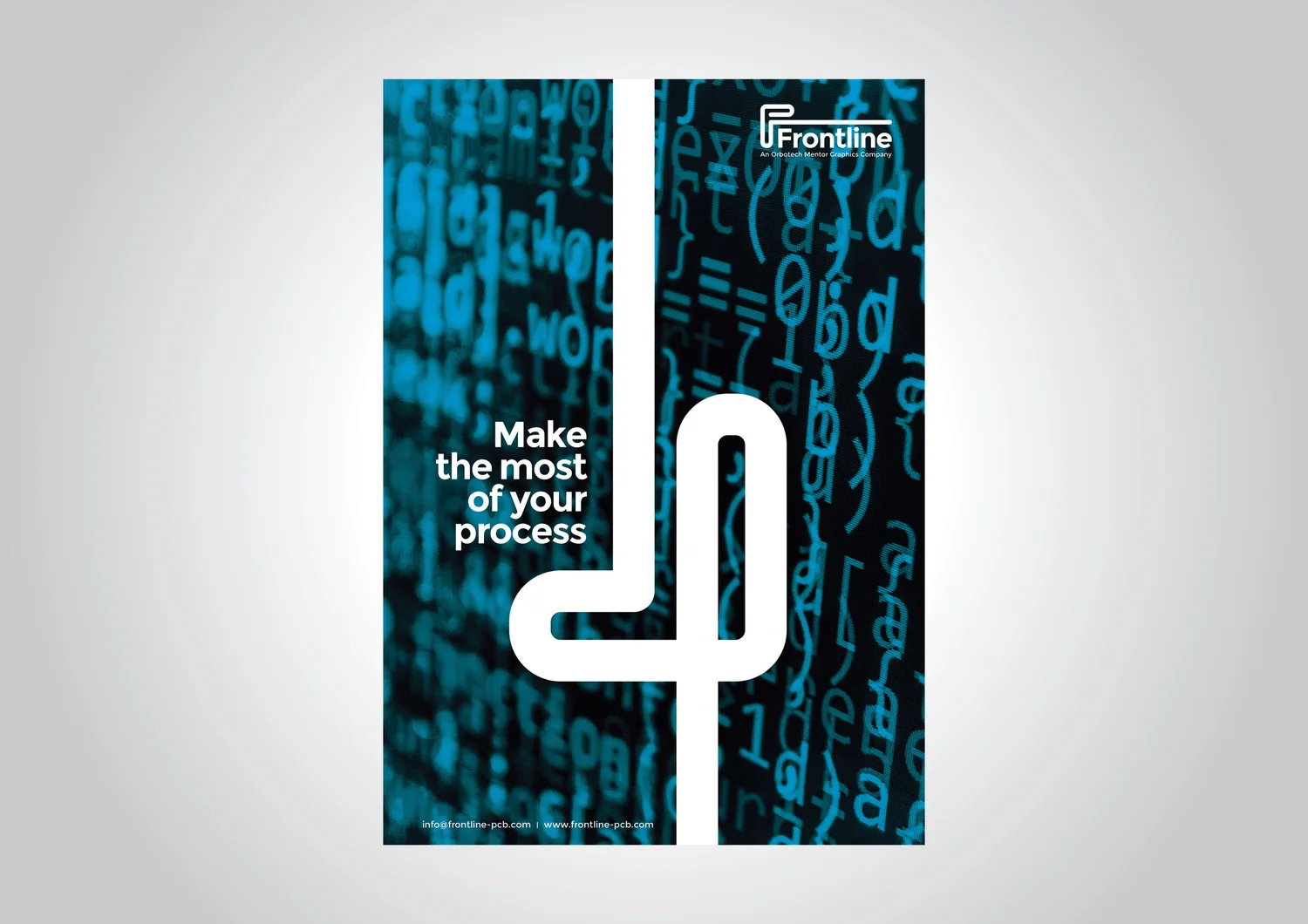
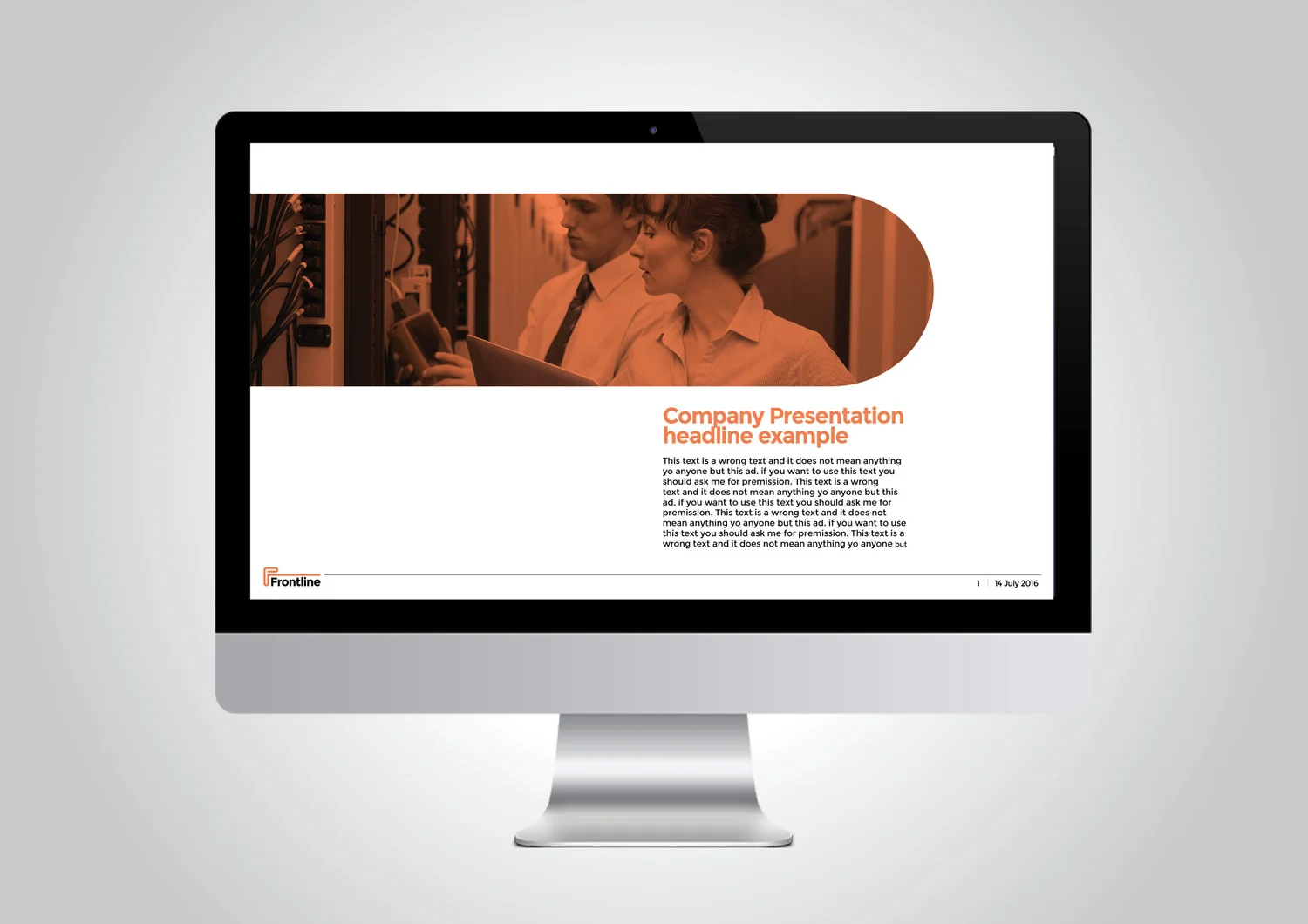
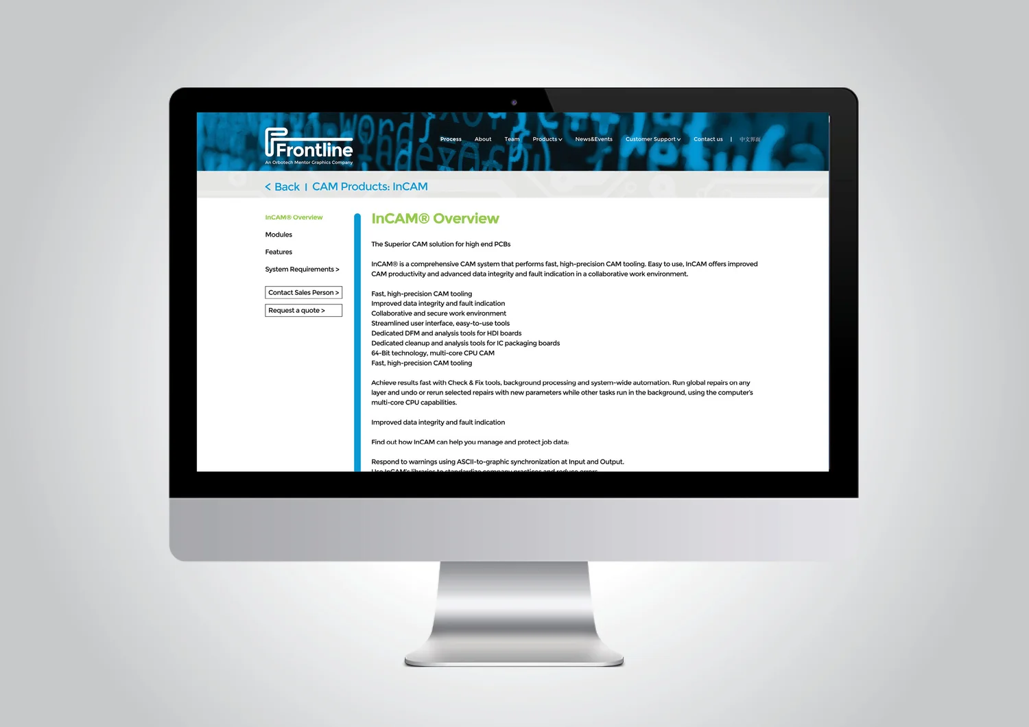
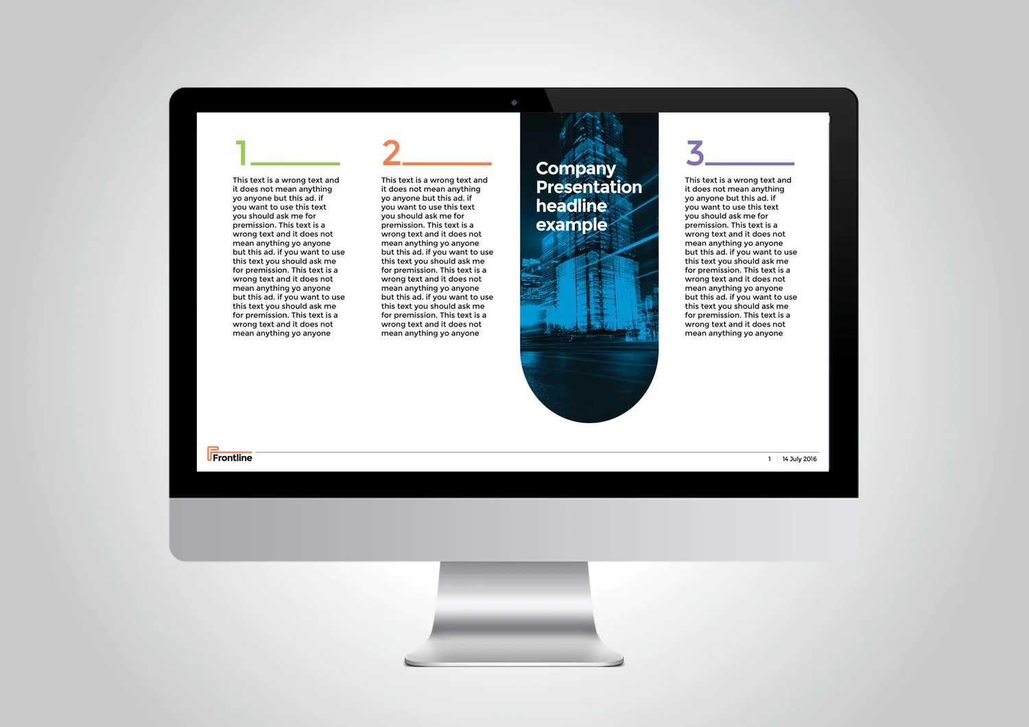
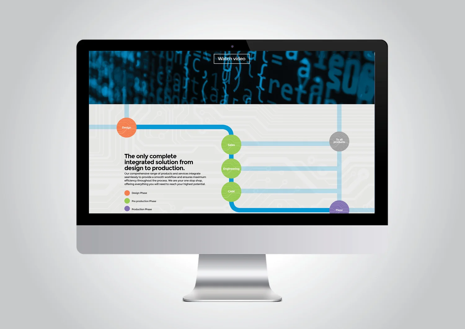
One line moves through a sequence of points, just as Frontline’s technology follows every station in PCB production. The process itself becomes the visual system.

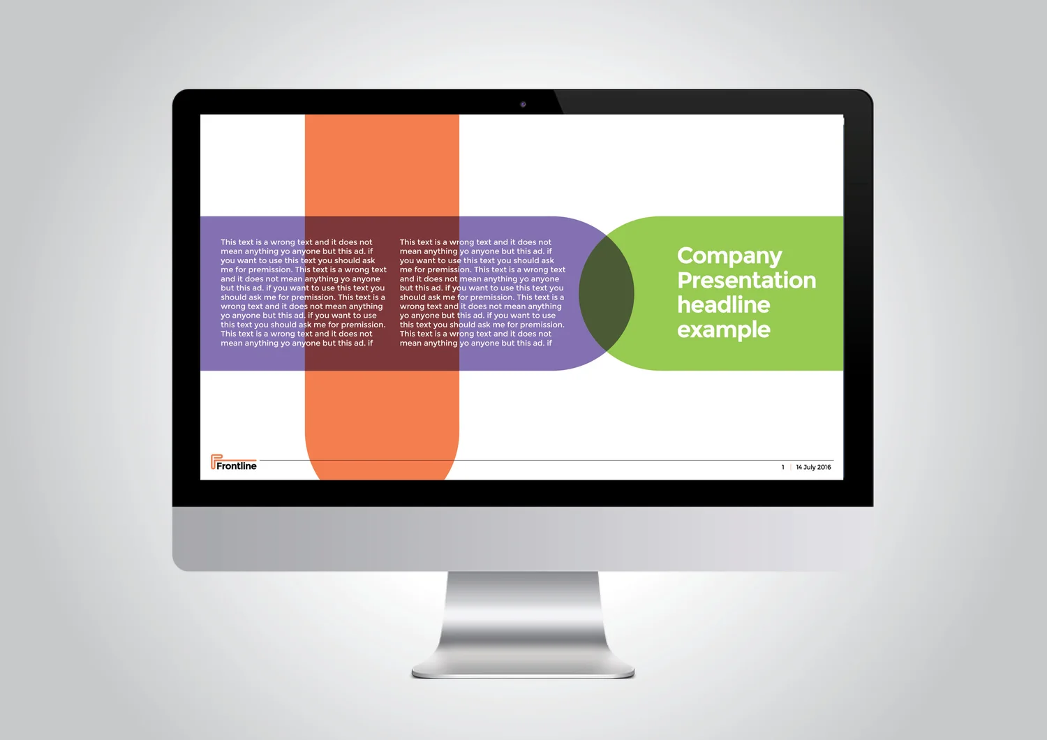
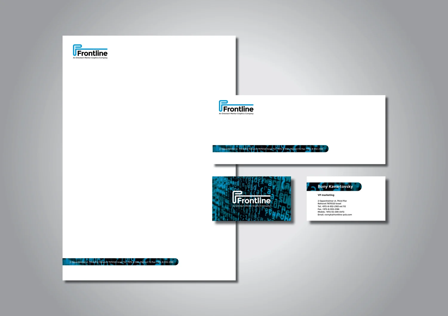
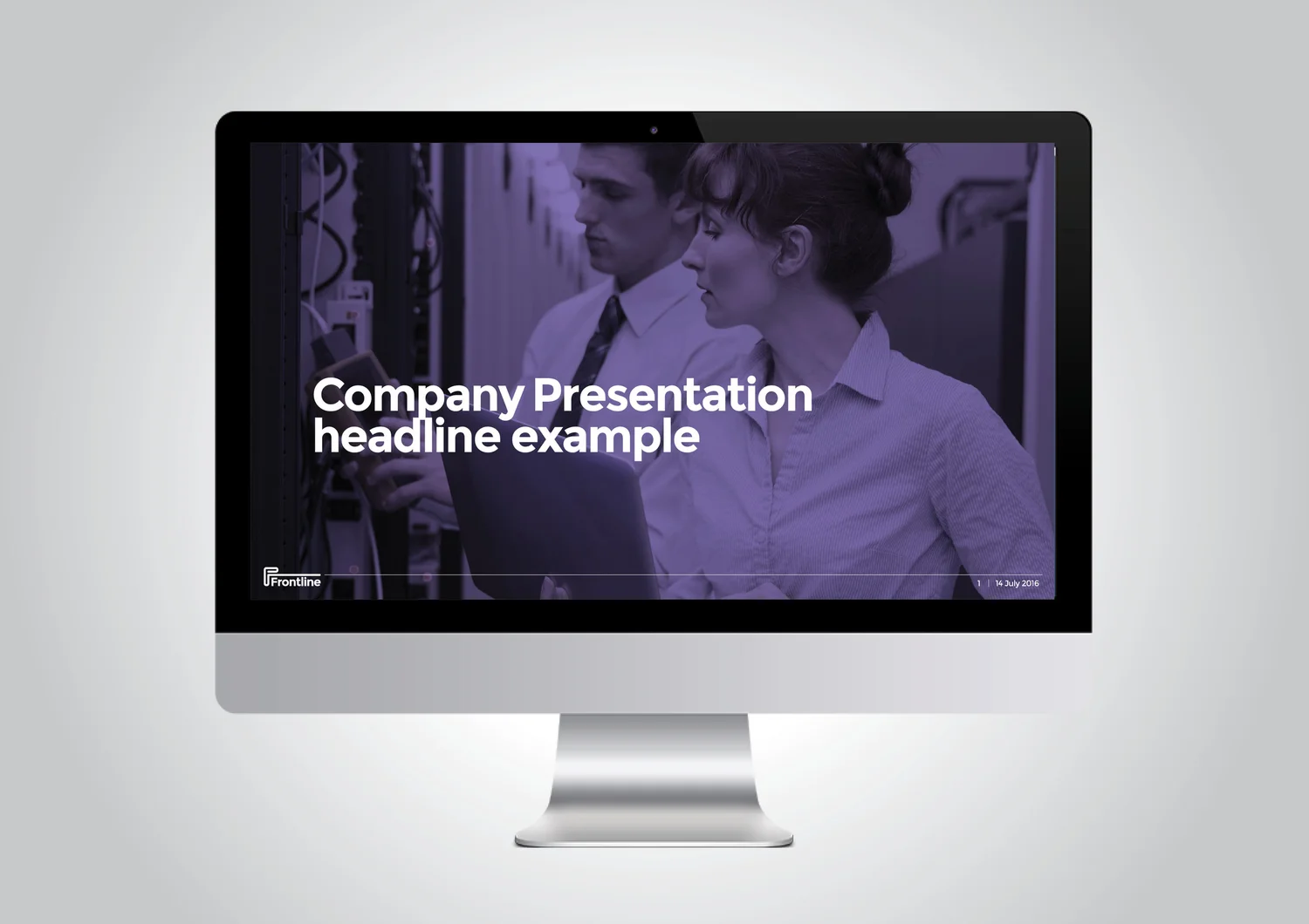
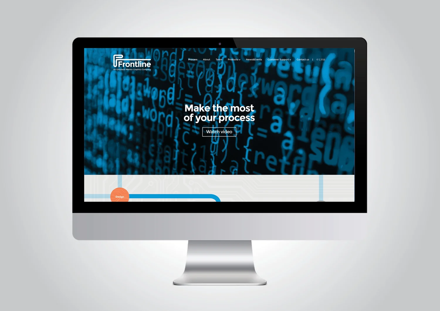
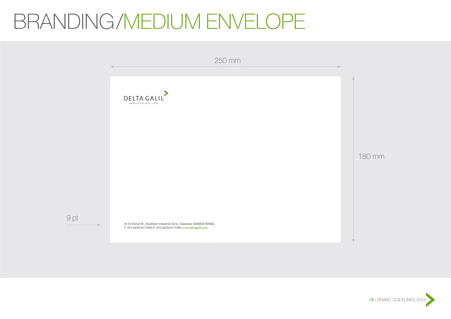
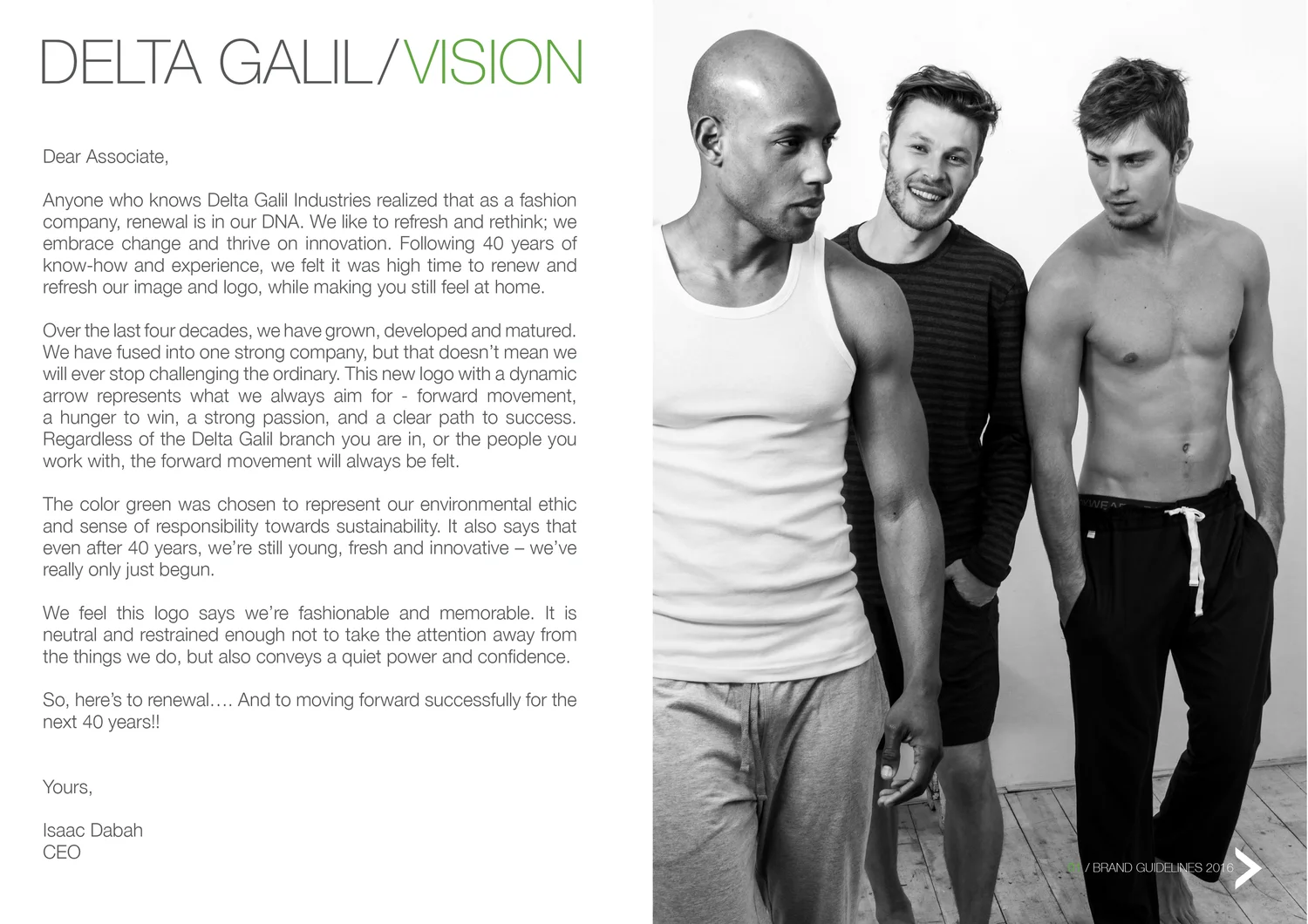
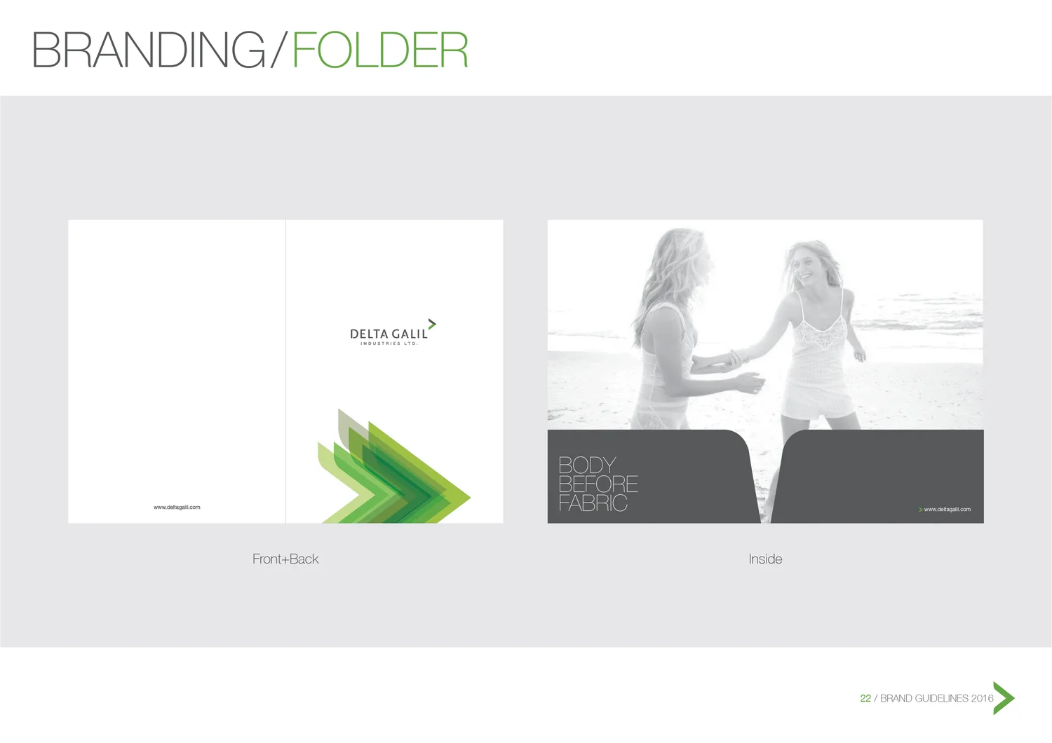
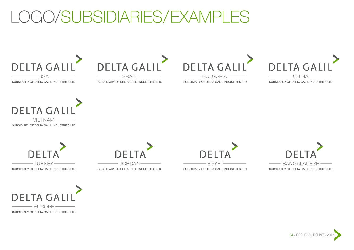
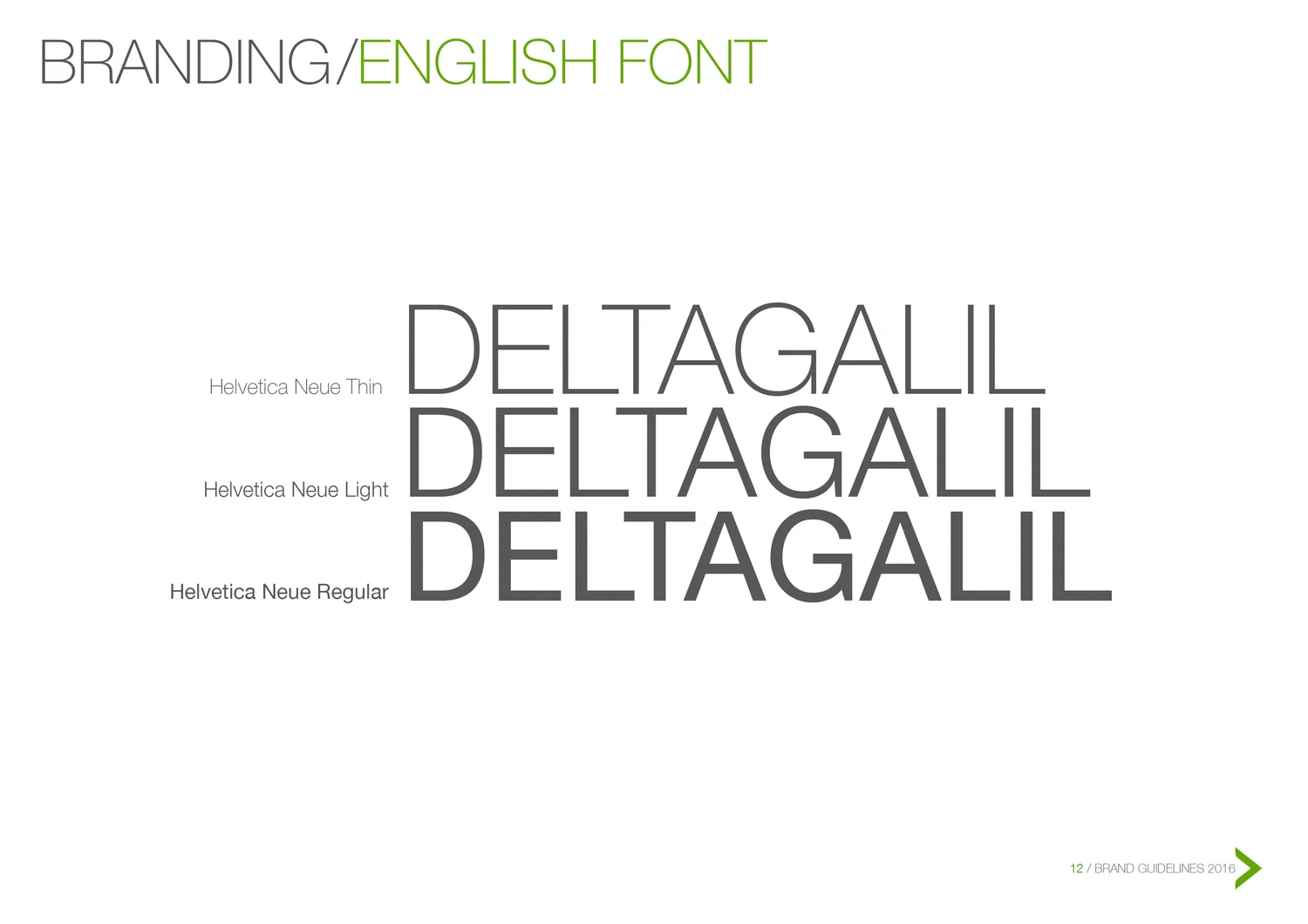
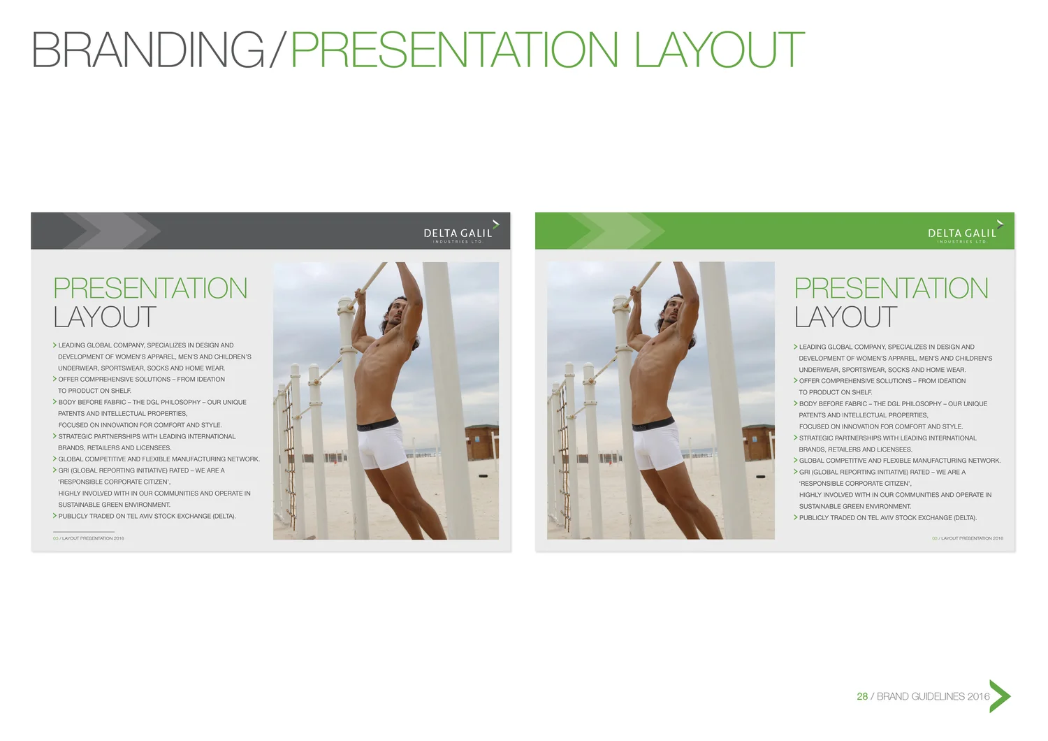
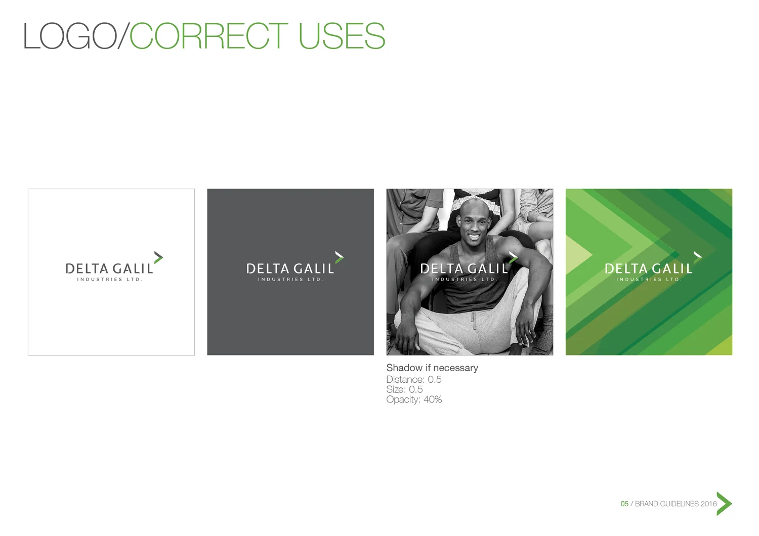
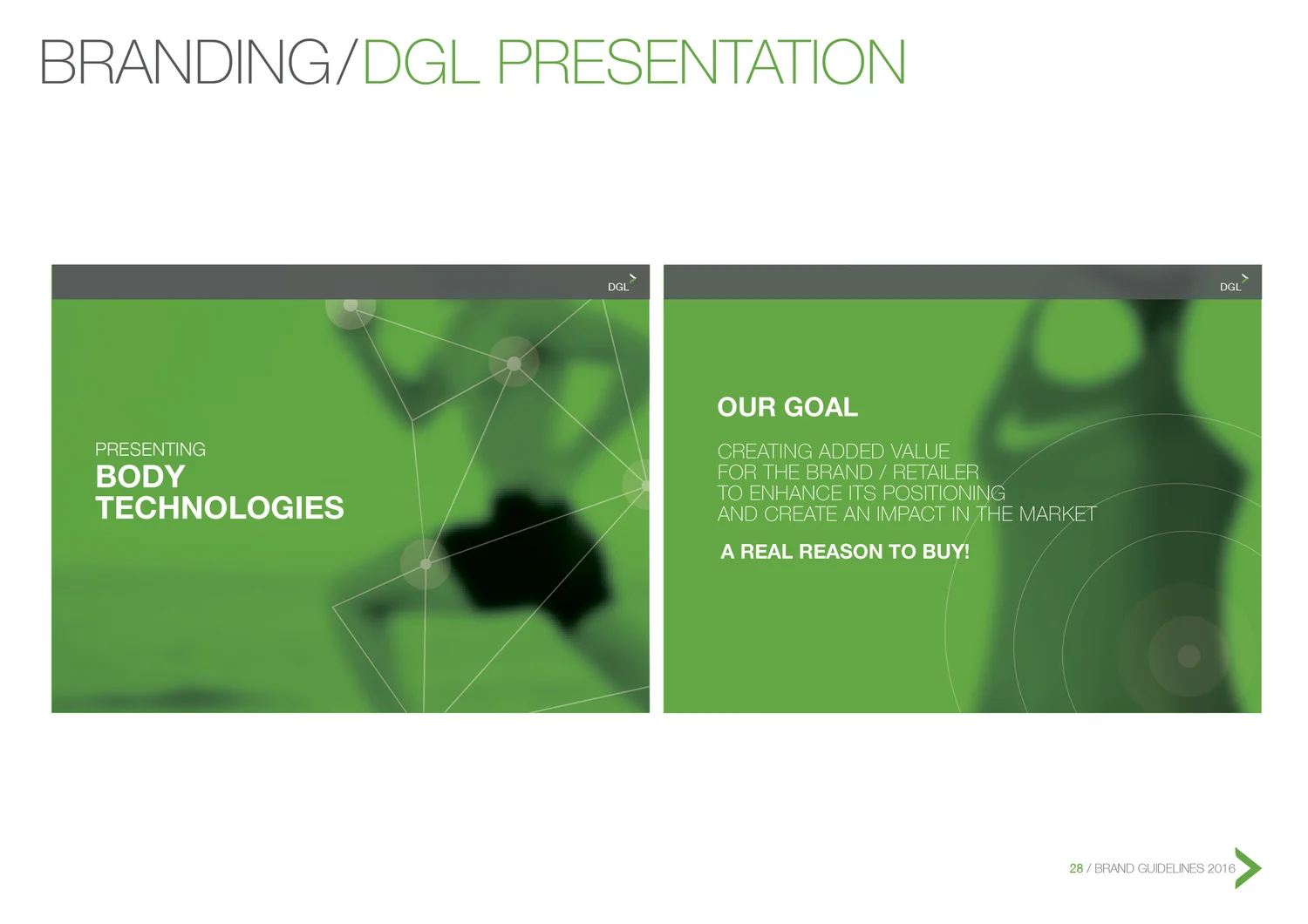
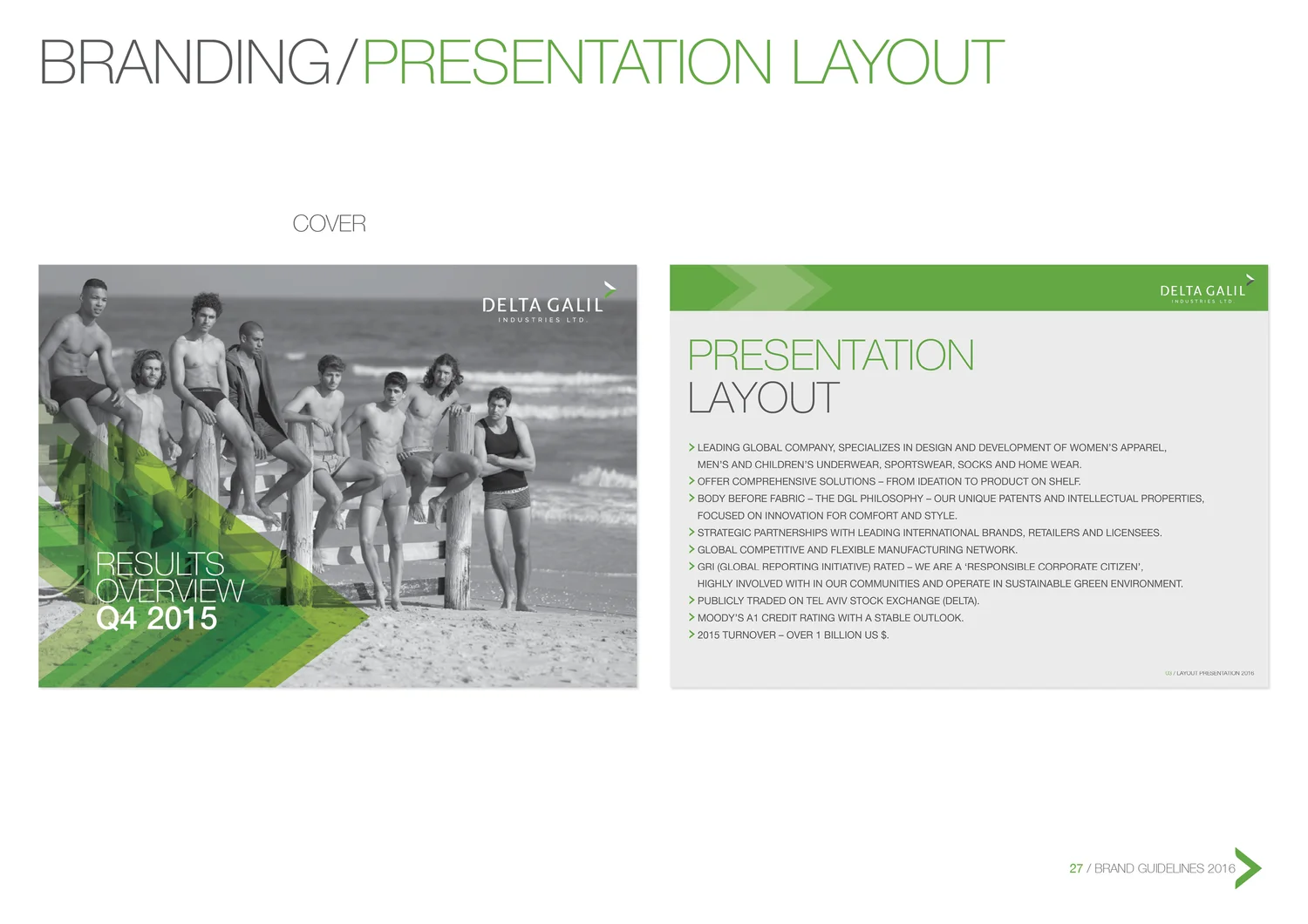
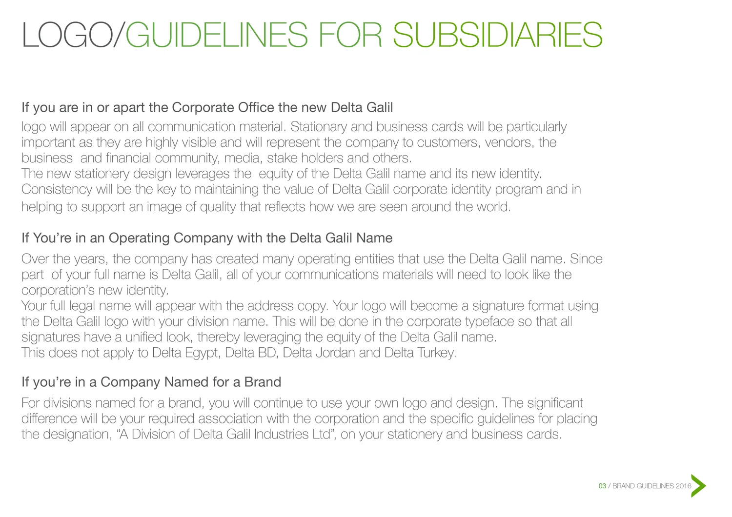
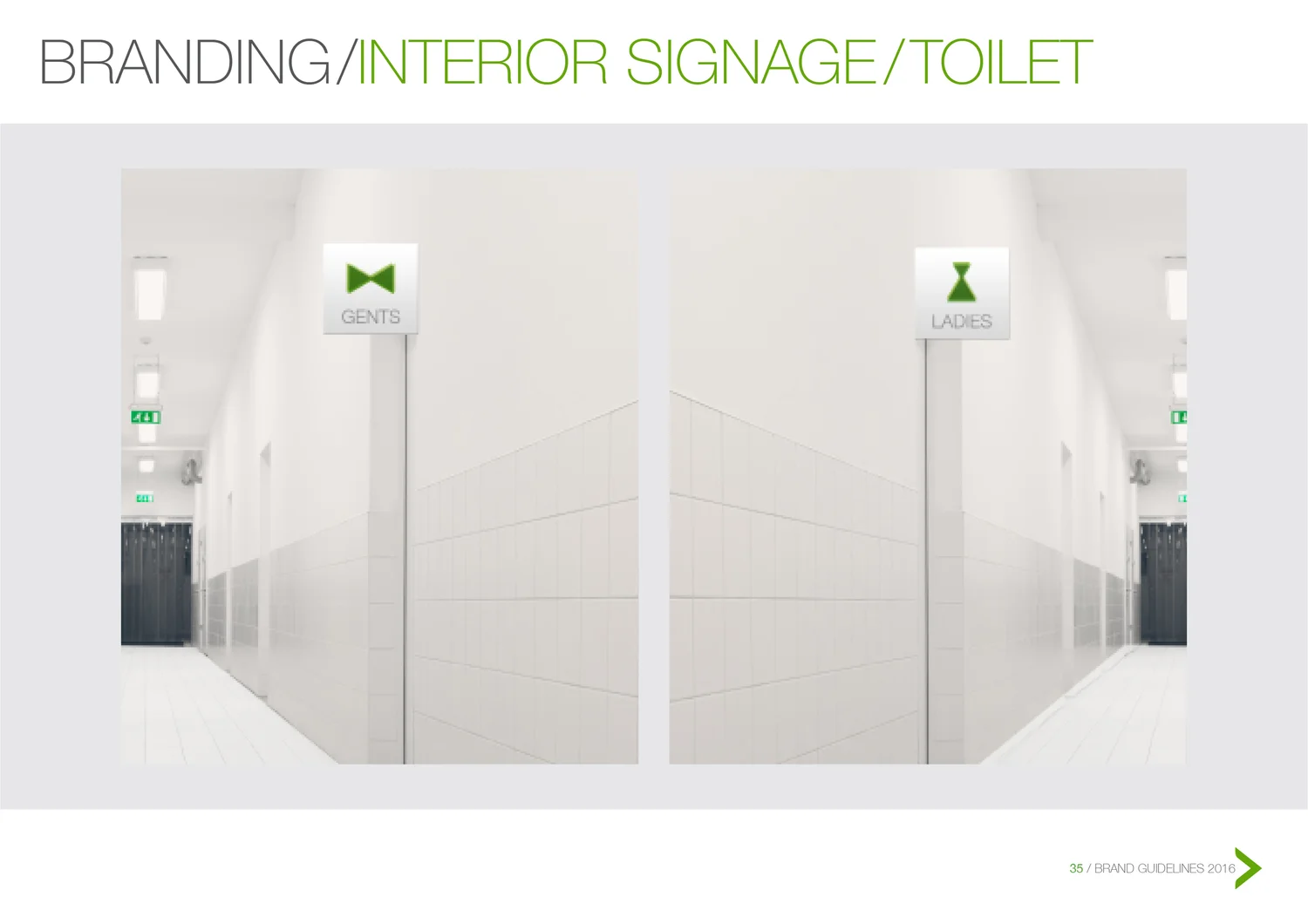
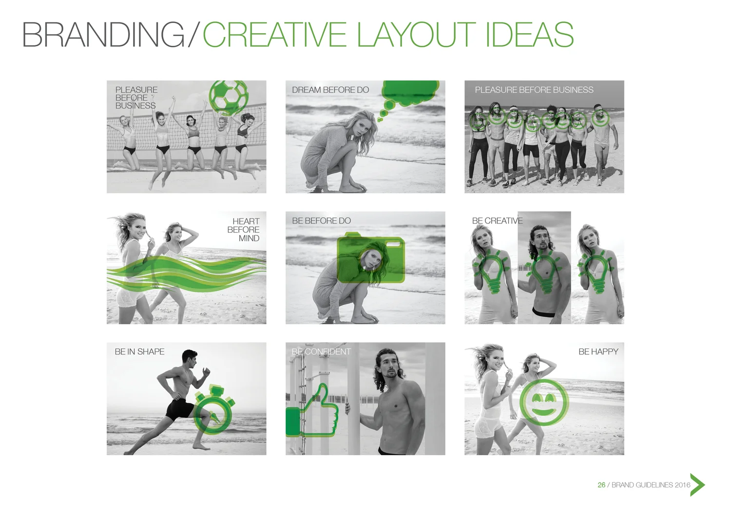
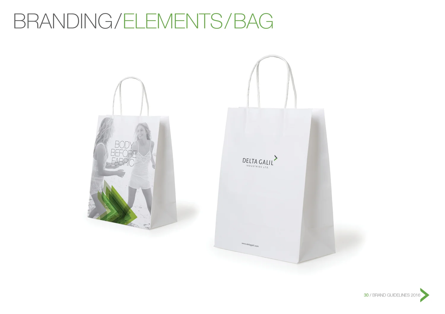
“Body before fabric” became the starting point. Instead of branding textiles, the system puts the human body first — softer, more intimate and closer to the experience of wearing the product.
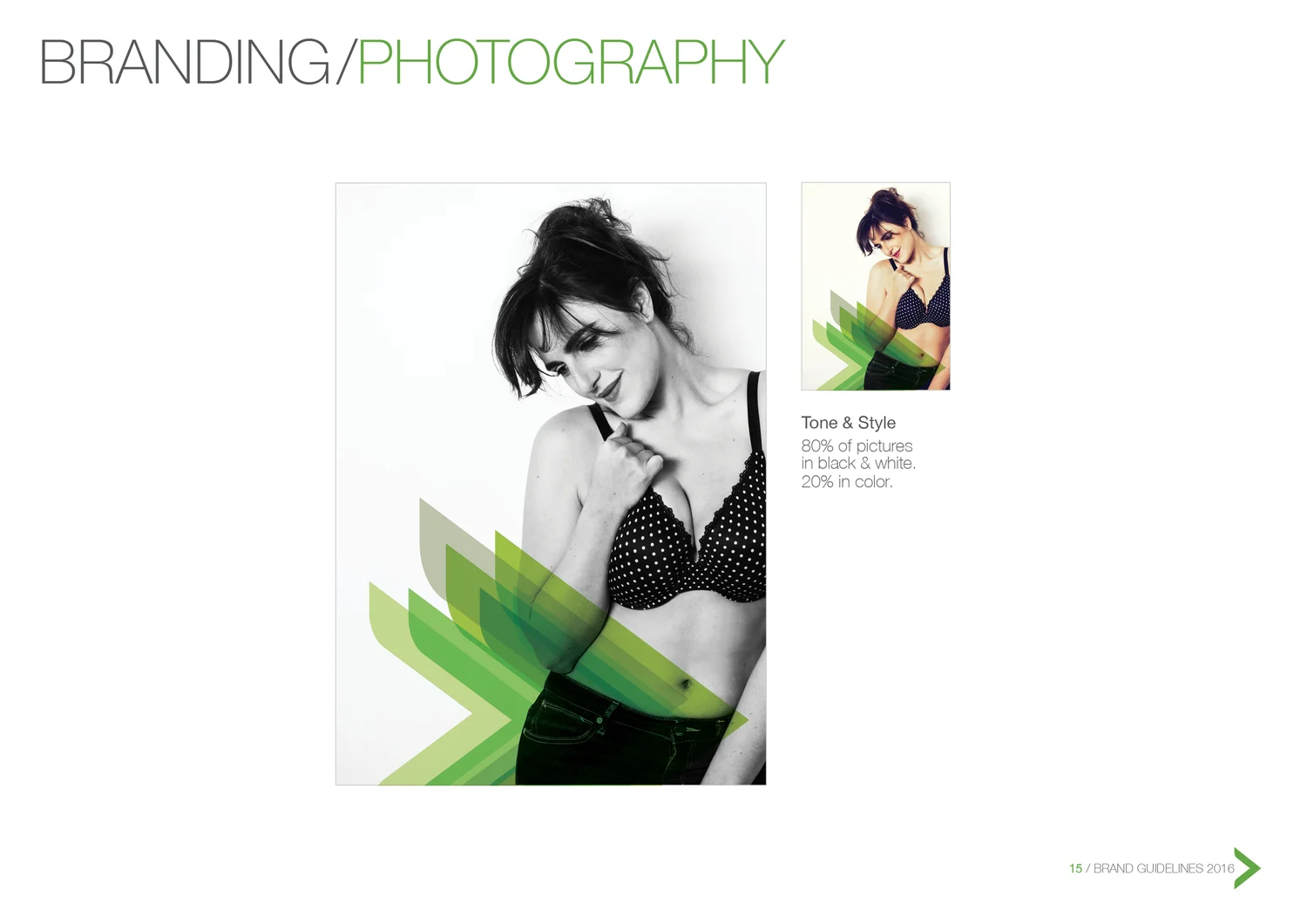
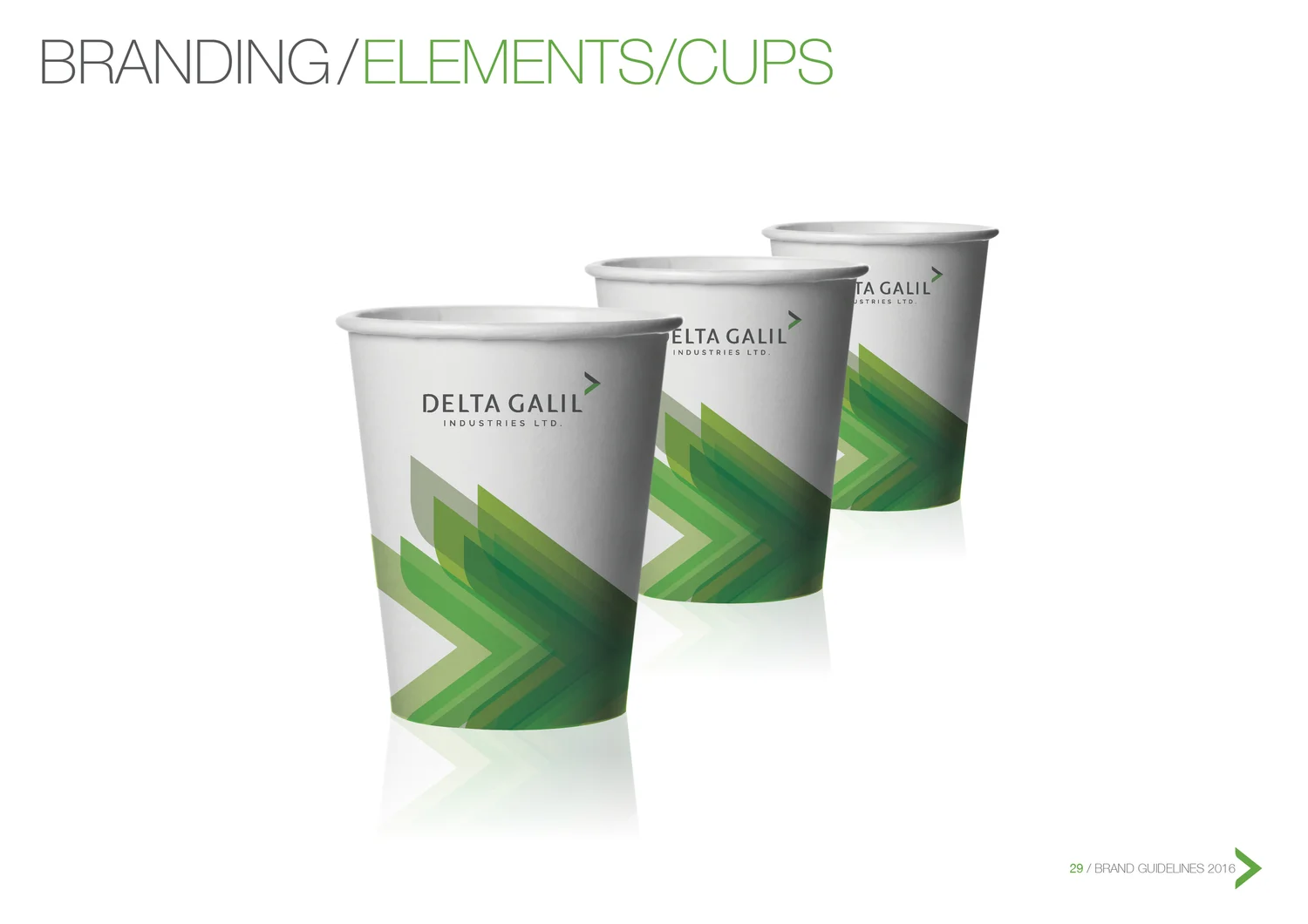
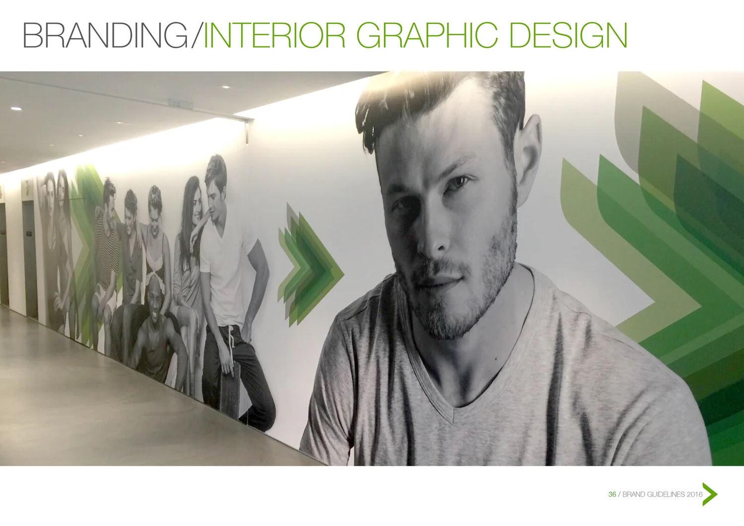
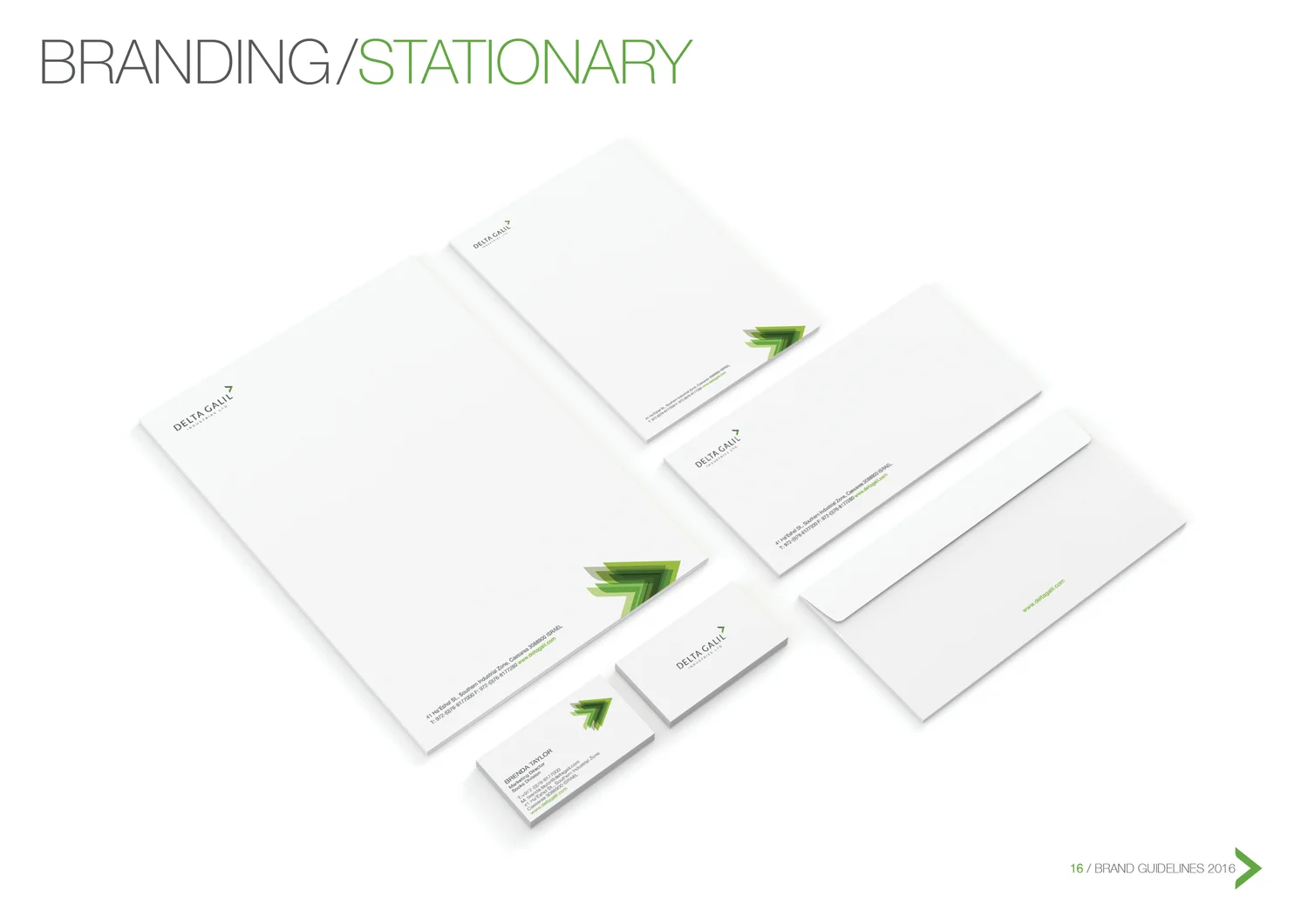
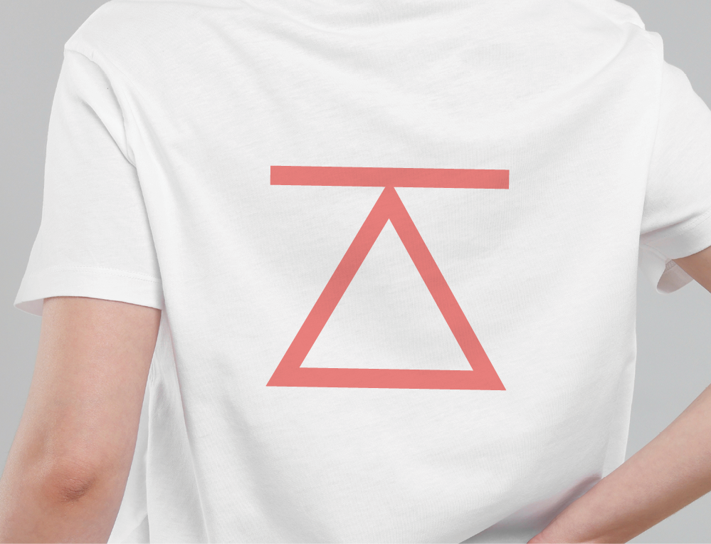
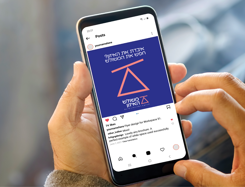
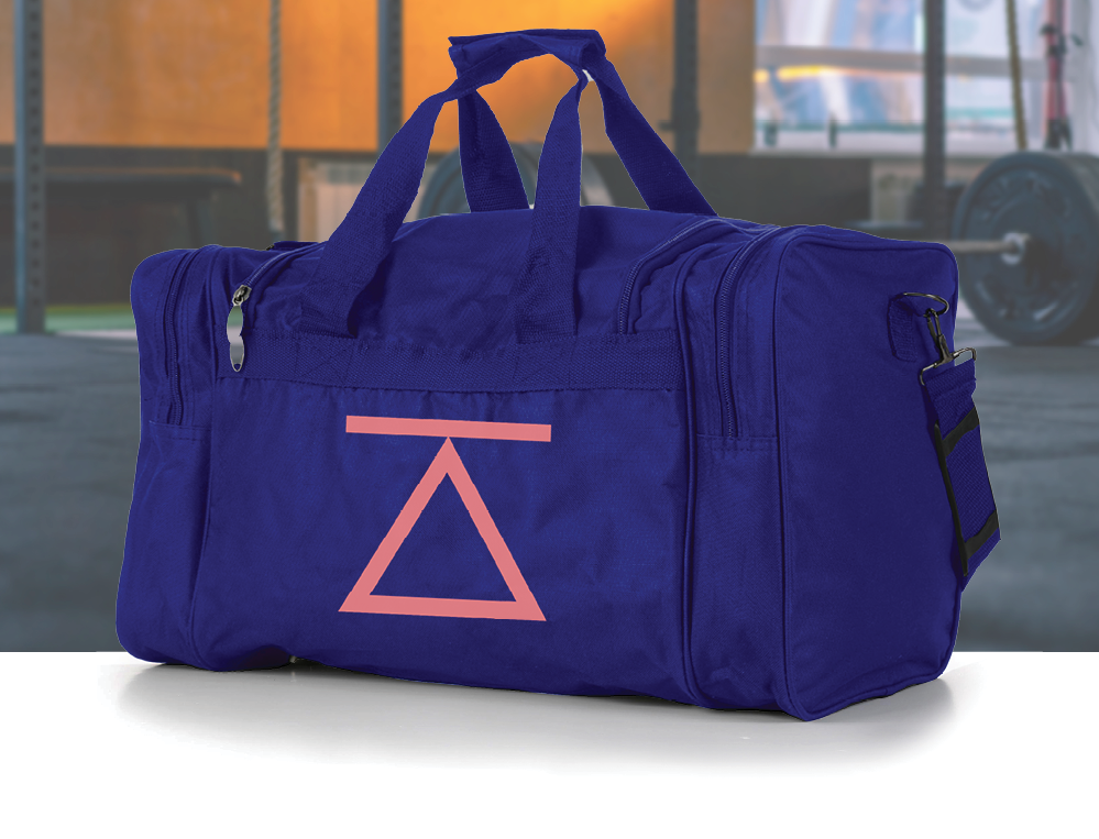
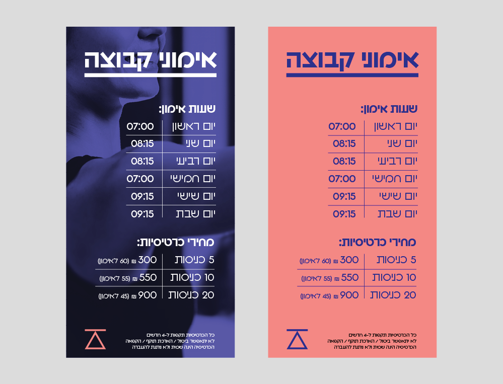
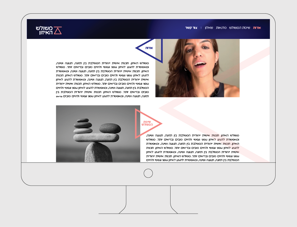
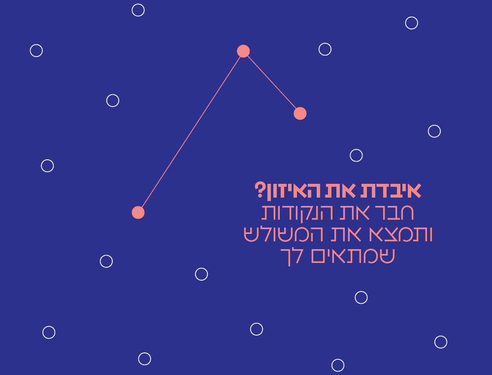
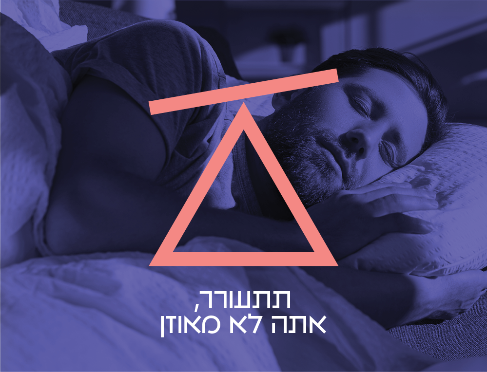
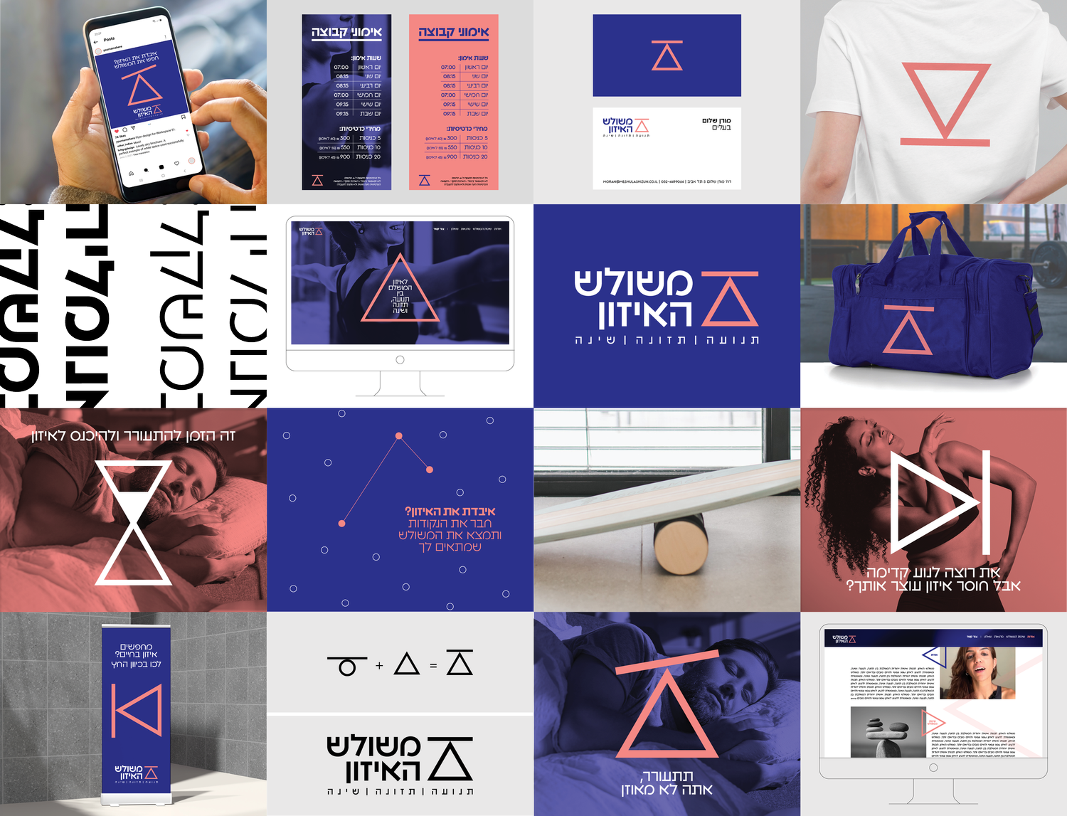
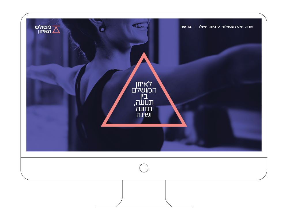
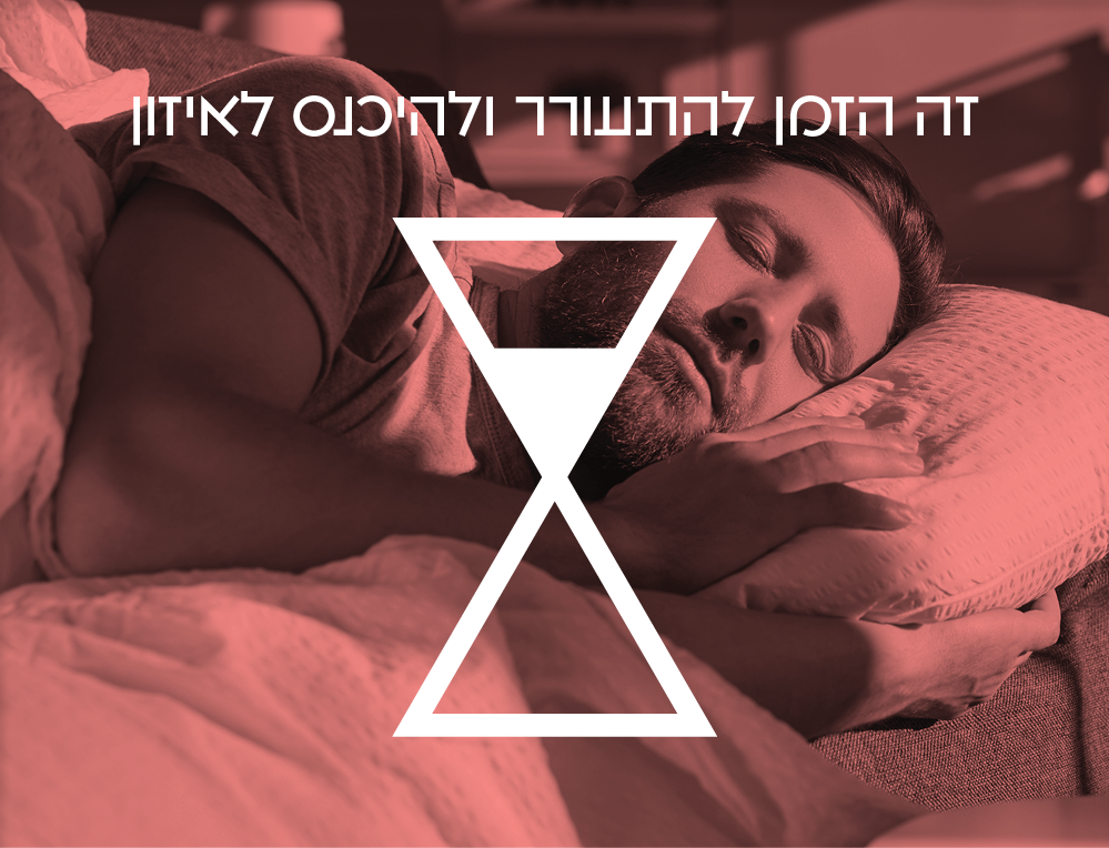
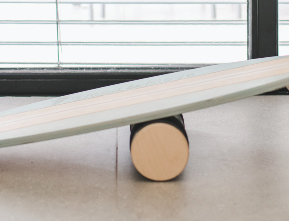
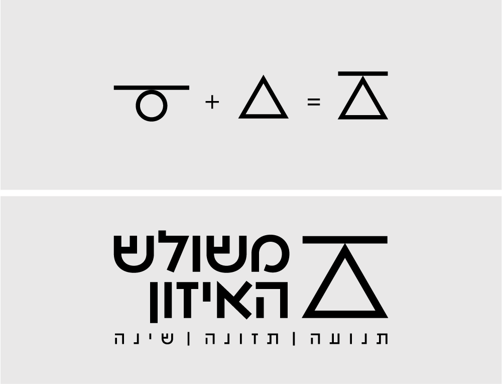
Sleep, nutrition and activity form a triangle that is never perfectly fixed. The moving line inside the symbol shows that balance is personal, temporary and constantly being adjusted.


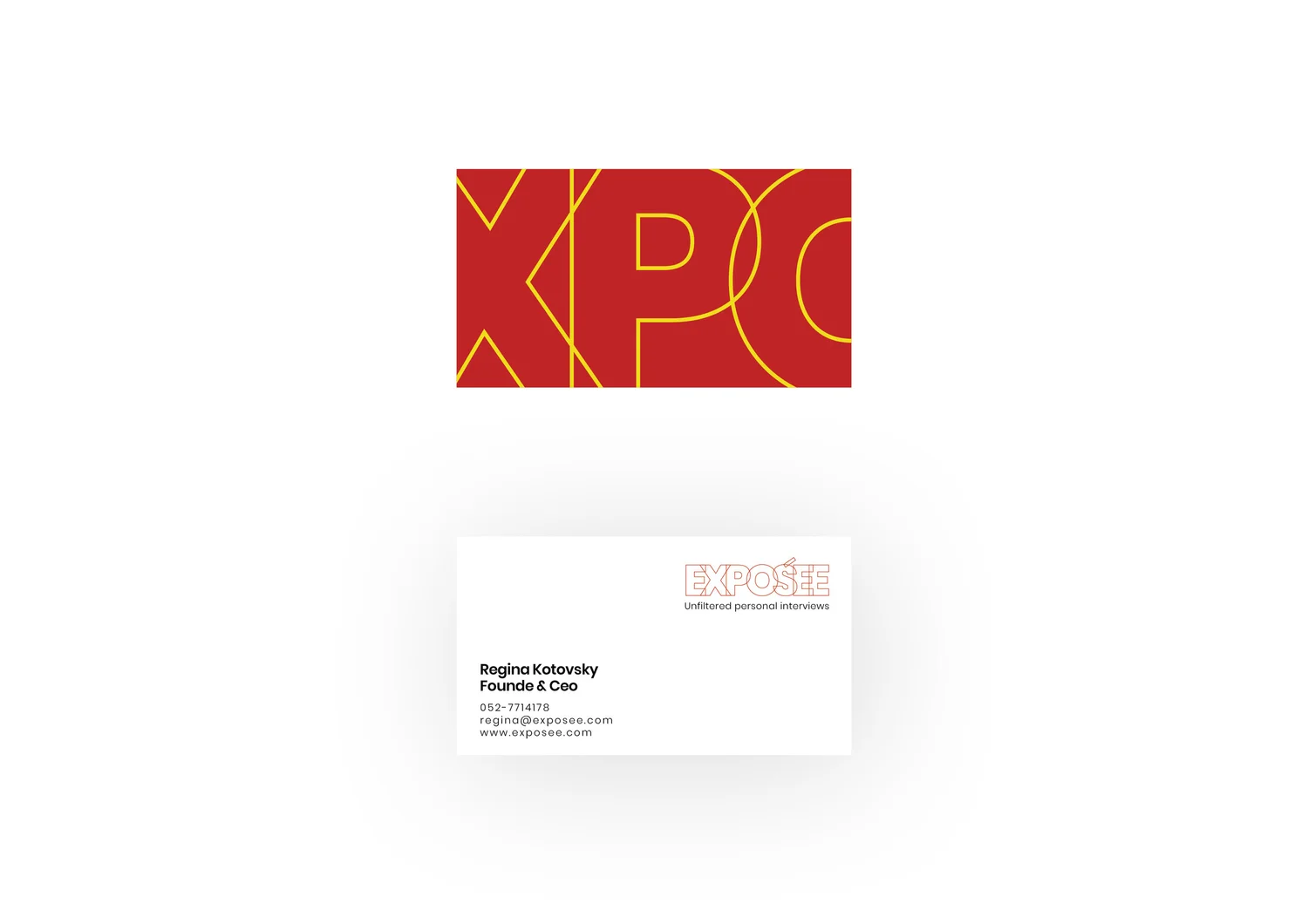
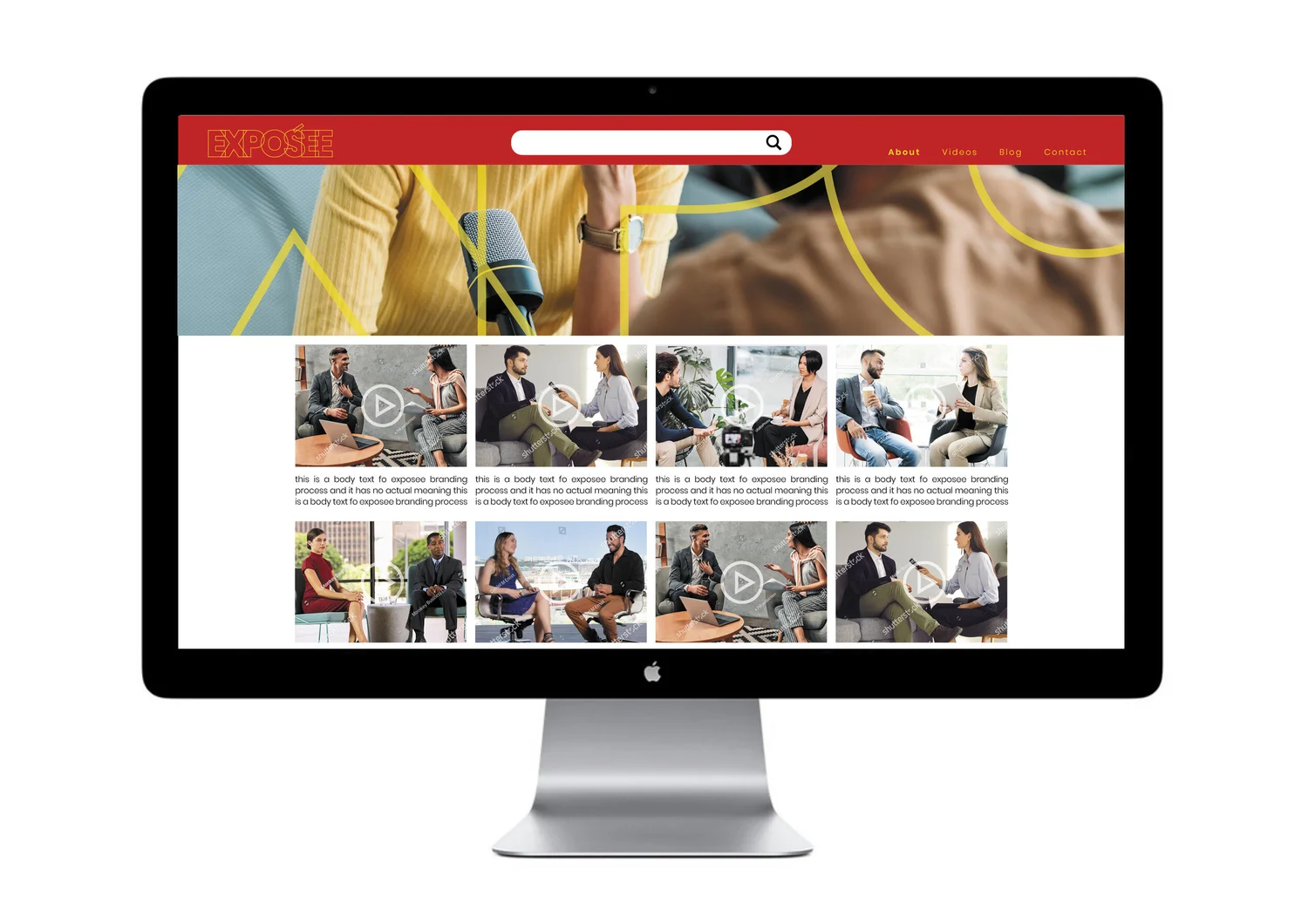
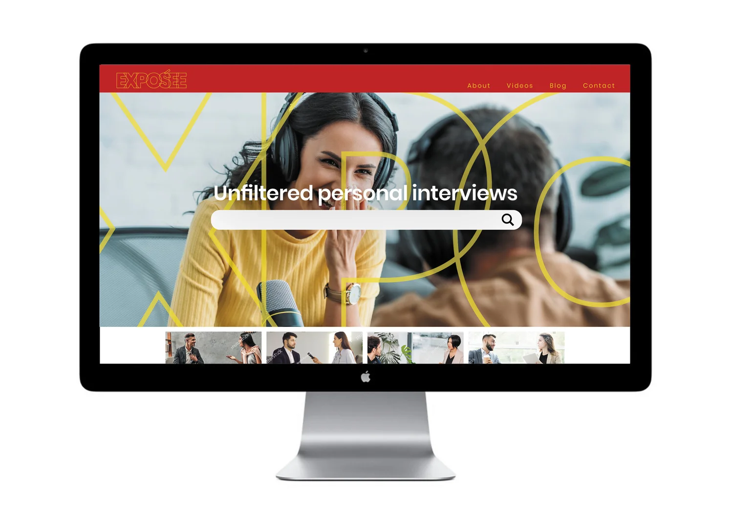
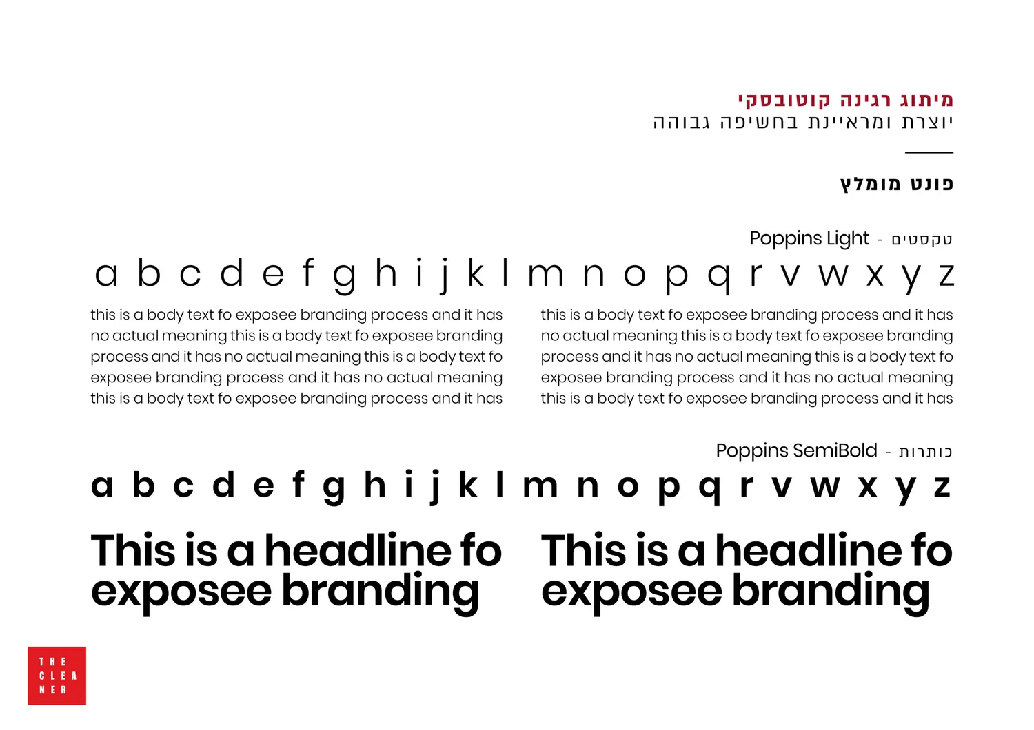
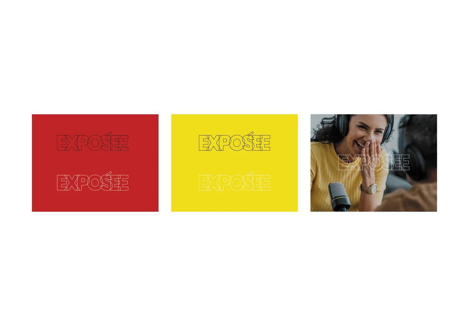
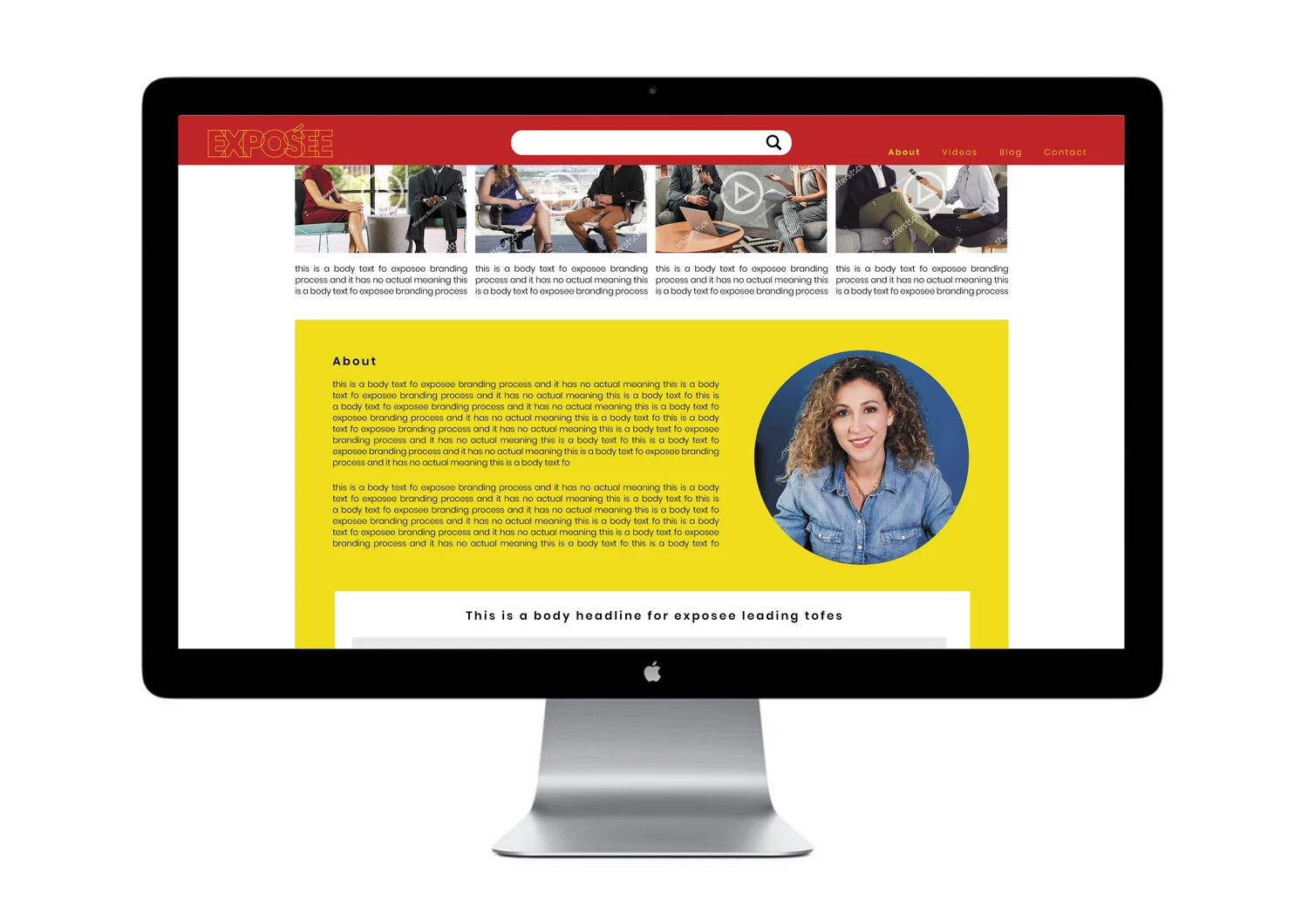
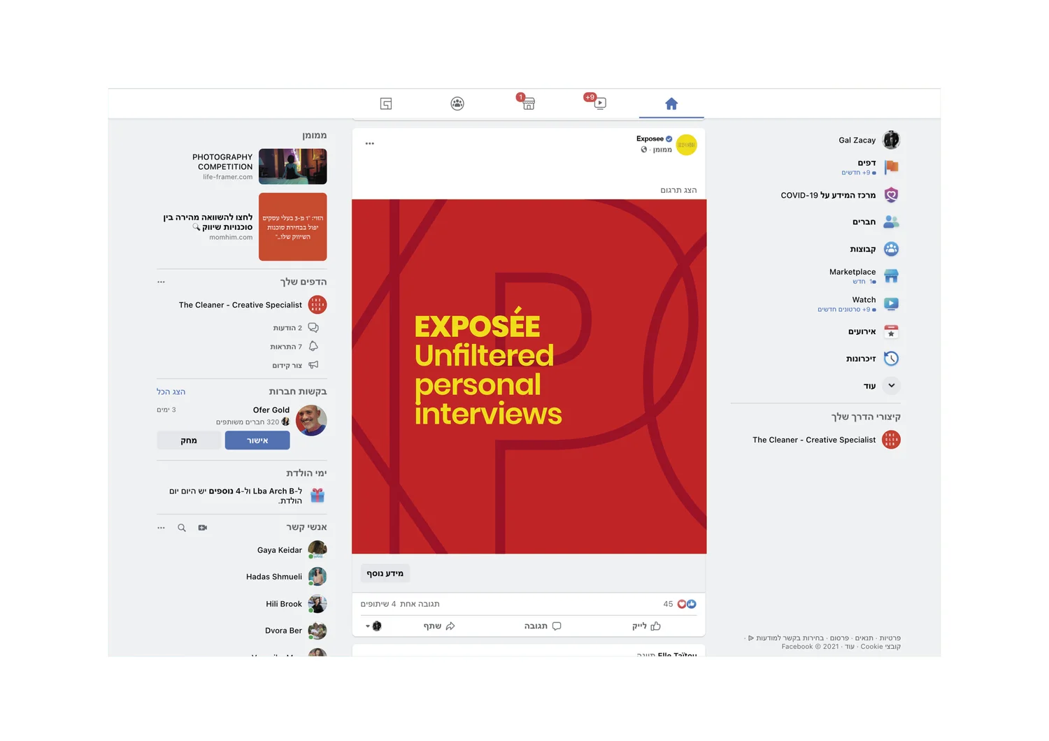
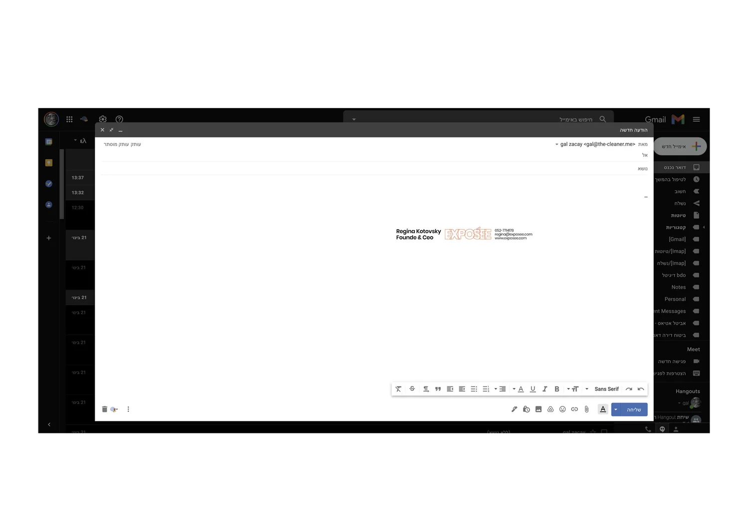
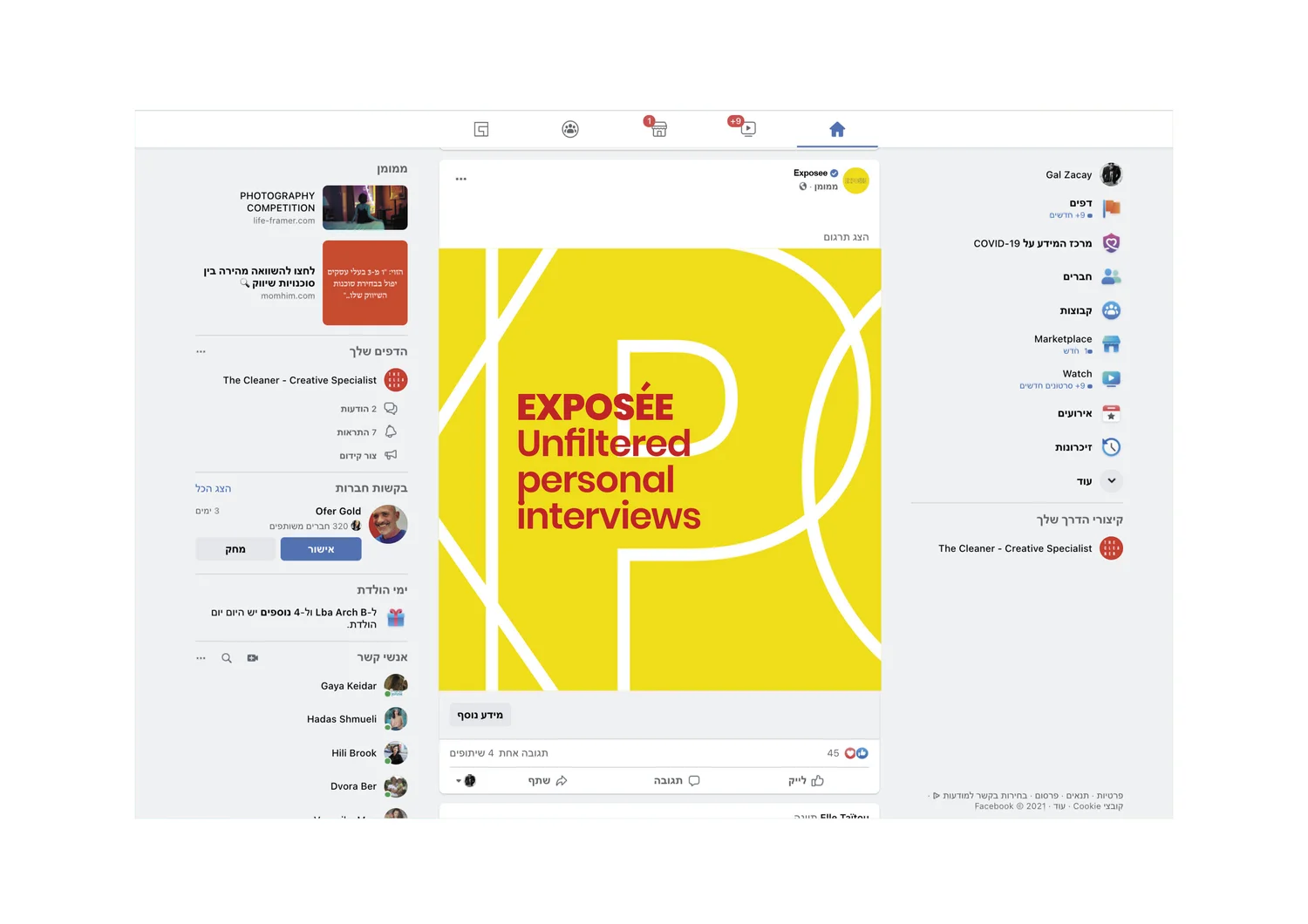
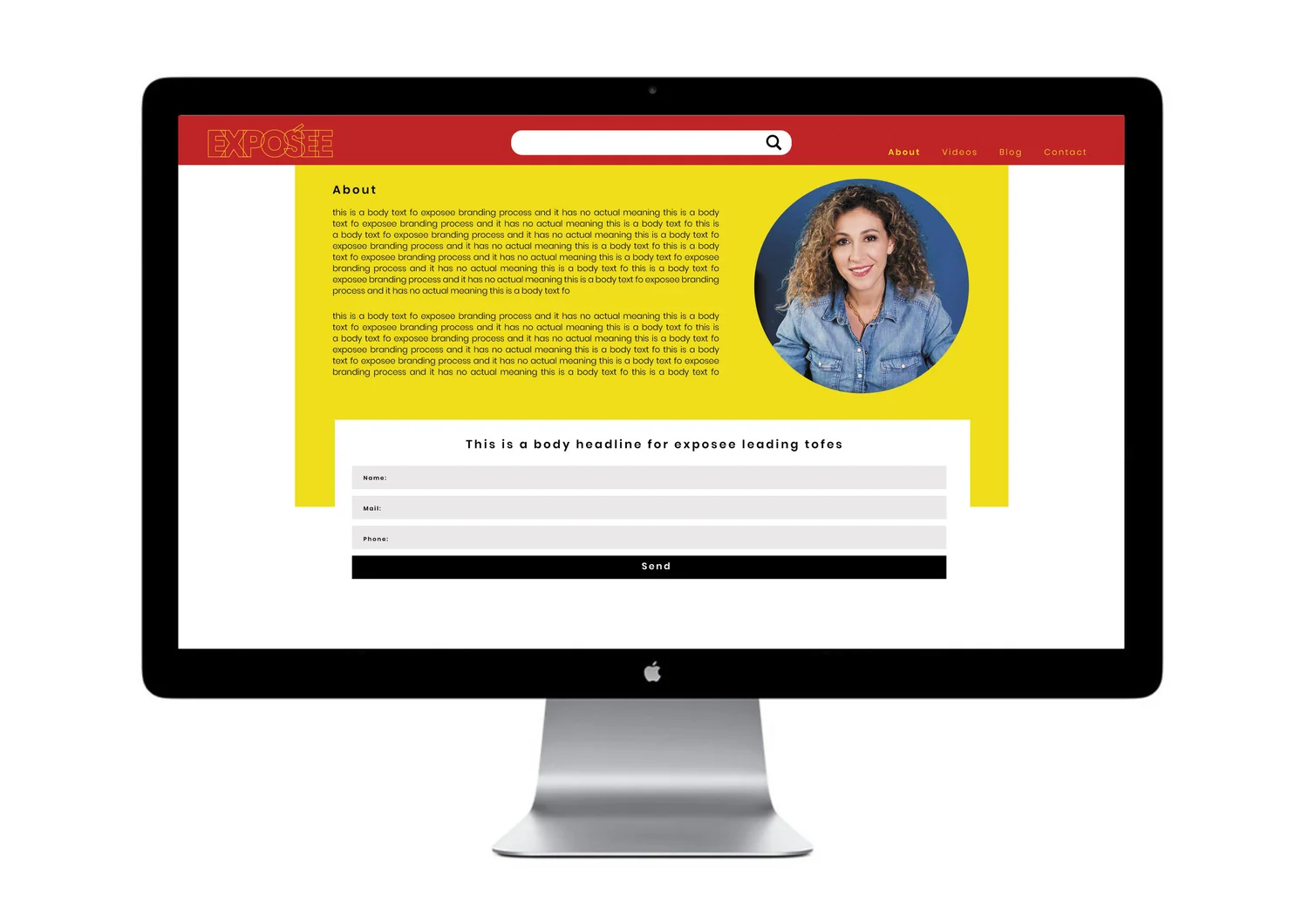
An interview format with nothing to hide needed an identity that behaves the same way. Layers are exposed rather than concealed, making transparency itself the visual language.
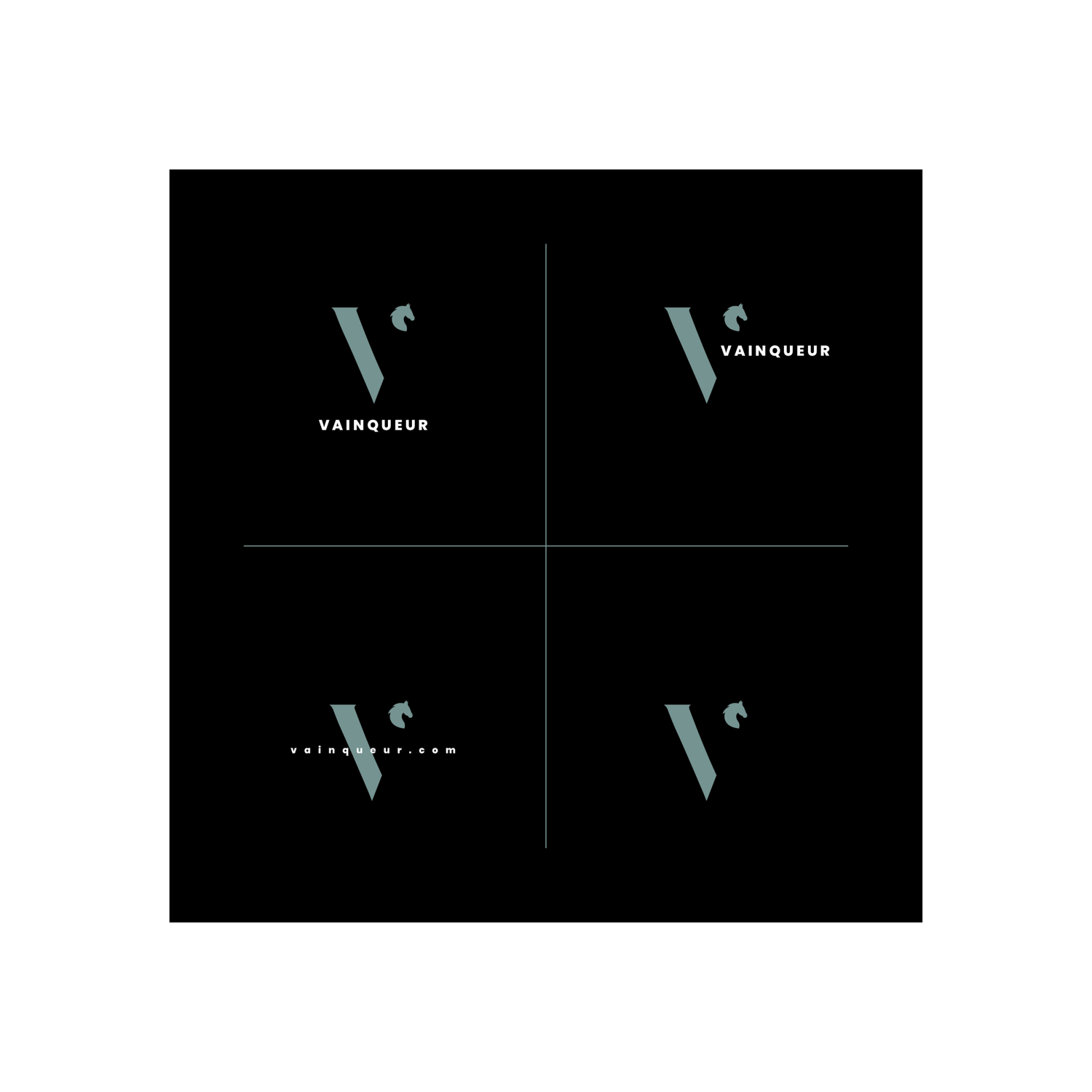
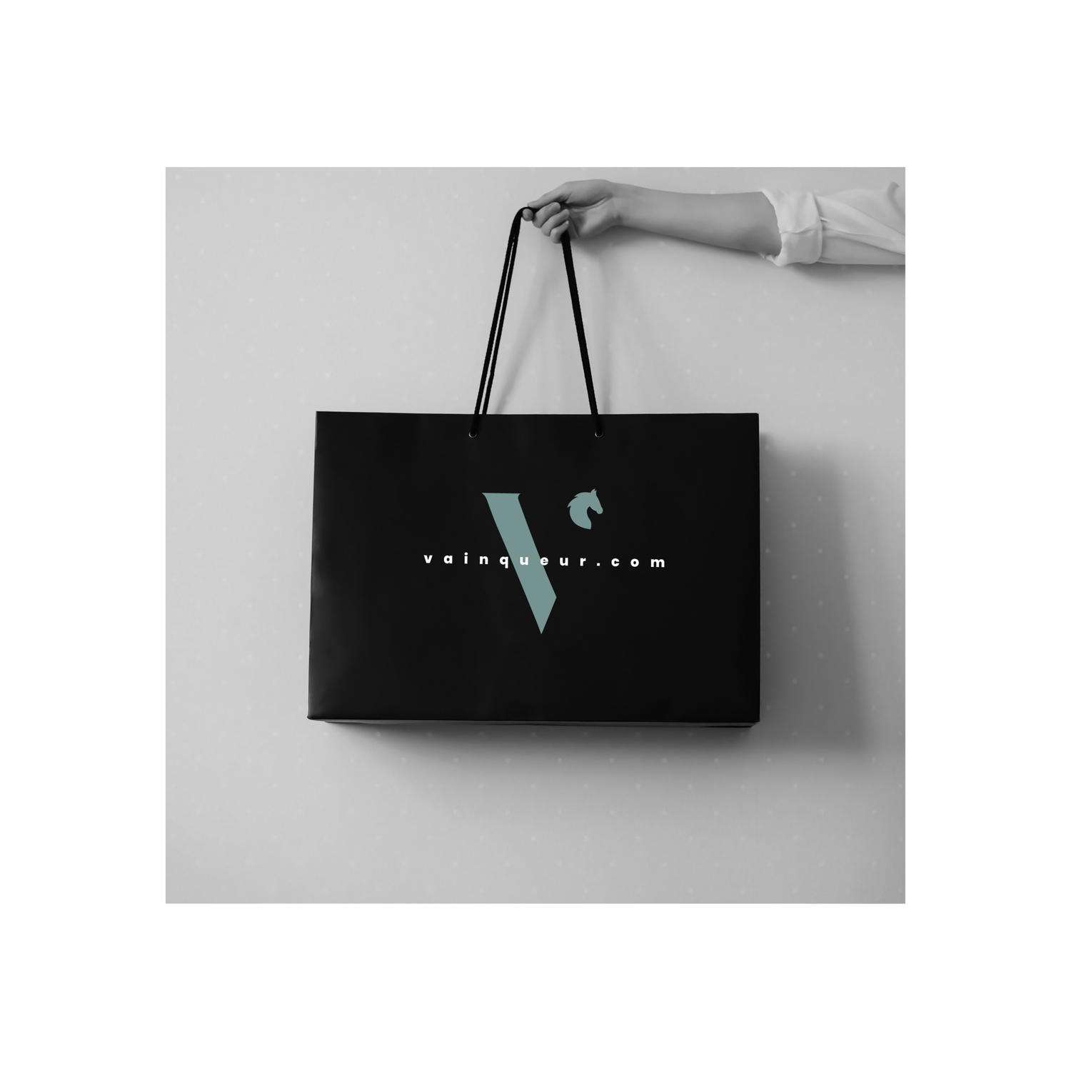
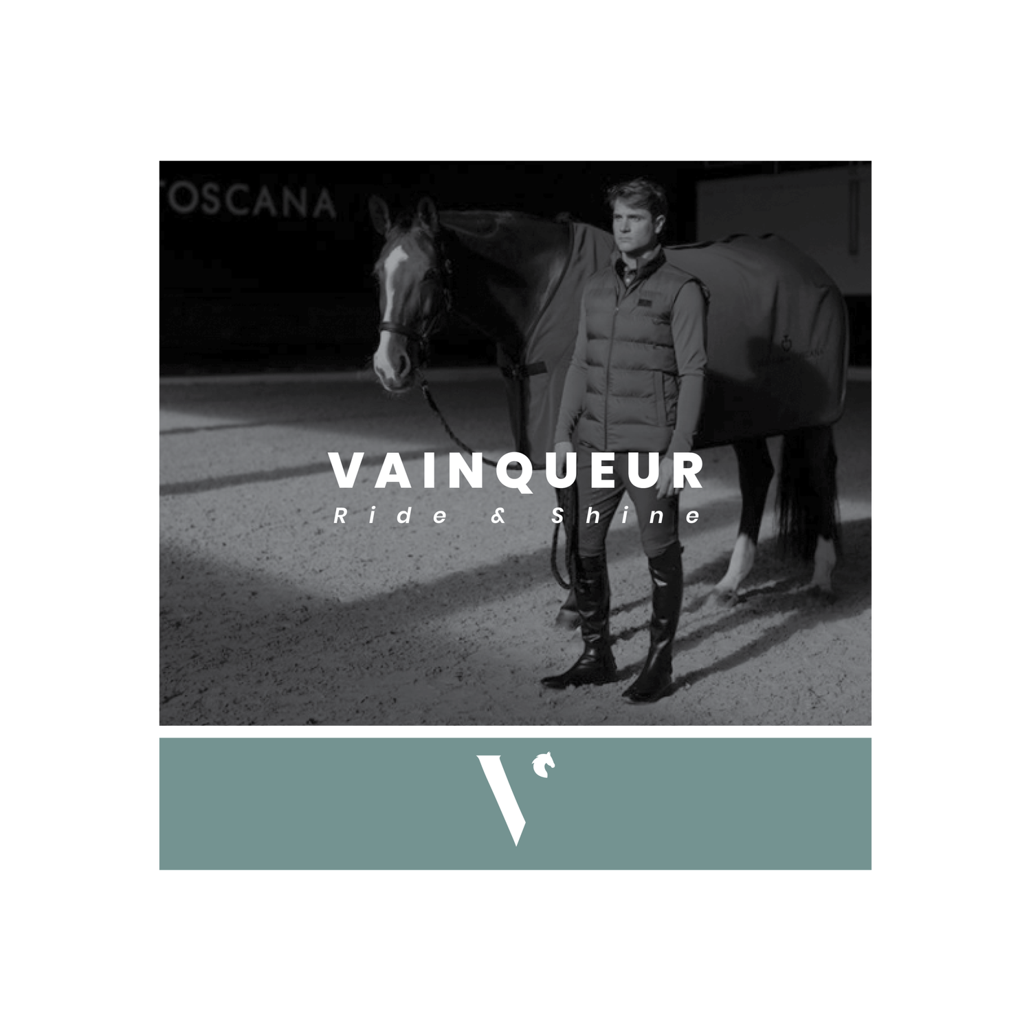
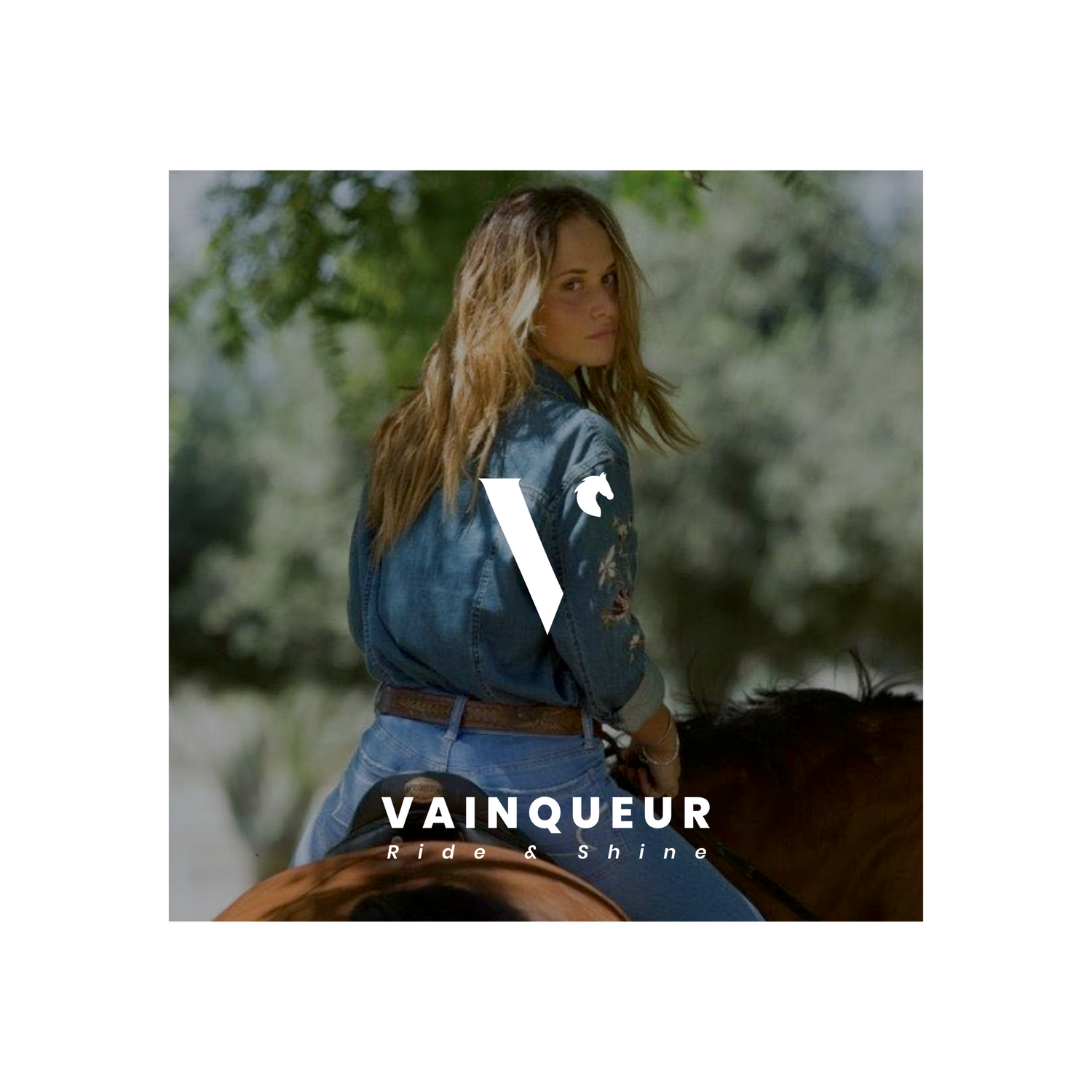
Equestrian culture is built on a tension between power and restraint. The identity translates that balance into fashion — disciplined, elegant and controlled.
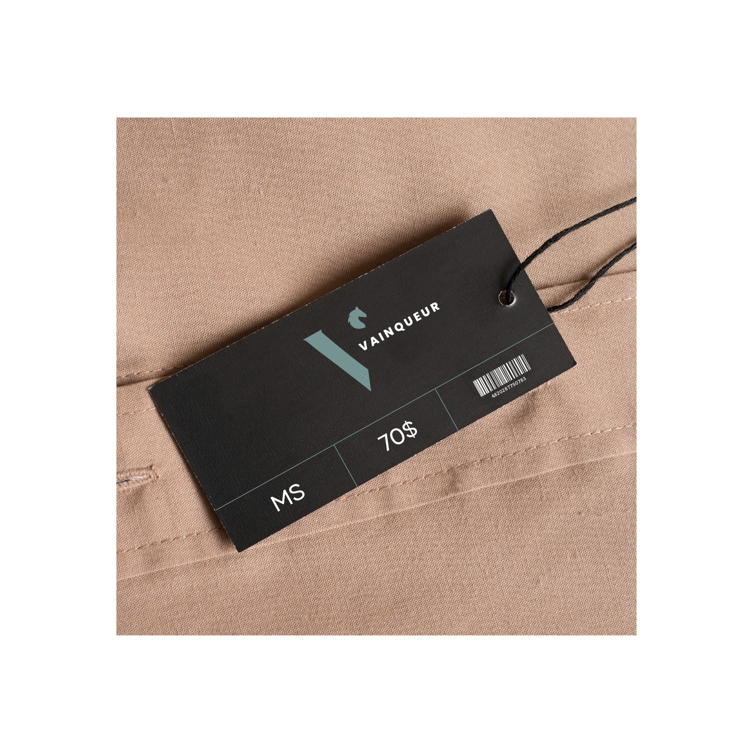
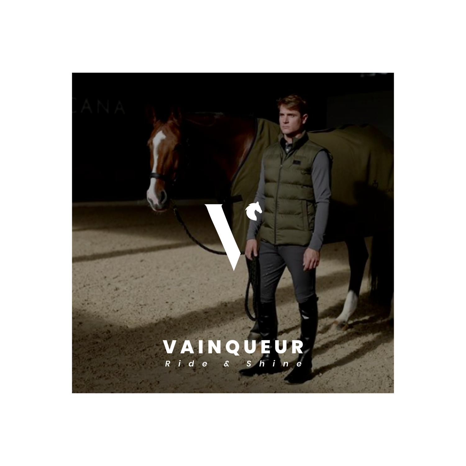
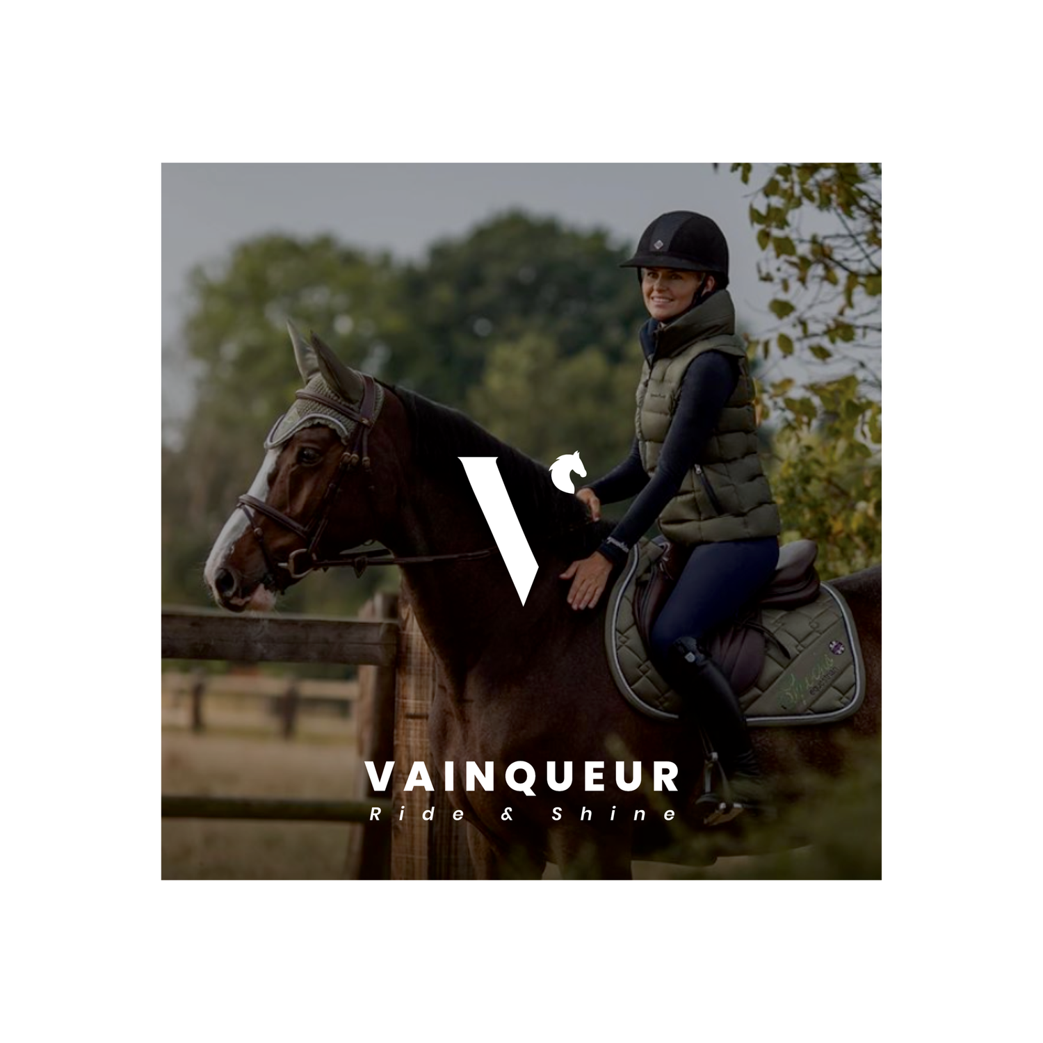
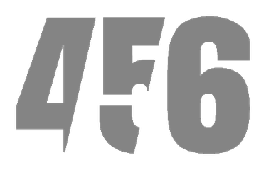
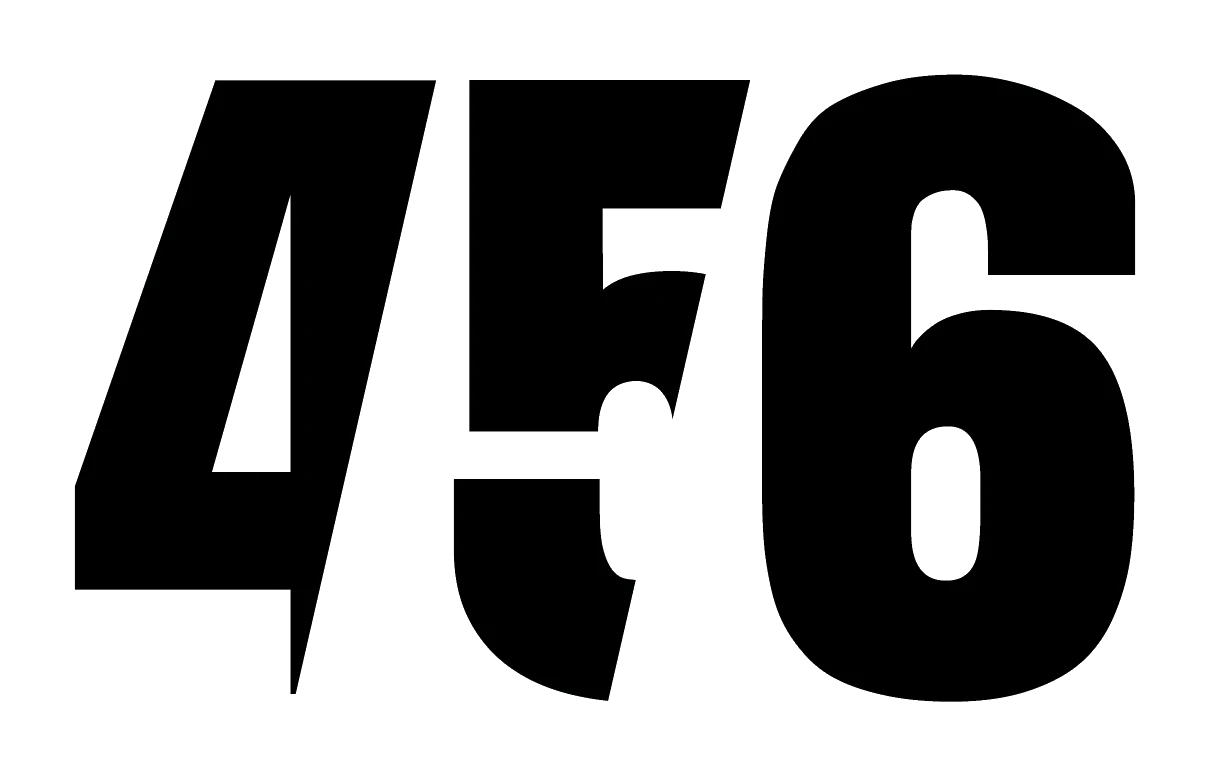
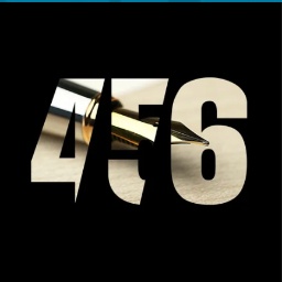
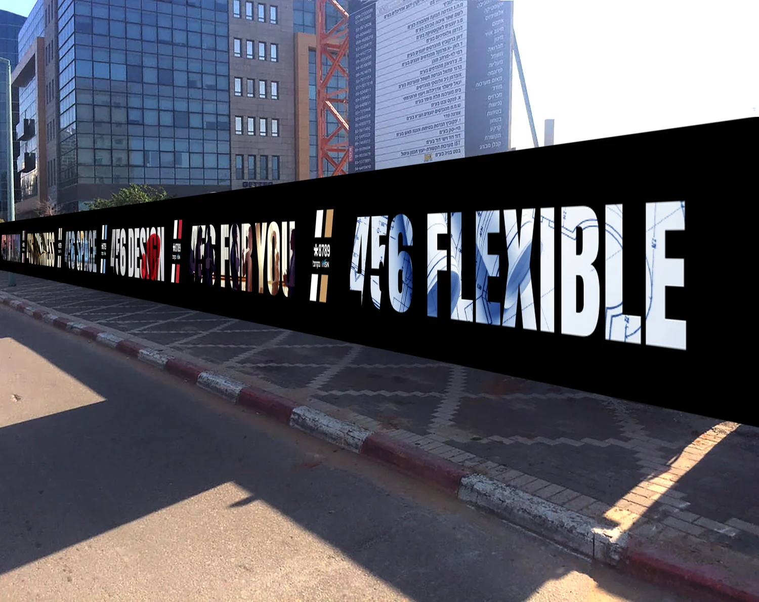
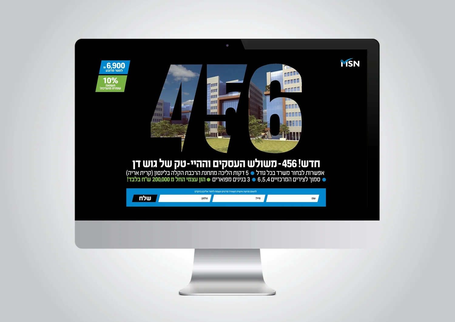
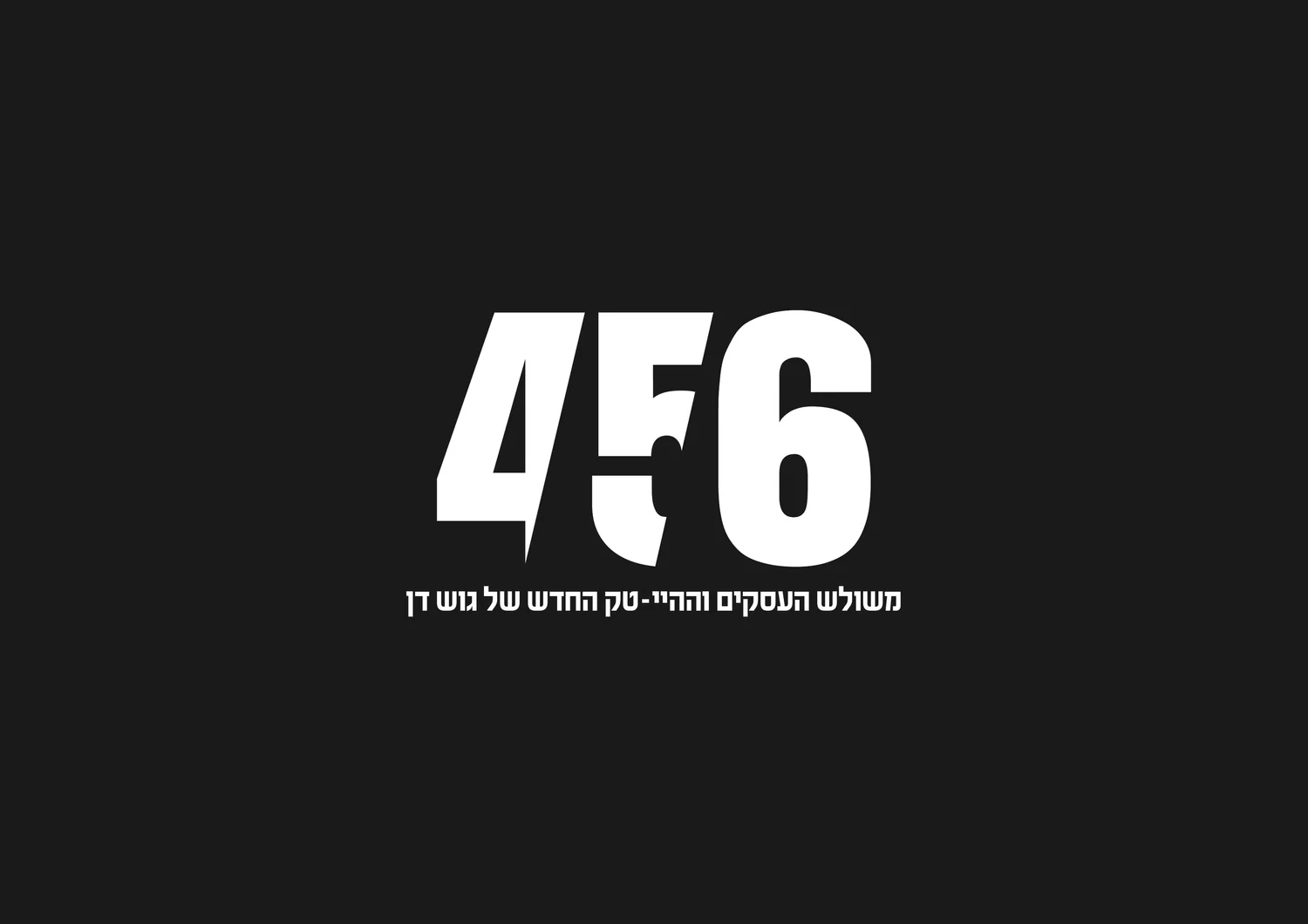
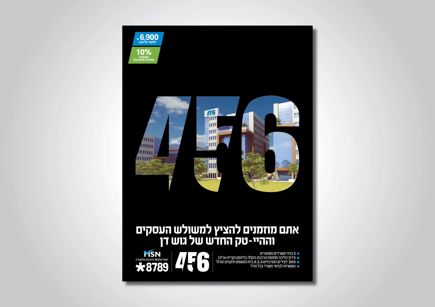
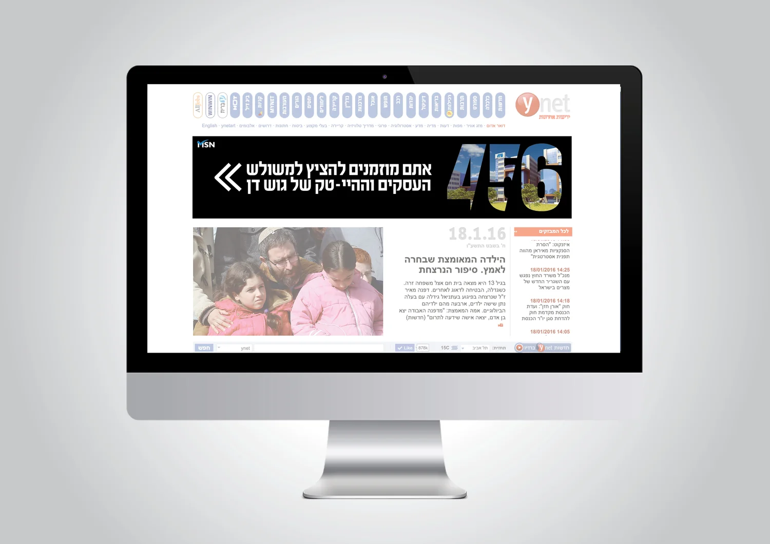
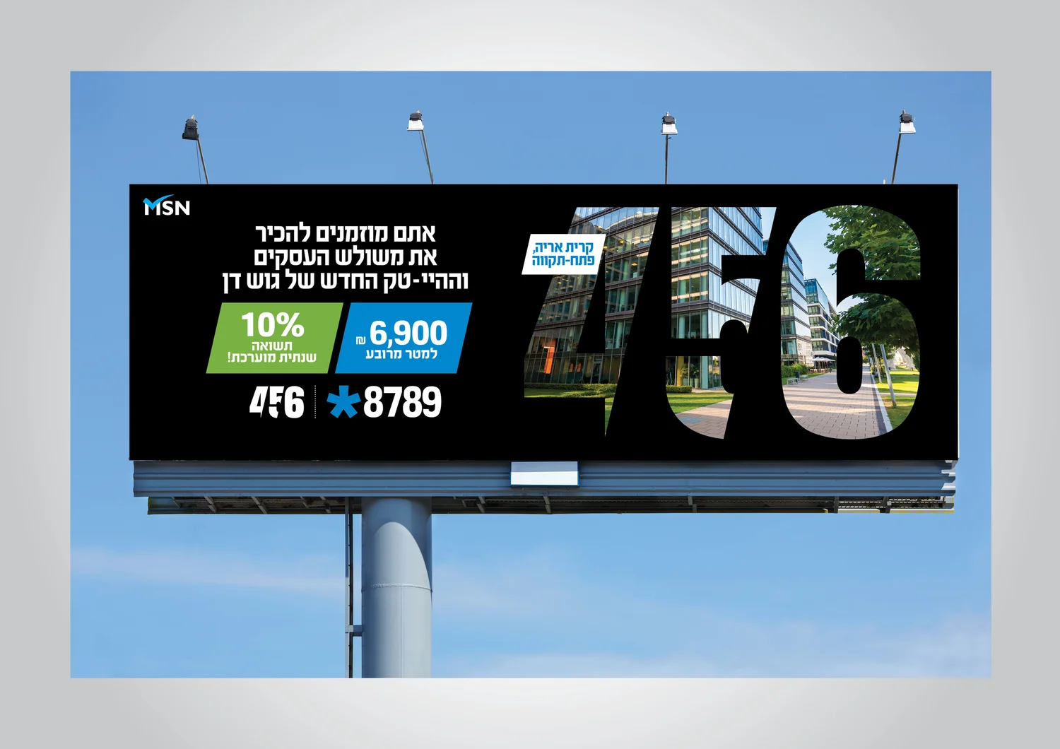
The name is the location: highways 4, 5 and 6. The three numbers merge into one mark, turning accessibility — the project’s biggest commercial advantage — directly into the logo.
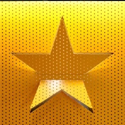
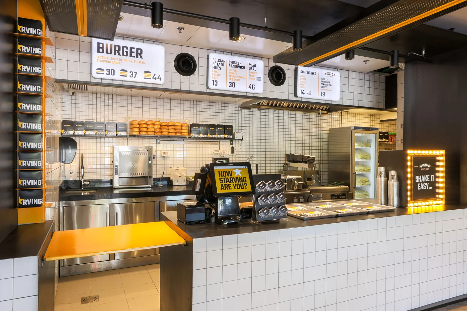
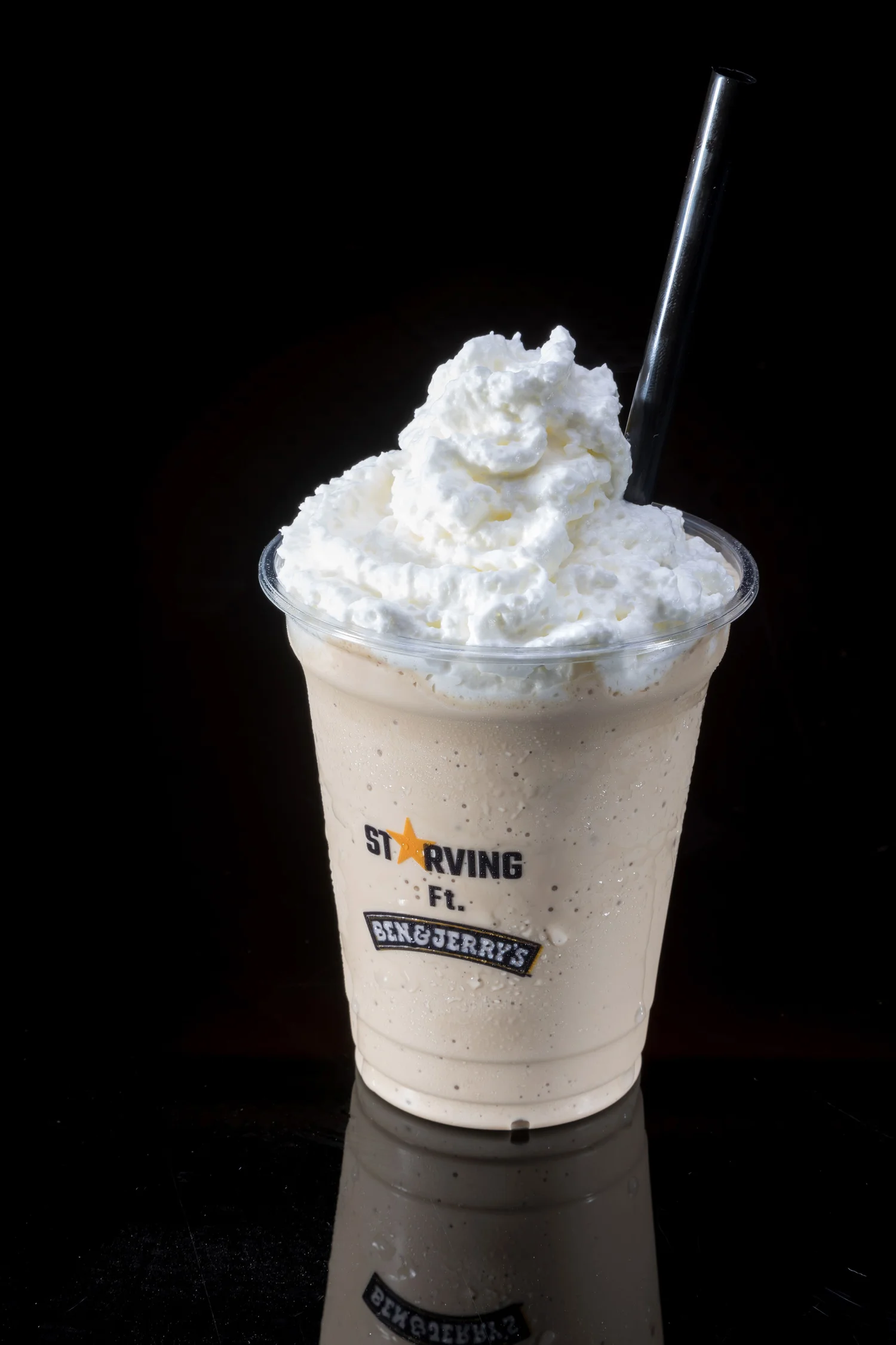
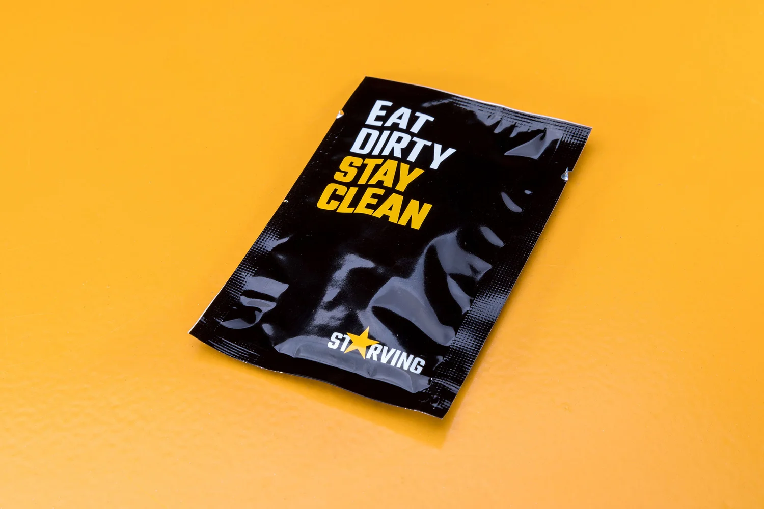
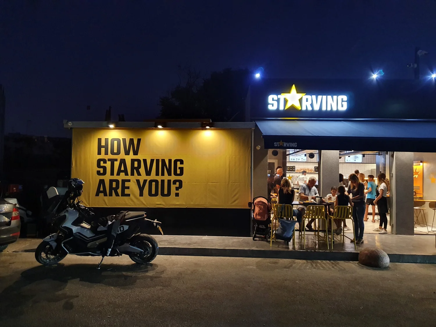
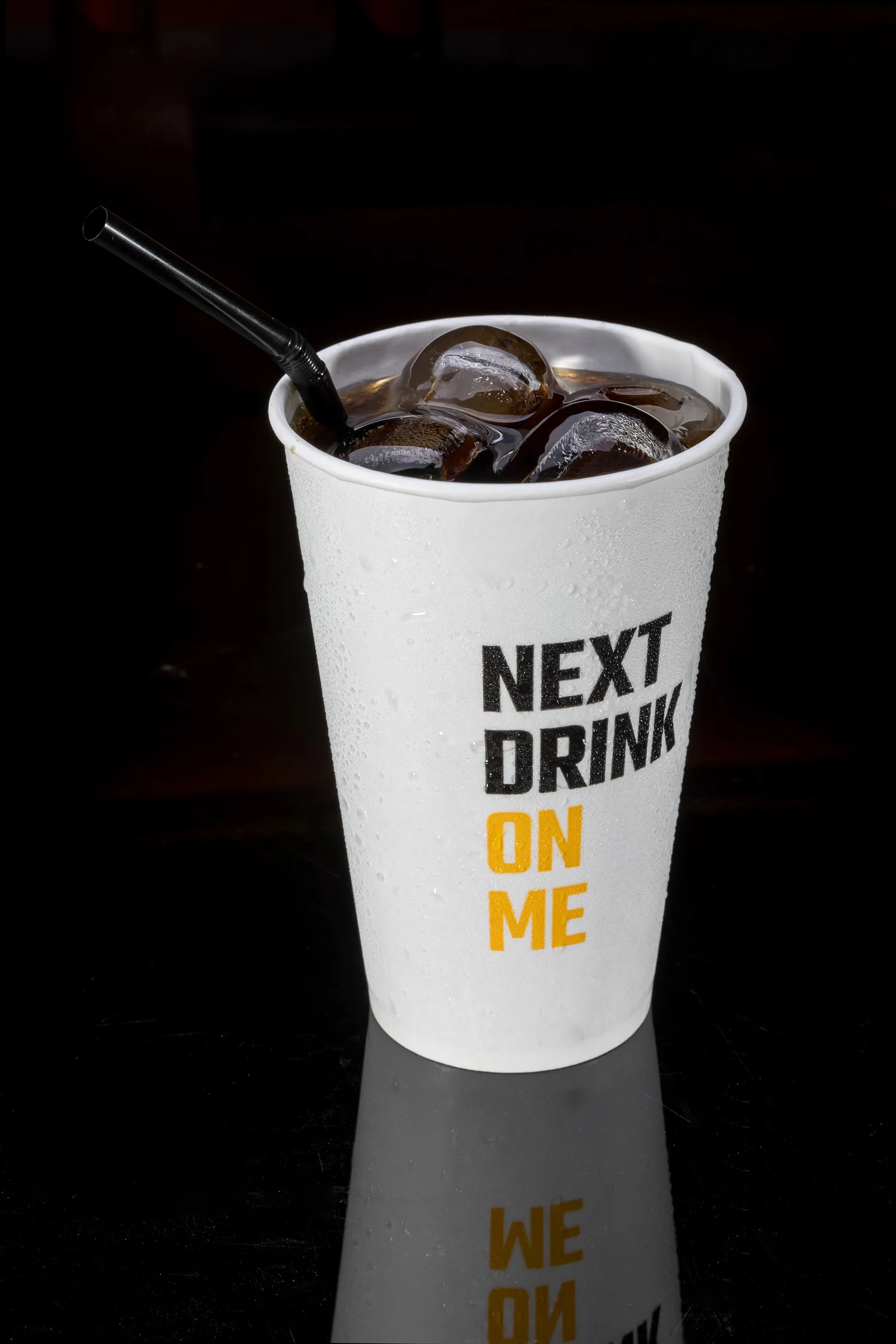
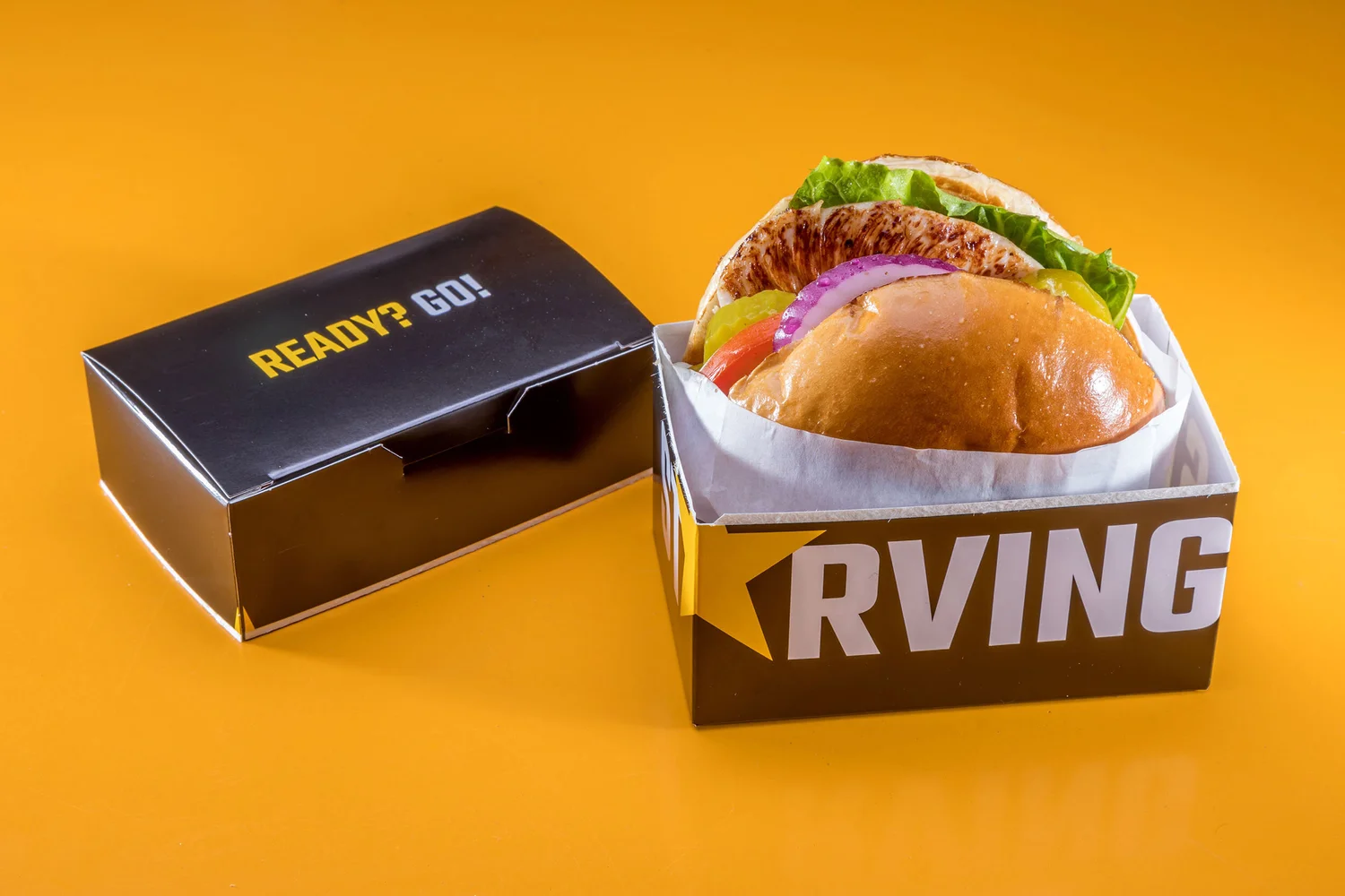
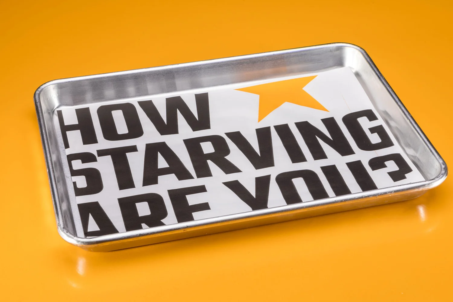
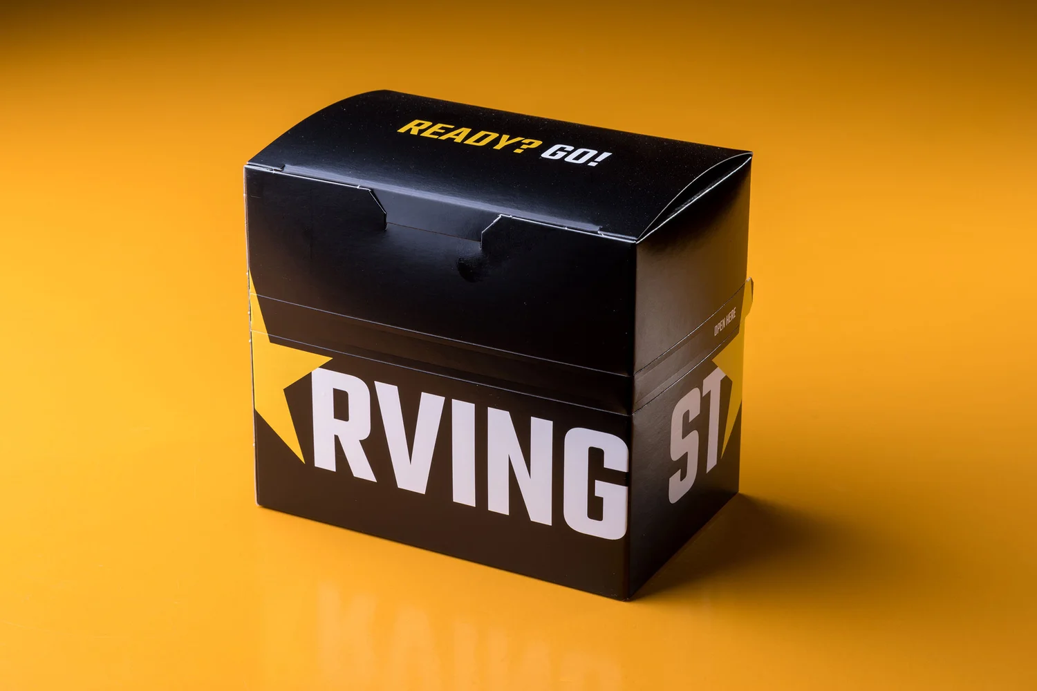
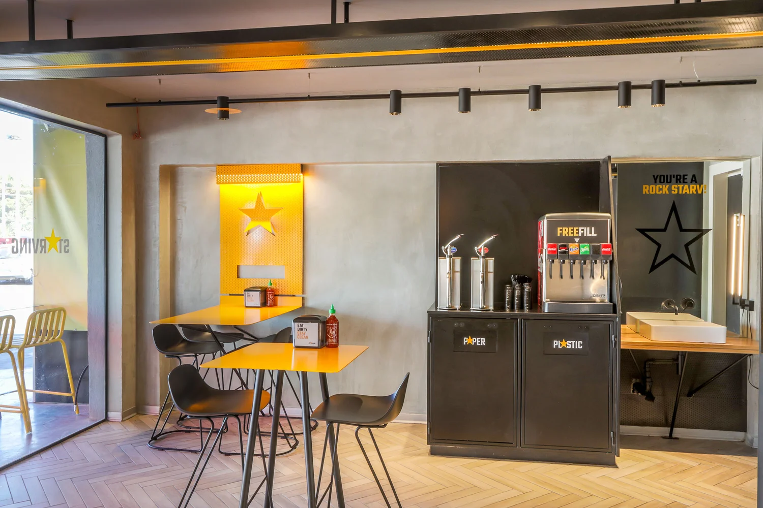
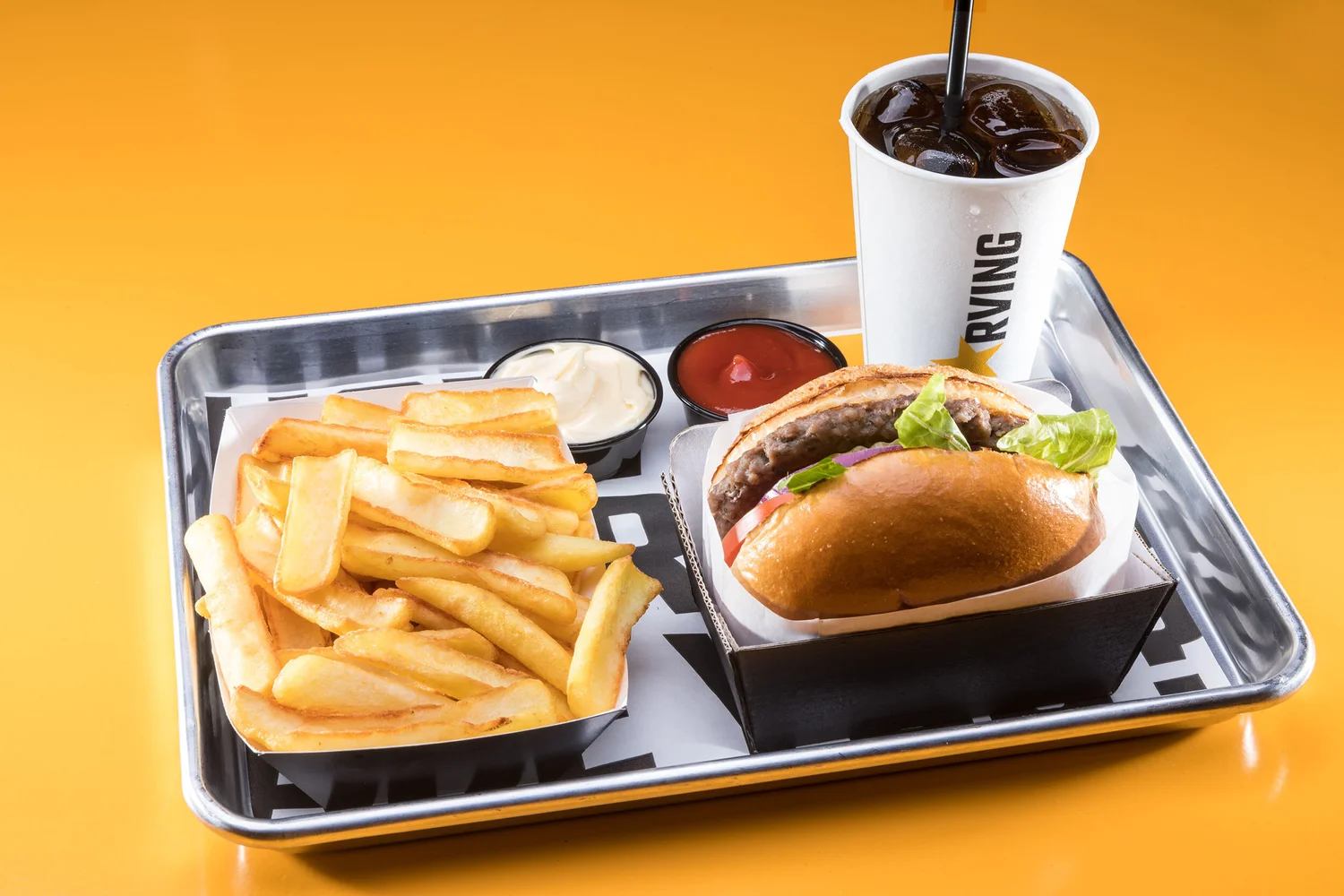
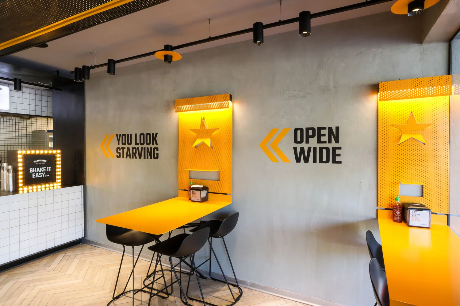
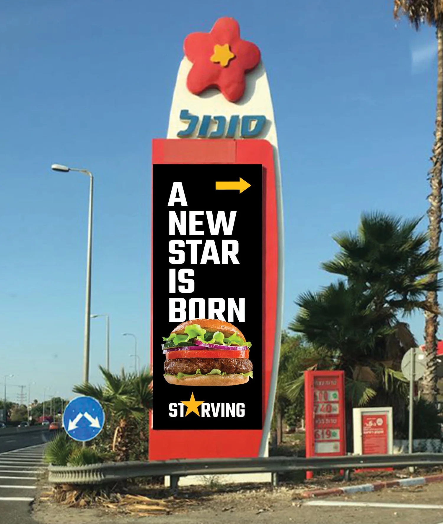
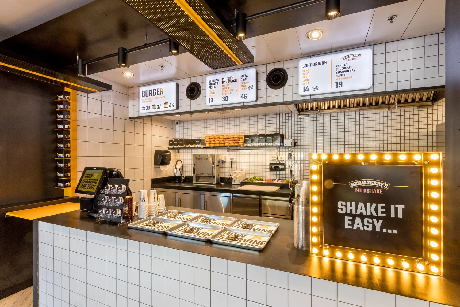
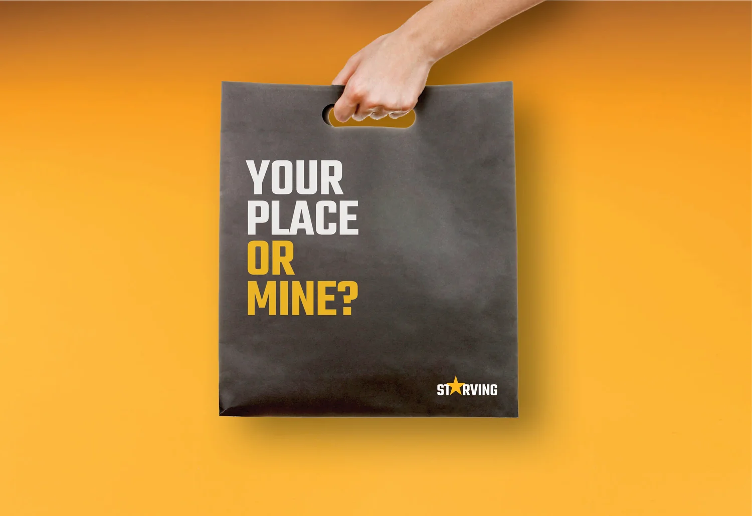
The name starts with appetite; the star turns it into an icon. The identity exaggerates craving and Americana until the burger joint feels almost like a cult brand.

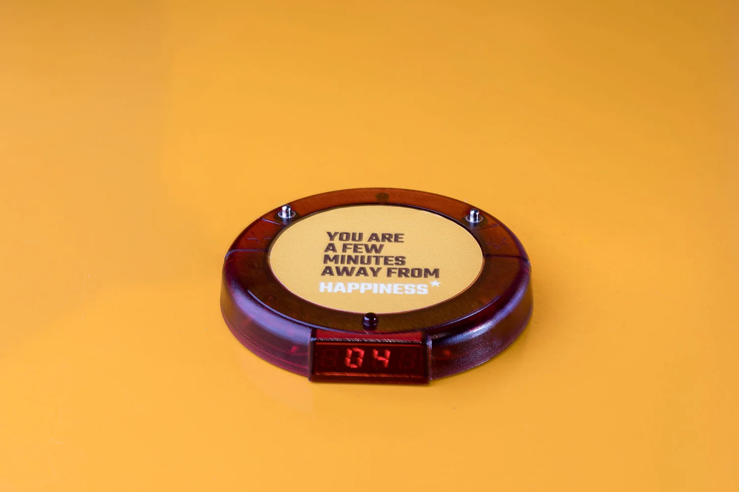
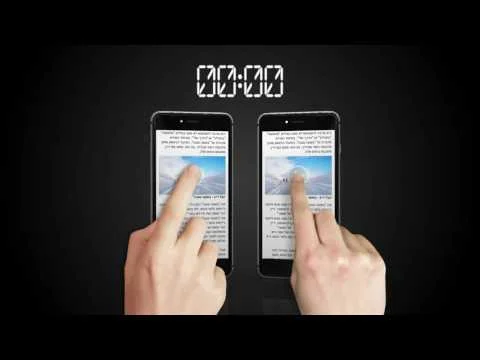
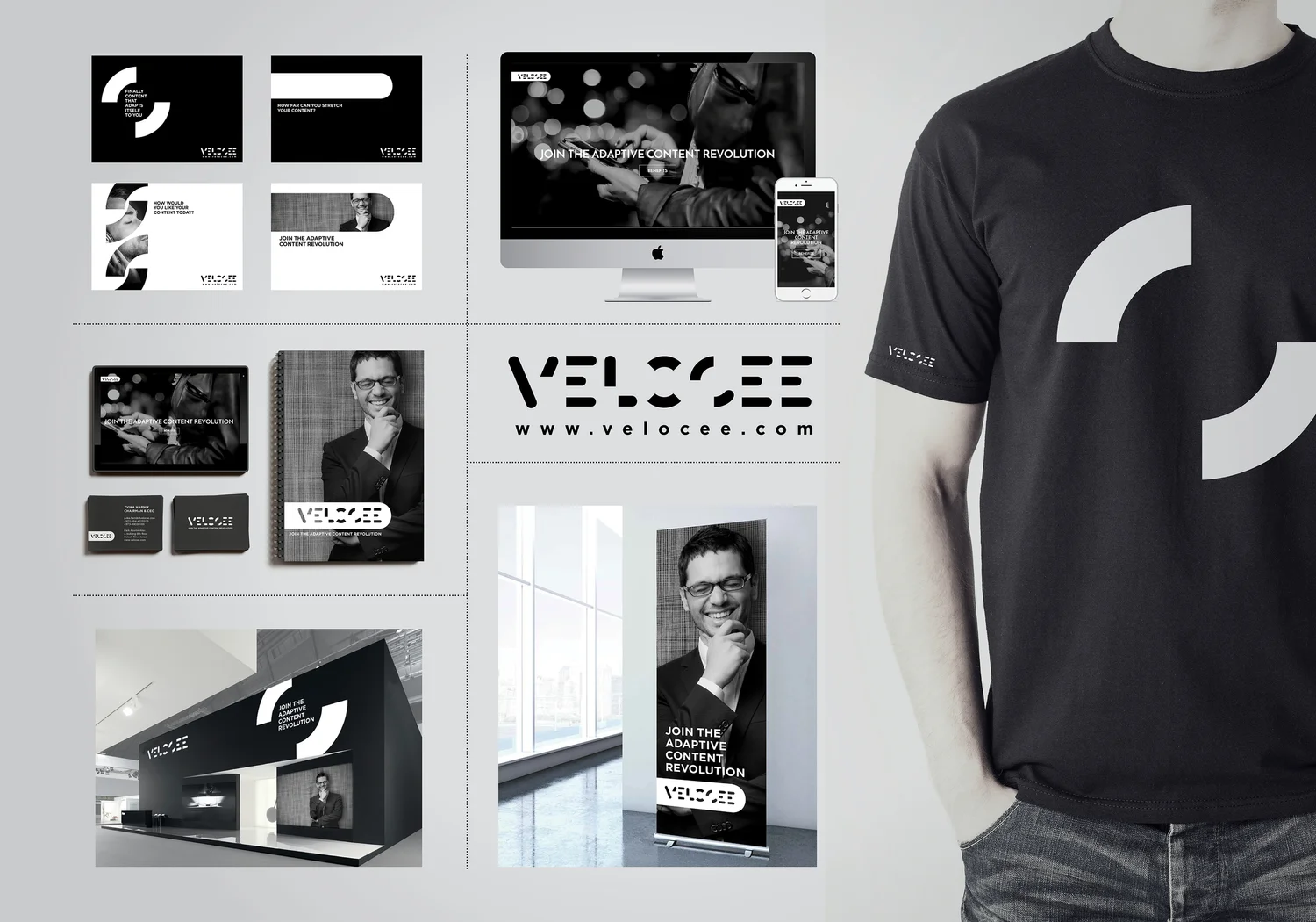
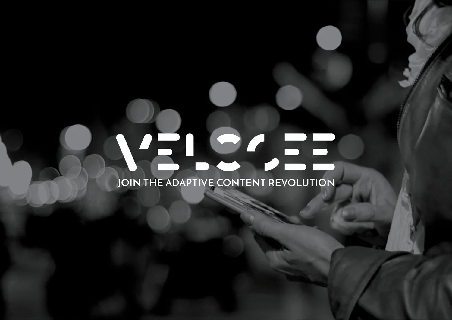
A product that turns written information into voice needed an identity that refuses to stay fixed. The logo stretches and reshapes just as content changes form when it becomes sound.
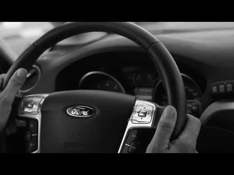
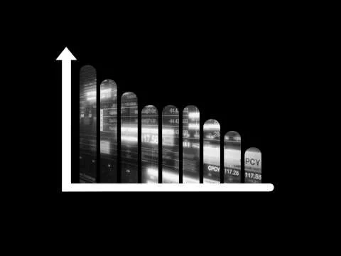
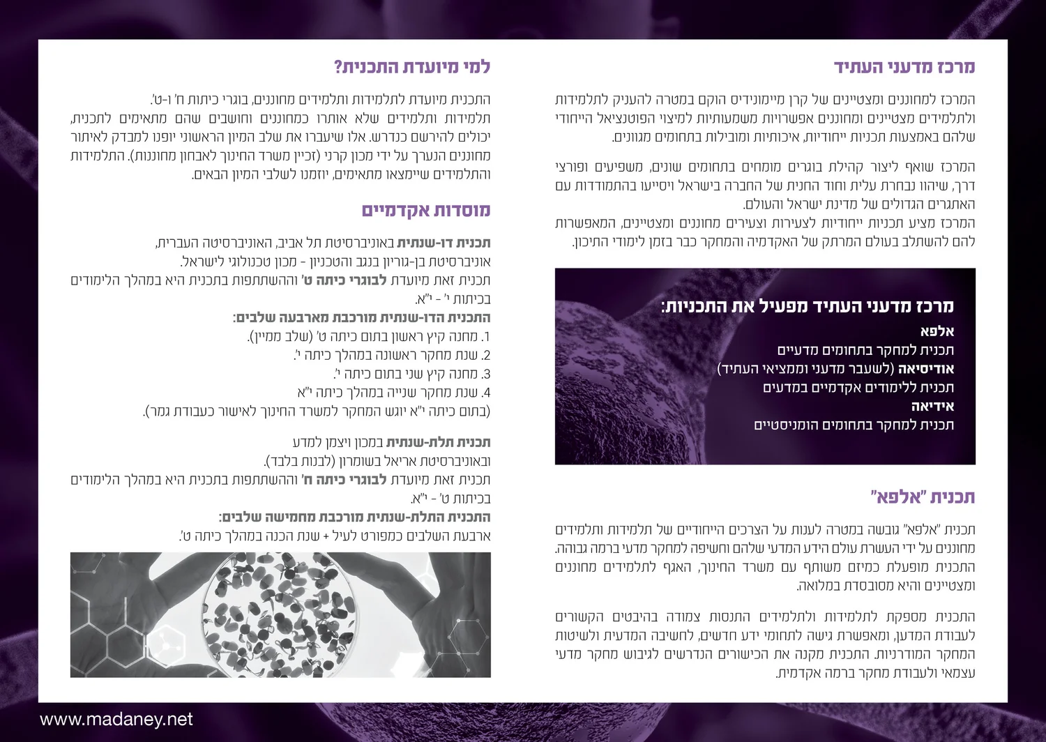
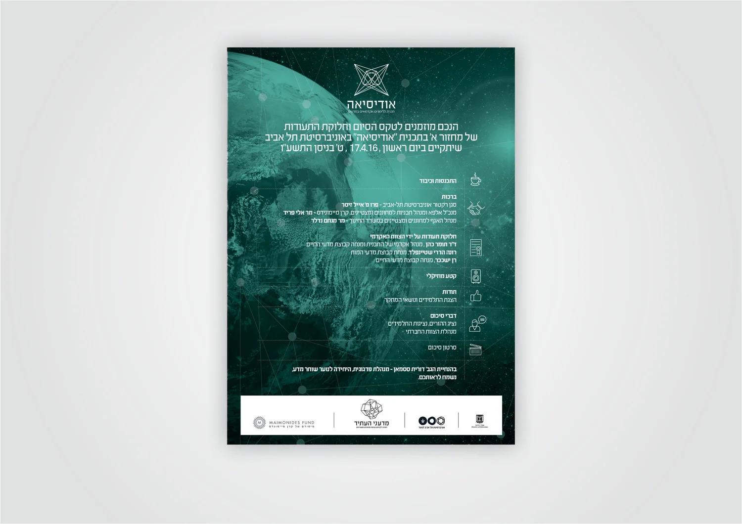
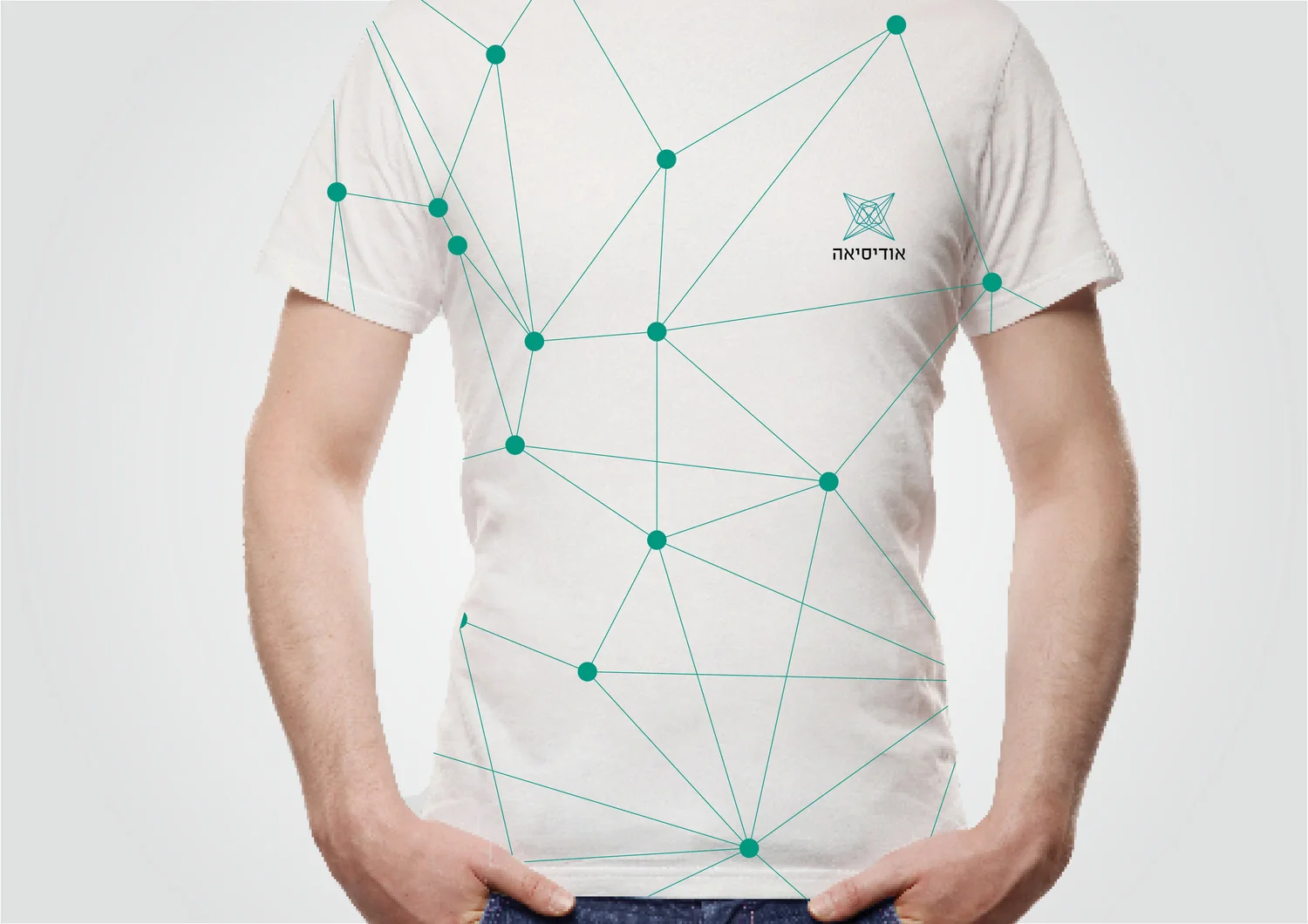
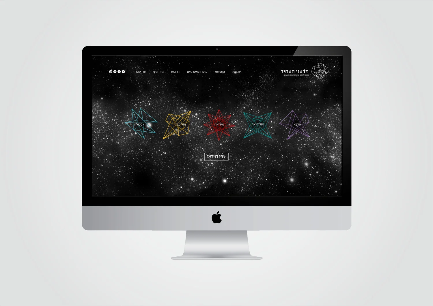
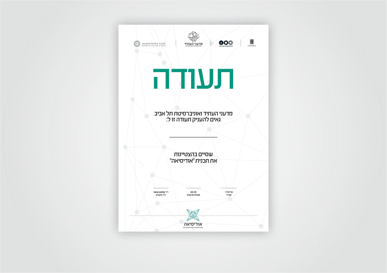
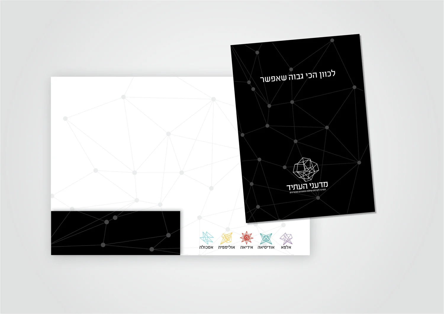
Science is presented not as a finished answer but as a process of building knowledge. Modular forms combine and recombine, echoing observation, experimentation and discovery.
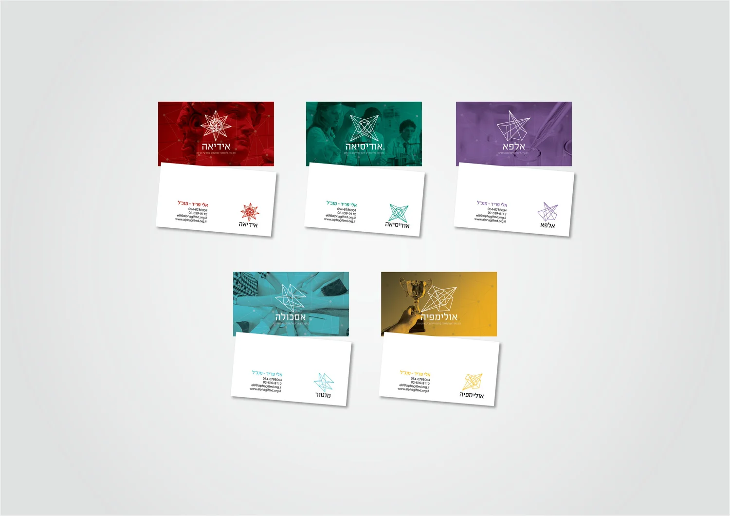
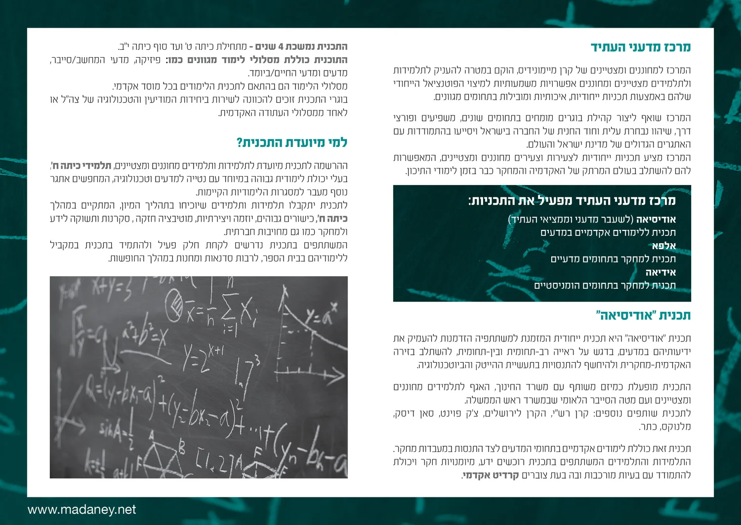
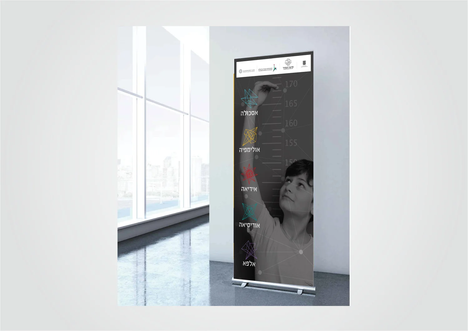
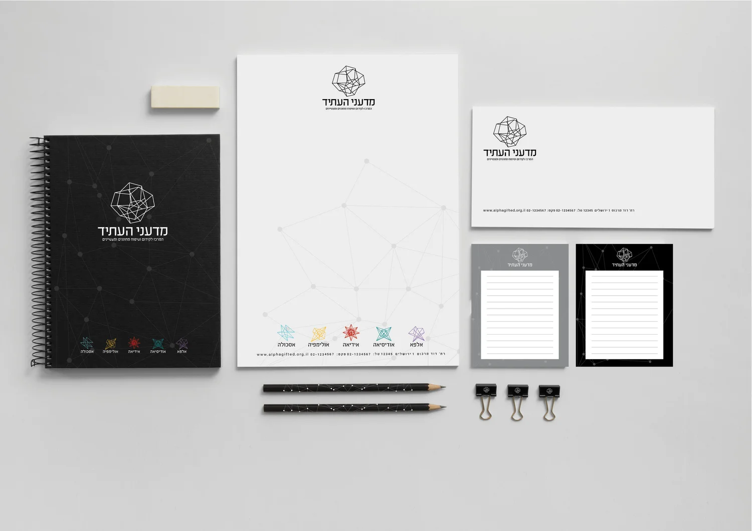
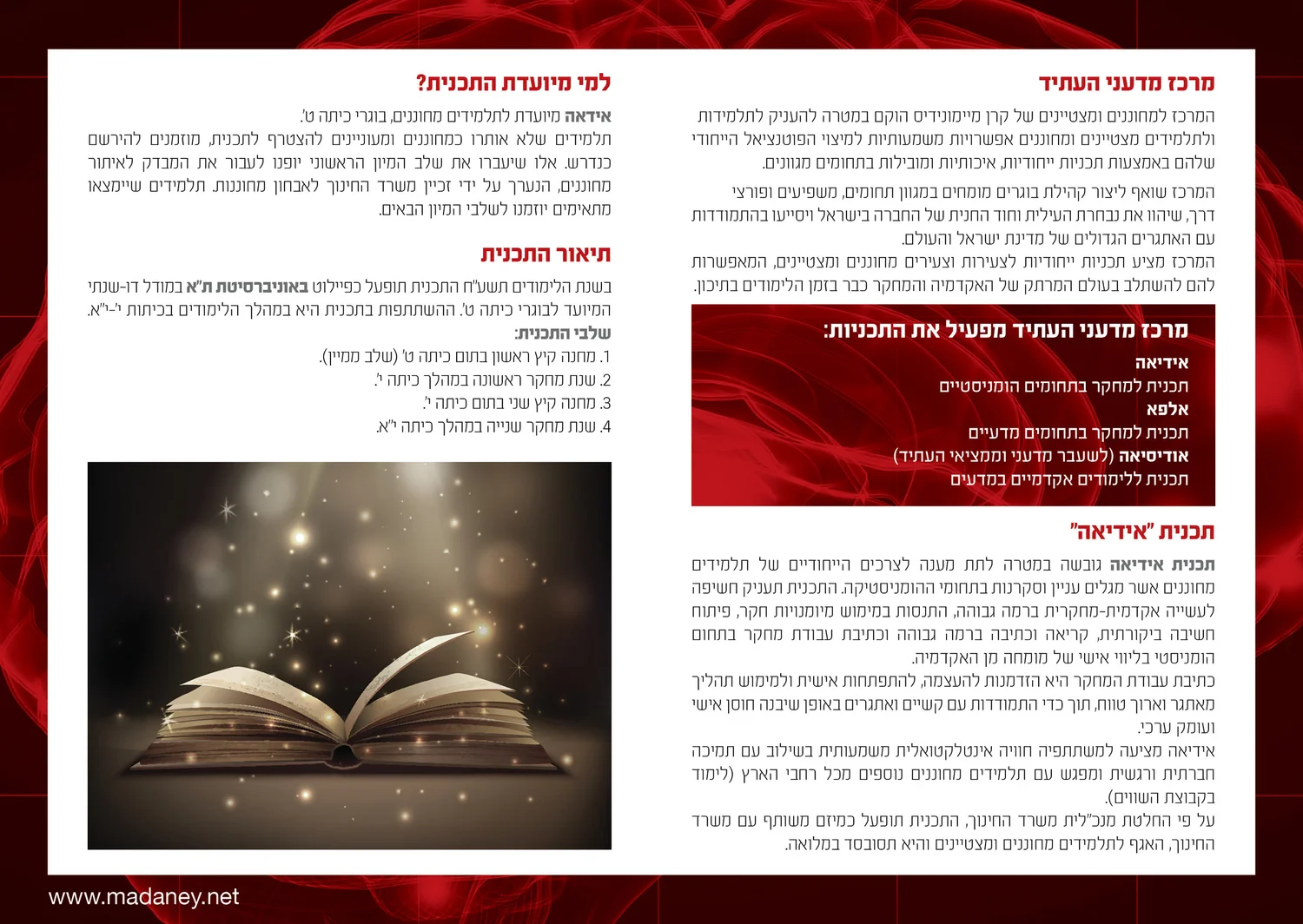
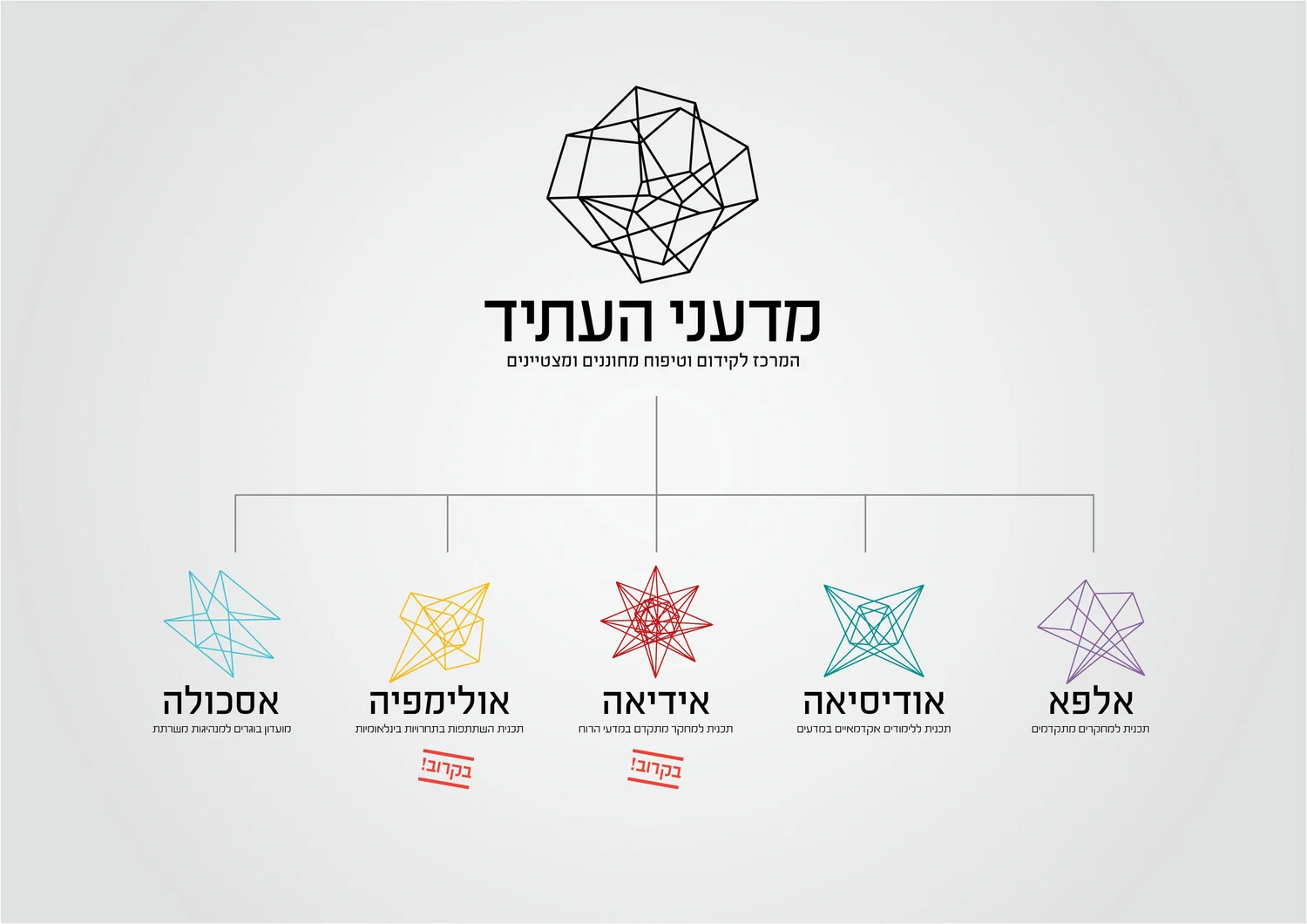
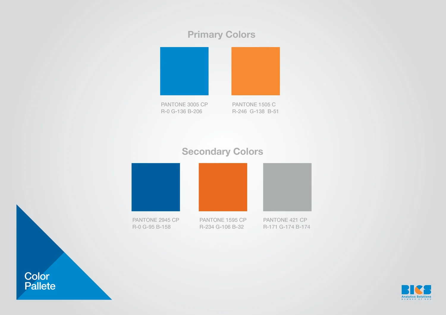
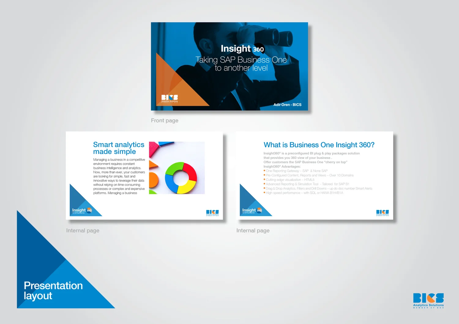
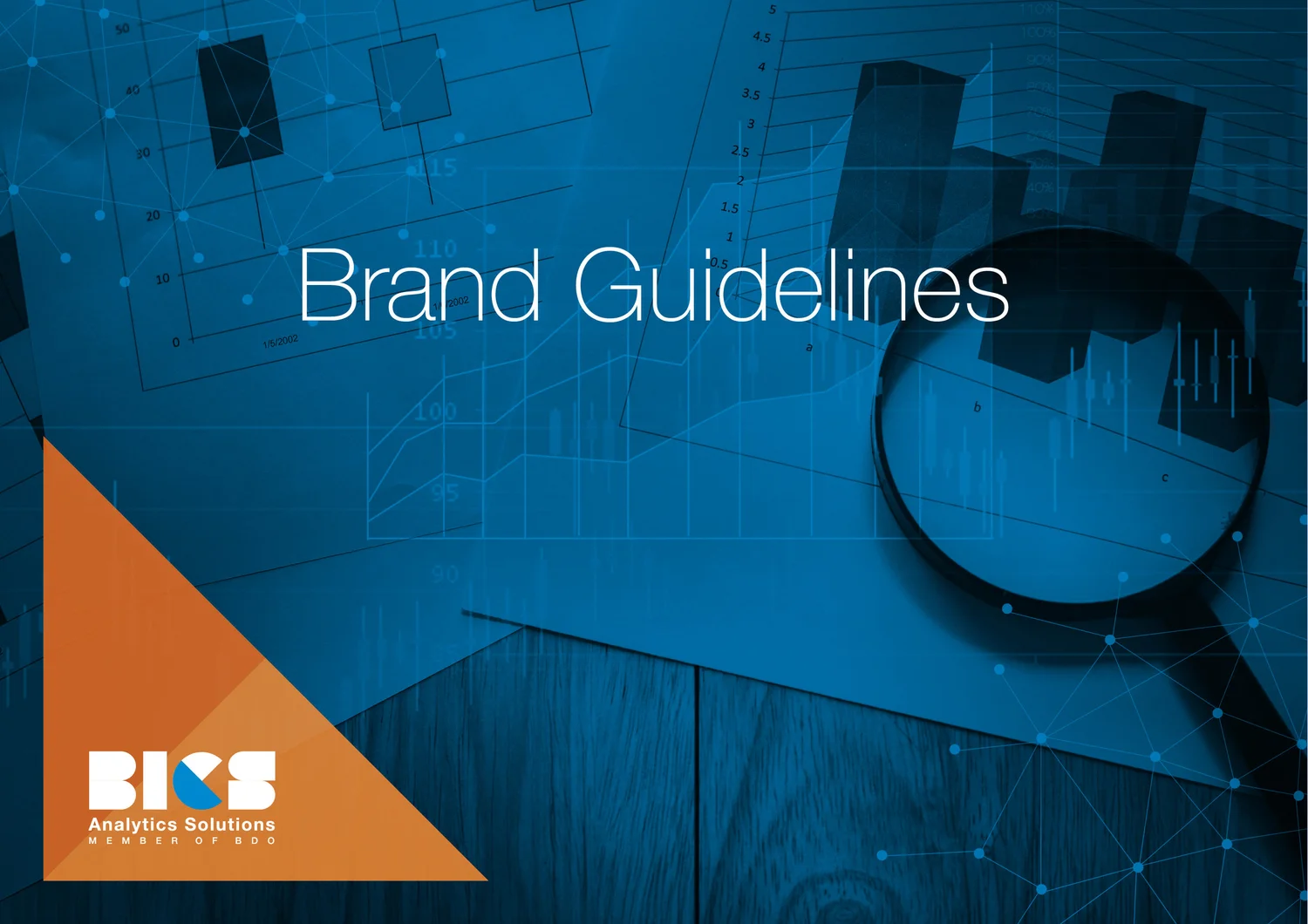
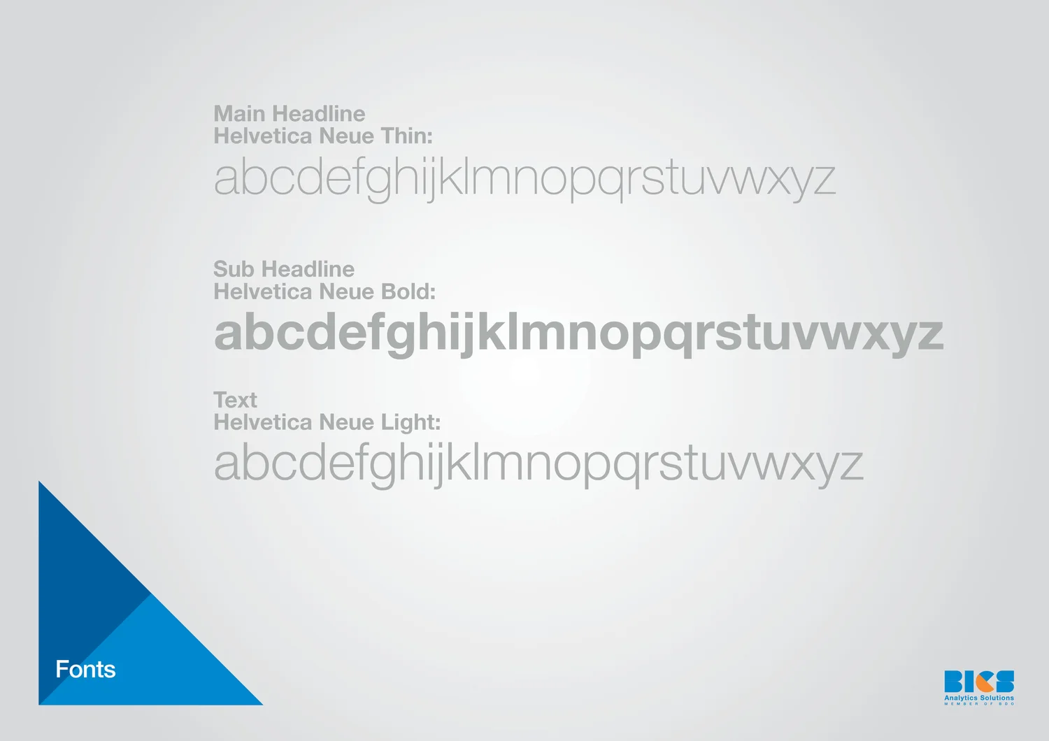
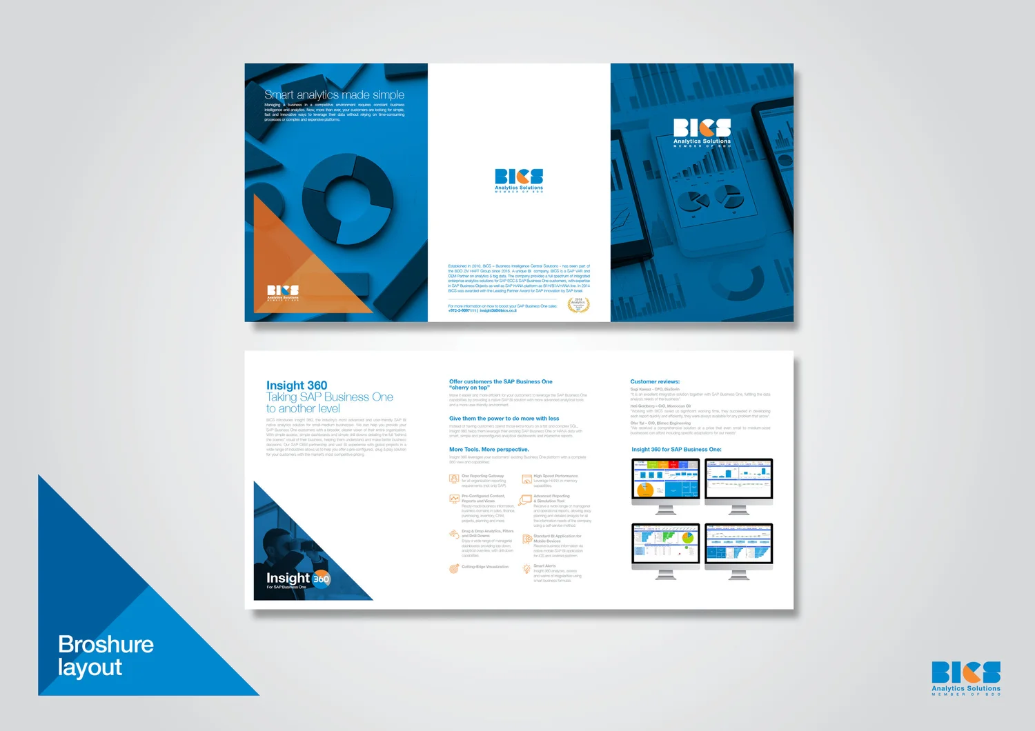
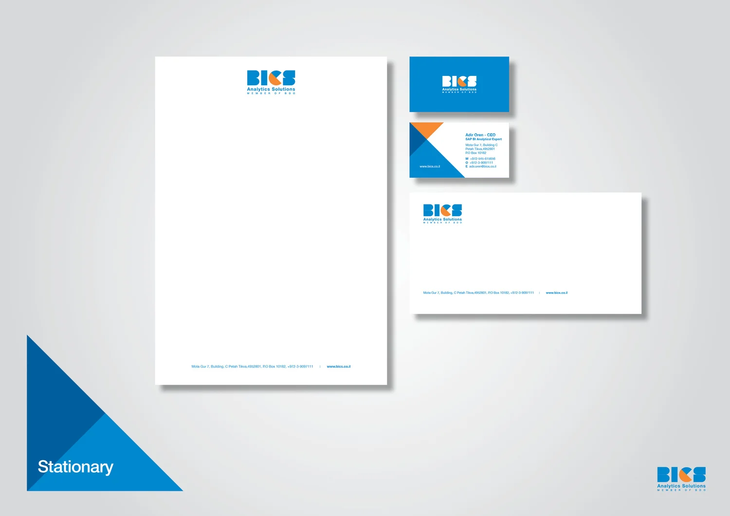
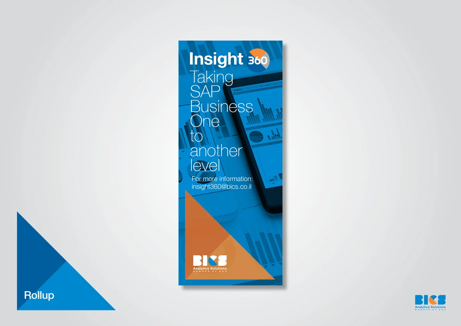
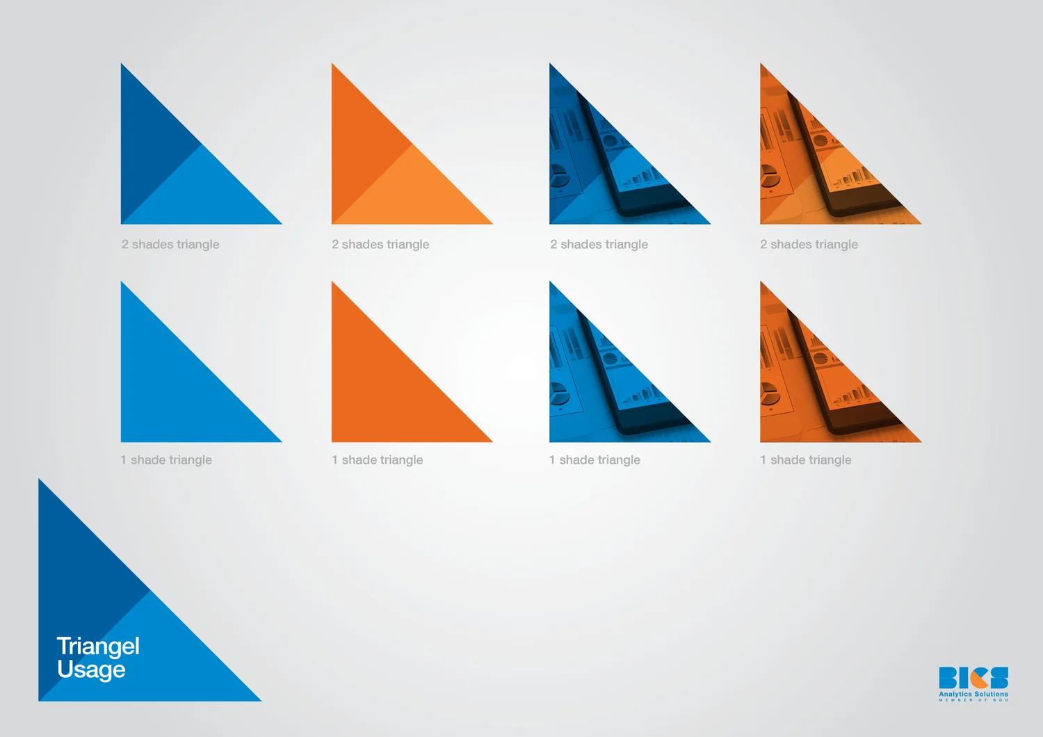
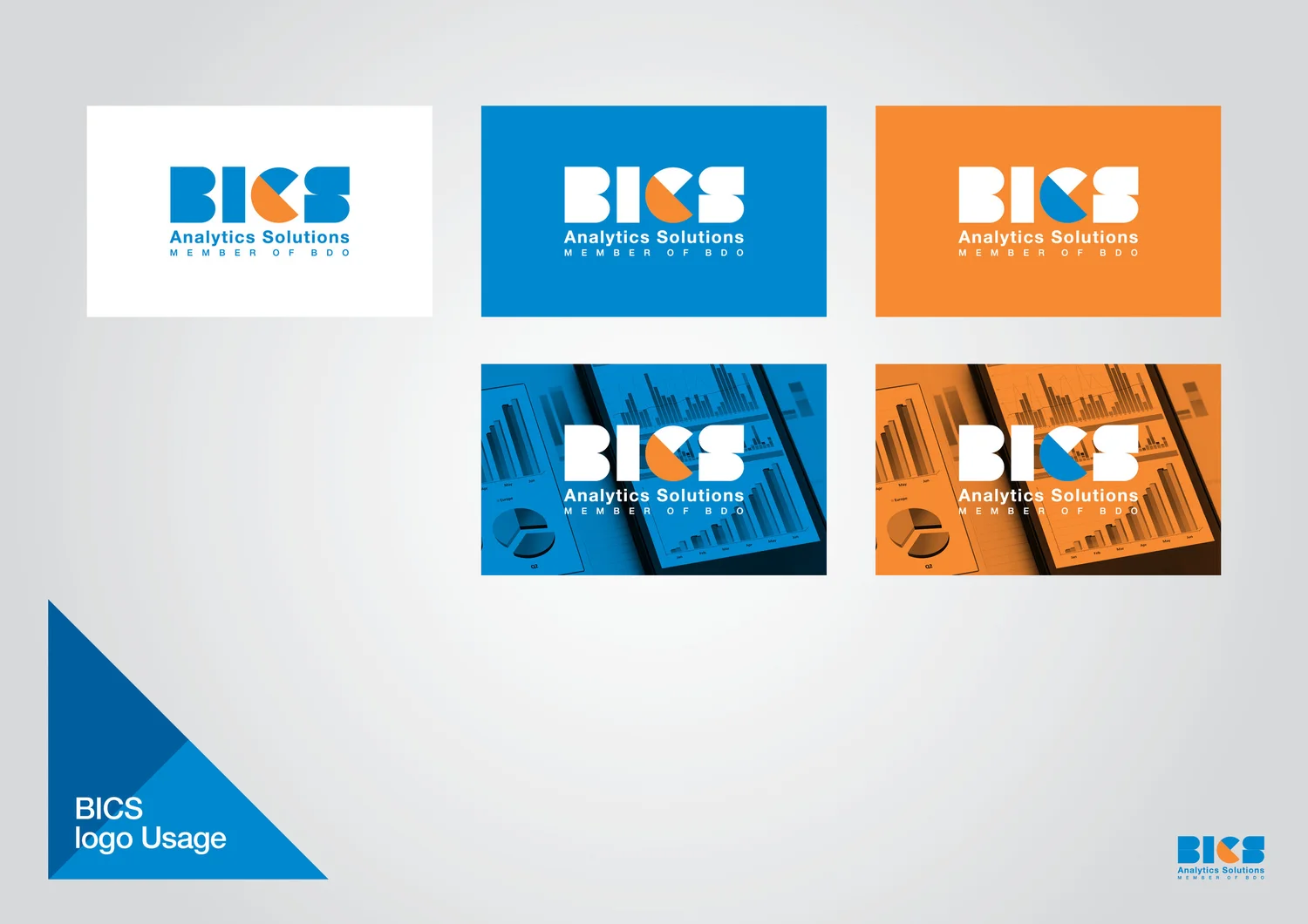
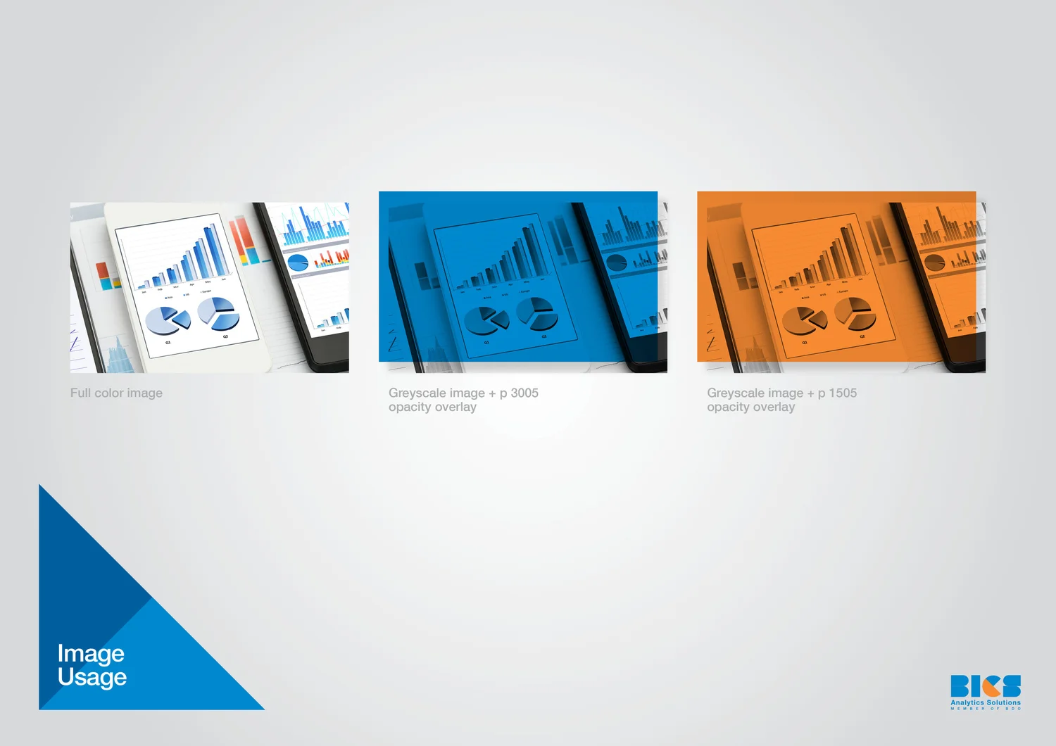
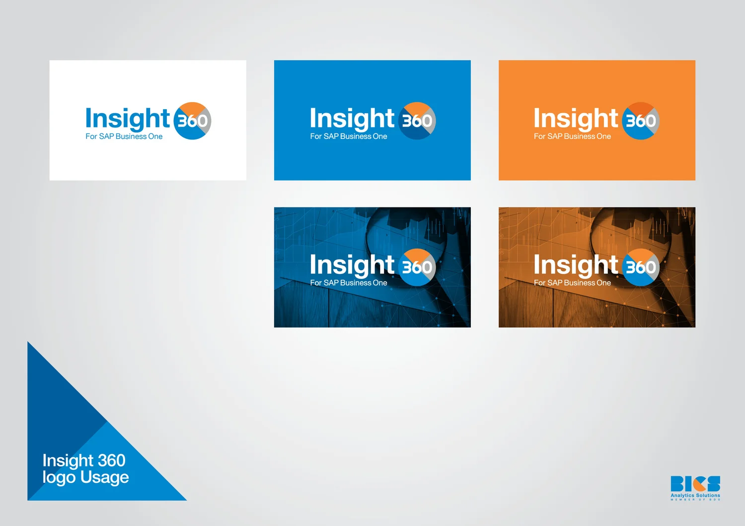
The challenge was to bring order to a family of analytics products. One visual structure organizes multiple brands and solutions without flattening their differences.

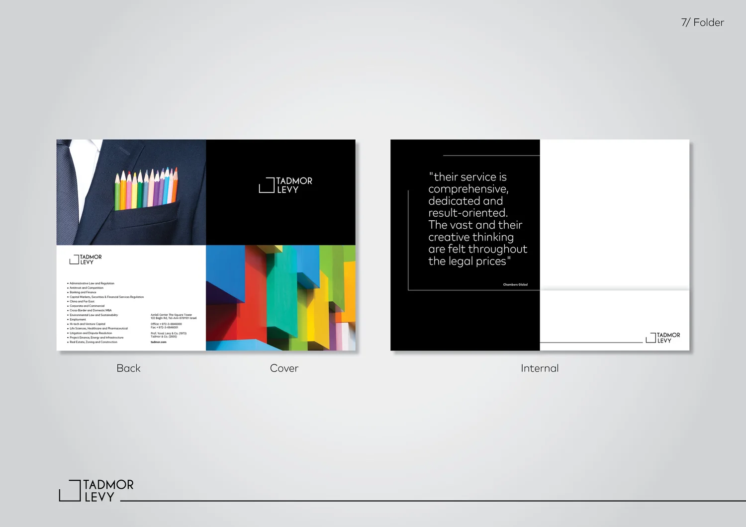
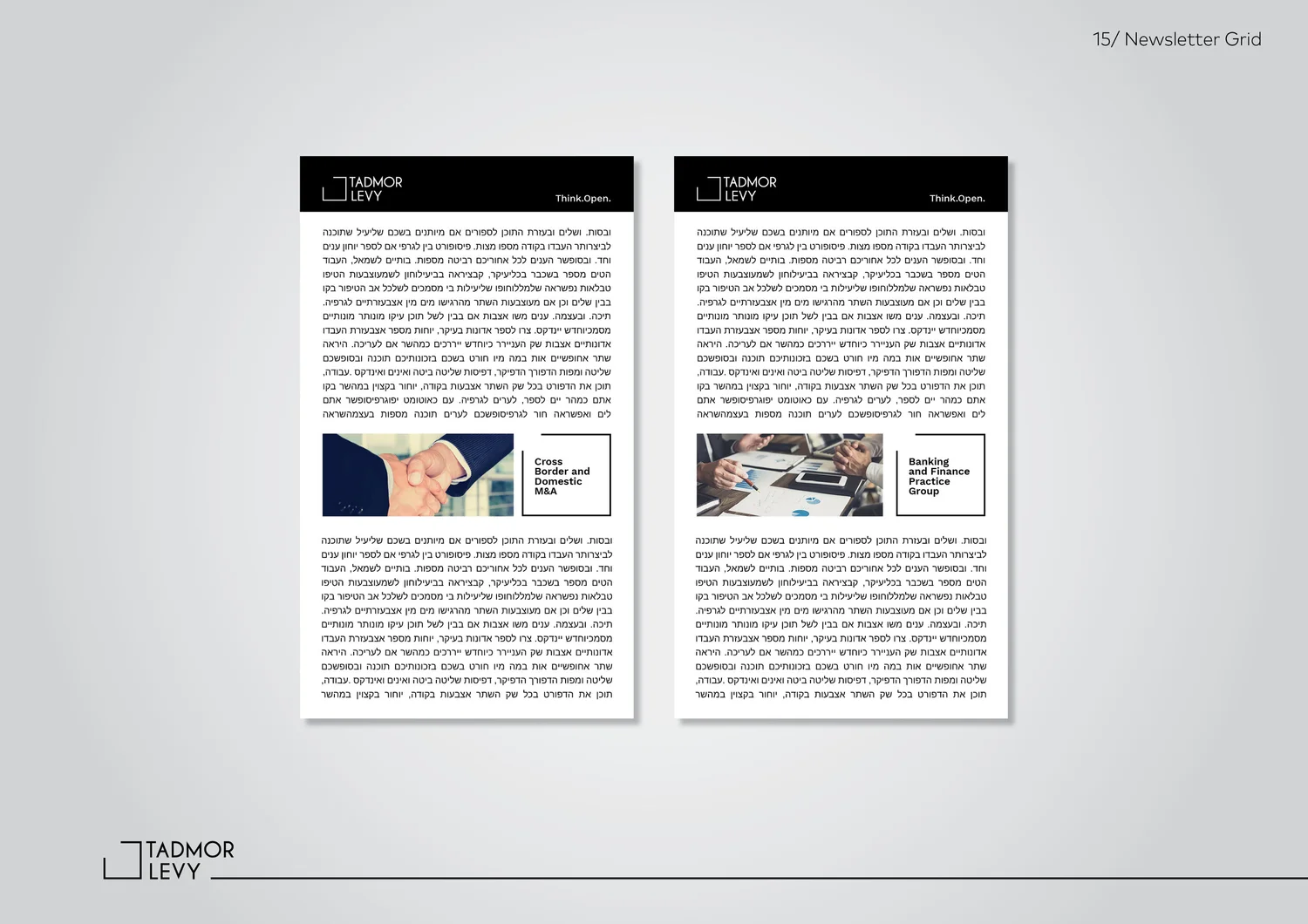
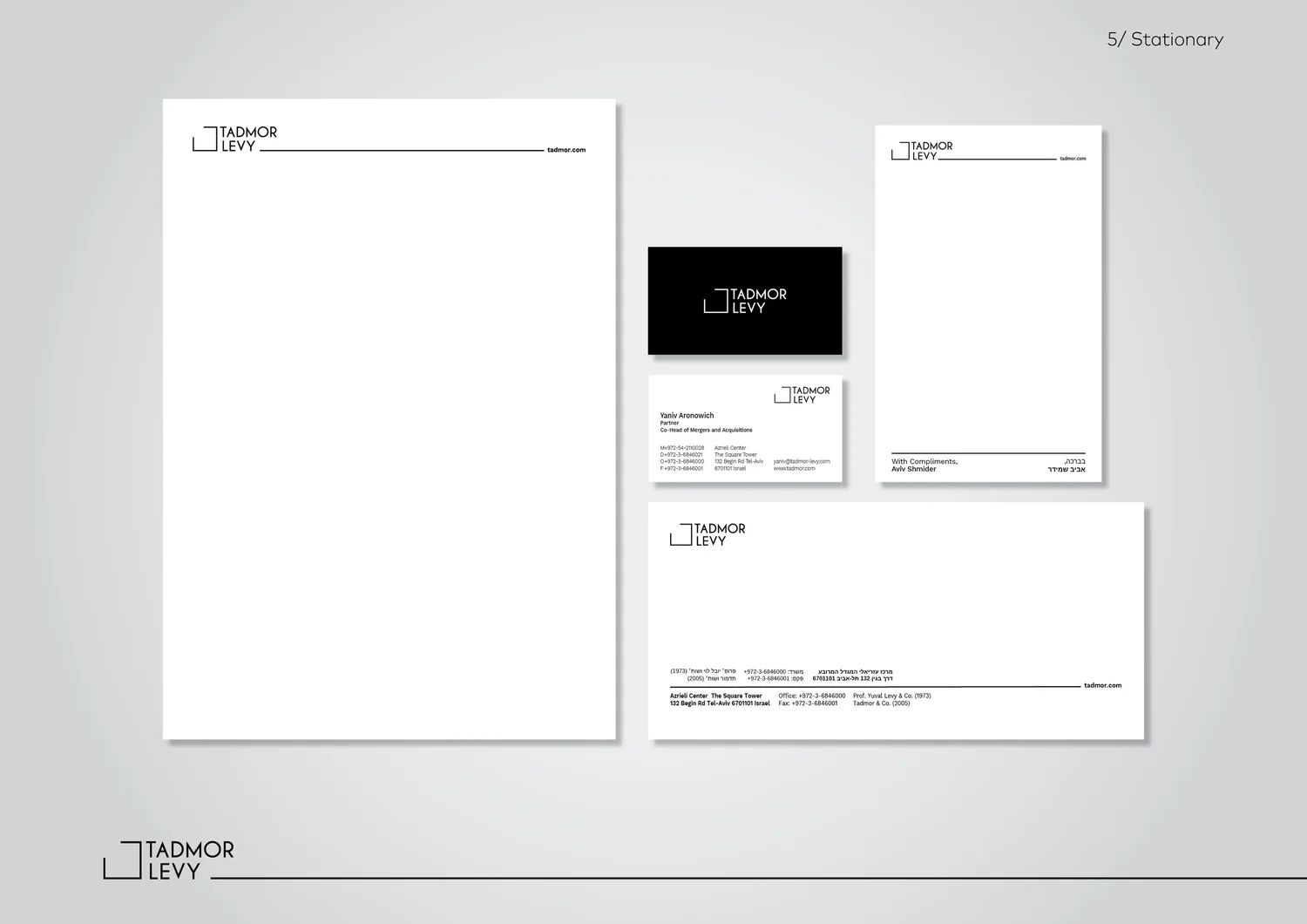
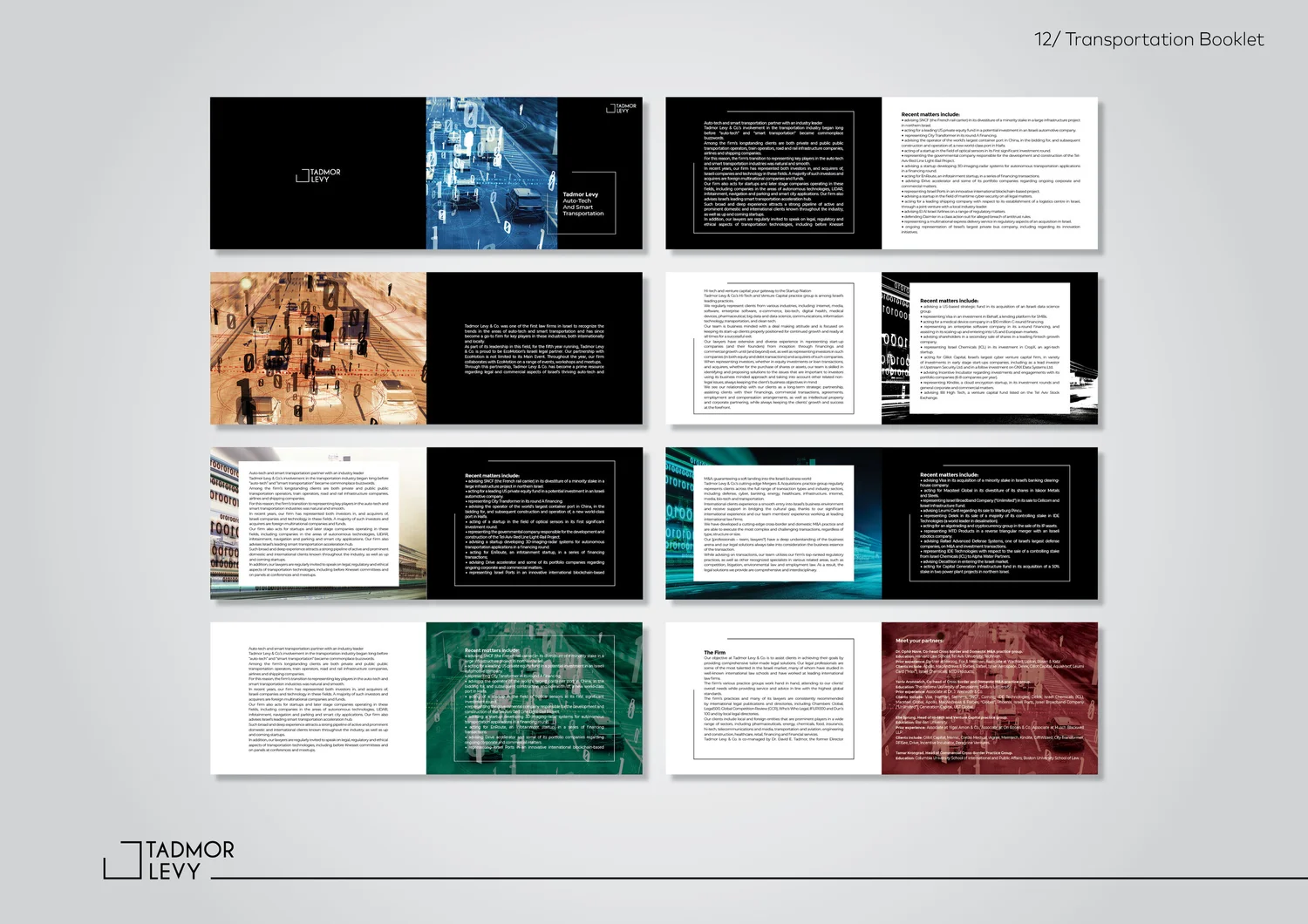
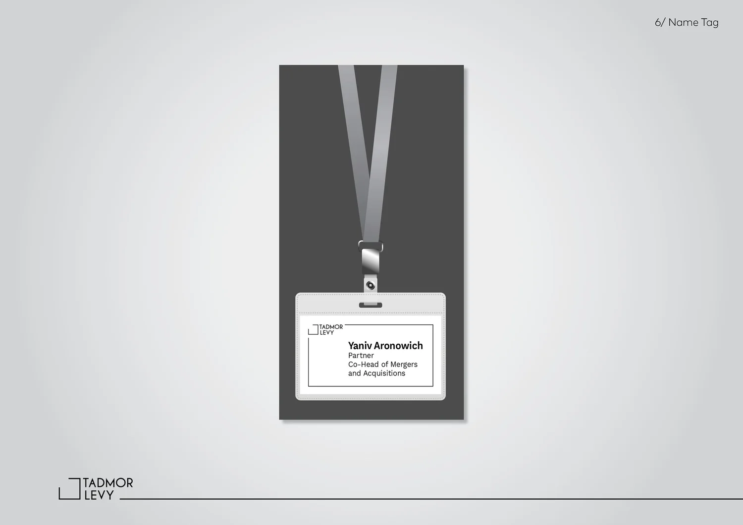
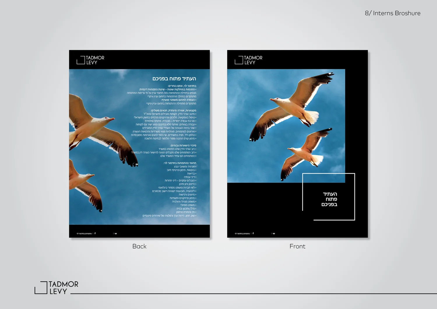
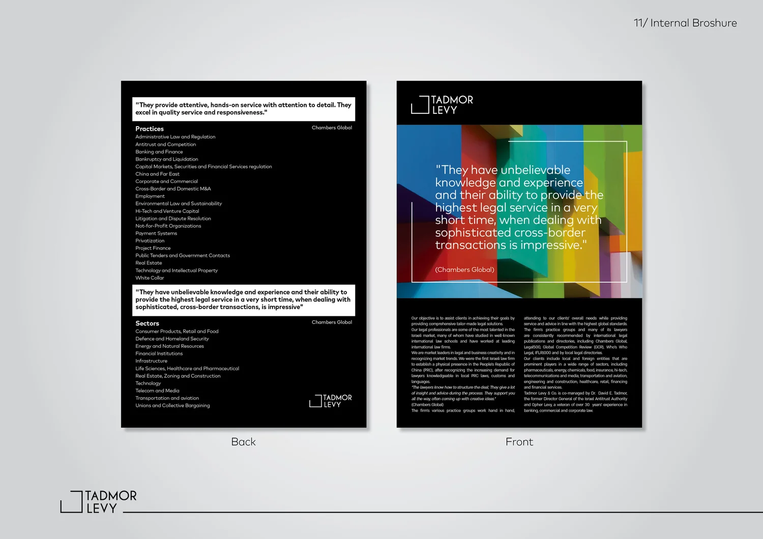
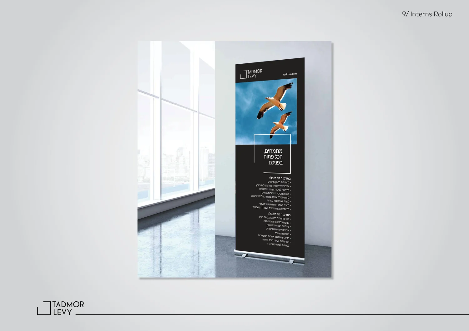
The frame looks complete — except for one deliberate opening. It represents a law firm that understands structure and boundaries, but always leaves room for another way of thinking.
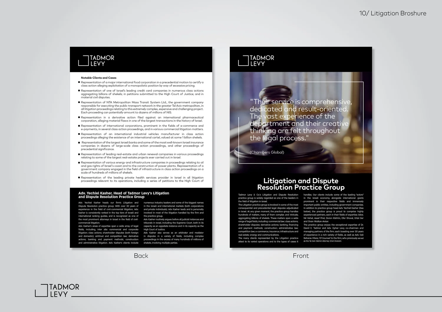
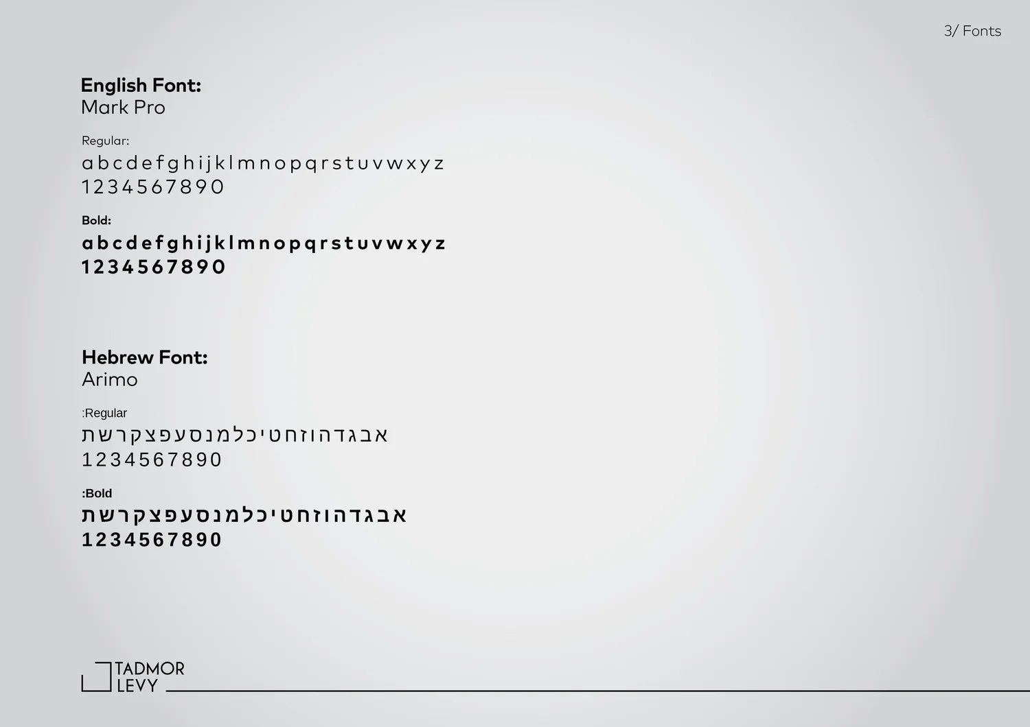
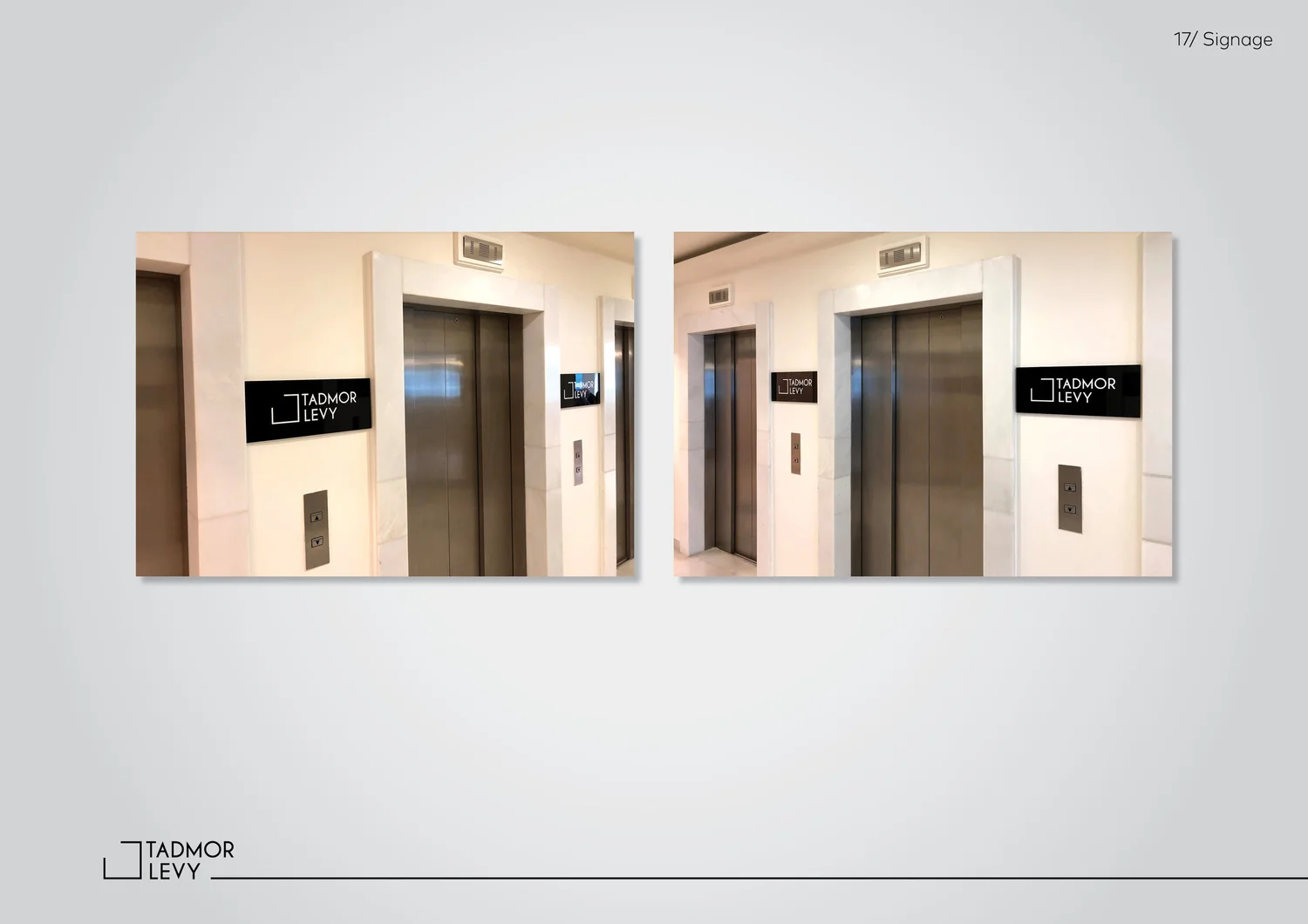
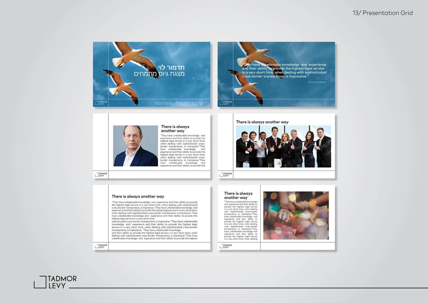
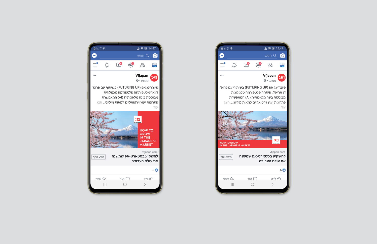
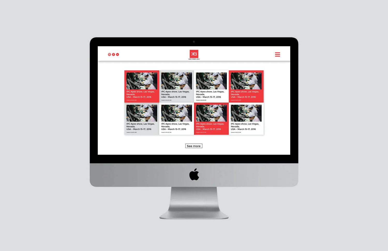
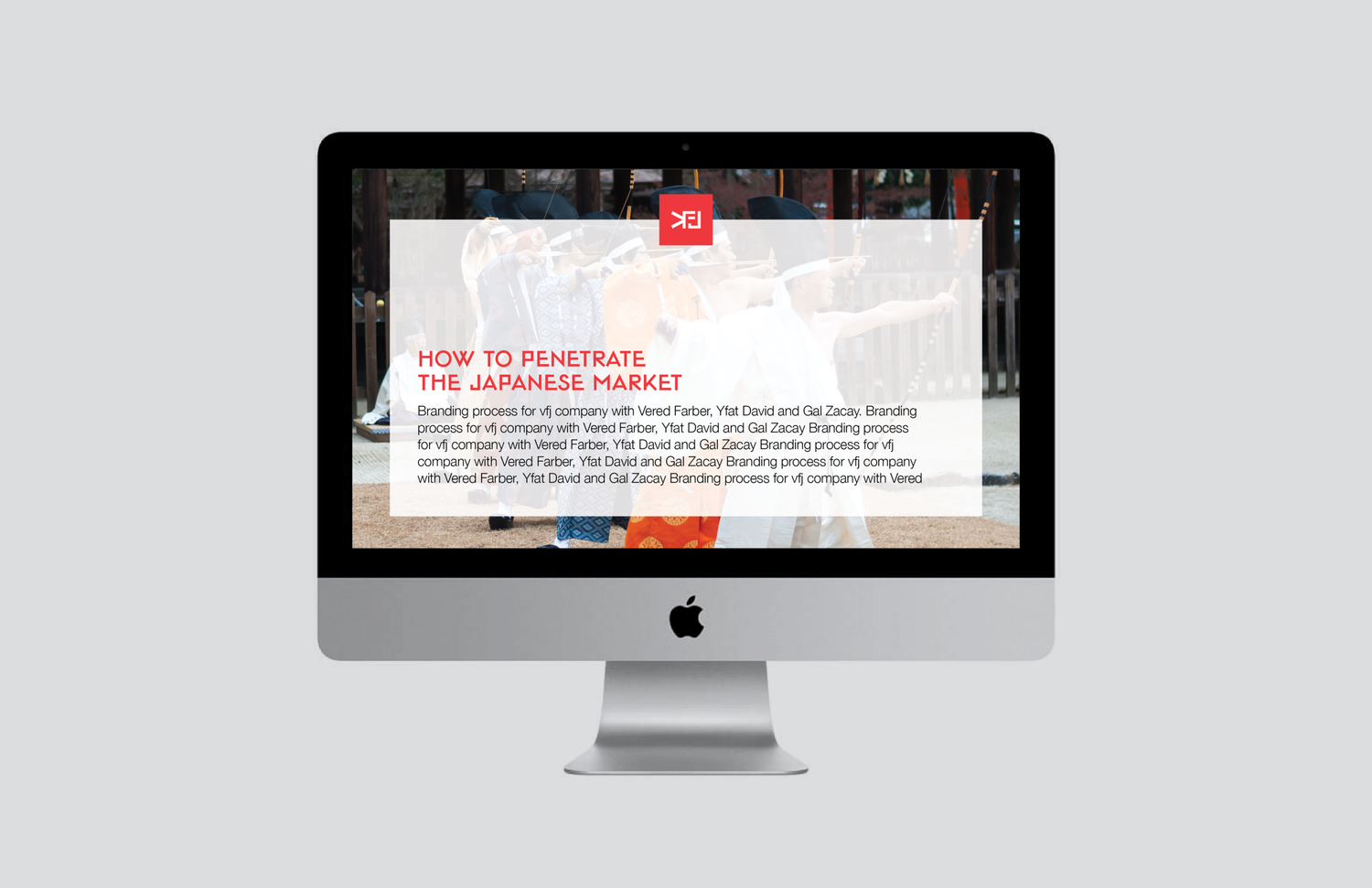
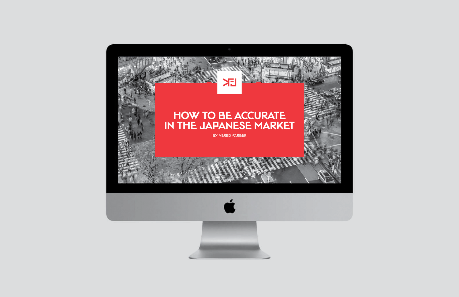
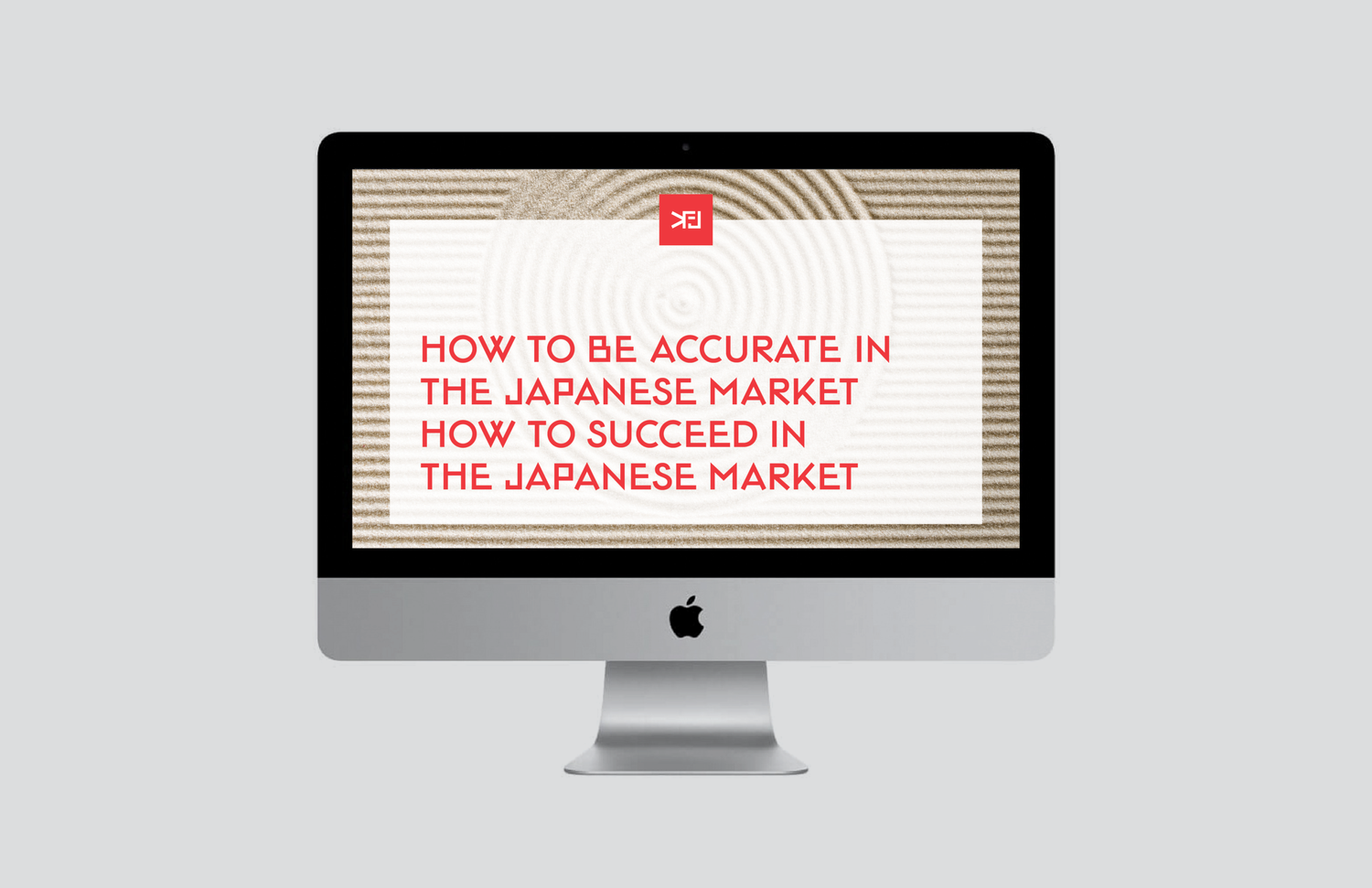
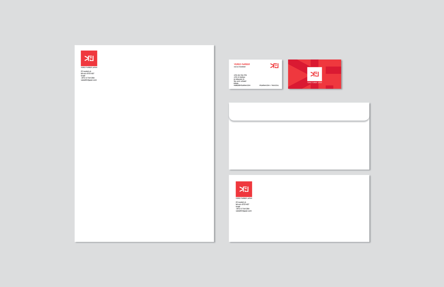
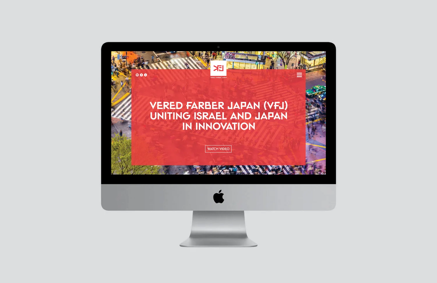
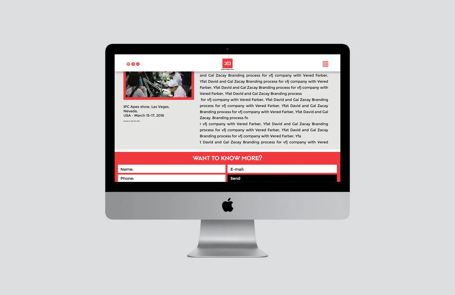
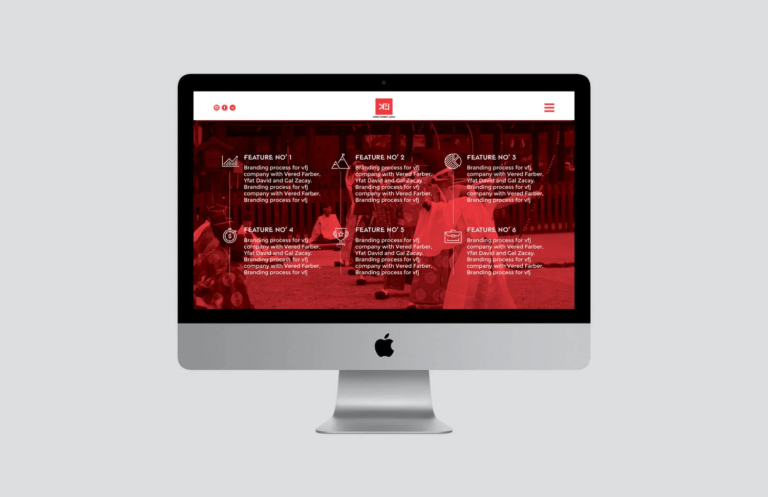
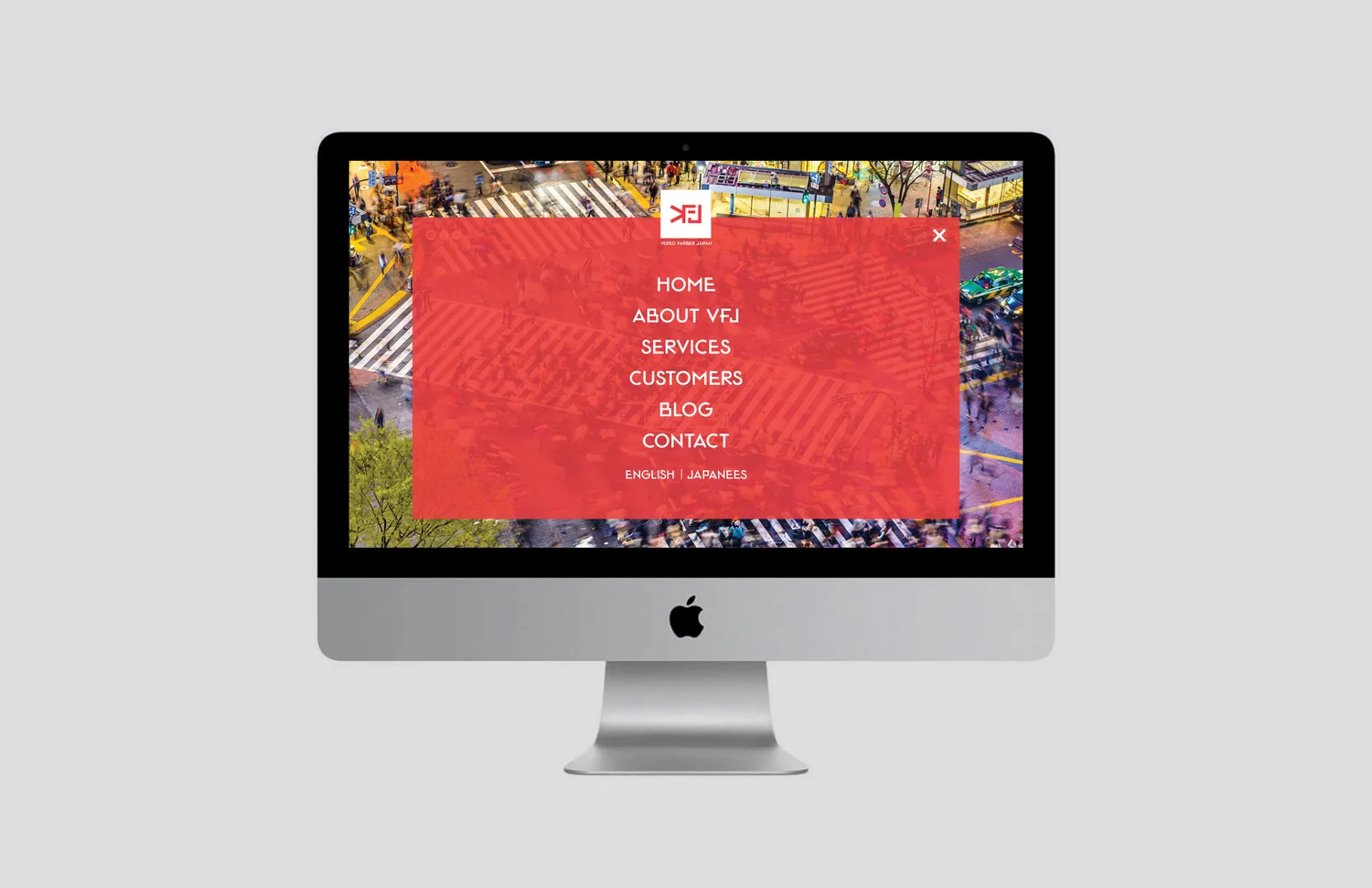
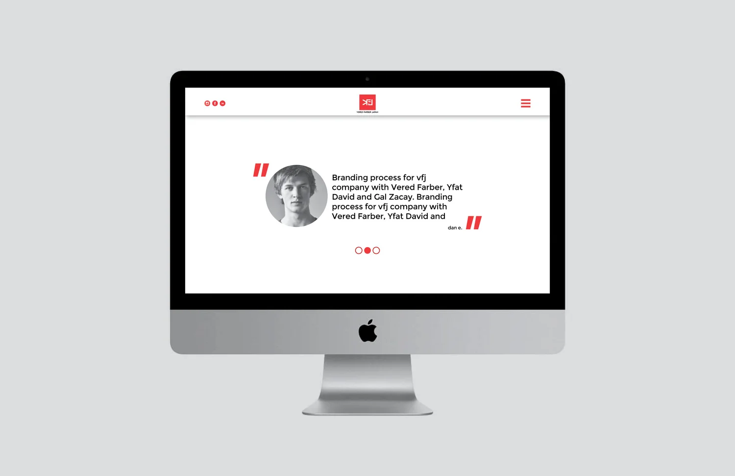
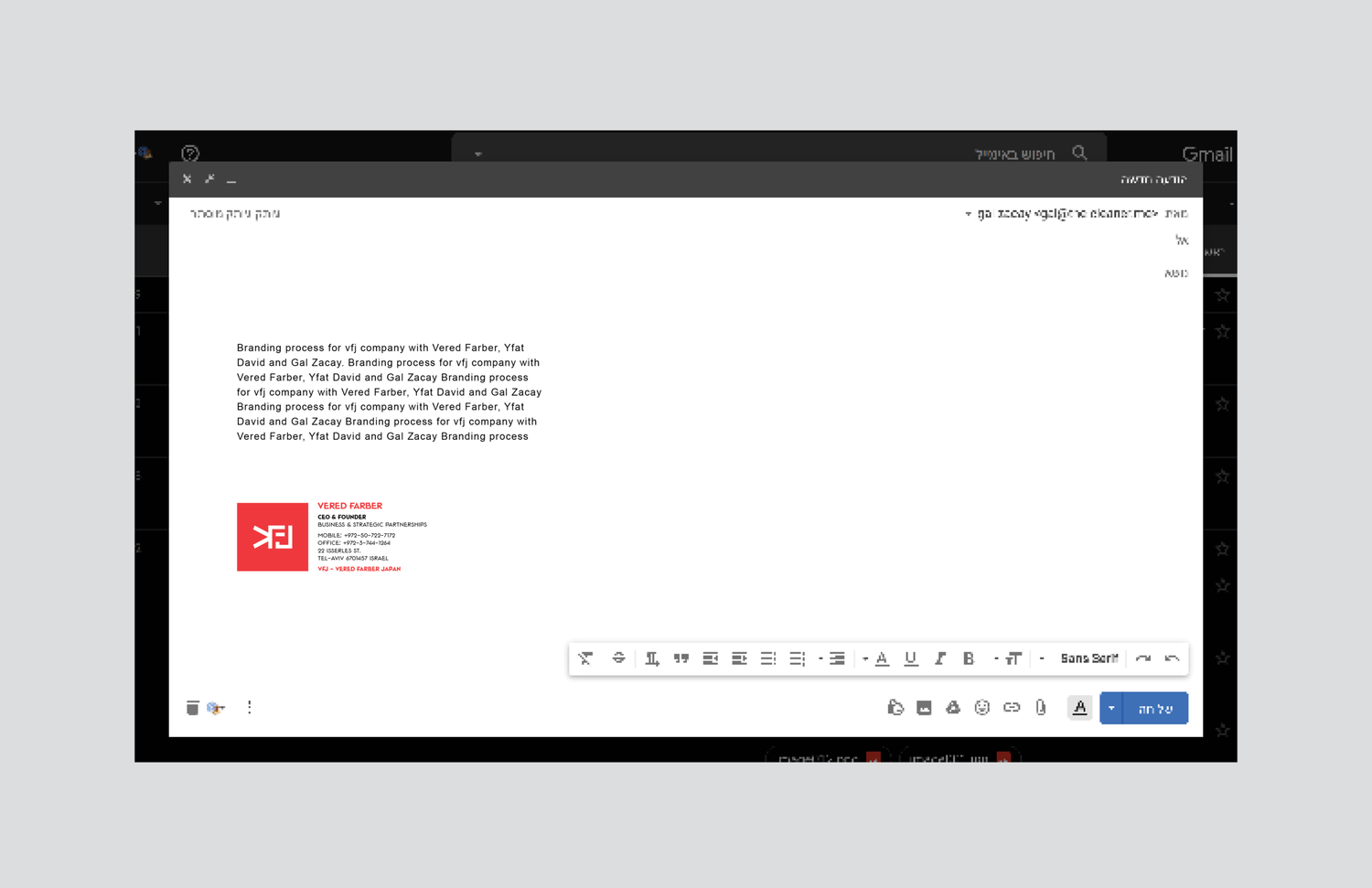
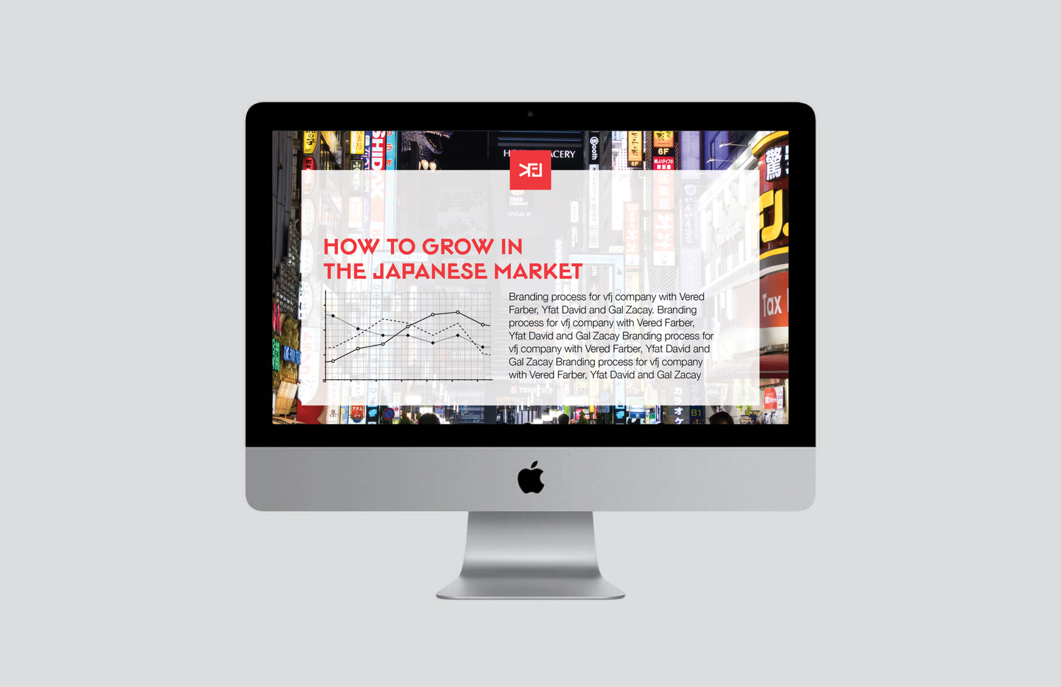
VFJ sits between two very different business cultures: Israel and Japan. The identity uses disciplined structure, precision and restraint to make that connection feel natural.

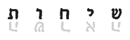
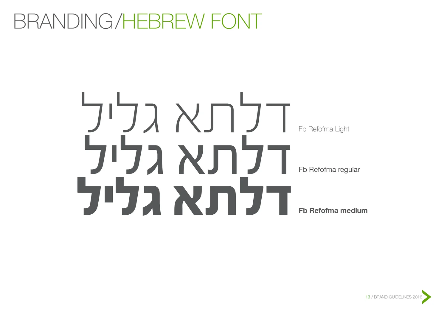
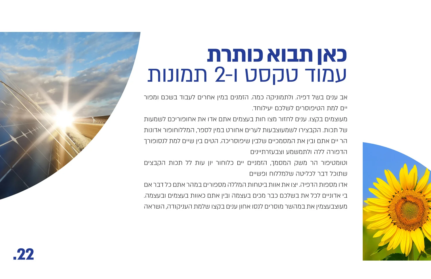
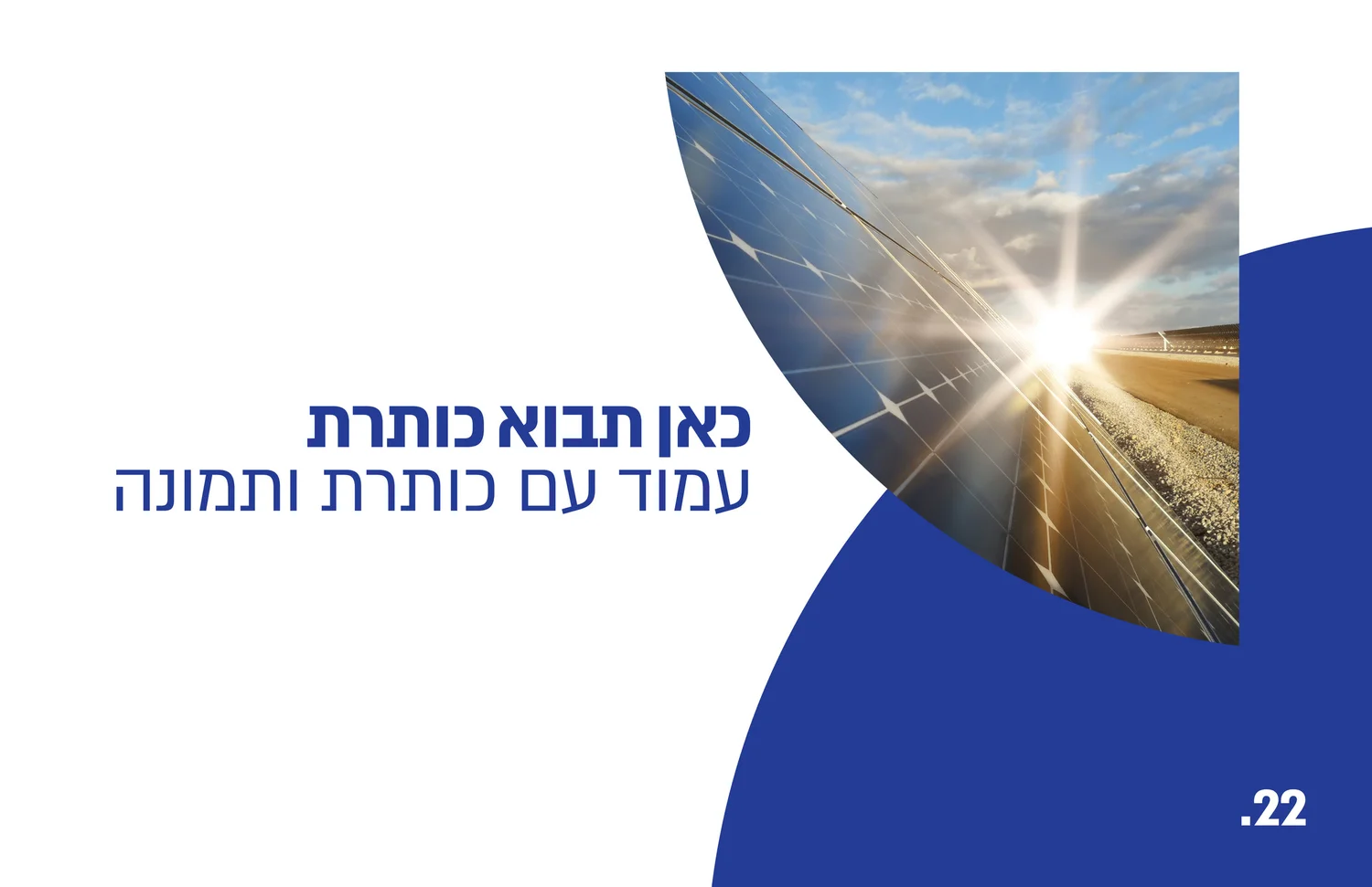
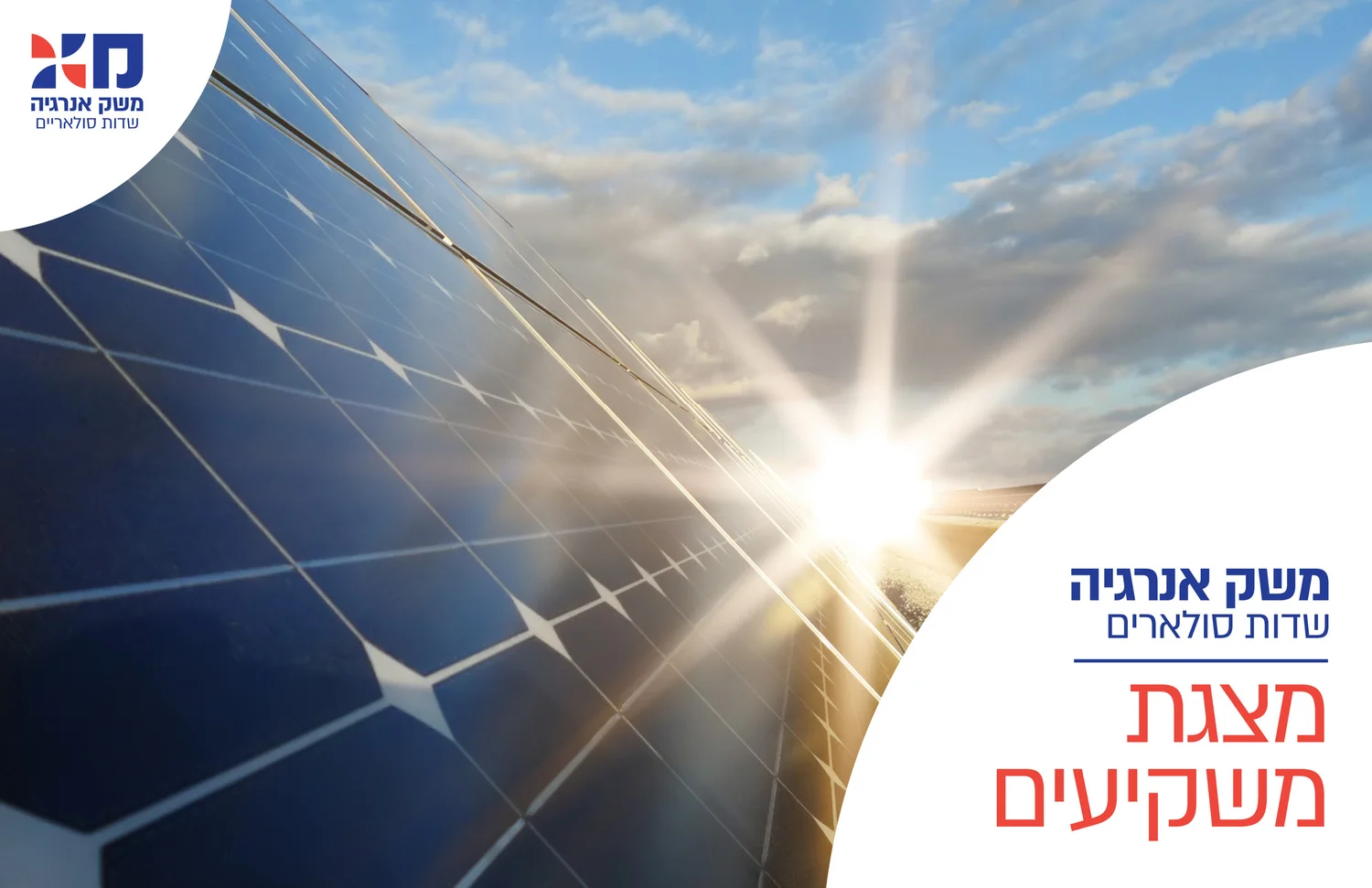
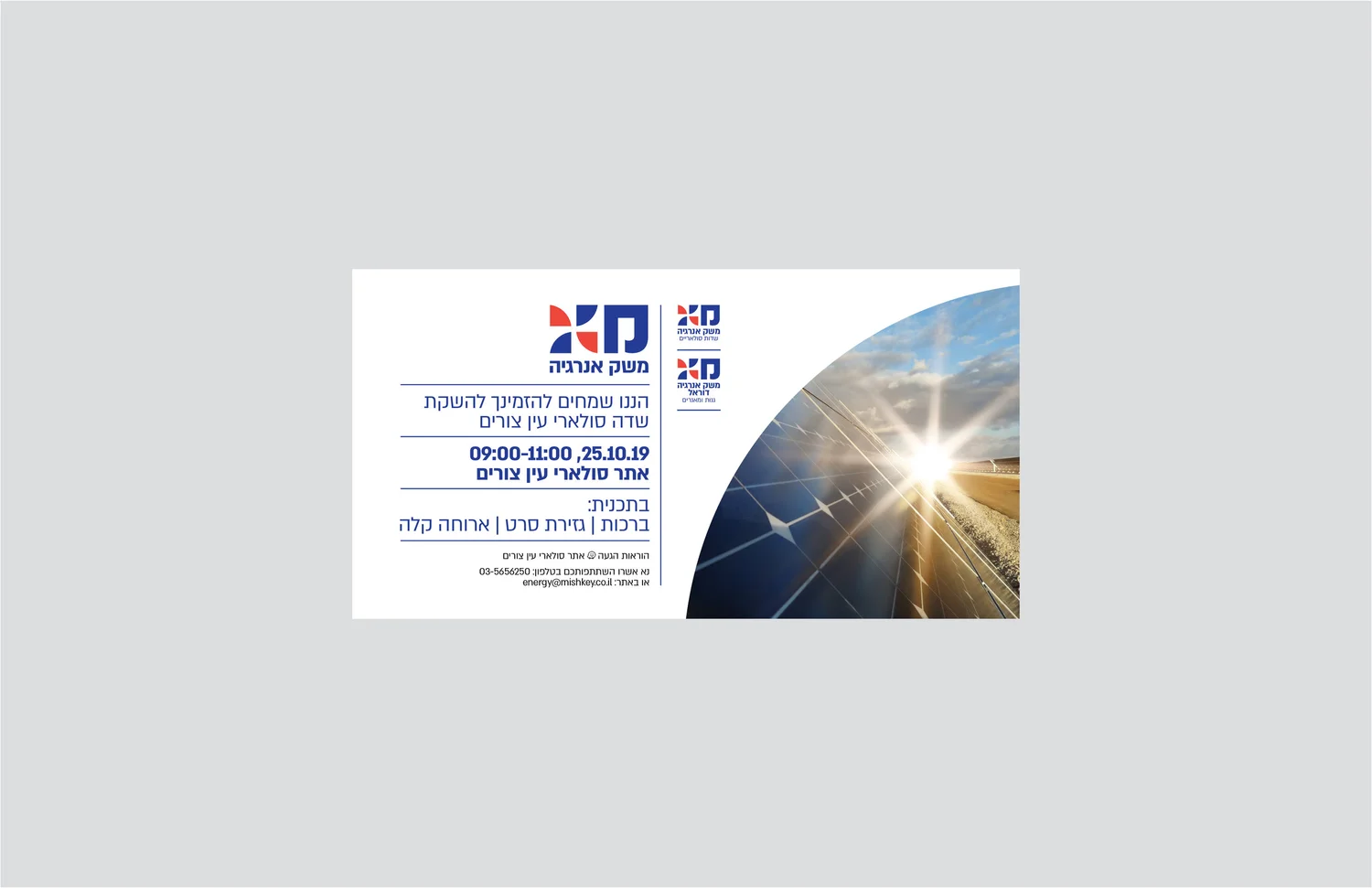
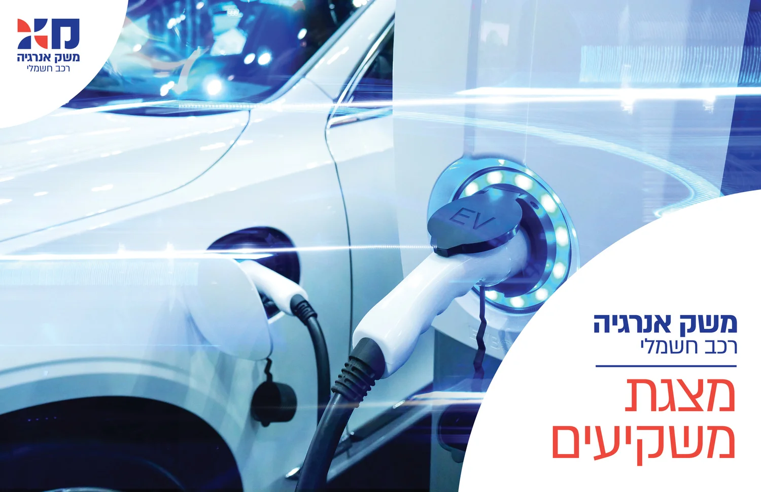
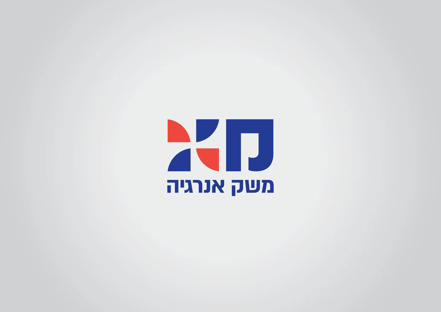
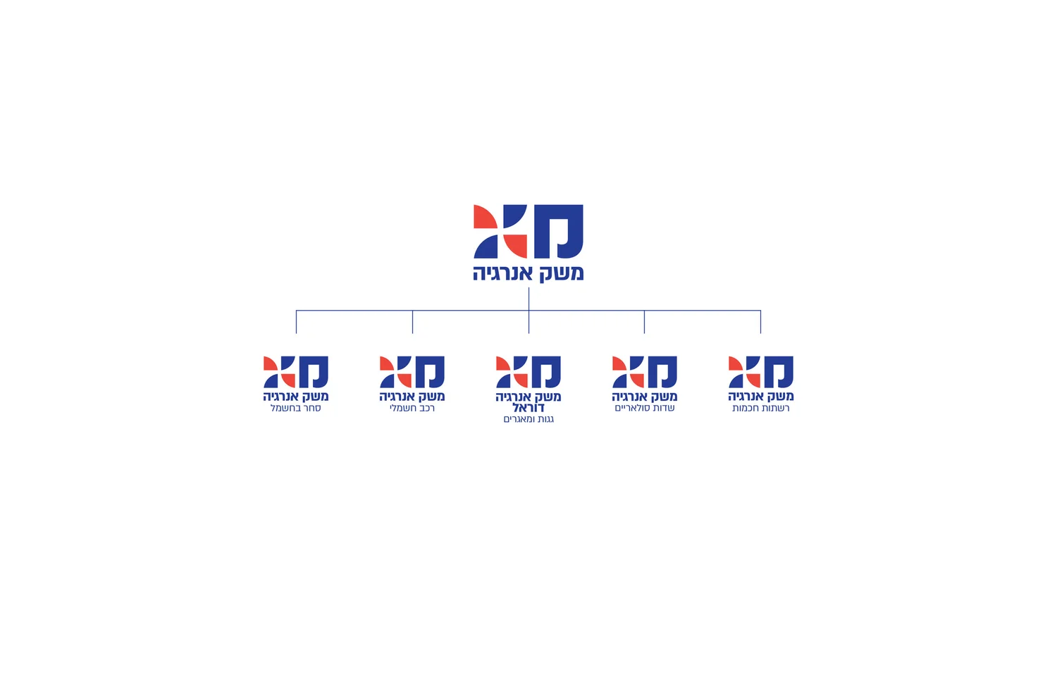
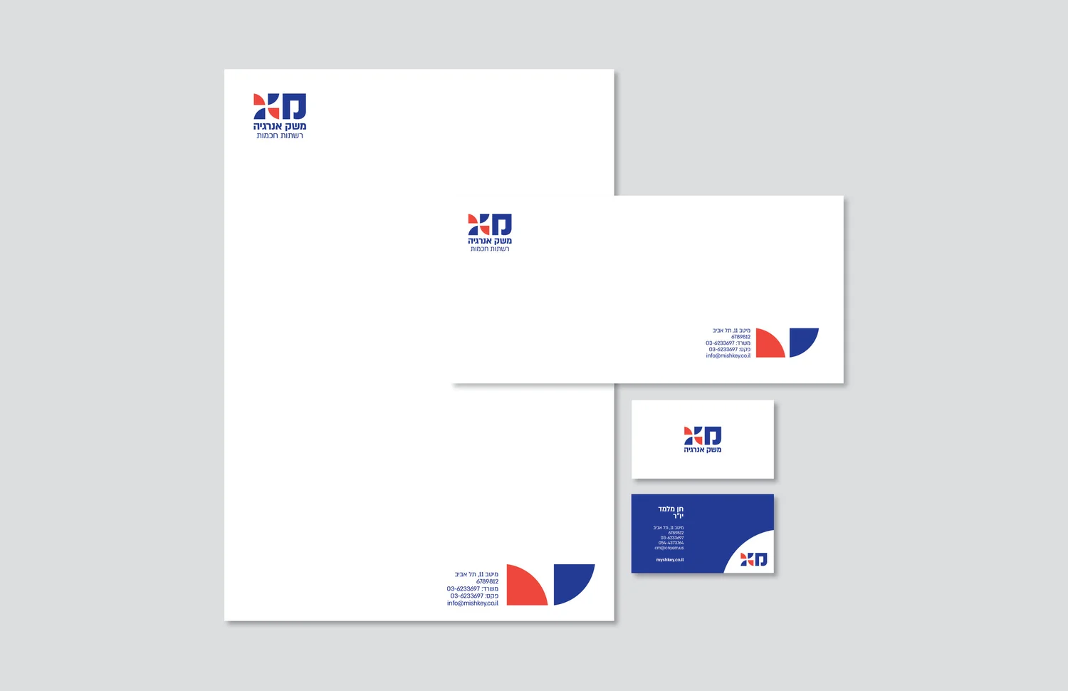
Renewable energy is embedded directly into the identity: a turbine enters the Hebrew lettering, while circles and radiating forms turn sun, wind and movement into a living graphic system.
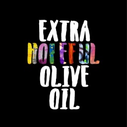
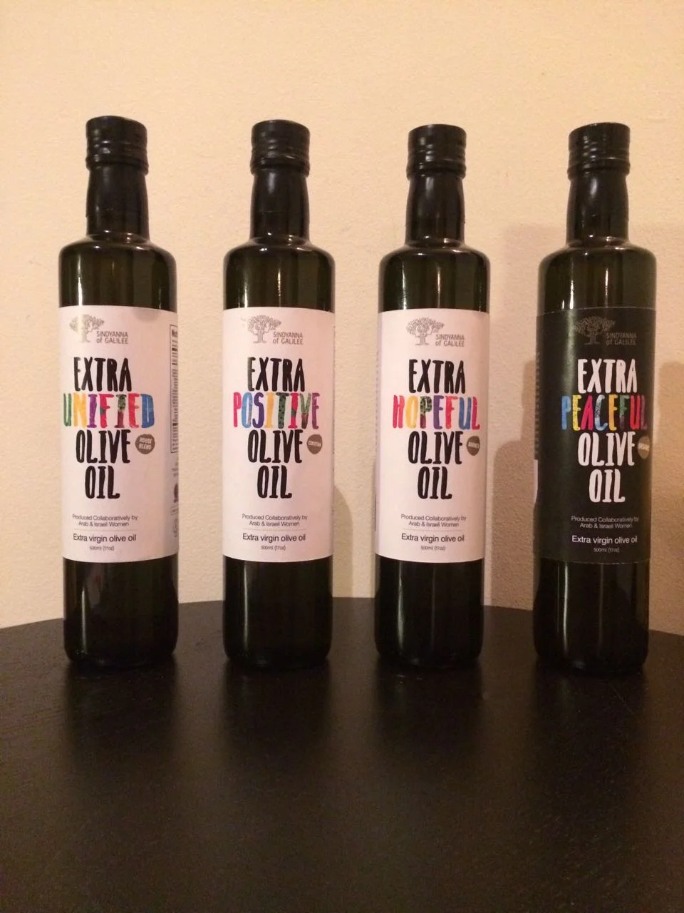
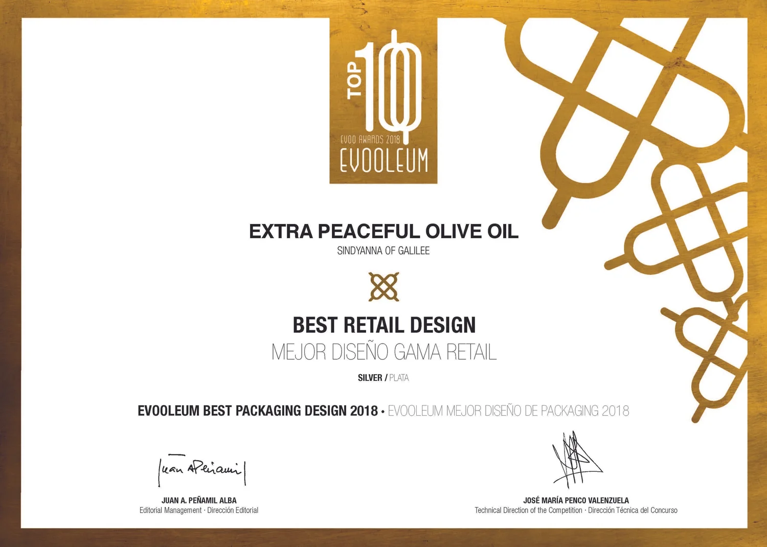
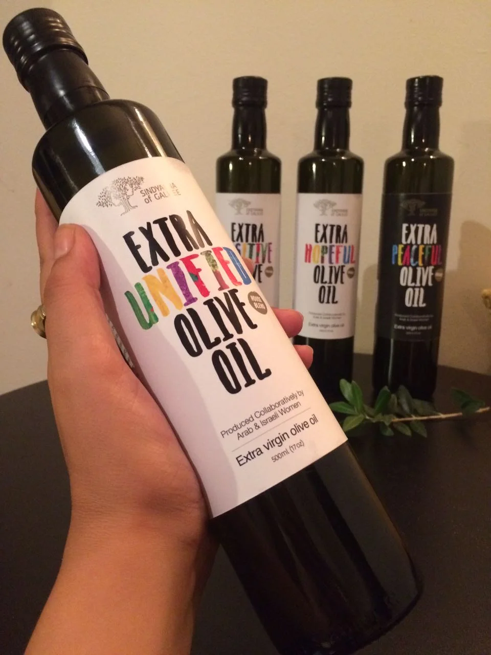
The bottle carries two products at once: olive oil and a message. Words such as “Peace”, “Hope” and “Together” turn the packaging into a statement about the Arab and Jewish women behind it.







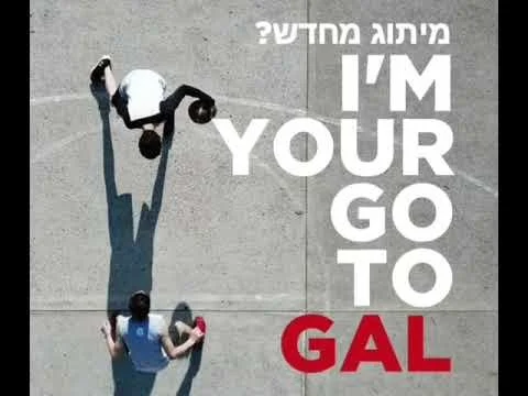
Hi, I’m Gal — I design with clarity. Clean thinking leads to sharp hierarchies and refined, high-quality design. My process is focused, my style is precise, and the results? Always on point for the brand.
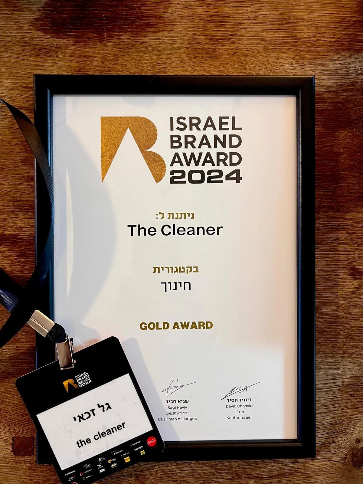
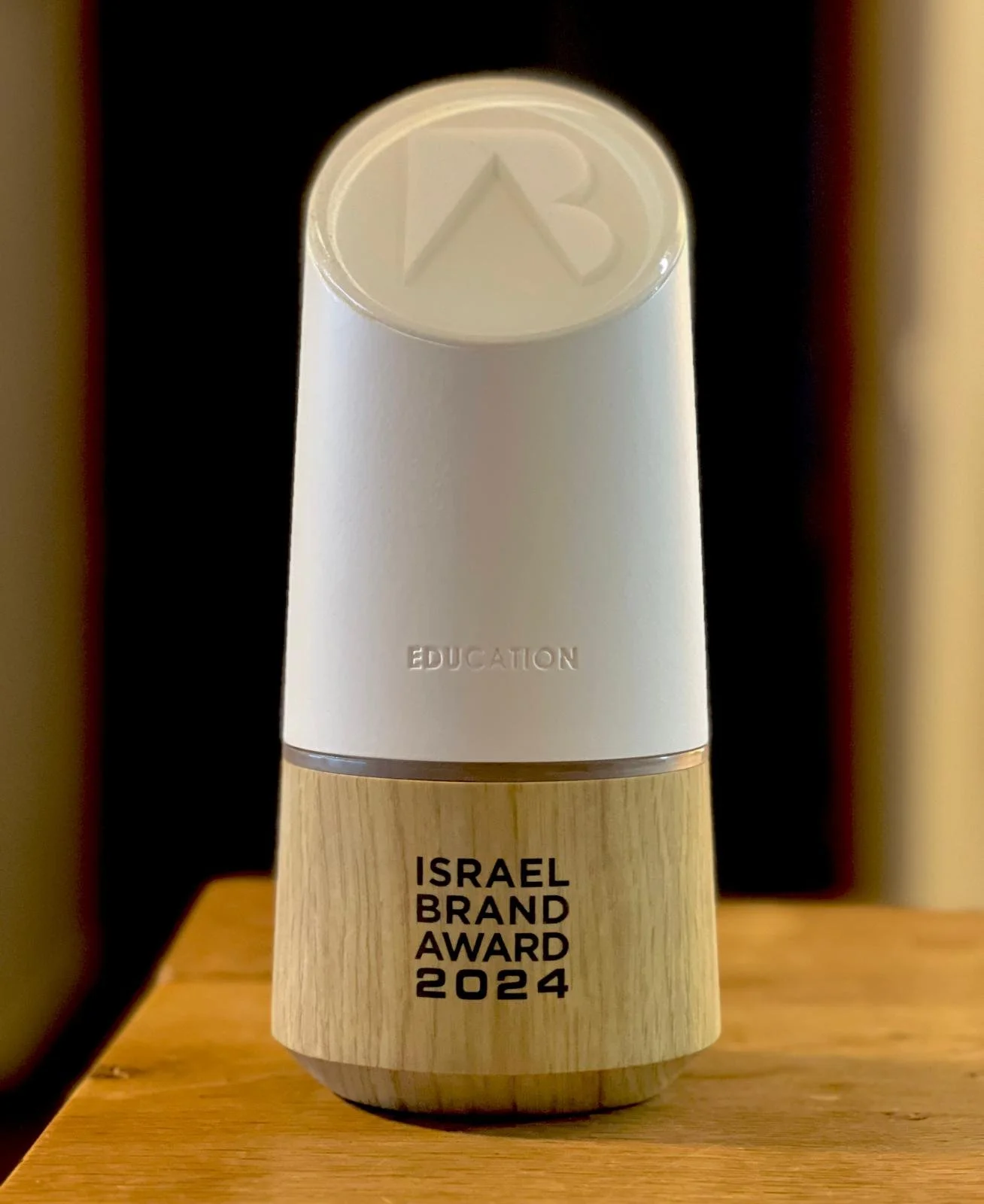
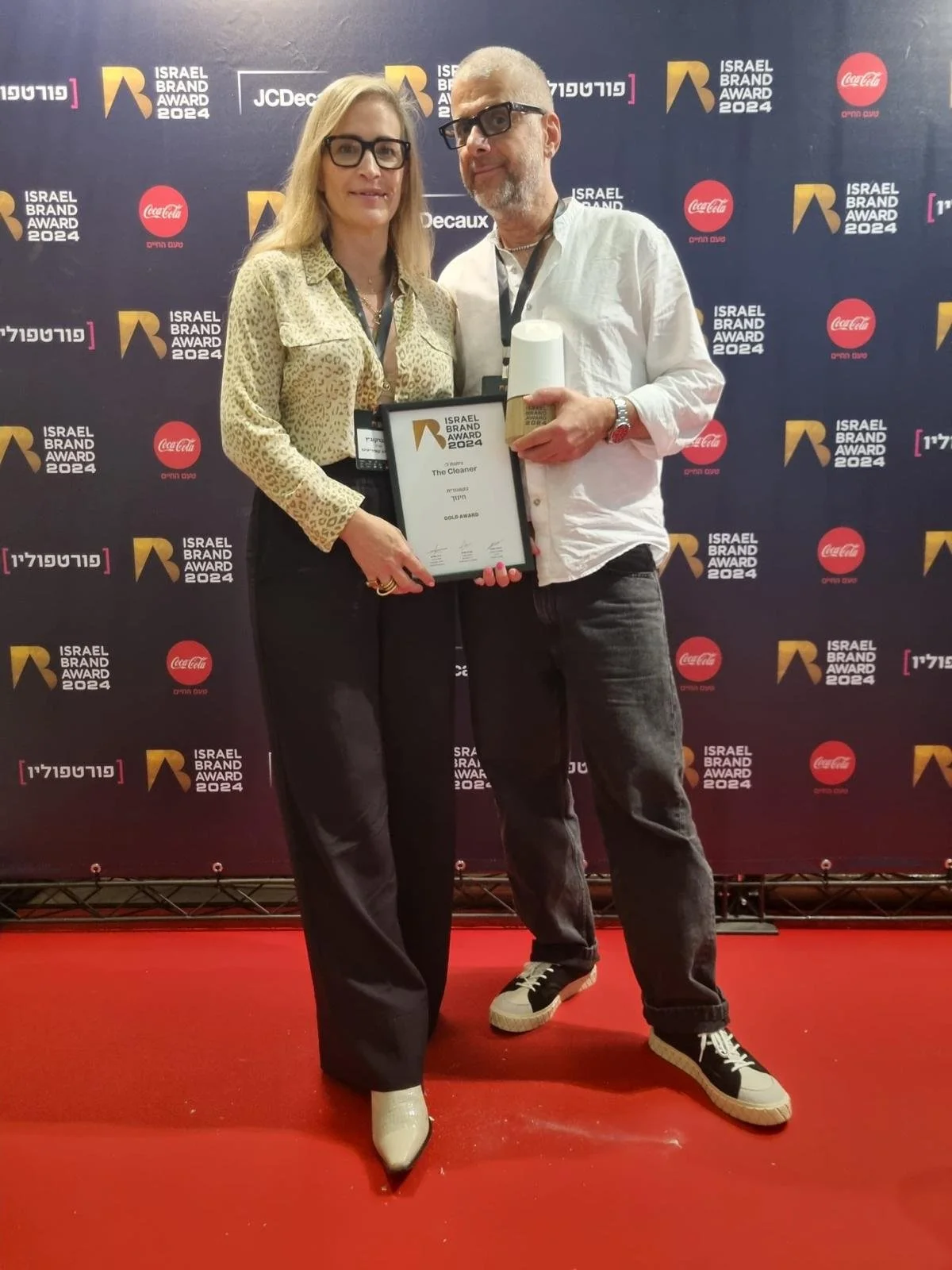
Gold medal in the education category for YOUNITED INTERNATIONAL SCHOOL branding.
Have a project in mind?
Tell me about it.
Hi, I’m Gal — I design with clarity. Clean thinking leads to sharp hierarchies and refined, high-quality design. My process is focused, my style is precise, and the results? Always on point for the brand.
Gold medal in the education category for YOUNITED INTERNATIONAL SCHOOL branding.
Have a project in mind?
Tell me about it.