


AMT Fitness – Be the One
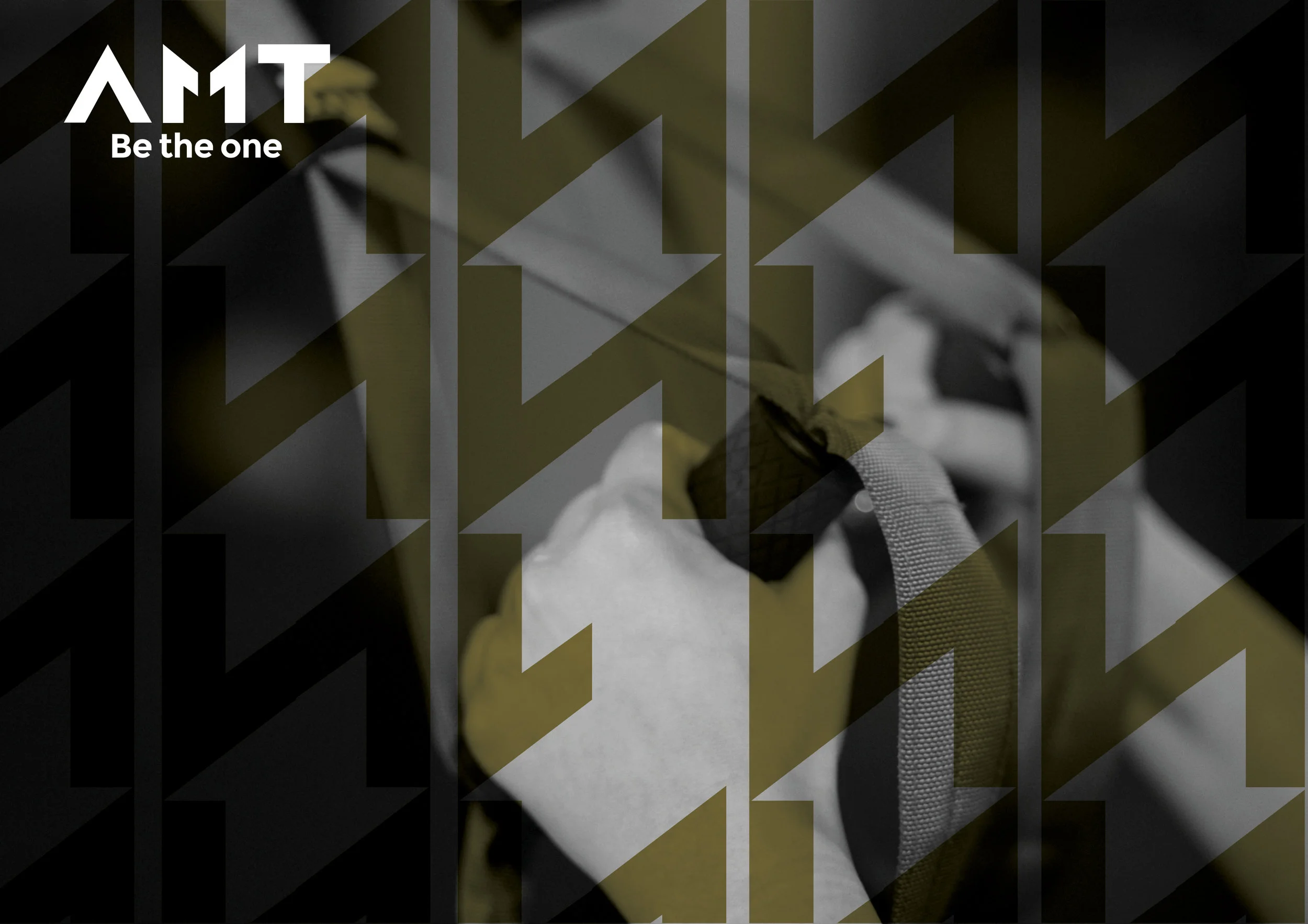
The concept behind AMT Fitness Center's branding is all about empowerment: Be the One. The number "1" is integrated into the logo itself, serving as both a typographic and symbolic element — a reminder that every person has the potential to be their own #1.
The design is bold and energetic, using sharp, athletic typography and strong visual contrasts to evoke motion, focus, and personal achievement. The visual language is rooted in strength — the typography feels powerful and deliberate, echoing the intensity and drive of the fitness world.
The color palette and layout are designed to inspire action and determination, making every interaction with the brand feel like a call to move, push, and grow.
At AMT, it’s not just about working out — it’s about stepping up. Being the one who shows up, who improves, who leads.